
| Intersoft ClientUI 8 > ClientUI Controls > Control Library > Data Controls Overview > UXMultipleSelectionComboBox |
UXMultipleSelectionComboBox is a queryable combo box control derived from the UXDataComboBox which is specially designed to support multiple selection. All features in UXPageableComboBox, such as multiple column, sorting, and paging feature, are also supported in this control. To learn more about these features, see UXDataComboBox Overview and UXPageableComboBox Overview.

UXMultipleSelectionComboBox performs data binding in much the same way as in UXPageableComboBox control. To learn more, see Using UXPageableComboBox.
The following code shows how to use UXMultipleSelectionComboBox control in single column.
| XAML |
Copy Code
|
|---|---|
<Intersoft:UXMultipleSelectionComboBox SearchResult="{Binding Customers}" FilterDescriptors="{Binding LookUpDescriptor.FilterDescriptors, Mode=TwoWay}" SortDescriptors="{Binding LookUpDescriptor.SortDescriptors, Mode=TwoWay}" PageDescriptor="{Binding LookUpDescriptor.PageDescriptor}" DisplayMemberPath="ContactName"> <Intersoft:UXMultipleSelectionComboBox.DataContext> <ViewModels:CustomerViewModel/> </Intersoft:UXMultipleSelectionComboBox.DataContext> </Intersoft:UXMultipleSelectionComboBox> |
|
 |
Notice that if you use the paging feature, you need to do special handling in your ViewModel. See UXPageableComboBox to learn how to handle this behavior. |
To enable multiple columns feature, simply add the following code to your UXMultipleSelectionComboBox control markup.
| XAML |
Copy Code
|
|---|---|
<Intersoft:UXMultipleSelectionComboBox.Columns> <Intersoft:UXDataComboBoxTextColumn Header="Customer ID" Binding="{Binding CustomerID}" DisplayMode="Image" ImageHeight="64" ImageWidth="64" ImageStretch="Fill" ImageBinding="{Binding PhotoPath}"/> <Intersoft:UXDataComboBoxTextColumn Header="Contact Name" Binding="{Binding ContactName}"/> <Intersoft:UXDataComboBoxTextColumn Header="Company Name" Binding="{Binding CompanyName}"/> <Intersoft:UXDataComboBoxTextColumn Header="Country" Binding="{Binding Country}"/> </Intersoft:UXMultipleSelectionComboBox.Columns> |
|
To learn more about Columns in UXMultipleSelectionComboBox, see UXPageableComboBox Columns Overview.
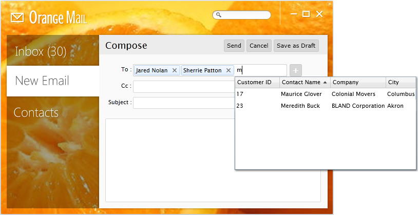
UXMultipleSelectionComboBox control can be used in non-editable or editable mode. In non-editable mode, users can select multiple items through the checkbox control available in the first column of each item. In contrast, editable mode provides a more elegant way to perform multiple selection. Users can update the selection directly through the text input element. Editable mode can be enabled by setting the IsEditable property to True.

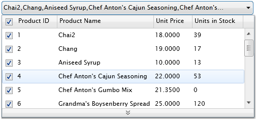
If multiple columns feature is applied, the results will look like the following image:

All behaviors in UXPageableComboBox such as auto complete, status bar, column header and auto load more data behaviors are also supported in UXMultipleSelectionComboBox. To learn more about these behaviors and how to customize them, see UXPageableComboBox Behaviors.
As mentioned in the above section, UXMultipleSelectionComboBox can be used in editable mode and not editable mode which determined by IsEditable property. Each mode has different behavior that you can customize.
In non-editable mode you can modify the following behaviors.
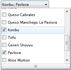
By default, selected items displayed on the non-editable combo box control is splitted with a comma character. If you want to change this behavior, you must set the InputSeparator property with a string or the character you desired.
| XAML |
Copy Code
|
|---|---|
<Intersoft:UXMultipleSelectionComboBox SearchResult="{Binding Customers}" FilterDescriptors="{Binding LookUpDescriptor.FilterDescriptors, Mode=TwoWay}" SortDescriptors="{Binding LookUpDescriptor.SortDescriptors, Mode=TwoWay}" PageDescriptor="{Binding LookUpDescriptor.PageDescriptor}" DisplayMemberPath="ContactName" InputSeparator="; "> <Intersoft:UXMultipleSelectionComboBox.DataContext> <ViewModels:CustomerViewModel/> </Intersoft:UXMultipleSelectionComboBox.DataContext> </Intersoft:UXMultipleSelectionComboBox> |
|
The above code change the separator value into a semicolon character which followed by a space character. It will produce results like the following image:

Often times, users need to check-all or uncheck-all the records. Of course, it will be a waste of time if users have to check or uncheck each record in the list. To address this scenario, UXMultipleSelectionComboBox already includes a built-in check-all or uncheck-all feature. To enable this feature, simply set the CheckBoxHeaderVisibility property to true. The control will automatically generate a checkbox in the column header area. Note that this time-saving feature can only be used in non-editable mode with multiple columns enabled.

In editable mode, UXMultipleSelectionComboBox includes smart result filtering capability.
When this feature is enabled, the selected items will be not be included in the search result list. You can enable this feature by setting the AutoFilterSelectedItems property to true.
The collection of data that has been selected will be assigned to the SelectedItems property. To get the selected items collection or initialize the selected items, you can easily bind the property from your ViewModel to the SelectedItems property of UXMultipleSelectionComboBox. For more details on how to initialize selected items, see How to Initialize Selected Items in UXMultipleSelectionComboBox.
With SelectedItemConverter property, it allows you to bind a collection of items where the selected item type is different with the search result type. Note that you should set the SelectedValuePath property of UXMultipleSelectionComboBox for the selected items to work properly.
This feature is particularly useful in such a scenario that you want to display the records from a table but you must bind it from another table that logically linked to a foreign key. In this case, you just need to assign the foreign key path to the SelectedValuePath property and UXMultipleSelectionComboBox will do the rest for you. You can see How to Implement Selected Items Converter in UXMultipleSelectionComboBox to learn more about this feature.
UXMultipleSelectionComboBox also provides comprehensive keyboard supports so certain tasks can be easily invoked through combined keys. The following is a list of supported keys in UXMultipleSelectionComboBox control.
| Key | Action Performed |
|---|---|
| Left/Right Arrow | Navigate through the query text and selected items in UXMultipleSelectionComboBox. |
| Up/Down Arrow | Navigate through each search records displayed in UXMultipleSelectionComboBox. Additionally, pressing the down arrow will open the dropdown if the dropdown is still closed. |
| Enter | If there is an item that have a focus, then it will select the focused item and close the dropdown. |
| Delete/Backspace | Delete the query text and perform re-query. Notice that UXMultipleSelectionComboBox will not perform auto complete at this time. |
| Escape | Return UXMultipleSelectionComboBox to it's previous selected item and close the dropdown. |
| Tab/Shift+Tab | Close the dropdown if the dropdown is opened, then go to the next/previous control. |
| CTRL+Down | Load more data if the dropdown is opened. |