

| Intersoft ClientUI 8 > ClientUI Controls > Control Library > Data Controls Overview > UXPageableComboBox |
UXPageableComboBox is an enhanced UXDataComboBox control featuring highly-efficient data retrieval mechanism through server paging and sorting capabilities. In addition, it also includes a host of innovative features such as multiple columns, templated column, description text, and much more.
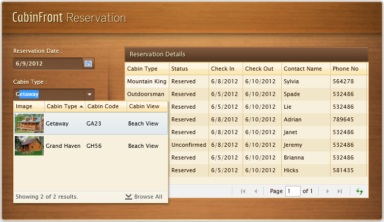
UXPageableComboBox provides a flexible way to display a collection of data in a single or multiple columns layout. Similar to UXDataComboBox, you need to input the query into UXPageableComboBox and handle the query using the QueryDescriptor component model. The control is designed with MVVM-ready architecture so that you can write the user interaction code entirely in the ViewModel including the implementation for paging feature.
The following code shows how to use UXPageableComboBox to query and display the records in single column layout.
| XAML |
Copy Code
|
|---|---|
<Intersoft:UXPageableComboBox SearchResult="{Binding Customers}" FilterDescriptors="{Binding LookUpDescriptor.FilterDescriptors, Mode=TwoWay}" SortDescriptors="{Binding LookUpDescriptor.SortDescriptors, Mode=TwoWay}" PageDescriptor="{Binding LookUpDescriptor.PageDescriptor}" DisplayMemberPath="ContactName" StatusBarVisibility="True"> <Intersoft:UXPageableComboBox.DataContext> <ViewModels:CustomerViewModel/> </Intersoft:UXPageableComboBox.DataContext> </Intersoft:UXPageableComboBox> |
|
| C# |
Copy Code
|
|---|---|
using System; using System.Collections; using Intersoft.Client.Data.ComponentModel; using Intersoft.ClientUI.Samples.DataControls.ModelServices; namespace Intersoft.ClientUI.Samples.DataControls.ViewModels { public class CustomerViewModel : ViewModelBase { #region Constructors public CustomerViewModel() { this.CustomersSource = CustomersRepository.Instance; this.Presenter = new MessagePresenter(); this.LookUpDescriptor = new QueryDescriptor(); // Initialize Sort Descriptor this.LookUpDescriptor.SuspendQueryChanged = true; this.LookUpDescriptor.SortDescriptors.Add(new SortDescriptor() { PropertyName = "ContactName", Direction = ListSortDirection.Ascending }); this.LookUpDescriptor.SuspendQueryChanged = false; } #endregion #region Fields private IEnumerable _customers; private QueryDescriptor _lookUpDescriptor; #endregion #region Properties protected IDataRepository CustomersSource { get; set; } public IEnumerable Customers { get { return this._customers; } set { if (_customers != value) { _customers = value; OnPropertyChanged("Customers"); } } } public QueryDescriptor LookUpDescriptor { get { return _lookUpDescriptor; } set { if (_lookUpDescriptor != value) { if (_lookUpDescriptor != null) _lookUpDescriptor.QueryChanged -= new EventHandler(OnLookUpQueryChanged); _lookUpDescriptor = value; _lookUpDescriptor.QueryChanged += new EventHandler(OnLookUpQueryChanged); OnPropertyChanged("LookUpDescriptor"); } } } protected virtual MessagePresenter Presenter { get; private set; } #endregion #region Methods private void OnLookUpQueryChanged(object sender, EventArgs e) { this.CustomersSource.GetData ( this.LookUpDescriptor, (customers) => { if (this.LookUpDescriptor.PageDescriptor.PageIndex > 0) { ObservableCollection<object> items = this.Customers as ObservableCollection<object>; foreach (var customer in customers) { items.Add(customer); } } else { ObservableCollection<object> items = new ObservableCollection<object>(customers.Cast<object>()); this.Customers = items; } }, (totalItemCount) => { if (totalItemCount != -1) this.LookUpDescriptor.PageDescriptor.TotalItemCount = totalItemCount; }, (error) => { this.Presenter.ShowErrorMessage( "An exception has occurred during data loading\n." + "Message: " + error.Message + "Stack Trace: " + error.StackTrace); } ); } #endregion } } |
|
As seen in the example above, notice that you only need to bind the FilterDescriptors in the XAML and handle the QueryChanged in your ViewModel. UXPageableComboBox will automatically provide the filter descriptors based on FilterMemberPath, FilterOperator and user's input query.
When the PageDescriptor is larger than 0, this indicates that the control is requesting more data to be retrieved. As seen in the code above, you should add the new items to the existing collection instead of assigning the result to the initial collection property. This approach allows incremental data loading which significantly improves performance even for very large data scenario.
 |
If the FilterMemberPath property is not specified, UXDataComboBox will use DisplayMemberPath for the filtering purpose. |
The sample code above shows you how to enable paging in your UXPageableComboBox. You can use the PageSize property to determine the number of item per page in your UXPageableComboBox or disable the paging feature by setting the CanUserPage property to False.
UXPageableComboBox control has a great feature to display records in multiple columns. Similar to UXGridView, you must specify the columns you want to use for hosting the content. The built-in column types include a text-image column and template column.
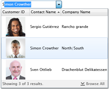
The following code will explain how to implement it on UXPageableComboBox control.
| XAML |
Copy Code
|
|---|---|
<Intersoft:UXPageableComboBox.Columns> <Intersoft:UXDataComboBoxTextColumn Header="Customer ID" Binding="{Binding CustomerID}" DisplayMode="Image" ImageHeight="64" ImageWidth="64" ImageStretch="Fill" ImageBinding="{Binding PhotoPath}"/> <Intersoft:UXDataComboBoxTextColumn Header="Contact Name" Binding="{Binding ContactName}"/> <Intersoft:UXDataComboBoxTextColumn Header="Company Name" Binding="{Binding CompanyName}"/> </Intersoft:UXPageableComboBox.Columns> |
|
By default, column header will be displayed in multiple column mode. But if you want to hide the column header, simply set the ColumnHeaderVisibility property to Collapsed.
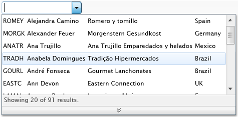
UXPageableComboBox column also support column header binding. This feature can be used to localize the column header text, suppose you want to make your application available in multi language. To use this feature, simply bind your localized resources to each column's HeaderBinding property. To learn more about Localization, see Localization Overview.
This feature allow you to initialize or change the UXPageableComboBox columns definition dynamically. You only need to bind the collection of column from your ViewModel to the Columns property of UXPageableComboBox control.
UXPageableComboBox columns also comes with sorting capability. This feature can be enabled by set the CanUserSort property to True. If you prefer to disable sorting on certain columns, set the CanUserSort property of the column to False.
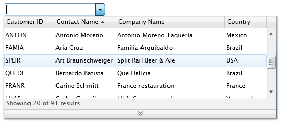
When sorting is enabled, you can specify the SortMemberPath property of UXPageableComboBox column to a value that represents the member path for sorting. If not specified, the SortMemberPath property will be automatically set to the member path defined in the Binding property.
Similar to UXDataComboBox, UXPageableComboBox will not open the result box immediately when you type in a query text. Instead, it will wait until the search results becomes available, then display it along with the result box. If you want to open the result box immediately when users type into the text box, you can set the AutoShowResultBox property to True.
By default, UXPageableComboBox will display empty result when the query text is empty, but UXPageableComboBox also gives you an option to show all the records when the query text is empty. To activate this behavior, set the LoadDataWhenEmpty property to True.
In addition, UXPageableComboBox also comes with several customizable behaviors, such as multiple columns, auto complete, status bar, description text, and auto load more data when scroll reaches the bottom.
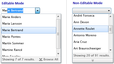
By default, UXPageableComboBox control is mainly designed for editable mode which enable users to query data through the text input control. Suppose you only have a few records for selection, you might consider to use non-editable mode. To use non-editable mode, simply set IsEditable property to False. It will display all records similar to the default combo box control does, but with paging capability.
Auto complete feature is enabled by default in UXPageableComboBox. It will automatically select the first item that match your query and auto complete your query text. If you type in another text after the auto complete, it will perform another query and auto complete after the data is retrieved. However, if you press Delete or Backspace keys, it will perform another query but will not perform the auto complete. If you prefer, you can disable the auto complete feature by setting the IsTextSearchEnabled property to False.
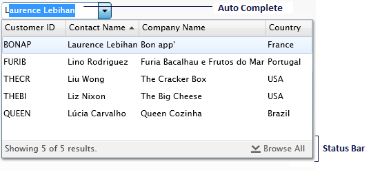
In UXPageableComboBox, you can enable the status bar feature by set the StatusBarVisibility property to Visible. The status bar will display any information about the records, such as total displayed records, total all records, searching progress, and button for browse all data.
DescriptionText is represents the additional information about the selected item which is displayed at the right side of the UXPageableComboBox. It will be displayed when the UXPageableComboBox is not focused. This feature can be enabled by set the DescriptionVisibility property to Visible and remember to bind the member path of the data source to the DescriptionMemberPath property.

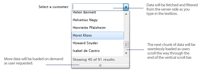
This feature enables UXPageableComboBox to automatically load more data when scroll reaches the bottom. To enable this feature, set AutoLoadMoreData property to True.
UXPageableComboBox also provides comprehensive keyboard supports so certain tasks can be easily invoked through combined keys. The following is a list of supported keys in UXPageableComboBox control.
| Key | Action Performed |
|---|---|
| Left/Right Arrow | Navigate through the query text in UXPageableComboBox. |
| Up/Down Arrow | Navigate through each search records displayed in UXPageableComboBox. Additionally, pressing the down arrow will open the dropdown if the dropdown is still closed. |
| Enter | If there is an item that have a focus, then it will select the focused item and close the dropdown. |
| Delete/Backspace | Delete the query text and perform re-query. Notice that UXPageableComboBox will not perform auto complete at this time. |
| Escape | Return UXPageableComboBox to it's previous selected item and close the dropdown. |
| Tab/Shift+Tab | Close the dropdown if the dropdown is opened, then go to the next/previous control. |
| CTRL+Down | Load more data if the dropdown is opened. |