

| Intersoft ClientUI 8 > ClientUI Controls > Control Library > Data Controls Overview > UXGridView |
Intersoft UXGridView is a powerful, MVVM-ready data grid control with high-performance virtual data loading architecture. It includes all features you expected in a standard data grid, plus a host of innovative features exclusive to UXGridView such as server query mode support, MVVM-ready editing architecture, combobox column with value list support, customizable editing controls, data aggregation, fluid drag-drop, built-in column filtering, ISO standards user experiences, and much more.
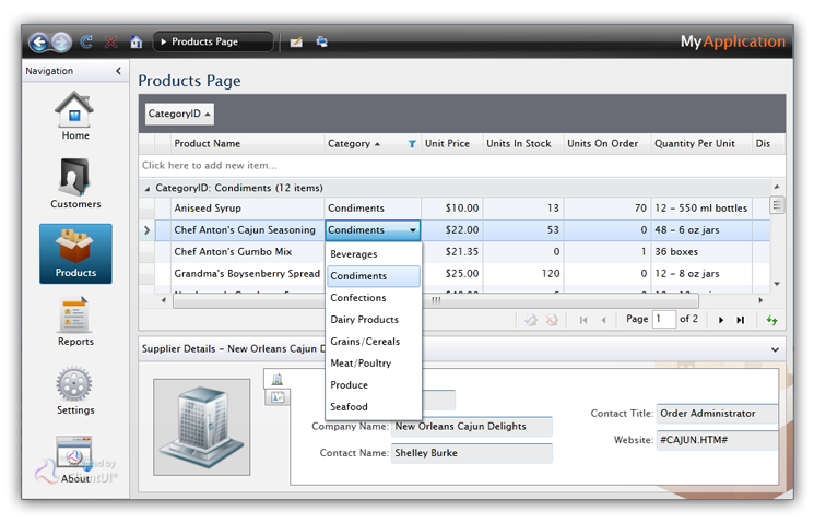
UXGridView provides a flexible way to display a collection of data in rows and columns. The built-in column types include a text box column, a check box column, combo box column and template column for hosting custom content. The built-in row type includes a drop-down details section that you can use to display additional content below the cell values.
To bind UXGridView to data, set the ItemsSource property to an object that implements IEnumerable. Each row in the UXGridView is bound to an object in the data source, and each column in the UXGridView is bound to a property of the data object. In order for the UXGridView user interface to update automatically when items are added to or removed from the source data, UXGridView must be bound to a collection that implements INotifyCollectionChanged, such as an ObservableCollection<T>. In addition, for the user interface to automatically reflect property changes, the objects in the source collection must implement the INotifyPropertyChanged interface.
The following code shows a simple UXGridView with data binding in XAML.
| XAML |
Copy Code
|
|---|---|
<Intersoft:UXGridView ItemsSource="{Binding Products}"/> |
|
It is often useful to view and interact with information in a data grid control such as UXGridView in different ways by grouping, sorting, filtering or paging the data. To handle this data operation, UXGridView provides two approaches that you can choose from by setting the QueryOperation property.
Client data operation means that the data operation, such as sorting, filtering and paging; are executed in the client side against the data source provided to the UXGridView. To use this operation, you set the QueryOperation property to Client.
You typically use a collection that implements IPagedCollectionView as the data source or encapsulate the collection to a PagedCollectionView class. To learn how to perform client-side sorting, filtering and paging using UXGridView, see How-to: Implement Client-side Sorting, Filtering and Paging using UXGridView.
Server data operation means that the data operation, such as sorting, filtering and paging; are processed in the server side. In this mode, UXGridView does not handle the data operation by its own. It will simply provide the query information allowing you to process it further to a data service.
To use this mode, you set the QueryOperation property to Server. When this mode is selected, UXGridView will not attempt to perform the data operation on the given data source. Instead, it will store and distribute the query information on several properties such as FilterDescriptors, SortDescriptors and PageDescriptor property. When one of these properties change, the QueryChanged event of the associated QueryDescriptor will be raised. This allows you to streamline the query processing in a centralized function, which is one of the strong benefits of QueryDescriptor. For more information about QueryDescriptor, see QueryDescriptor Overview.
To learn how to perform server-side sorting, filtering and paging using UXGridView, see How-to: Implement Server-side Sorting, Filtering and Paging using UXGridView.
By default, the UXGridView control generates columns automatically when you set the ItemsSource property. The generated columns are of type UXGridViewCheckBoxColumn for bound Boolean (and nullable Boolean) properties, and of type UXGridViewTextColumn for all other properties. If a property does not have a string or numeric value type, the generated text box columns are read-only and display the data object's ToString value.
You can prevent automatic column generation by setting the AutoGenerateColumns property to false. This is useful when you want to create and configure all columns explicitly. Alternatively, you can let the data grid generate the columns, but handle the AutoGeneratingColumn event to customize columns after they are instantiated. To rearrange the display order of the columns, you can set the DisplayIndex property to the desired value for each individual column.
Generated columns recognize the DisplayAttribute if it is present on the source object. The DisplayAttribute.ShortName property is used to specify column header text. The DisplayAttribute.Order property is used to specify the order in which columns appear. The DisplayAttribute.AutoGenerateField property is used to specify whether the field has a column generated for it.
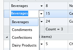
Regardless of how you generate the columns, you can access the Columns collection to programmatically add, insert, remove, and change any columns in the control at run time. Alternatively, you can specify columns in XAML, in which case you should set AutoGenerateColumns to false. Creating your own columns enables you to use additional column types, such as the UXGridViewComboBoxColumn, UXGridViewExpanderColumn, UXGridViewSelectColumn, UXGridViewTemplateColumn or other custom column type that inherited from UXGridViewColumn.
The following list describes the built-in column types available in UXGridView.
| XAML |
Copy Code
|
|---|---|
<Intersoft:UXGridView.Columns> <Intersoft:UXGridViewComboBoxColumn Header="Category ID" DisplayMemberPath="CategoryName" ValueMemberPath="CategoryID" Width="120" Binding="{Binding CategoryID, Converter={StaticResource CategoryConverter}}" ValueListSource="{Binding Categories, Source={StaticResource CategoriesViewModel}}"/> </Intersoft:UXGridView.Columns> |
|
| XAML |
Copy Code
|
|---|---|
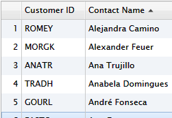
<Intersoft:UXGridView.Columns> <Intersoft:UXGridViewExpanderColumn /> <Intersoft:UXGridViewTextColumn Header="Customer ID" Binding="{Binding CustomerID}"/> <Intersoft:UXGridViewTextColumn Header="Contact Name" Binding="{Binding ContactName}"/> <Intersoft:UXGridViewTextColumn Header="Contact Title" Binding="{Binding ContactTitle}"/> <Intersoft:UXGridViewTextColumn Header="CompanyName" Binding="{Binding CompanyName}"/> </Intersoft:UXGridView.Columns> |
|

| XAML |
Copy Code
|
|---|---|
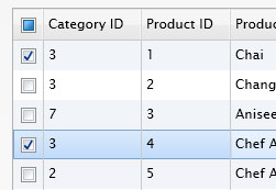
<Intersoft:UXGridView.Columns> <Intersoft:UXGridViewSelectColumn/> <Intersoft:UXGridViewTextColumn Header="Customer ID" Binding="{Binding CustomerID}"/> <Intersoft:UXGridViewTextColumn Header="Contact Name" Binding="{Binding ContactName}"/> <Intersoft:UXGridViewTextColumn Header="Contact Title" Binding="{Binding ContactTitle}"/> <Intersoft:UXGridViewTextColumn Header="CompanyName" Binding="{Binding CompanyName}"/> </Intersoft:UXGridView.Columns> |
|
| XAML |
Copy Code
|
|---|---|
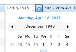
<Intersoft:UXGridViewTextColumn Header="Birth Date" Binding="{Binding BirthDate, StringFormat=MM/dd/yyyy}"> <Intersoft:UXGridViewTextColumn.CellEditingTemplate> <DataTemplate> <Grid Background="White" Margin="1"> <Intersoft:UXDateTimePicker Value="{Binding BirthDate, Mode=TwoWay}" EditMask="MM/dd/yyyy" BorderThickness="0" UseEditMaskAsDisplayMask="True" VerticalAlignment="Center" HorizontalAlignment="Stretch"/> </Grid> </DataTemplate> </Intersoft:UXGridViewTextColumn.CellEditingTemplate> </Intersoft:UXGridViewTextColumn> |
|
 |
The CellTemplate and CellEditingTemplate properties are also available in all built-in column types, allowing you to change the display and editing template for the desired columns. |
Bound columns are columns that support binding to its data context, which you can specify through the provided Binding property. The binding expression is also used to bind the generated cell element to its data context. Since the column exposes the binding expression, you can leverage the features and options supported in the native binding expression. For examples, StringFormat to format the value with the specified format, or use Converter to translate the value to a more meaningful information.
| XAML |
Copy Code
|
|---|---|
<Intersoft:UXGridViewTextColumn Header="Category" Width="120" Binding="{Binding CategoryID, Converter={StaticResource CategoryConverter}}"/> <Intersoft:UXGridViewTextColumn Header="Unit Price" Binding="{Binding UnitPrice, StringFormat=c}" CellHorizontalAlignment="Right"/> |
|
You can also bind the Columns property to a ViewModel. This enables you to manipulate the Columns collection of UXGridView in your ViewModel.
| XAML |
Copy Code
|
|---|---|
<Intersoft:UXGridView Columns="{Binding Columns}" AutoGenerateColumns="False"/> |
|
UXGridViewColumn has a Header property that determines the text displayed in each column header. This property should be sufficient for application that doesnt' support text localization.
Besides Header property UXGridViewColumn also provide HeaderBinding property that can be used to bind the text property of column header to other sources such as localization resources.
| XAML |
Copy Code
|
|---|---|
<Intersoft:UXGridView AutoGenerateColumns="False"> <Intersoft:UXGridView.Columns> <Intersoft:UXGridViewTextColumn HeaderBinding="{Binding Resource.CustomerIDHeader, Source={StaticResource ApplicationResource}}" Binding="{Binding CustomerID}"/> <Intersoft:UXGridViewTextColumn HeaderBinding="{Binding Resource.CompanyNameHeader, Source={StaticResource ApplicationResource}}" Binding="{Binding CompanyName}"/> <Intersoft:UXGridViewTextColumn HeaderBinding="{Binding Resource.ContactTitleHeader, Source={StaticResource ApplicationResource}}" Binding="{Binding ContactTitle}"/> <Intersoft:UXGridViewTextColumn HeaderBinding="{Binding Resource.PhoneHeader, Source={StaticResource ApplicationResource}}" Binding="{Binding Phone}"/> </Intersoft:UXGridView.Columns> </Intersoft:UXGridView> |
|
To learn more information about ClientUI localization framework, see Localization Overview.
To display aggregate values of a UXGridViewBoundColumn, you set the ColumnFooterVisibility property to Visible and specify the Aggregate property to the desired aggregate mode. You can also specify a string format to the aggregate value through the provided FooterFormatString property.
| XAML |
Copy Code
|
|---|---|
<Intersoft:UXGridView ColumnFooterVisibility="Visible" ItemsSource="{Binding Products}" > <Intersoft:UXGridView.Columns> <Intersoft:UXGridViewTextColumn Header="Category ID" Binding="{Binding CategoryID}"/> <Intersoft:UXGridViewTextColumn Header="Product ID" Binding="{Binding ProductID}" Aggregate="Count" FooterFormatString="Count = {0}"/> <Intersoft:UXGridViewTextColumn Header="Product Name" Binding="{Binding ProductName}"/> <Intersoft:UXGridViewTextColumn Header="Units In Stock" Binding="{Binding UnitsInStock}" Aggregate="Max" FooterFormatString="Max = {0}"/> <Intersoft:UXGridViewTextColumn Header="Unit Price" Binding="{Binding UnitPrice}" Aggregate="Avg" FooterFormatString="Avg = {0:n2}"/> <Intersoft:UXGridViewTextColumn Header="Units On Order" Binding="{Binding UnitsOnOrder}" Aggregate="Min" FooterFormatString="Min = {0}"/> <Intersoft:UXGridViewTextColumn Header="Quantity Per Unit" Binding="{Binding QuantityPerUnit}"/> </Intersoft:UXGridView.Columns> </Intersoft:UXGridView> |
|
It is also possible to set multiple values on the Aggregate property which is shown in the following example.
| XAML |
Copy Code
|
|---|---|
<Intersoft:UXGridViewTextColumn Header="Unit Price" Binding="{Binding UnitPrice}" Aggregate="Avg,Max,Min" FooterFormatString="Avg = {0} | Max = {0} | Min = {0}"/> |
|
Data aggregation in group footer is supported as well which can be enabled by setting the GroupFootersVisibility property to Visible. To learn more about data grouping in UXGridView, see Grouping Data using UXGridView.
Frozen columns are columns that are always displayed and cannot be scrolled out of visibility. Frozen columns are always the leftmost columns in display order. You cannot drag frozen columns into the group of unfrozen columns or drag unfrozen columns into the group of frozen columns.
To enable frozen columns in UXGridView, you need to set the FrozenColumnCount property to a value that represents the number of columns to freeze.
| XAML |
Copy Code
|
|---|---|
<Intersoft:UXGridView ItemsSource="{Binding Products}" FrozenColumnCount="2"/> |
|
The rows of UXGridView are rendered in the rows presenter area. You can select the row using mouse click as well as using keyboard arrow keys to navigate from one to another row. In general, there are three types of row element: UXGridViewRow, UXGridViewRowGroupHeader and UXGridViewRowGroupFooter.
UXGridViewRow is the row element that host the user data. You can customize the entire layout by customizing the RowTemplate property, as well as adding a row details through the RowDetailsTemplate property. These customization gives you the flexibility to display information in different dimensions and views.
UXGridViewRowGroupHeader is the row group element that will be visible when UXGridView is grouped. You can expand or collapse the row group header by double clicking on the element, or press the left and right arrow keys.
UXGridViewRowGroupFooter is the row group footer element that will be visible in each group when UXGridView is grouped. In addition, you will need to set the GroupFootersVisibility property to Visible. This element contains the aggregate values for each particular group.
The rows of UXGridView are determined by the number of items specified in items source. If the number of items in items source is less than the available screen estate it will show blank white space.
Setting the EmptyRowsVisibility to Visible enables UXGridView to show empty rows in this blank white space area, to give a better look and feel.
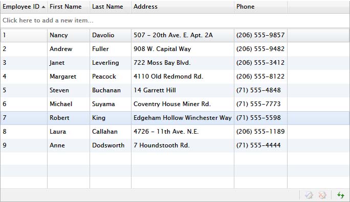
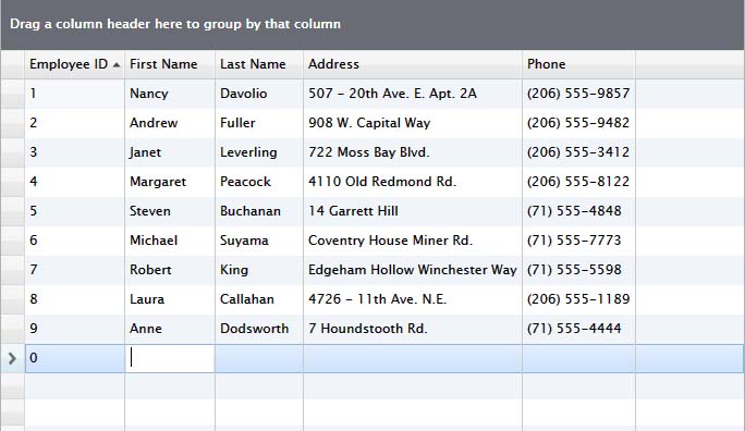
When CanUserAddRows is enabled and EmptyRowsVisibility is set to Visible you can change the new row position to bottom through NewRowPosition property.
 |
Note that some features are not compatible when CanUserAddRows is enabled and EmptyRowsVisibility is set to Visible such as paging and grouping. |
When you specify the template for RowDetailsTemplate property, you will see a row details element for each row. You can set the visibility mode of these row details element through the RowDetailsVisibilityMode property. There are three mode that you can choose from.
Alternatively, you can also control the visible of the row details at runtime by using UXGridViewExpanderColumn.
When you expand the row details using any of the methods described above, the ExpandedItem property will be set to the data context of the expanded row. You can use this property for more advanced user interaction, such as displaying a hierarchical grid view.
The following code shows how to create hierarchical grid view using row details.
| XAML |
Copy Code
|
|---|---|
<Intersoft:UXGridView AutoGenerateColumns="False" ExpandedItem="{Binding ExpandedItem, Mode=TwoWay}" EnableRowVirtualization="False" ItemsSource="{Binding Employees}"> <Intersoft:UXGridView.Columns> <Intersoft:UXGridViewExpanderColumn/> <Intersoft:UXGridViewTextColumn Header="Employee ID" Binding="{Binding EmployeeID}"/> <Intersoft:UXGridViewTextColumn Header="First Name" Binding="{Binding FirstName}"/> <Intersoft:UXGridViewTextColumn Header="Last Name" Binding="{Binding LastName}"/> <Intersoft:UXGridViewTextColumn Header="Title" Binding="{Binding Title}"/> </Intersoft:UXGridView.Columns> <Intersoft:UXGridView.RowDetailsTemplate> <DataTemplate> <Border Margin="0,1,1,1" Background="#FFF7F7F7" BorderBrush="#FFAFAFAF" BorderThickness="0,1,0,0"> <Grid> <Border BorderBrush="#FFAFAFAF" BorderThickness="1,0,0,1" HorizontalAlignment="Left" Width="20" VerticalAlignment="Top" Height="24" Margin="10,0,0,0"/> <Intersoft:UXGridView ItemsSource="{Binding Orders}" Margin="20,10,12,12" CanUserPage="True" PageSize="5" AutoGenerateColumns="False"> <Intersoft:UXGridView.Columns> <Intersoft:UXGridViewTextColumn Header="Order ID" Binding="{Binding OrderID}"/> <Intersoft:UXGridViewTextColumn Header="Order Date" Binding="{Binding OrderDate}"/> <Intersoft:UXGridViewTextColumn Header="Required Date" Binding="{Binding RequiredDate}"/> <Intersoft:UXGridViewTextColumn Header="Shipped Date" Binding="{Binding ShippedDate}"/> </Intersoft:UXGridView.Columns> </Intersoft:UXGridView> </Grid> </Border> </DataTemplate> </Intersoft:UXGridView.RowDetailsTemplate> </Intersoft:UXGridView> |
|
The above code shows how to define the row details to create hierarchical grid view and bind the ExpandedItem property to the ViewModel. In the ViewModel, you write a custom logic to load the child data whenever the ExpandedItem property is set.
| CS |
Copy Code
|
|---|---|
public object ExpandedItem { get { return this._expandedItem; } set { if (this._expandedItem != value) { this._expandedItem = value; this.OnPropertyChanged("ExpandedItem"); // this.LoadOrders(value); } } } |
|
UXGridView has three type of SelectionMode that you can choose from.
When a row is selected, the SelectedItem and SelectedItems property will be automatically synchronized. You can bind these properties to your ViewModel to capture the currently selected items.
Furthermore, you can also customize the SelectionUnit to one of the possible three values: Row, Cell or RowAndCell.
To increase the overall performSance, UXGridView implements row virtualization when rendering the rows. The main objective of this concept is to generate only the elements that will be displayed in the current viewport of UXGridView. This feature is particularly useful for scenarios when you are dealing with large dataset.
Although the virtualization feature is recommended in most scenarios, there might be some scenarios where this feature is undesireable. To turn off the virtualization feature, you simply set the EnableRowVirtualization property to false.
When you need to increase the scrolling performance even further, especially due to larger view port, you can set the HorizontalScrollMode and VerticalScrollMode properties to Deferred. In this mode, the row virtualization will be suspended during scrolling, and resumed when the scrolling completes.
When you set the scroll mode to Deferred, you will see a visual indicator as you scroll through the vertical scroll bar. You can use the ScrollIndicatorBinding or ScrollIndicatorTemplate to customize the appearance and template of the scrolling visual indicator.
The following code shows how to use the ScrollIndicatorBinding to customize the data display in the scroll indicator element.
| XAML |
Copy Code
|
|---|---|
<Intersoft:UXGridView ItemsSource="{Binding Products}" HorizontalScrollMode="Deferred" VerticalScrollMode="Deferred" ScrollIndicatorBinding="{Binding ProductName}"> <Intersoft:UXGridView.Columns> <Intersoft:UXGridViewTextColumn Header="Category ID" Binding="{Binding CategoryID}"/> <Intersoft:UXGridViewTextColumn Header="Product ID" Binding="{Binding ProductID}"/> <Intersoft:UXGridViewTextColumn Header="Product Name" Binding="{Binding ProductName}"/> <Intersoft:UXGridViewTextColumn Header="Unit Price" Binding="{Binding UnitPrice}"/> <Intersoft:UXGridViewTextColumn Header="Units In Stock" Binding="{Binding UnitsInStock}"/> <Intersoft:UXGridViewTextColumn Header="Units On Order" Binding="{Binding UnitsOnOrder}"/> <Intersoft:UXGridViewTextColumn Header="Quantity Per Unit" Binding="{Binding QuantityPerUnit}"/> </Intersoft:UXGridView.Columns> </Intersoft:UXGridView> |
|
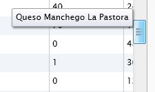
The following code shows how to use the ScrollIndicatorTemplate to customize the template of the scroll indicator element.
| XAML |
Copy Code
|
|---|---|
<Intersoft:UXGridView ItemsSource="{Binding Products}" HorizontalScrollMode="Deferred" VerticalScrollMode="Deferred"> <Intersoft:UXGridView.ScrollIndicatorTemplate> <DataTemplate> <Intersoft:DockPanel FillChildMode="Custom" Height="48"> <Image Intersoft:DockPanel.Dock="Left" Source="{Binding PhotoPath}" /> <TextBlock Margin="4" Text="{Binding ProductName}" VerticalAlignment="Center" Intersoft:DockPanel.IsFillElement="True"/> </Intersoft:DockPanel> </DataTemplate> </Intersoft:UXGridView.ScrollIndicatorTemplate> <Intersoft:UXGridView.Columns> <Intersoft:UXGridViewTextColumn Header="Category ID" Binding="{Binding CategoryID}"/> <Intersoft:UXGridViewTextColumn Header="Product ID" Binding="{Binding ProductID}"/> <Intersoft:UXGridViewTextColumn Header="Product Name" Binding="{Binding ProductName}"/> <Intersoft:UXGridViewTextColumn Header="Unit Price" Binding="{Binding UnitPrice}"/> <Intersoft:UXGridViewTextColumn Header="Units In Stock" Binding="{Binding UnitsInStock}"/> <Intersoft:UXGridViewTextColumn Header="Units On Order" Binding="{Binding UnitsOnOrder}"/> <Intersoft:UXGridViewTextColumn Header="Quantity Per Unit" Binding="{Binding QuantityPerUnit}"/> </Intersoft:UXGridView.Columns> </Intersoft:UXGridView> |
|

You can easily localize the textual content of UXGridView by setting the ResourceOverride property to a UXGridViewResource instance containing the customized textual content.
The default textual content are listed in the following table.
| Resource Key | Resource Value |
|---|---|
| BusyText | Loading... |
| ContextMenu_Cancel | Cancel |
| ContextMenu_CopyRow | Copy Row(s) |
| ContextMenu_Delete | Delete |
| ContextMenu_Edit | Edit |
| ContextMenu_Group | Group |
| ContextMenu_GroupByBox | Group By Box |
| ContextMenu_RejectChanges | Reject Changes |
| ContextMenu_SaveChanges | Save Changes |
| ContextMenu_SortAscending | Sort Ascending |
| ContextMenu_SortDescending | Sort Descending |
| ContextMenu_Ungroup | Ungroup |
| ContextMenu_Update | Update |
| DragDrop_DropHereToGroup | Drop here to group |
| DragDrop_MoveColumnHere | Move column here |
| DragDrop_MoveGroupHere | Move group here |
| DragDrop_RemoveGroup | Remove group |
| GroupByBox | Drag a column header here to group by that column |
| ItemModified | This item was modified. |
| NoCurrentRow | There is no current row. Operation cannot be completed. |
| NoOwningGrid | There is no instance of UX assigned to this {0}. Operation cannot be completed. |
| RejectChangesTooltip | Undo All Changes |
| Row_InvalidRowIndexCannotCompleteOperation | Invalid row index. Operation cannot be completed. |
| Row_NewRowText | Click here to add new item... |
| RowGroupHeader_ItemCountPlural | ({0} items) |
| RowGroupHeader_ItemCountSingular | ({0} item) |
| RowGroupHeader_PropertyName | {0}: |
| SaveChangesTooltip | Save All Changes |
The following examples show how to localize the textual content of a UXGridView.
| Example Title |
Copy Code
|
|---|---|
<Intersoft:UXGridView QueryOperation="Client" Source="{Binding Customers}"> <Intersoft:UXGridView.ResourceOverride> <Intersoft:UXGridViewResource BusyText="Caricamento" RowGroupHeader_ItemCountPlural="({0} articoli)" RowGroupHeader_ItemCountSingular="{0} articolo)"/> </Intersoft:UXGridView.ResourceOverride> </Intersoft:UXGridView> |
|
For more information about ClientUI localization framework, see Localization Overview.
This topic provides a comprehensive overview of UXGridView which discusses the basics of data access and explains the fundamental elements and settings available in the control.
UXGridView also provides more advanced features which you can explore through the following links: