
| Intersoft.Client.UI.Aqua.UXRibbon Namespace : UXRibbonKeyTipControl Class |

<TemplatePartAttribute(Name="RootElement", Type=System.Windows.Controls.Grid)>
<DescriptionAttribute("Represents a bubble pop-up control to display key tip information.")>
Public Class UXRibbonKeyTipControl
   Inherits Intersoft.Client.Framework.ISContentControl
   Implements Intersoft.Client.Framework.IControl, Intersoft.Client.Framework.IFramework, Intersoft.Client.Framework.ILicensing
Dim instance As UXRibbonKeyTipControl
[TemplatePartAttribute(Name="RootElement", Type=System.Windows.Controls.Grid)]
[DescriptionAttribute("Represents a bubble pop-up control to display key tip information.")]
public class UXRibbonKeyTipControl : Intersoft.Client.Framework.ISContentControl, Intersoft.Client.Framework.IControl, Intersoft.Client.Framework.IFramework, Intersoft.Client.Framework.ILicensing
[TemplatePartAttribute(Name="RootElement", Type=System.Windows.Controls.Grid)]
[DescriptionAttribute("Represents a bubble pop-up control to display key tip information.")]
public ref class UXRibbonKeyTipControl : public Intersoft.Client.Framework.ISContentControl, Intersoft.Client.Framework.IControl, Intersoft.Client.Framework.IFramework, Intersoft.Client.Framework.ILicensing
KeyTip is one of the accessibility features in ribbon user interface metaphor. KeyTip replaces the access key (or also known as mnemonic key) in the traditional menu bar control, which enables users to easily locate a command through a series of key strokes. Furthermore, KeyTip supports multi-level key association on certain controls such as dropdown button, split button, and menu item.
To enable KeyTip in UXRibbonBar, set the UXRibbonKeyTipService.EnableKeyTips attached property of UXRibbonBar to true.
At runtime, users can activate the KeyTip through the following modifier keys:
When a valid KeyTip is selected, the ribbon control will raise a specific action associated to the item such as opening a menu, navigating to a page, or executing a command.
To specify the access text of the KeyTip, set the UXRibbonKeyTipService.AccessText attached property on the controls that support KeyTip. The following list describes the built-in controls that support KeyTip.
You can also specify KeyTip to a dialog launcher in UXRibbonTabGroup by specifying the UXRibbonKeyTipService.AlternateText attached property.
In addition, KeyTip supports multiple characters for the access text, which is particularly useful for applications with a large number of commands. For instance, you can assign "FP" as the KeyTip for "Format Painter" command which makes more sense to users.
Furthermore, KeyTip with multiple characters enables you to create some sort of grouping. When users type a character, it will filter out the other key tips that do not start with the typed character. Users can also cancel the last typed characters by pressing the Escape key.
The following example shows how to configure KeyTip in the ribbon control.
| XAML |
Copy Code
|
|---|---|
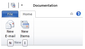
<Intersoft:UXRibbonBar RibbonTitle="Documentation" Intersoft:UXRibbonKeyTipService.EnableKeyTips="True"> ... <Intersoft:UXRibbonTab Header="Home" ResizeOrder="NewGroup" Intersoft:UXRibbonKeyTipService.AccessText="H"> <Intersoft:UXRibbonTabGroup Name="NewGroup" MaximumSize="Small" Header="New"> <Intersoft:UXRibbonButton Content="New E-mail" MinimumSize="Large" Intersoft:UXRibbonKeyTipService.AccessText="N" LargeIcon="/assets/icons/new_email.png" Icon="/assets/icons/new_email.png" /> <Intersoft:UXRibbonButton Content="New Items" MinimumSize="Large" Intersoft:UXRibbonKeyTipService.AccessText="I" LargeIcon="/assets/icons/new_items.png" Icon="/assets/icons/new_items.png" /> </Intersoft:UXRibbonTabGroup> </Intersoft:UXRibbonTab> ... </Intersoft:UXRibbonBar> |
|
The result looks like the following figure.

To learn more about UXRibbonKeyTipControl, see Activating Ribbon Key Tips.
System.Object
System.Windows.DependencyObject
System.Windows.UIElement
System.Windows.FrameworkElement
System.Windows.Controls.Control
System.Windows.Controls.ContentControl
Intersoft.Client.Framework.ISContentControl
Intersoft.Client.UI.Aqua.UXRibbon.UXRibbonKeyTipControl
Target Platforms: Windows 7, Windows Vista SP1 or later, Windows XP SP3, Windows Server 2008 (Server Core not supported), Windows Server 2008 R2 (Server Core supported with SP1 or later), Windows Server 2003 SP2