


WebGrid redefines data visualization concept by introducing a new breakthrough Pivot Charting feature. The Pivot Charting is offered as built-in feature, including the automatic data processing and data aggregation. With Pivot Charting feature, transforming raw data from the Grid View into a stunning Chart View is only a matter of single button click. This section provides the overview and fundamental information of Pivot Charting so that you can quickly getting started with this new powerful feature.
This topic contains the following sections:
Introduction of Pivot Charting
Definition
Pivot Charting is a powerful data analysis and visualization tool that enables you to present your dataset in multiple viewpoints. Pivot Charting allows you to look at data in several dimensions; for example, sales by region, sales by sales rep, sales by product category, sales by month, etc. Such capability is provided in numerous decision support applications under various function names. The Pivot Charting terminology is first introduced in Microsoft Excel XP and Microsoft Access XP. The following illustration describes the concept of Pivot Charting in general.
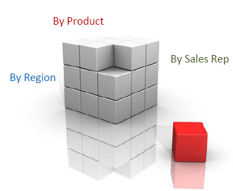
The ability to quickly switch between one slice of data and another allows users to analyze their information in small palatable chunks instead of a giant report that is confusing.
How it works
A Pivot Chart has four essential elements:
-
Data fields: The Y-axis of the data space. This data field displays one of the aggregate functions (sum, count, max, min ...) of a data series.
-
Series fields: The Z-axis of the data space. This data field represents a series of unique data available in the data source which appears in each data category.
-
Category fields: The X-axis of the data space. The data must be categorical.
-
Filter fields: The fields used to filter the data source from global level.
You can assign multiple fields to the Data fields, Series fields, Category fields and Filter fields.
 |
For example, you can assign "Year" as the major category; "Country" as the minor category; and divide the GDP into distinct sectors of the industry. Or you may drag "Country" from the category field to the page field if you find your table too crowded. |
- Sum
- Count
- Min
- Max
- Average
- Standard Deviation
- Variance
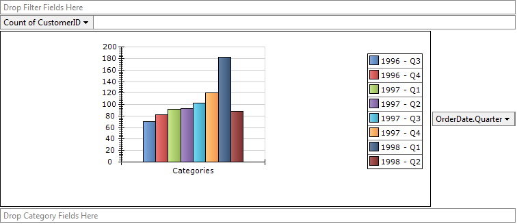
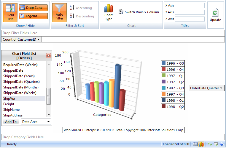
Pivot Charting is an exact visualization of Pivot Table in Graph format instead of text. The Pivot Table itself has the same concept with Pivot Charting as mentioned above. The following illustration describes the sales data by order date in quarterly time interval.
A graphical data presentation with built-in aggregation, instead of raw flat data.
|
While in the Pivot Charting view, WebGrid takes the same datasource used by the Grid view and performs data pivoting and aggregation based on the specified root data member. The Chart Field List is retrieved from the available columns in the Grid view. |
By default, the Pivot Charting view will show an empty Chart for the first time unless the initial series, data and category field is specified. You can start to analyze your data by dragging one of the fields in the Chart Field List to series, data and category zone.
For more information, see:
Pivot Charting and Business Intelligence
Getting Started
In addition to the wealth of Pivot Charting functions and comprehensive object model, WebGrid is designed to let you take advantage of these advanced features quickly and easily.
The Pivot Charting feature can be enabled in as easy as three steps:
- Launch WebGrid.NET Designer for the WebGrid instance.
- Select Pivot Charting tab, then check "Allow Pivot Charting".
- Click OK.
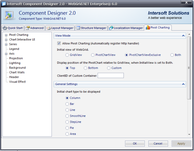
The following screenshot shows the Pivot Charting designer in WebGrid.NET Designer:
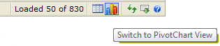
View your Webform in the browser. To see the data in Pivot Charting view, simply click the Switch to Pivot Chart View that appears in the status bar of the WebGrid.
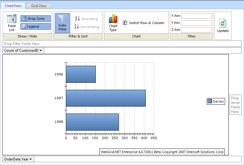
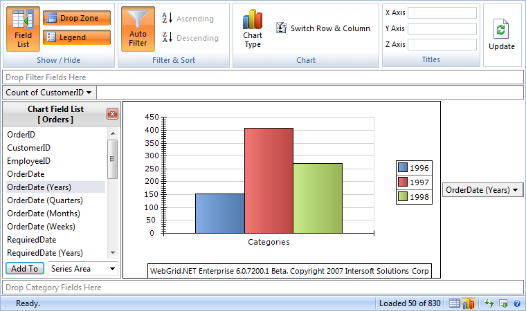
Immediately after you clicked on the PivotChart View button, the Pivot Charting Interactive UI™ will be delivered to your browser similar to the following image.
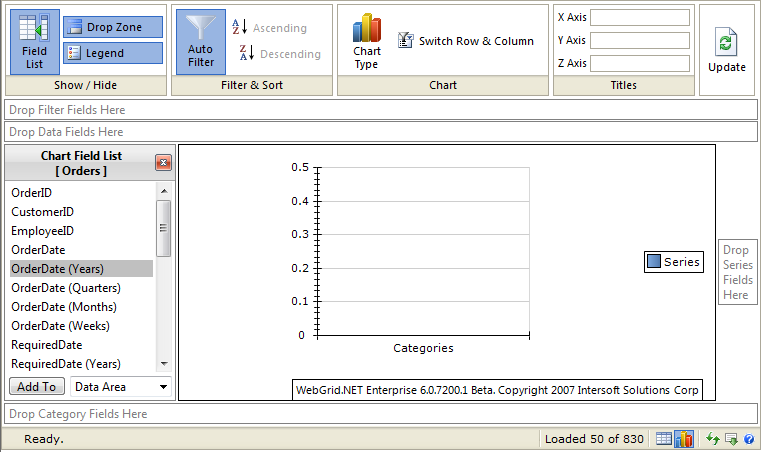
With the Charting UI ready, the data aggregation and visualization is now at your fingertips. You can start by dragging OrderID field to the Data Fields area, then OrderDate (Years) to the Series Fields area. If you have been familiar with Multi-dimensional Data concept, you can try to drop several fields to Series and Category for data analytical, as well as to change the aggregation method of the Data Fields to get the right information you wanted.
For more information, see:
Using Designer with Pivot Charting
Key Concepts
WebGrid.NET Enterprise's Pivot Charting is built on the top of rock solid architecture that allows great level of extensibility, customizability and scalability. This section provides more detailed explanation of the Pivot Charting's key concepts.
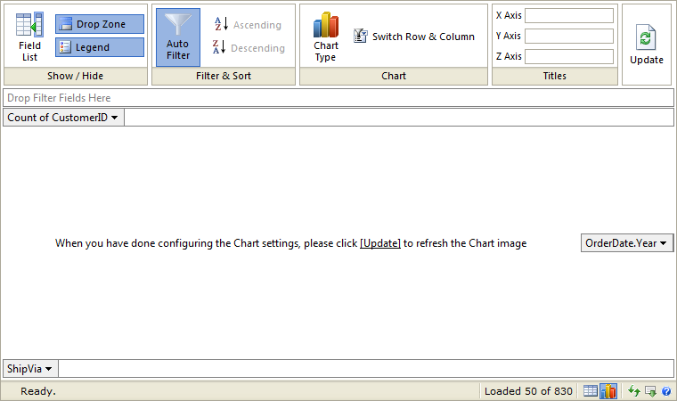
Pivot Charting User Interface
The Pivot Charting is bundled with intuitive user interface to ensure high efficiency and ease-to-use for end users. The Pivot Charting User Interface adopted Ribbon UI with two built-in themes: Standard and Elegant. The theme is determined with the Default Style mode value applied to the WebGrid control. The Default Style was firstly introduced in previous version. To learn more, please refer to Default Style.
The following screenshot describes the main User Interface of Pivot Charting.
As seen in above illustration, the main Pivot Charting's User Interface consists of two main parts:
-
Ribbon UI
The Ribbon UI consists of five group commands:- Show/Hide (Toggle) the visibility of interface elements. You can toggle the visibility of three main essential interface elements:
- Field List. The container that shows a list of available fields for pivot charting.
- Drop Zone. The drop areas for data, series and category fields.
- Legend. The legend of data series.
- Filter & Sort. This group contains commands to perform auto filtering, as well as data sorting for Series and Category fields.
- Chart group contains commands for customizing chart types. A list of supported chart types will be shown when you clicked on Chart Type command.
- Titles group allows you to enter custom axis labels that visualized along with the Chart image.
- Update command. When you need to refresh the Chart data, you can easily access the Update button.
- Show/Hide (Toggle) the visibility of interface elements. You can toggle the visibility of three main essential interface elements:
-
Pivot Surface Area
The main pivot surface area consists of six essential user interface elements such as described in the following:- Chart Field List. Represents the fields available for pivot charting. The available fields are WebGridColumn objects which ShowInChartFieldList property are set to True.
- Filter Drop Zone. Represents the filtered fields that applied to the global data view.
- Data Drop Zone. Represents the data fields used by the aggregate method.
- Chart Image Surface. Represents the chart image produced by the Charting engine based on the Pivot Chart Settings. The chart image is produced in the real time by using Intersoft's proprietary AJAX technology (FlyPostBack™).
- Series Zone. Represents the data fields displayed as series.
- Category Zone. Represents the data fields displayed as category.
Pivot Charting View Mode
Pivot Charting has several view modes that you can use.
- Allow Pivot Charting (Initial View: Grid view)
This mode show Grid view initially but the user can switch to Chart view from the PivotChart View button.
- Allow Pivot Charting (Initial View: ChartView)
This mode is the opposite approach than the previous one. The Chart view is shown initially but the user later can switch to Grid view by clicking the Grid View button.
- Both View
This mode shows both Grid and Chart view. You can switch the position to Top/Bottom/Custom.
To place the chart view in custom container, you need to specify the ChartCustomContainerId (e.g. ChartCustomContainerId = "ChartImage")
In this figure you can see that the Chart view is placed under ChartView tab while the Grid view is placed under GridView tab.
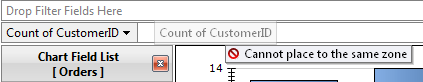
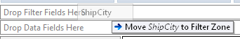
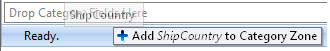
Drag and Drop
Drag and Drop is one of the Key Features in Pivot Charting User Interface. You can conveniently drag a field from Chart Field List to any of four available drop zones. You can also drag any field element from any drop zone to another in the same way and manner as in Microsoft Access 2007.
Furthermore, when you drag a field element there will be an indicator whether you can drag to that particular place or not.
Context Menu
The context menu for the Pivot Charting can be accessed by right clicking on anywhere in the Pivot Charting UI except the Chart Image Surface.
The context menu contains commands to toggle the visibility of user interface elements. The context menu is useful when the Ribbon UI is currently in Hidden state and you need to toggle the visibility of other interface elements.
The following screenshot shows the context menu of Pivot Charting.
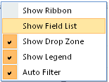
The commands in the context menu have equal function to those in Ribbon UI.
Automatic Refresh vs Batch Refresh
To show more interactivity by default when the user performs an action at Pivot Charting interface (e.g. add field element to a drop zone, show/hide legend, show/hide table field list), the Chart Image will be refreshed. So the user will get the latest chart image based on their last action.
If you prefer not to refresh the Chart image after every action, you can turn off the ChartAutoRefresh property. With this setting, when there is an action the ChartImage container will be changed into a message notifying the user to click update to get the ChartImage such as shown in the following screenshot.
When ChartAutoRefresh is off, the changes will not be updated immediately. This enables you to perform multiple changes and update it at once.
Auto Resize Chart Image
Another interesting feature embedded in Pivot Chart User Interface is the capability to auto-resize the chart image based on browser's height / width. You can do this by setting the width / height of the WebGrid to 100%.
With this feature, the user who has larger screen size can get benefit from it because they can see larger data visualization. On the other hand, the user who has smaller screen will also get benefit because they do not need to scroll the browser since the image will be resized to fit their browser's size.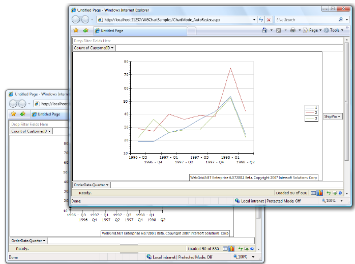
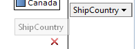
Pivot Field Data Filtering
You can choose specific data of series or category to be included in the visualized chart image. The Pivot Charting includes built-in automatic filtering feature which can be easily accessed by clicking on the dropdown arrow of the category or series field.
The following screenshot describes the user interface for pivot filtering.
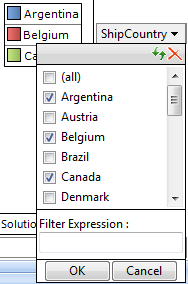
The filtering user interface allows you to check/uncheck specific items to be filtered.
Instead of checking/un-checking the data, user can also specify a filter expression. When filter expression is used, the checked/un-checked data will be ignored.
|
You can easily switch off the filtering for temporary by clicking the Auto Filter command in the Ribbon UI. When clicked once again, it will turn on the last specified filtering settings. |
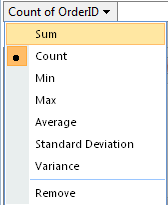
Pivot Field Data Aggregation
You can customize the aggregation method of each Data Field by clicking on its dropdown arrow. The Chart will be refreshed automatically when a new selection is made.
Pivot Data Processing
The pivot data visualization is generated by processing the collection of series fields, category fields, filter fields and data fields.
- Data fields: The Y-axis of the data space. This data field displays one of the aggregate functions (sum, count, max, min ...) of a data series.
- Series fields: The Z-axis of the data space. This data field represents a series of unique data available in the data source which appear in each data category.
- Category fields: The X-axis of the data space. The data must be categorical.
- Filter fields: The fields used to filter the data source from global level.
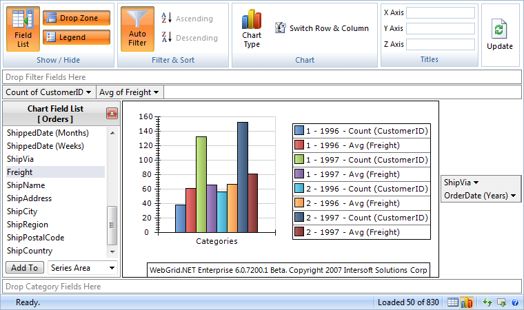
Data fields and series fields play parts in determining the series data that appear in each data category. If you only have one object in data fields' collection and also one object in series fields' collection, the chart engine will use the data in the series field's collection as the series data collection. (This series data collection will appear in legend if the legend is visible).
If you have more than one object in data fields' collection and/or series field's collection, the chart engine will perform a combination from both object in data fields' collection and series fields' collection for the series data. The following screenshot shows a Pivot Chart with two data fields.
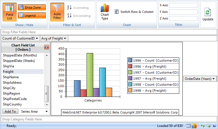
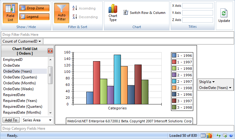
The above screenshot shows a pivot chart with two series fields, while the below one shows the pivot with two series fields and two data fields.
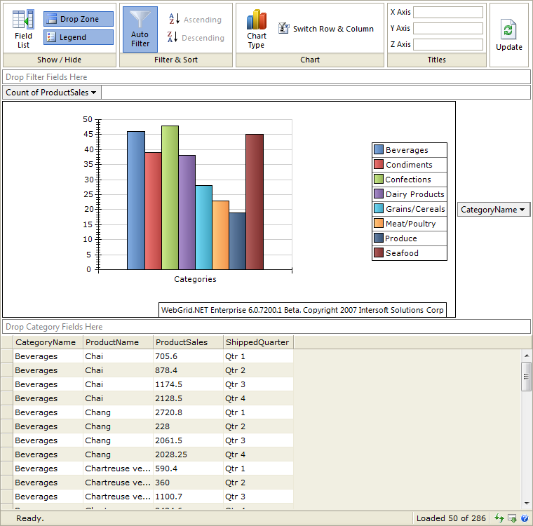
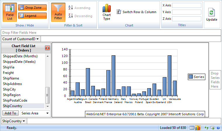
Data category fields play parts in categorizing the series data. If you have one object in category fields' collection, the chart engine will categorize the data based on that object (e.g. categorize the sales per country).
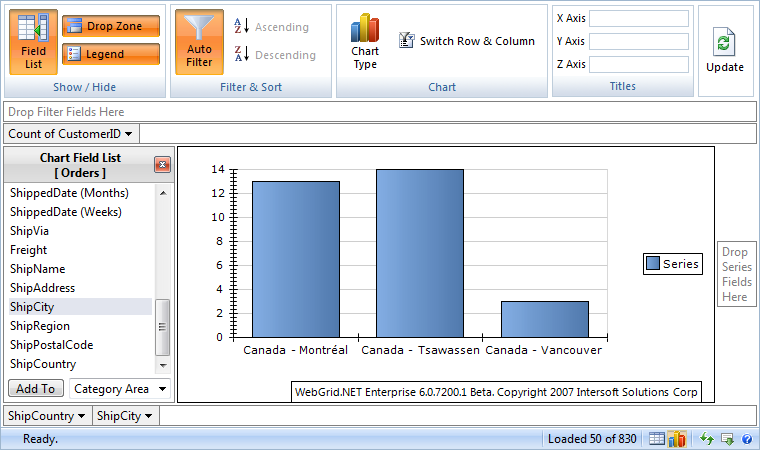
If you have more than one object in category fields' collection, the chart engine will categorize the data based on the last object. For example, if we have country - city in the category collection, the data will be categorized based on city. However, the label will still use country-city format. The following screenshot shows a pivot chart with two category fields.
Automatic Image Handlers
Chart Image request handler uses HttpHandler that needs to be defined in web.config as:
| web.config |  Copy Code Copy Code |
|---|---|
<httpHandlers> <add path="ISChart.axd" verb="GET" type="ISNet.WebUI.WebGrid.Chart.ChartRequestHandler, ISNet.WebUI.WebGrid" validate="true"/> </httpHandlers> |
|
|
The HttpHandler definition above is automatically registered in your Web application when you enable Pivot Charting in WebGrid Designer. To make sure you have enabled Pivot Charting in proper way, please see Getting Started with Pivot Charting. |
When using the HttpHandler, the image will be rendered directly to the client's browser during AJAX call. Note that you might want to change the request handler mode to Centralized File Server mode if you are using Multiple Server/Web Farm environment for better scalability. The automatic image handler is a unique innovation in WebGrid's Charting feature which has more advantages over the traditional temporary images approach. Some of the key advantages are:
- Hassles-free development and deployment. You do not need to configure IIS virtual directory or any other folders. Just a simple XCOPY of your Web application will do.
- Better performance. Since there is no need to produce temporary images, it reduces the overhead of I/O operation and hence, increasing performance.
- Better security measurement. Since there are no temporary images generated in the IIS-level directory, your Web application is more secure than ever.
Centralized Image File Server
When using centralized File Server, the image will be cached in file server specified in ImageFileServer settings and the client will then request the image from the file server. (E.g. ImageFileServer: path=C:\Cache).
Some of the benefits using File Server cache are:
- Highly scalable. You can choose a network drive to store the caches which enables multiple web servers to access the state.
- Decent performance. With more than dozen of high performance hard drives, you can choose a near memory speed with high random access and sequential read write hard drive to store the caches.
- Easily extensible. Unlike memory (RAM), you can easily extend hard drives with larger one when it becomes insufficient.
Features of File Server:
- Automatic cleaning. When the cache has expired, the caches will be automatically deleted.
- Allow customizations on cache policy and expiration duration.
Chart Engine Interface (IChartEngine)
WebGrid Pivot Charting architecture provides an extensible Chart engine interface called IChartEngine.
| C# | Copy Code |
|---|---|
public interface IChartEngine { Bitmap GenerateChartImage(ChartConfig chartConfig, DataTable data); } |
|
You can implement this interface and generate the chart image using your own ChartEngine. Note that the return value must be a Bitmap type.
After you have implemented the interface, you can attach the engine into e.AlternativeChartEngine at ChartImageProcessing event.
| C# | Copy Code |
|---|---|
protected void WebGrid1_ChartImageProcessing(object sender, ISNet.WebUI.WebGrid.Chart.WebGridChartEventArgs e) { e.AlternativeChartEngine = new AlternativeChartEngine(); } |
|
|
By implementing this approach, WebGrid will use the specified Chart Engine to perform the chart image generation, instead of using the built in Chart Engine. Just make sure that GenerateChartImage method of your AlternativeChartEngine produces the image in Bitmap type. |
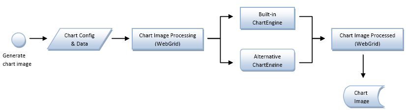
Generating Chart image process sequence
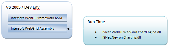
Assembly Relations
Language Localization
All textual items in Pivot Charting User Interface can be localized from WebGrid's localization settings. You can add the following tag in your localization file (which can be found in C:\Program Files\Intersoft Solutions\CommonLibrary\WebGrid\V8_0_7200\Localization) to customize the Pivot Charting UI text items based on your preference.
| Component's Tag | Copy Code |
|---|---|
<Charting> <Loading>Loading Chart...</Loading> <Update>When you have done configuring the Chart settings, please click {UpdateLink} to refresh the Chart image</Update> <UpdateLinkText>[Update]</UpdateLinkText> <DropFilterField>Drop Filter Fields Here</DropFilterField> <DropDataField>Drop Data Fields Here</DropDataField> <DropSeriesField>Drop Series Fields Here</DropSeriesField> <DropCategoryField>Drop Category Fields Here</DropCategoryField> <DropXData>Drop X Data Fields Here</DropXData> <DropYData>Drop Y Data Fields Here</DropYData> <DropBubbleData>Drop Bubble Data Fields Here</DropBubbleData> <DropHighData>Drop High Data Fields Here</DropHighData> <DropLowData>Drop Low Data Fields Here</DropLowData> <DropOpenData>Drop Open Data Fields Here</DropOpenData> <DropCloseData>Drop Close Data Fields Here</DropCloseData> <DropThetaData>Drop Theta Data Fields Here</DropThetaData> <DropRadiusData>Drop Radius Data Fields Here</DropRadiusData> <ShowHideRibbon>Show / Hide</ShowHideRibbon> <FilterSortRibbon><
Stretch
In this mode the panel contents does not break outside the panel bounds by scaling along X and Y as much as needed to fit the entire bounds with the panel contents. This bounds mode does not preserve the aspect ratio of the original panel contents. This mode is best for 2D Chart types.
None
In this mode the panel does not try to fit in the bounds defined by the layout manager. It will only make sure that the center of the panel contents matches the center of the bounds.
Automatic
In this mode all 2D Chart except Pie and Doughnut will be using Stretch mode, the other chart type will use Fit Mode.
The following code modifies the bounds mode of the chart image.C# Copy CodeWebGrid1.ChartSettings.BoundsMode = BoundsMode.Stretch;
If you modify the Zoom property of chart projection, the chart may break outside the bounds. -
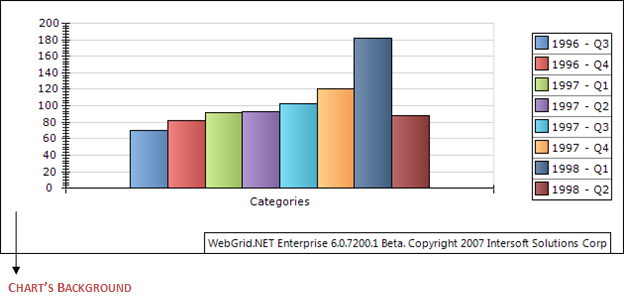
Background
Background of the chart is the chart container's space where the chart image and other chart elements are placed into.
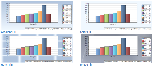
Various Fill Style
There are four types of fill style (Gradient Fill, Color Fill, Hatch Fill, Image Fill). Each of them has their own attributes. Below are some samples of background fill.
-
Axis
Follows are things that can be modified for each chart's axis (X, Y, and Z Axis):
- Label Orientation Mode
- Invert Axis
Label Orientation Mode
You can modify the label orientation from:
C# Copy CodeChartSettings chartSettings = WebGrid1.ChartSettings; chartSettings.XAxis.LabelGenerationMode = LabelGenerationMode.Rotate90;
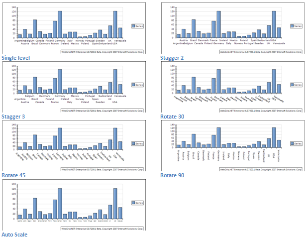
There are seven types of label orientation mode (SingleLevel, Stagger2, Stagger3, Rotate30, Rotate45, Rotate90 and AutoScale). Except SingleLevel, Stagger2, Stagger3 modes, the other entire modes will be applied if the number of data point is quite large. In SingleLevel mode, the chart engine has the capability to determine the size and the stagger level. If you prefer to have only one line at all costs, try the AutoScale mode.
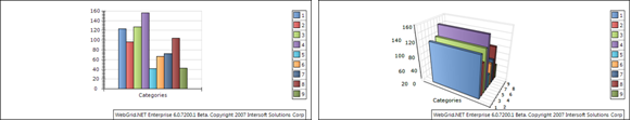
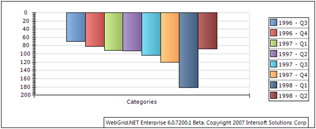
Invert Axis
You can invert the axis from:
C# Copy CodeChartSettings chartSettings = WebGrid1.ChartSettings; chartSettings.YAxis.Invert = true;By inverting the axis, you will get different perspective of data visualization as follow:
-
Legend
Chart's data legend visibility is controlled from:
C# Copy CodeChartSettings chartSettings = WebGrid1.ChartSettings; chartSettings.LegendSettings.Mode = LegendMode.Automatic;
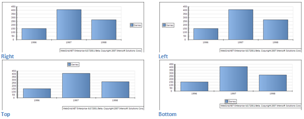
When legend is visible, you can controls its appearance. Firstly, you can dock the Legend to a specified position (Top, Left, Right, or Bottom).
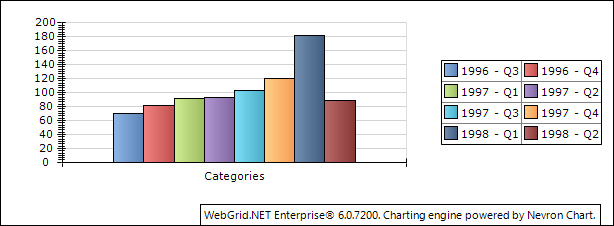
Furthermore, you can also control the layout of the legend. For example: instead of showing the legend data per row (RowsOnly) you can set it per column (ColsOnly).
You can add a header / title text to Chart Image from:
C# Copy CodeChartSettings chartSettings = WebGrid1.ChartSettings; chartSettings.HeaderSettings.Text = "ChartHeader";By default the position of this Chart Header is at Top Left of the chart image, you can move the position using:
C# Copy CodeChartSettings chartSettings = WebGrid1.ChartSettings; chartSettings.HeaderSettings.Alignment = HeaderAlignment.TopRight;
By default the position of this Chart Header is at Top Left of the chart image, you can move the position using:
You can move the chart header to six positions (TopLeft, TopCenter, TopRIght, BottomLeft, BottomCenter, BottomRight) 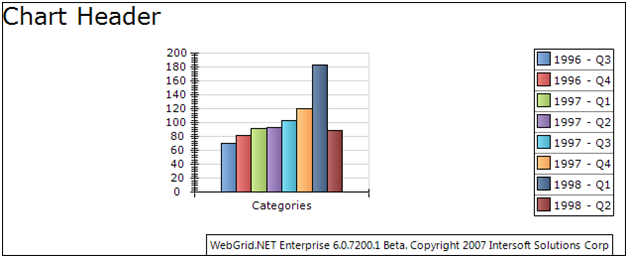
You can move the chart header to six positions (TopLeft, TopCenter, TopRIght, BottomLeft, BottomCenter, BottomRight)
-
Image Format
The chart image can be generated into four image format (Gif, Jpeg, Png and Bitmap). The default value is PNG.
-
Walls
Chart walls are visible when 3D Chart types is used. All the axis settings are also applied to chart walls. Furthermore, chart walls also have their own styles properties (BorderStyle, FillStyle and ShadowStyle), you can modified these properties to meet up with your preferences.

You can specify the lighting from:Component's Tag Copy Code<ISWebGrid:WebGrid>...<ChartSettings> <LightModelSettings GlobalAmbientLight="Gainsboro" LightModel="NorthernLights" EnableLighting="true"> <LightSources> <ISWebGrid:ChartLightSourceSettings Ambient="Black" Difuse="DimGray" Specular="DimGray" LightSourceType="Directional"> <Position X="-1" Z="1" /> </ISWebGrid:ChartLightSourceSettings> <ISWebGrid:ChartLightSourceSettings Ambient="Black" Difuse="DimGray" Specular="DimGray" LightSourceType="Directional"> <Position Y="1" Z="1" /> </ISWebGrid:ChartLightSourceSettings> </LightSources> </LightModelSettings> <VisualEffectSettings EnableJittering="True" JitteringSteps="4" RenderSurface="Window" ShapeRenderingMode="HighQuality" /> </ChartSettings> ...</ISWebGrid:WebGrid>
The LightModelSettings property control the lighting effects to all chart types. You might want to use predefined lighting provided to fasten the process declaring the light sources.
However, if you prefer to specify your own lighting settings, you can manipulate the following properties.
- GlobalAmbientLight
- LightSources collection.
In each light sources you can specify:- LightSourceType
- Ambient Color
- Difuse Color
- Specular Color
- Position
- Direction
- Constant Attenuation
- Linear Attenuation
- Quadratic Attenuation
- Spot Cutoff
- Spot Exponent
Reference samples: WebGridSamples\ChartLighting.aspx.
-
Bounds Mode
-
Projection
In 3D chart types you can change the projection view of the chart from:
C# Copy CodeChartProjectionSettings projection = WebGrid1.ChartSettings.ProjectionSettings;
You can select the projection types from available predefined projection, or use your own projection settings by manipulating the following properties:
- Projection Type
- Elevation
- Perspective Angle
- Rotation
- Viewer Rotation
- X Depth
- Y Depth
- Zoom
Reference Samples: WebGridSamples\ChartProjection.aspx.
 See Also
Getting Started
Getting Started
Overview
WebGrid Features Overview
Other Resources
Walkthrough Topics
How-to Topics