


WebGrid have many chart series which can be used.
This topic contains the following sections:
- Series Column
- Series Bar
- Series Line
- Series Smooth Line
- Series Step Line
- Series Pie
- Series Doughnut
- Series Area
- Other Series related features
Series Column
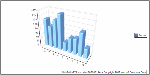
Series Column has seven sub types, they are:
- Clustered Column
- Stacked Column
- 100% Stacked Column
- Basic 3D Column
- Clustered 3D Column
- 100% Stacked 3D Column
You can select which chart type to be used from:
| C# |  Copy Code Copy Code |
|---|---|
ChartSettings chartSettings = WebGrid1.ChartSettings; chartSettings.SeriesColumnSettings.Type = SeriesColumnType.ClusteredColumn |
|
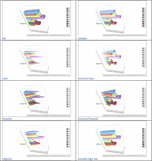
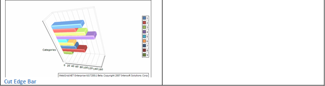
Bar Shape
There are nine shapes of bar that you can choose from.
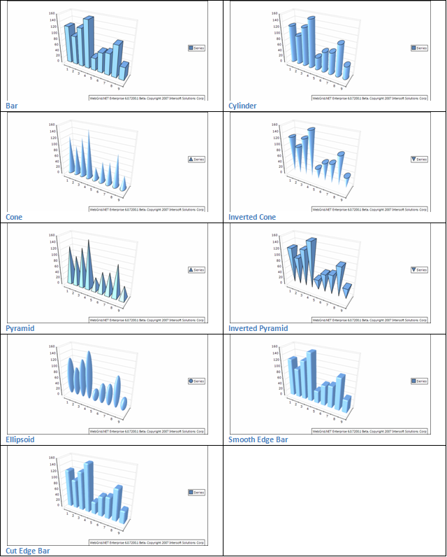
The shape of the bars is controlled from BarShape property. It accepts values from BarShape enumeration.
| C# | Copy Code |
|---|---|
SeriesBar settings = WebGrid1.ChartSettings.SeriesColumnSettings.Settings; settings.BarShape = BarShape.SmoothEdgeBar; |
|
When the bars are displayed as SmoothEdgeBar or CutEdgeBar, you can control whether top and bottom edges of the bar are displayed in the respective manner with the help of the HasTopEdge and HasBottomEdge properties.
| C# | Copy Code |
|---|---|
SeriesBar settings = WebGrid1.ChartSettings.SeriesColumnSettings.Settings; settings.HasBottomEdge = true; settings.HasTopEdge = true; |
|
The size of the edge is controlled in percents of the smaller width or depth bar dimension. By default, it is set to 15. The following code will make the smooth bar edges twice bigger.
| C# | Copy Code |
|---|---|
SeriesBar settings = WebGrid1.ChartSettings.SeriesColumnSettings.Settings; Settings.BarEdgePercent = 30; |
|
Origin
By default, all bars are using 0 as origin value (all bars begin from 0). You can turn off this behavior by setting the UseOrigin property to false.
| C# | Copy Code |
|---|---|
SeriesBar settings = WebGrid1.ChartSettings.SeriesColumnSettings.Settings;
settings.UseOrigin = false;
|
|
If the bars do not use an origin value, they will all begin from the minimum bar value (the minimal bar will be displayed with zero height). In some cases, you may want the bars to begin from a certain value - for example 15. The following code will achieve the result:
| C# | Copy Code |
|---|---|
SeriesBar settings = WebGrid1.ChartSettings.SeriesColumnSettings.Settings;
settings.UseOrigin = false;
settings.Origin = 15;
|
|
Series Bar
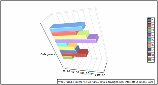
Series Bar has seven sub types, they are:
- Clustered Bar
- Stacked Bar
- 100% Stacked Bar
- Basic 3D Bar
- Clustered 3D Bar
- 100% Stacked 3D Bar
You can select which chart type to be used from:
| C# | Copy Code |
|---|---|
ChartSettings chartSettings = WebGrid1.ChartSettings;chartSettings.SeriesBarSettings.Type = SeriesBarType.ClusteredBar; |
|
Bar Shape
There are nine shapes of bar you can choose from.
The shape of the bars is controlled from BarShape property. It accepts values from BarShape enumeration.
| C# | Copy Code |
|---|---|
SeriesBar settings = WebGrid1.ChartSettings.SeriesBarSettings.Settings;settings.BarShape = BarShape.SmoothEdgeBar; |
|
When the bars are displayed as SmoothEdgeBar or CutEdgeBar, you can control whether top and bottom edges of the bar are displayed in the respective manner with the help of the HasTopEdge and HasBottomEdge properties.
| C# | Copy Code |
|---|---|
SeriesBar settings = WebGrid1.ChartSettings.SeriesBarSettings.Settings; settings.HasBottomEdge = true; settings.HasTopEdge = true; |
|
The size of the edge is controlled in percents of the smaller width or depth bar dimension. By default, it is set to 15. The following code will make the smooth bar edges twice bigger.
| C# | Copy Code |
|---|---|
SeriesBar settings = WebGrid1.ChartSettings.SeriesBarSettings.Settings; Settings.BarEdgePercent = 30; |
|
Origin
By default, all bars are using 0 as origin value (all bars begin from 0). You can turn off this behavior by setting the UseOrigin property to false.
| C# | Copy Code |
|---|---|
SeriesBar settings = WebGrid1.ChartSettings.SeriesBarSettings.Settings;
settings.UseOrigin = false;
|
|
If the bars do not use an origin value they will all begin from the minimum bar value (the minimal bar will be displayed with zero height). In some cases, you may want the bars to begin from a certain value - for example 15. The following code will achieve the result:
| C# | Copy Code |
|---|---|
SeriesBar settings = WebGrid1.ChartSettings.SeriesBarSettings.Settings;
settings.UseOrigin = false;
settings.Origin = 15;
|
|
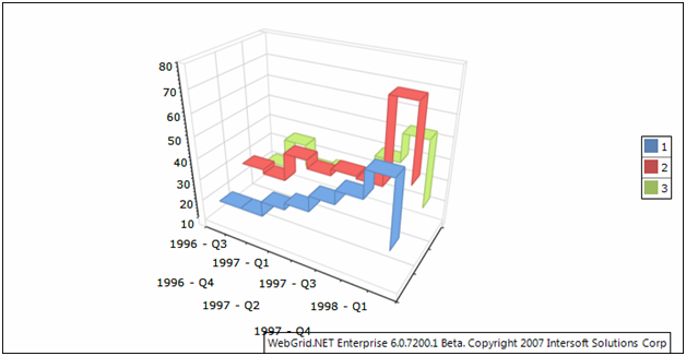
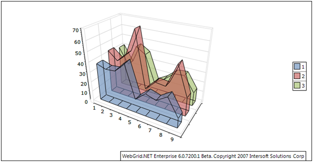
Series Line
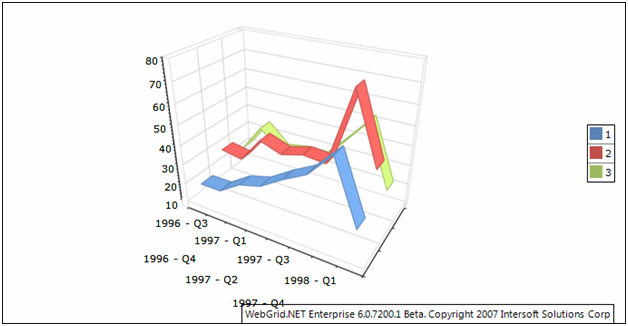
Series Line has fourteen sub types, they are:
- Overlapped Line
- Overlapped Line With Markers
- Stacked Line
- Stacked Line With Markers
- 100% Stacked Line
- 100% Stacked Line With Markers
- Basic 3D Line
- Basic 3D Line With Markers
- Overlapped 3D Line
- Overlapped 3D Line With Markers
- Stacked 3D Line
- Stacked 3D Line With Markers
- 100% Stacked 3D Line
- 100% Stacked 3D Line With Markers
You can select which chart type to be used from:
| C# | Copy Code |
|---|---|
ChartSettings chartSettings = WebGrid1.ChartSettings; chartSettings.SeriesBarSettings.Type = SeriesBarType.ClusteredBar; |
|
Line Shape
There are four types of shape that you can choose from.
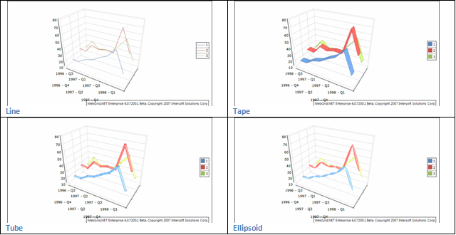
The line segments can be visualized with different shapes. You can control the shape with the help of the LineSegmentShape property which accepts values from the LineSegmentShape enumeration. By default, the series is displayed as simple line. The following example will display the series as tape:
| Example Title | Copy Code |
|---|---|
SeriesLine settings = WebGrid1.ChartSettings.SeriesLineSettings.Settings; settings.LineSegmentShape = LineSegmentShape.Tape; |
|
Series Smooth Line
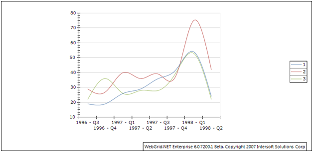
Series Line has two sub types, they are:
- Overlapped Smooth Line
- Overlapped Smooth Line With Markers
You can select which chart type to be used from:
| C# | Copy Code |
|---|---|
ChartSettings chartSettings = WebGrid1.ChartSettings; chartSettings.SeriesSmoothLineSettings.Type = SeriesSmoothLineType.OverlappedSmoothLine; |
|
Series Step Line
Series Step Line has four sub types, they are:
- Overlapped Step Line
- Overlapped Step Line With Markers
- Basic 3D Step Line
- Basic 3D Step Line With Markers
You can select which chart type to be used from:
| C# | Copy Code |
|---|---|
ChartSettings chartSettings = WebGrid1.ChartSettings; chartSettings.SeriesStepLineSettings.Type = SeriesStepLineType.OverlappedStepLine; |
|
Line Shape
There are four types of shape that you can choose from.
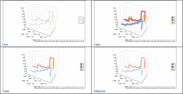
The line segments can be visualized with different shapes. You can control the shape with the help of the LineSegmentShape property which accepts values from the LineSegmentShape enumeration. By default the series is displayed as simple line. The following example will display the series as tape:
| C# | Copy Code |
|---|---|
SeriesStepLine settings = WebGrid1.ChartSettings.SeriesStepLineSettings.Settings; settings.LineSegmentShape = LineSegmentShape.Tape; |
|
Series Pie
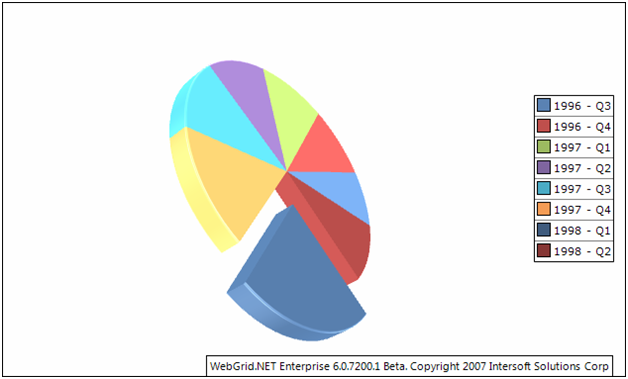
Series Pie has four sub types:
- Pie
- Exploded Pie
- 3D Pie
- 3D Exploded Pie
You can select which chart type to be used from:
| C# | Copy Code |
|---|---|
ChartSettings chartSettings = WebGrid1.ChartSettings; chartSettings.SeriesPieSettings.Type = SeriesPieType.Pie; |
|
Pie Style
There are two types of pie that you can choose from.
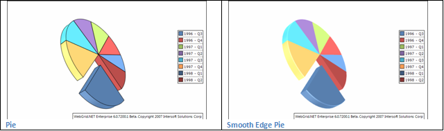
The shape of the pie segments can be controlled through the PieStyle property. It accepts values from the PieStyle enumeration. For example: the following code will display a smooth edge pie chart:
| C# | Copy Code |
|---|---|
settings.PieStyle = PieStyle.Pie; |
|
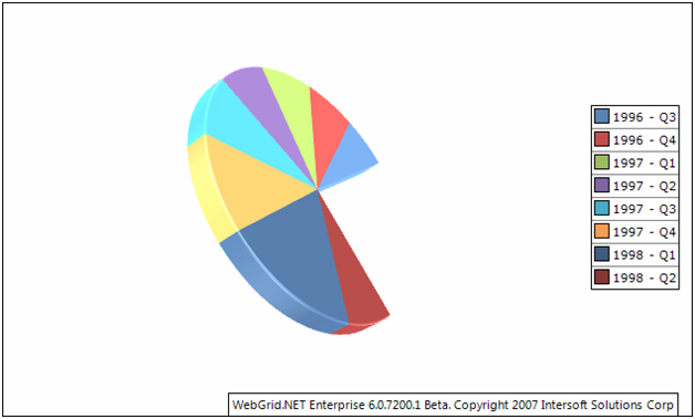
Explosion
You can explode the data point of the pie chart using:
| Example Title | Copy Code |
|---|---|
SeriesPie settings = WebGrid1.ChartSettings.SeriesPieSettings.Settings;settings.ExplodeMode = PieExplodeMode.Biggest;settings.Explosion = 8; |
|
Miscellaneous
The BeginAngle property specifies the initial rotation of the first item. The TotalAngle property controls the total angle (in degrees) in which pies is displayed. By default, this property is 360 degrees. The following code will change the begin angle of the pies to 30 degrees and set the total angle to 180 degrees.
| C# | Copy Code |
|---|---|
SeriesPie settings = WebGrid1.ChartSettings.SeriesPieSettings.Settings; settings.BeginAngle = 45; settings.TotalAngle = 270; |
|
Series Doughnut
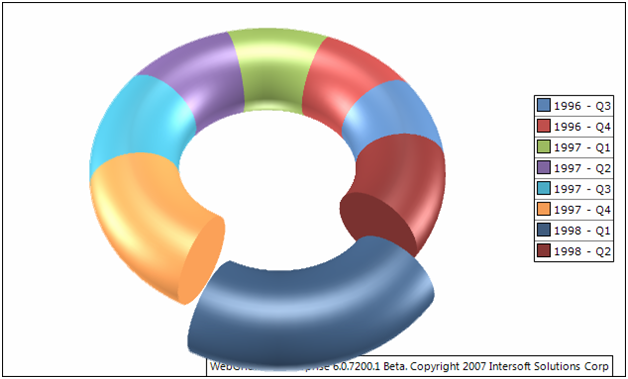
Series Doughnut has four sub types:
- Doughnut
- Exploded Doughnut
- 3D Doughnut
- Exploded 3D Doughnut
You can select which chart type to be used from:
| C# | Copy Code |
|---|---|
ChartSettings chartSettings = WebGrid1.ChartSettings; chartSettings.SeriesDoughtnutSettings.Type = SeriesDoughnutType.Doughnut; |
|
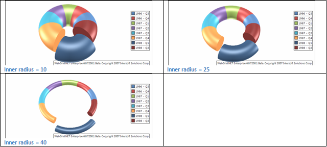
InnerRadius
Inner radius controls the length of the inner radius (the doughnut hole), the larger the value, the thinner the doughnut will be and vice versa. The maximum value is 50 which means the doughnut is not visible.
Explosion
You can explode the data point of the pie chart using:
| C# | Copy Code |
|---|---|
SeriesPie settings = WebGrid1.ChartSettings.SeriesDoughnutSettings.Settings;settings.ExplodeMode = PieExplodeMode.Biggest;settings.Explosion = 8; |
|
Miscellaneous
The BeginAngle property specifies the initial rotation of the first item. The TotalAngle property controls the total angle (in degrees) in which pies is displayed. By default, this property is 360 degrees. The following code will change the begin angle of the pies to 45 degrees and set the total angle to 270 degrees.
| C# | Copy Code |
|---|---|
SeriesPie settings = WebGrid1.ChartSettings.SeriesDoughnutSettings.Settings;settings.BeginAngle = 45;settings.TotalAngle = 270; |
|
Series Area
Series Area has five sub types:
- Stacked Area
- 100% Stacked Area
- Basic 3D Area
- Stacked 3D Area
- 100% Stacked 3D Area
You can select which chart type to be used from:
| C# | Copy Code |
|---|---|
ChartSettings chartSettings = WebGrid1.ChartSettings; chartSettings.SeriesAreaSettings.Type = SeriesAreaType.Doughnut; |
|
Origin
By default, all bars are using 0 as origin value (all bars begin from 0). You can turn off this behavior by setting the UseOrigin property to false.
| C# | Copy Code |
|---|---|
SeriesArea settings = WebGrid1.ChartSettings.SeriesAreaSettings.Settings;
settings.UseOrigin = false;
|
|
If the bars do not use an origin value, they will all begin from the minimum bar value (the minimal bar will be displayed with zero height). In some cases, you may want the bars to begin from a certain value - for example 26. The following code will achieve the result:
| C# | Copy Code |
|---|---|
SeriesArea settings = WebGrid1.ChartSettings.SeriesAreaSettings.Settings;
settings.UseOrigin = false;
settings.Origin = 26;
|
|
Other Series related features
Except features that related to corresponding chart type, there also features that applied generally to entire series, they are:
-
Series Legend
This feature basically used to control the formatting of the legend text format.
There are two types of legend mode that you can select from (Series or Data Points).
In Series mode the legend will be set from the Chart Engine. If it is set to Data Points, the legend will be determined by the given format.
C# Copy CodeSeriesLegend seriesLegend = settings.SeriesLegend; seriesLegend.Format = "<label> (<value>) (<percent>)";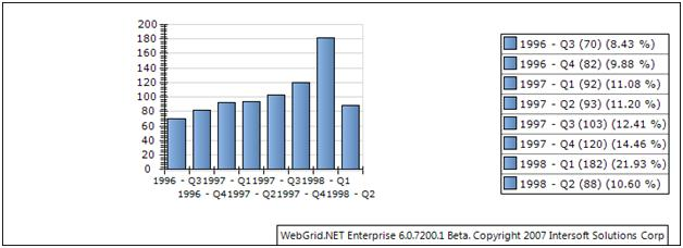
-
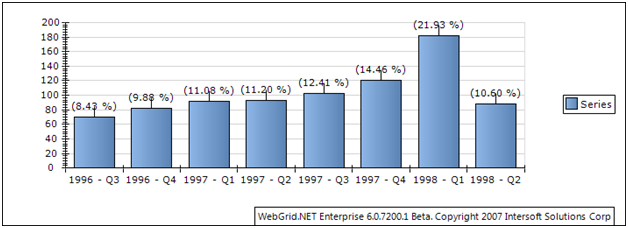
Series Data Point
Data point is a mark that is placed in each series object that represents the data. By default, the data point is set to visible = false. If you want to show it, you can simply:
C# Copy CodeChartDataLabelStyle labelStyle = settings.DataLabelStyle; labelStyle.Visible = true; labelStyle.Format = "(<percent>)";
You can also specify the formatting text as in series legend. Furthermore, you can also specify the position of the data points according to your preference.

In pie and doughnut chart, the data points can be visualized in more modes:
- Center - the data labels are displayed in the center of the pie segments.
- Rim the data labels are visualized at the pies rim.
- Spider the data labels are visualized at aligned in columns on the left and the right side of the pie.
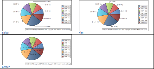
Chart Tool Tip and Interactivity
You can show Chart tooltip and interactivity at chart object by activating ChartInteractiveStyle.
| C# | Copy Code |
|---|---|
Series settings = WebGrid1.ChartSettings.GetSeries();
ChartInteractiveStyle interactive = settings.InteractiveStyle;
interactive.Enabled = true;
|
|
By doing this you can now show a tooltip at chart object and also attach mouse events (mouse over, mouse out, click, and double click).
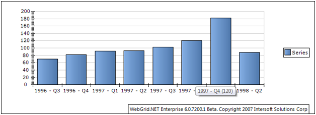
You can control the tool tip format from:
| C# | Copy Code |
|---|---|
Series settings = WebGrid1.ChartSettings.GetSeries();
ChartInteractiveStyle interactive = settings.InteractiveStyle;
interactive.Tooltip = "<label> (<value>)";
|
|
Here is the Formating available:
| Format | Description |
| <label> | Show the data label |
| <value> | Show the data value |
| <index> | Show the index of the data |
| <total> | Show the total data value |
| <percent> | Show the percentage of current value |
Beside tool tip you can also attach mouse events as follow:
| C# | Copy Code |
|---|---|
Series settings = GetSeries();
ChartInteractiveStyle interactive = settings.InteractiveStyle;
interactive.OnClick = "ChartEventClick";
|
|
| JavaScript | Copy Code |
|---|---|
function ChartEventClick(controlId, label, value, index, aggregate, filterExpression) { label = unescape(label); value = unescape(value); index = unescape(index); aggregate = unescape(aggregate); filterExpression = unescape(filterExpression); alert ( "Label : " + label + "\n" + "Value : " + value + "\n" + "Index : " + index + "\n" + "Aggregate : " + aggregate + "\n" + "Filter Expression : " + filterExpression + "\n"); } |
|
The information passed to client side event handler are : controlId, label, value, index, aggregate, filterExpression of corresponding chart object.
You might want to use the filterExpression as additional filterExpression later for your child query in drill in concept.
 See Also
Getting Started
Getting Started
Overview
WebGrid Features Overview
Other Resources
Walkthrough Topics
How-to Topics