
| Intersoft ClientUI 8 > ClientUI Controls > Control Library > Navigation Controls Overview > UXTreeView |
UXTreeView is a versatile, feature-packed tree view control for displaying and navigating hierarchical data. UXTreeView is uniquely engineered with loosely-coupled architecture to enable full support for MVVM design pattern. It offers numerous advanced features such as child load-on-demand supporting both MVP and MVVM pattern, tri-state check boxes, customizable expand mode, multiple selection, node editing and hierarchical template editing support.
UXTreeView also comes with comprehensive UX features, remarkably the fluid drag and drop support, full keyboard navigation support, and other usability features that conform to ISO Standards 9241. To learn more about the user experiences features implemented in ClientUI controls, see User Experiences Overview.

The UXTreeView is a control that displays data in a hierarchical manner. At the core of the UXTreeView control is UXTreeViewItem, a specialized object that implements both headered content and items control model which enables reliable and consistent hierarchical data presentation. In short, the UXTreeViewItem provides the hierarchy of the UXTreeView control.
The UXTreeView control enables users to expand or collapse a node in the hierarchy by using common input devices such as mouse or keyboard. You can get the selected item or selected items through the provided SelectedItem or SelectedItems property.
The following code shows how to create a simple UXTreeView in XAML.
| XAML |
Copy Code
|
|---|---|
<Grid> <Intersoft:UXTreeView BorderThickness="0"> <Intersoft:UXTreeViewItem Header="Project Deliverables"> <Intersoft:UXTreeViewItem Header="Final" /> <Intersoft:UXTreeViewItem Header="Draft" /> <Intersoft:UXTreeViewItem Header="Work in Progress" /> </Intersoft:UXTreeViewItem> <Intersoft:UXTreeViewItem Header="Project Management Deliverables"> <Intersoft:UXTreeViewItem Header="Project Definition" /> <Intersoft:UXTreeViewItem Header="Communications" /> <Intersoft:UXTreeViewItem Header="Presentations" /> <Intersoft:UXTreeViewItem Header="Financial Information" /> <Intersoft:UXTreeViewItem Header="Logs" /> <Intersoft:UXTreeViewItem Header="Miscellaneous" /> <Intersoft:UXTreeViewItem Header="Workplans" /> <Intersoft:UXTreeViewItem Header="Status " /> <Intersoft:UXTreeViewItem Header="Meeting Minutes" /> <Intersoft:UXTreeViewItem Header="Reports" /> </Intersoft:UXTreeViewItem> <Intersoft:UXTreeViewItem Header="Reference"> <Intersoft:UXTreeViewItem Header="Tutorials" /> <Intersoft:UXTreeViewItem Header="Templates" /> <Intersoft:UXTreeViewItem Header="Other Reference Material" /> </Intersoft:UXTreeViewItem> <Intersoft:UXTreeViewItem Header="Workarea"> <Intersoft:UXTreeViewItem Header="Team member 1" /> <Intersoft:UXTreeViewItem Header="Team member 2" /> </Intersoft:UXTreeViewItem> </Intersoft:UXTreeView> </Grid> |
|

UXTreeView is inherited from ISDragableHeaderedHierarchicalMultipleSelectionControl, which means it can be used to perform a single or multiple selection and has built-in drag and drop behaviors. For more information about selection control and content model, see ItemsControl Overview and Content Model Overview respectively.
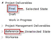
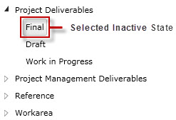
The following figure illustrates the selection state for UXTreeView.


UXTreeView has two selection modes such as discussed in the following list.
You can change this selection behavior through the TreeSelectionMode property.
You can navigate between items by using keyboard's arrow keys.
In Single mode, navigating between items will change the selection immediately.
In Multiple mode, you need to use Ctrl or Shift key to active the multiple selection. By pressing Shift key, you can select a range of nodes, while pressing Ctrl key allows you to continously select individual node. With the Ctrl key pressed, you can toggle the current selection without affecting the previous selection by pressing the Spacebar or Enter key.
 |
When CheckBoxVisibility property is set to Visible, only Enter key can be used to toggle the current selection. In this case, the Spacebar key will be used to toggle the checked state of the check box. |
You can bind a collection of data to UXTreeView by using HierarchicalDataTemplate to visualize the data in hierarchical manner. You use the ItemsSource and ItemTemplate property to specify the source and template of each level of data contained in the UXTreeView. If you do not want to differentiate the template of each level, you can create a generic style for UXTreeViewItem and assign it to the ItemContainerStyle property of the UXTreeView control. To learn more about data binding, see Data Binding Overview.
To bind the data, you can either use ItemTemplate such as HierarchicalDataTemplate, or the member path properties such as listed below.
The following example shows how to perform binding to UXTreeView using the member path properties.
| XAML |
Copy Code
|
|---|---|
<Grid> <Intersoft:UXTreeView ItemsSource="{Binding Files}" DisplayMemberPath="Name" CollectionMemberPath="Files" ImageMemberPath="Icon" AutoSelectMode="Expand" NavigateUriMemberPath="NavigateUri"> <Intersoft:UXTreeView.ItemContainerStyle> <Style TargetType="Intersoft:UXTreeViewItem"> <Setter Property="DisplayMemberPath" Value="Name" /> <Setter Property="ImageMemberPath" Value="Icon" /> <Setter Property="CollectionMemberPath" Value="Files" /> <Setter Property="DisplayMode" Value="ContentAndImage" /> <Setter Property="NavigateUriMemberPath" Value="NavigateUri" /> </Style> </Intersoft:UXTreeView.ItemContainerStyle> </Intersoft:UXTreeView> </Grid> |
|
For more information on how to implement data binding to UXTreeView using member path properties, see How-to: Bind Hierarchical Data to UXTreeView using Member Path Properties (MVVM).
The following code shows you how to used HierarchicalDataTemplate for UXTreeView.
| XAML |
Copy Code
|
|---|---|
<Grid> <Grid.Resources> <Intersoft:HierarchicalDataTemplate x:Key="fileEntry" ItemsSource="{Binding Files}"> <StackPanel Orientation="Horizontal"> <Image Source="{Binding Icon}" Height="20" /> <ContentPresenter Margin="0 0 4 0" Content="{Binding Name}" /> </StackPanel> </Intersoft:HierarchicalDataTemplate> </Grid.Resources> <Intersoft:UXTreeView ItemTemplate="{StaticResource fileEntry}" ItemsSource="{Binding Files}" /> </Grid> |
|
For more information on how to implement data binding to UXTreeView using HierarchicalDataTemplate in your application, see How-to: Bind Hierarchical Data to UXTreeView using HierarchicalDataTemplate (MVVM).
To learn more about MVVM pattern, see MVVM Pattern Overview.
The item container type of UXTreeView is UXTreeViewItem.
UXTreeView uses content control architecture which allows you to put any arbitrary object to its Content. UXTreeView extends the content model with ImageContent presentation to provide an efficient way to display an image in addition to the content itself. UXTreeViewItem also supports ImageContent model, so you can use the ImageMemberPath to bind an image field to the image element of UXTreeViewItem.
The following example shows how to setup the UXTreeView to use ImageContent presentation and specify an image to the content.
| XAML |
Copy Code
|
|---|---|
<Grid> <Intersoft:UXTreeView> <Intersoft:UXTreeViewItem Header="Games" IsExpanded="True" DisplayMode="ContentAndImage" Icon="/SLNavigationPane;component/images/Folder.png"> <Intersoft:UXTreeViewItem Header="Chess Titans" DisplayMode="ContentAndImage" Icon="/SLNavigationPane;component/images/Folder.png" /> <Intersoft:UXTreeViewItem Header="FreeCell" DisplayMode="ContentAndImage" Icon="/SLNavigationPane;component/images/Folder.png" /> <Intersoft:UXTreeViewItem Header="Hearts" DisplayMode="ContentAndImage" Icon="/SLNavigationPane;component/images/Folder.png" /> </Intersoft:UXTreeViewItem> </Intersoft:UXTreeView> </Grid> |
|
The result looks like the following figure.

UXTreeViewItem implements ICommandSource interface which exposes Command, CommandParameter and CommandTarget property. You can assign a command to a UXTreeViewItem by setting its Command property to the target command existed in your application. With commanding, you can separate the actual logic of the command from the command definition, which is ideal for MVVM pattern application. To learn about MVVM pattern, see MVVM Pattern Overview.
The following example shows how to assign a command to a UXTreeViewItem which will be executed when the item is selected.
| XAML |
Copy Code
|
|---|---|
<Intersoft:UXTreeView> <Intersoft:UXTreeViewItem Header="Add new task" Command="{Binding AddNewTaskCommand}" /> </Intersoft:UXTreeView> |
|
For more information on how to implement routed command in your application, see How-to: Implement a RoutedCommand. For more information about the basics of commanding concept, see Commanding Overview.
 |
Depending on the scenarios you want to achieve, you may want to evaluate when to use command or selection in your application. It's best practice to use commanding when you have a particular action to execute when a node is selected. However, if you simply wish to capture the current selection in the control, please use the SelectedItem or SelectedItems property. |
UXTreeViewItem implements INavigationSource interface, which means you can use UXTreeViewItem to perform navigation to pages through the provided NavigateUri property. When NavigateUri is specified, the page navigation will take place when the item is selected.
The following example shows how to setup the UXTreeView to perform navigation to a UXPage in a navigation frame.
| XAML |
Copy Code
|
|---|---|
<Intersoft:UXTreeView> <Intersoft:UXTreeViewItem Header="Navigation"> <Intersoft:UXTreeViewItem Header="Home" NavigateUri="/Home" /> <Intersoft:UXTreeViewItem Header="Customer" NavigateUri="/Customer" /> <Intersoft:UXTreeViewItem Header="Product" NavigateUri="/Product" /> <Intersoft:UXTreeViewItem Header="About" NavigateUri="/About" /> </Intersoft:UXTreeViewItem> </Intersoft:UXTreeView> <Intersoft:UXFrame> <Intersoft:UXFrame.UriMapper> <Intersoft:UriMapper> <Intersoft:UriMapping Uri="" MappedUri="/Home.xaml"/> <Intersoft:UriMapping Uri="/Error" MappedUri="/ErrorPage.xaml"/> <Intersoft:UriMapping Uri="/{page}" MappedUri="/{page}.xaml" /> </Intersoft:UriMapper> </Intersoft:UXFrame.UriMapper> </Intersoft:UXFrame> |
|
You can also create user-friendly URI to simplify the URI reference and enhance navigation experience. For more information about ClientUI navigation framework and its features, see Navigation Overview.
To prevent user from selecting one or more items, you set the CanUserSelect property to false for unbound mode, or CanUserSelectMemberPath for bound mode.
Similar to CanUserSelect, you can also prevent user from toggling one or more items through the CanUserExpandCollapse property for unbound mode or CanUserExpandCollapseMemberPath for bound mode.
UXTreeView has three automatic selection modes which you can customize through the AutoSelectMode property. The modes are discussed in the following list.
In certain cases, you may prefer to expand only one item at a time, you can achieve this by customizing the TreeExpandMode property. This property has two possible values: Single and Multiple. In Single mode, only one item could be expanded at a time, while Multiple mode allows you to expand as much items as you desire. The default value is the Multiple mode.
You can also automatically expand an item when the item is selected by setting the IsExpandOnSelect property to True.
Users can expand and collapse a UXTreeViewItem in a number of ways such as double clicking an item using mouse or pressing arrow keys on keyboard. When AutoSelectMode is set to ExpandOnSelect, the item can automatically expand as the item becomes selected.
The following code shows you how to set the AutoSelectMode and TreeExpandMode property .
| XAML |
Copy Code
|
|---|---|
<Grid> <Intersoft:UXTreeView AutoSelectMode="Expand" TreeExpandMode="Multiple"> <Intersoft:UXTreeViewItem Header="Folder 1"> <Intersoft:UXTreeViewItem Header="File 1" /> <Intersoft:UXTreeViewItem Header="File 2" /> <Intersoft:UXTreeViewItem Header="File 3" /> <Intersoft:UXTreeViewItem Header="File 4" /> </Intersoft:UXTreeViewItem> <Intersoft:UXTreeViewItem Header="Folder 2"> <Intersoft:UXTreeViewItem Header="File 1" /> <Intersoft:UXTreeViewItem Header="File 2" /> </Intersoft:UXTreeViewItem> <Intersoft:UXTreeViewItem Header="Folder 3" /> </Intersoft:UXTreeView> </Grid> |
|
UXTreeView features built-in editing capability which can be easily enabled by setting the IsEditable property to true. When enabled, users can press the F2 key on the selected item to activate editing mode. By default, UXTextBox control will be used as the editing control.
If you prefer, you can also customize the editing control to use more advanced editing controls such as UXNumericUpDown by customizing the ItemEditTemplate property. To show the edited text/value properly, you must bind the property to the control you defined in the ItemEditTemplate property.
The following code shows how to enable node editing in UXTreeView.
| XAML |
Copy Code
|
|---|---|
<Grid> <Intersoft:UXTreeView IsEditable="True"> <Intersoft:UXTreeViewItem Header="Folder 1"> <Intersoft:UXTreeViewItem Header="File 1" /> </Intersoft:UXTreeViewItem> <Intersoft:UXTreeViewItem Header="Folder 2" /> </Intersoft:UXTreeView> </Grid> |
|

The following code shows how to customize the editing controls in UXTreeView by setting a custom data template to the ItemEditTemplate.
| XAML |
Copy Code
|
|---|---|
<Grid> <Intersoft:UXTreeView x:Name="EmployeeTrees" TreeSelectionMode="Multiple" ItemsSource="{Binding Employees}" DisplayMemberPath="Name" CollectionMemberPath="Employees" IsEditable="True"> <Intersoft:UXTreeView.ItemEditTemplate> <DataTemplate> <StackPanel Orientation="Horizontal"> <Intersoft:UXTextBox Text="{Binding Name, Mode=TwoWay}" /> <TextBlock Text="|" /> <Intersoft:UXTextBox Text="{Binding Age, Mode=TwoWay}" /> </StackPanel> </DataTemplate> </Intersoft:UXTreeView.ItemEditTemplate> <Intersoft:UXTreeView.ItemContainerStyle> <Style TargetType="Intersoft:UXTreeViewItem"> <Setter Property="CollectionMemberPath" Value="Employees" /> <Setter Property="DisplayMemberPath" Value="Name" /> </Style> </Intersoft:UXTreeView.ItemContainerStyle> </Intersoft:UXTreeView> </Grid> |
|

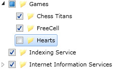
UXTreeView includes powerful checkbox capability which allows you to easily capture checked items from the user input. You can enable this feature by simply setting the CheckBoxVisibility property to Visible., then access the CheckedItems property to obtain the checked items. Note that the CheckedItems only includes leaf items.
The following code shows how to enable the checkbox behavior.
| XAML |
Copy Code
|
|---|---|
<Grid> <Intersoft:UXTreeView x:Name="CheckedTree" CheckBoxVisibility="Visible" TreeExpandMode="Multiple"> <Intersoft:UXTreeViewItem Header="Games" IsExpanded="True" DisplayMode="ContentAndImage" Icon="/SLNavigationPane;component/images/Folder.png"> <Intersoft:UXTreeViewItem Header="Chess Titans" DisplayMode="ContentAndImage" Icon="/SLNavigationPane;component/images/Folder.png" /> <Intersoft:UXTreeViewItem Header="FreeCell" DisplayMode="ContentAndImage" Icon="/SLNavigationPane;component/images/Folder.png" /> <Intersoft:UXTreeViewItem Header="Hearts" DisplayMode="ContentAndImage" Icon="/SLNavigationPane;component/images/Folder.png" /> </Intersoft:UXTreeViewItem> <Intersoft:UXTreeViewItem Header="Indexing Service" DisplayMode="ContentAndImage" Icon="/SLNavigationPane;component/images/Folder.png" /> <Intersoft:UXTreeViewItem Header="Internet Information Services" DisplayMode="ContentAndImage" Icon="/SLNavigationPane;component/images/Folder.png"> <Intersoft:UXTreeViewItem Header="FTP Server" DisplayMode="ContentAndImage" Icon="/SLNavigationPane;component/images/Folder.png"> <Intersoft:UXTreeViewItem Header="FTP Extensibility" DisplayMode="ContentAndImage" Icon="/SLNavigationPane;component/images/Folder.png" /> <Intersoft:UXTreeViewItem Header="FTP Sevice" DisplayMode="ContentAndImage" Icon="/SLNavigationPane;component/images/Folder.png" /> </Intersoft:UXTreeViewItem> <Intersoft:UXTreeViewItem Header="Web Management Tools" DisplayMode="ContentAndImage" Icon="/SLNavigationPane;component/images/Folder.png"> <Intersoft:UXTreeViewItem Header="IIS 6 Management Compatibility" DisplayMode="ContentAndImage" Icon="/SLNavigationPane;component/images/Folder.png"> <Intersoft:UXTreeViewItem Header="IIS 6 Management Console" DisplayMode="ContentAndImage" Icon="/SLNavigationPane;component/images/Folder.png" /> <Intersoft:UXTreeViewItem Header="IIS 6 Scripting Tools" DisplayMode="ContentAndImage" Icon="/SLNavigationPane;component/images/Folder.png" /> <Intersoft:UXTreeViewItem Header="IIS 6 WMI Compatibility" DisplayMode="ContentAndImage" Icon="/SLNavigationPane;component/images/Folder.png" /> <Intersoft:UXTreeViewItem Header="IIS Metabase and IIS 6 configuration compatibility" DisplayMode="ContentAndImage" Icon="/SLNavigationPane;component/images/Folder.png" /> </Intersoft:UXTreeViewItem> <Intersoft:UXTreeViewItem Header="IIS Management Console" DisplayMode="ContentAndImage" Icon="/SLNavigationPane;component/images/Folder.png" /> <Intersoft:UXTreeViewItem Header="IIS Management Scripts and Tools" DisplayMode="ContentAndImage" Icon="/SLNavigationPane;component/images/Folder.png" /> <Intersoft:UXTreeViewItem Header="IIS Management Service" DisplayMode="ContentAndImage" Icon="/SLNavigationPane;component/images/Folder.png" /> </Intersoft:UXTreeViewItem> </Intersoft:UXTreeViewItem> </Intersoft:UXTreeView> </Grid> |
|

As seen in the above illustration, UXTreeView maintains the checkbox state of parent items automatically. It will show a full checked state when all of the child items are checked, and show an indeterminate state when the child items are partially checked. In addition, the checkbox of the parent items also implement special behaviors that allow users to quickly toggle the checked state of all child items by simply clicking on the parent item's checkbox.
For more information on how to bind the CheckedItems property to a UXListBox control, see How-to: Bind UXTreeView CheckedItems Property to UXListBox.
By default, UXTreeView applies sliding animation during the item expand and collapse to provide smooth and compelling user experiences. In certain cases where animation is not preferred, you can disable it by setting the EnableSlidingAnimation property to false.
UXTreeView also supports text search capability similar to other ClientUI items control such as UXListBox and UXComboBox. To enable text search, you set the IsTextSearchEnabled property to true. To enable case sensitivity in the text search, you set the IsTextSearchCaseSensitity property to true.
The text search feature is an essential usability feature that allows users can quickly locate an item in the hierarchical tree based on the typed characters. Note that only visible items in the hierarchy will be traversed during text search.
The following code shows how to enable text search in UXTreeView.
| XAML |
Copy Code
|
|---|---|
<Grid> <Intersoft:UXTreeView IsTextSearchEnabled="True"> <Intersoft:UXTreeViewItem Header="Folder 1"> <Intersoft:UXTreeViewItem Header="File 1" /> <Intersoft:UXTreeViewItem Header="File 2" /> <Intersoft:UXTreeViewItem Header="File 3" /> <Intersoft:UXTreeViewItem Header="File 4" /> </Intersoft:UXTreeViewItem> <Intersoft:UXTreeViewItem Header="Folder 2"> <Intersoft:UXTreeViewItem Header="File 1" /> <Intersoft:UXTreeViewItem Header="File 2" /> </Intersoft:UXTreeViewItem> <Intersoft:UXTreeViewItem Header="Folder 3" /> </Intersoft:UXTreeView> </Grid> |
|
For more information about user experience features such as text search, see User Experiences Overview.
In addition to the basic features, UXTreeView also offers advanced features such as loading child nodes on demand. This feature is particularly useful to improve the overall performance when the assigned data source is relatively large. To enable load-on-demand, you set the IsLoadOnDemand property of the control to true.
UXTreeView provides two kind of load-on-demand behaviors which you can choose based on your application's scenarios. Each of the load-on-demand behavior is explained in the following sections.
With the Automatic mode, which is the default load-on-demand mode, UXTreeView automatically processes the child items by looking up the requested node in the hierarchy from the given datasource. This mode is ideal when you already have the complete datasource assigned in the ItemsSource and do not require custom implementation of child data retrieval in your application's logic.
For more advanced scenarios, UXTreeView can also completely delegate the child data retrieval process to your application's logic by setting the LoadOnDemandMode property to UseProcessedItem. This mode is ideal for performance-critical data applications where loading all hierarchical data is not feasible due to the data size. In such scenario, you may want to load only several levels of the data initially, then load the rest of the items on demand as they are being expanded.
UXTreeView is specifically designed to elegantly achieve this scenario using MVVM pattern implementation. UXTreeView exposes ExpandedItem property that you can bind in the ViewModel. This allows you to interact with the entity being expanded and write your own logic to retrieve the child items in the ViewModel. Once the child items become available, you assign the original entity to the ProcessedItem property to notify the control that the loading process is completed.
In this mode, a busy indicator will be automatically displayed in each expanded item during the loading progress. You can determine how soon the busy indicator should appear by setting the BusyLatency property to a value in seconds measurement. The default value is 0.1s.
The following code shows how to implement load on demand in UXTreeView with the LoadOnDemandMode property set to UseProcessedItem. The example is implemented using MVVM pattern.
| C# |
Copy Code
|
|---|---|
public class CompanyEmployee : ModelBase
{
    private String _name;

    public String Name
    {
        get { return this._name; }
        set
        {
            if (this._name != value)
            {
                this._name = value;
                OnPropertyChanged("Name");
            }
        }
    }
} |
|
| C# |
Copy Code
|
|---|---|
public class Company : ModelBase
{
    private string _section;
    private ObservableCollection<CompanyEmployee> _employees;

    public string Section
    {
        get { return this._section; }
        set
        {
            if (this._section != value)
            {
                this._section = value;
                OnPropertyChanged("Section");
            }
        }
    }

    public ObservableCollection<CompanyEmployee> Employees
    {
        get { return this._employees; }
        set
        {
            if (this._employees != value)
            {
                this._employees = value;
                OnPropertyChanged("Employees");
            }
        }
    }

    public Company()
    {
        this.Employees = new ObservableCollection<CompanyEmployee>();
    }
} |
|
| C# |
Copy Code
|
|---|---|
public class CompanyViewModel : ViewModelBase
{
    private ObservableCollection<Company> _companies;
    private object _expandedItem;
    private object _processedItem;

    public ObservableCollection<Company> Companies
    {
        get { return this._companies; }
        set
        {
            if (this._companies != value)
            {
                this._companies = value;
                OnPropertyChanged("Companies");
            }
        }
    }

    public object ExpandedItem
    {
        get { return this._expandedItem; }
        set
        {
            if (this._expandedItem != value)
            {
                this._expandedItem = value;
                Company obj = value as Company;
                ObservableCollection<CompanyEmployee> data = new ObservableCollection<CompanyEmployee>();

                //using thread
                if (obj != null && obj.Employees.Count == 0)
                {
                    var t = new Thread(() =>
                    {
                        try
                        {
                            Thread.Sleep(300);
                            for (int i = 0; i < 20; i++)
                            {
                                data.Add(new CompanyEmployee()
                                {
                                    Name = obj.Section + ", Employee " + i.ToString()
                                });
                            }
                            System.Windows.Deployment.Current.Dispatcher.BeginInvoke(() =>
                            {
                                obj.Employees = data;
                                this.ProcessedItem = value;
                            });
                        }
                        catch
                        {
                            System.Diagnostics.Debug.WriteLine("Debug");
                        }
                    });
                    t.Start();
                }
                else
                    this.ProcessedItem = value;
                OnPropertyChanged("ExpandedItem");
            }
        }
    }

    public object ProcessedItem
    {
        get { return this._processedItem; }
        set
        {
            if (this._processedItem != value)
            {
                this._processedItem = value;
                OnPropertyChanged("ProcessedItem");
            }
        }
    }

    public CompanyViewModel()
    {
        this.LoadData();
    }

    private void LoadData()
    {
        this.Companies = new ObservableCollection<Company>();
        this.Companies.Add(new Company() { Section = "Human Resource" });
        this.Companies.Add(new Company() { Section = "Development and Training" });
        this.Companies.Add(new Company() { Section = "Developer" });
        this.Companies.Add(new Company() { Section = "Support" });
        this.Companies.Add(new Company() { Section = "Project Manager" });
    }
} |
|
| XAML |
Copy Code
|
|---|---|
<Intersoft:UXPage> <Intersoft:UXPage.Resources> <ViewModel:CompanyViewModel x:Key="CompanyViewModel" /> </Intersoft:UXPage.Resources> <Grid x:Name="LayoutRoot"> <Grid.Resources> <Intersoft:HierarchicalDataTemplate x:Key="CompanyEmployeeTemplate" ItemsSource="{Binding Employees}"> <TextBlock Text="{Binding Name}" /> </Intersoft:HierarchicalDataTemplate> <Intersoft:HierarchicalDataTemplate x:Key="CompanyTemplate" ItemTemplate="{StaticResource CompanyEmployeeTemplate}" ItemsSource="{Binding Employees}"> <TextBlock Text="{Binding Section}" /> </Intersoft:HierarchicalDataTemplate> </Grid.Resources> <Intersoft:UXTreeView TreeExpandMode="Multiple" Height="300" IsLoadOnDemand="True" BusyLatency="0.002" LoadOnDemandMode="UseProcessedItem" ExpandedItem="{Binding ExpandedItem, Mode=TwoWay}" ProcessedItem="{Binding ProcessedItem, Mode=TwoWay}" ItemsSource="{Binding Companies}" EnableSlidingAnimation"False" DataContext="{StaticResource CompanyViewModel}" ItemTemplate="{StaticResource CompanyTemplate}"> </Intersoft:UXTreeView> </Grid> </Intersoft:UXPage> |
|
UXTreeView supports drag and drop capability which is built upon ClientUI DragDrop Framework. To learn more how to enable drag and drop to UXTreeView, see ItemsControl Overview and Drag-drop Framework Overview respectively.
You can easily customize the UXTreeView appearance through the following properties.
If you would like to completely customize the control appearance or if you want to change the styles of each visual state, you can edit the template of the control and do the modification accordingly.
To learn more how to change the template and the visual states, see Styles and Template Overview.