
| Intersoft ClientUI 8 > ClientUI Controls > Control Library > Toolbar and Menu Controls Overview > UXStatusBar |
UXStatusBar is an items control that represents a status bar user interface, which can contains a collection of items such as UXStatusBarItem and UXSeparator.
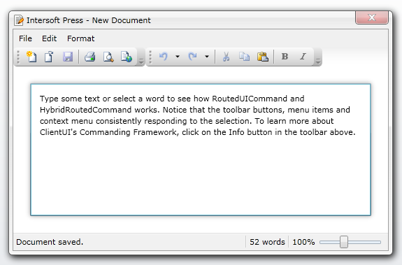
The UXStatusBar comes with a professional, Aero-style theme ideal for business applications. The control is particularly useful when used along with window and dialog boxes to provide information about the current state of the application such as saving status, number of words, and zoom level.
For more information about window and dialog boxes in ClientUI, see Window and Dialog Boxes Overview.

You use the UXStatusBar control to display a collection of application states, which mainly consisted of UXStatusBarItem to represent a status content, and UXSeparator to represent a vertical separator.
The following XAML code shows how to create a UXStatusBar that shows two status items separated with a vertical separator.
| XAML |
Copy Code
|
|---|---|
<Intersoft:UXStatusBar Intersoft:DockPanel.Dock="Bottom" Height="25"> <Intersoft:UXStatusBarItem Content="Document saved."/> <Intersoft:UXSeparator/> <Intersoft:UXStatusBarItem Content="52 words" /> </Intersoft:UXStatusBar> |
|
Often times, you may want to show one of the status bar item to fill the remaining space, particularly for the main status content that shows longer text. You can easily achieve this design by setting the IsFill property of the particular UXStatusBarItem to true, such as shown in the following example.
| XAML |
Copy Code
|
|---|---|
<Intersoft:UXStatusBar Intersoft:DockPanel.Dock="Bottom" Height="25"> <Intersoft:UXStatusBarItem Content="Document saved." IsFill="true"/> <Intersoft:UXSeparator/> <Intersoft:UXStatusBarItem Content="52 words" /> </Intersoft:UXStatusBar> |
|
 |
You can set the IsFill property to only one of the UXStatusBarItem in the UXStatusBar control. |
The UXStatusBarItem is a content control, this means that you can put any UI elements as the content of the UXStatusBarItem. To learn more about content control, see Content Controls Overview.
The following XAML code shows an example that uses a UXSliderBar control to represent a zooming control in the UXStatusBarItem.
| XAML |
Copy Code
|
|---|---|
<Intersoft:UXStatusBar Intersoft:DockPanel.Dock="Bottom" Height="25"> <Intersoft:UXStatusBarItem> <StackPanel Orientation="Horizontal"> <TextBlock Text="100%" VerticalAlignment="Center"/> <Intersoft:UXSliderBar Minimum="0" Maximum="200" Value="100" Width="100"/> </StackPanel> </Intersoft:UXStatusBarItem> </Intersoft:UXStatusBar> |
|
For the list of ClientUI walkthroughs, see Walkthroughs and How-to Topics.
For the list of ClientUI samples available in local installation, see Locating the Samples in Local Installation.