
| Intersoft ClientUI 8 > ClientUI Controls > Control Library > Scheduling Controls Overview > UXScheduleMonthView |
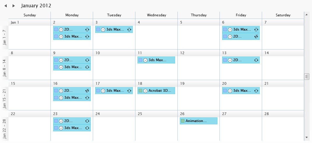
UXScheduleMonthView is one of built-in scheduling view controls designed specifically to display events in month layout. It shares common features as in UXScheduleView or other scheduling views such as UXScheduleDayView, UXScheduleWeekView and UXScheduleWorkWeekView. To learn more about the shared common features, see UXScheduleView Overview.

UXScheduleMonthView is inherited from UXScheduleViewBase which means that it shares common features with other scheduling controls such as UXScheduleDayView, UXScheduleWeekView and UXScheduleWorkWeekView. To learn more about the core features in UXScheduleMonthView, see UXScheduleView Overview.
UXScheduleMonthView is used to display data in month layout. You can customize the number of days that will be displayed in the month view by customizing the NumberOfDays property. The value must be larger than 14 and must be a multiplication of 7.
| NumberOfDays |
Copy Code
|
|---|---|
<Intersoft:UXScheduleMonthView DisplayDate="1/2/2012" NumberOfDays="28" EventsSource="{Binding Events}" CategoriesSource="{Binding Categories}" ResourcesSource="{Binding Resources}"/> |
|
Each row in UXScheduleMonthView represents a date week range. You can customize the first day of week for this date week range by modifying FirstDayOfWeek property.
| FirstDayOfWeek |
Copy Code
|
|---|---|
<Intersoft:UXScheduleMonthView DisplayDate="1/2/2012" NumberOfDays="28" FirstDayOfWeek="Tuesday" EventsSource="{Binding Events}" CategoriesSource="{Binding Categories}" ResourcesSource="{Binding Resources}"/> |
|
In each row, there is a row header that indicates the date range of the following week. You can change this indicator to a week number by setting the ShowWeekNumber property to true.
| NumberOfDays |
Copy Code
|
|---|---|
<Intersoft:UXScheduleMonthView DisplayDate="1/2/2012" NumberOfDays="28" ShowWeekNumber="True" EventsSource="{Binding Events}" CategoriesSource="{Binding Categories}" ResourcesSource="{Binding Resources}"/> |
|
Furthermore, you can also set the WeekNumberRule to determine how the week number should be calculated.
In addition to the customizable behaviors, UXScheduleMonthView is also packed with rich built-in UX features such as discussed in the following sections.
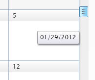
When the UXScheduleMonthView is scrolled vertically, you will notice a visual indicator of the date which you will scroll into. You can customize the format of the date by modifying the ScrollIndicatorFormat property.

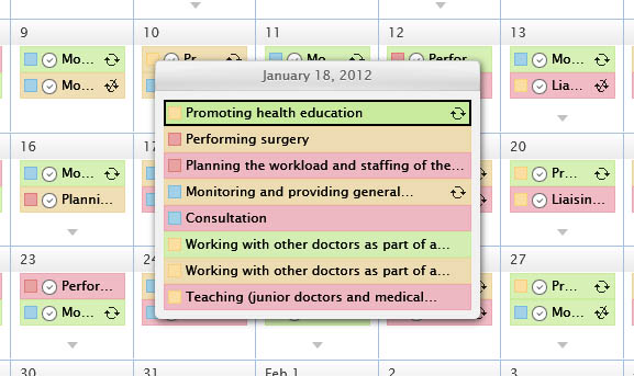
When there are too many events in a cell and the screen space is insufficient to render all events, an arrow button will appear which you can click to display all the events available in the particular cell. You can also press the Down arrow key to open the "more items" popup.

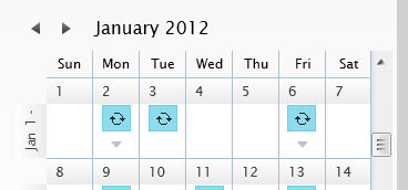
The header of each day cell in UXScheduleMonthView implements smart adjustment depending on the available width. It will check whether all header elements have enough space to display the full day of week text. If one or more headers do not have enough space, it will automatically use the short day of week text instead.


UXScheduleMonthView also implements sophisticated keyboard gesture that you can use to navigate cell and views, perform inline editing, navigating through events, and much more. The following table provides a list of keyboard gestures to perform an action based on certain conditions.
| Key | Action |
|---|---|
| Left Arrow Key | Move one cell to the left. If the current cell is the at the most left position of the current view, go up one row and select the cell at the most right position. |
| Right Arrow Key | Move one cell to the right. If the current cell is the at the most right position of the current view, go down one row and select the cell at the most left position. |
| Up Arrow Key | Move one cell upward. |
| Down Arrow Key | Move one cell downward. |
| Page Down | Scroll the view to the next view port and select the cell. |
| Page Up | Scroll the view to the previous view port and select the cell. |
| Any keys or enter key | Depending on the InsertKeyMode and whether the insertion is enabled, pressing any keys or enter key will create a new event in the current selected cells. If you press escape afterward it will select the previous cells. |
| Tab | Move to the next nearest event. |
| Shift + Tab | Move to the previous nearest event. |
 |
If the Shift modifier key is hold when navigating the cells using Left Arrow, Right Arrow, Up Arrow, Down Arrow, Page Up and Page Down; multiple cells will be selected starting from the current position to the target position. |
| Key | Action |
|---|---|
| Left Arrow Key | Select the cell positioned at the left of the event. |
| Right Arrow Key | Select the cell positioned at the left of the event. |
| Up Arrow Key | Select the cell positioned at the top of the event. |
| Down Arrow Key | Select the cell positioned at the bottom of the event. |
| Page Down | Scroll the view to the next view port. |
| Page Up | Scroll the view to the previous view. |
| F2 | Enter inline editing mode when editing event is enabled. |
| Tab | Move to the next nearest event. |
| Shift + Tab | Move to the previous nearest event. |
Whenever you select a cell using keyboard or mouse, or moving from one event to another event to an element that outside the view, UXScheduleMonthView will scroll directly to that element using the auto scroll feature.
You can customize the UXScheduleMonthView appearance through the following properties.
If you would like to completely customize the control appearance or if you want to change the styles of each visual state available in UXScheduleMonthView, you can edit the template of the control and do the modification accordingly.
To learn more how to change the template and the visual states, see Styles and Template Overview.