

| Intersoft ClientUI 8 > ClientUI Controls > Control Library > Scheduling Controls Overview > UXScheduleDayView |
UXScheduleDayView is one of the built-in scheduling controls available in the UXScheduleView control lineup. It is specifically designed to display data in day layout. It shares common features with UXScheduleView or other scheduling views such as UXScheduleWeekView, UXScheduleWorkWeekView and UXScheduleMonthView. To learn more about the shared core features, see UXScheduleView Overview.
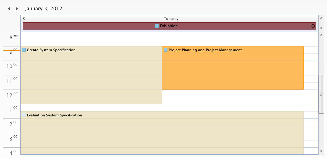
UXScheduleDayView is inherited from UXScheduleViewBase which means that it shares common core features with other scheduling controls such as UXScheduleWeekView, UXScheduleWorkWeekView and UXScheduleMonthView. To learn more about the core features in UXScheduleDayView, see UXScheduleView Overview.
UXScheduleDayView is used to display data in daily manner. Time-based events will be displayed in the time cell area while the all-day events will be displayed in the all-day event area located in the top section of the control. The UXScheduleDayView is completely customizable, you can customize many of its behaviors such as the number of days visible, work hours, visible hours, time interval and many more.
To customize the number of visible days in UXScheduleDayView, you set the NumberOfDays property such as shown in the code example below.
| NumberOfDays |
Copy Code
|
|---|---|
<Intersoft:UXScheduleDayView x:Name="SampleControl1" DisplayDate="1/2/2012" NumberOfDays="4" EventsSource="{Binding Events}" CategoriesSource="{Binding Categories}" ResourcesSource="{Binding Resources}"/> |
|
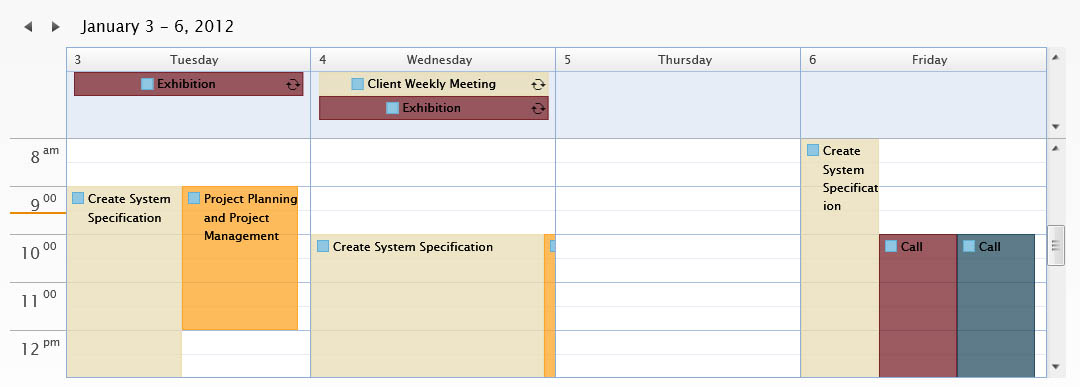
Another element that you can customize in UXScheduleDayView is the working hour. In UXScheduleDayView, the time cells that indicate working hours are shown in white background, while the non-working hours are shown in light blue background. You can customize the working hours by customizing the DayStartTime and DayEndTime properties. By default, the working hours start from 08:00:00 to 17:00:00.
| Work Hours |
Copy Code
|
|---|---|
<Intersoft:UXScheduleDayView DisplayDate="1/4/2012" DayStartTime="07:00:00" DayEndTime="19:00:00" EventsSource="{Binding Events}" CategoriesSource="{Binding Categories}" ResourcesSource="{Binding Resources}"/> |
|
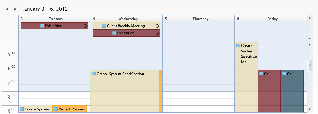
Furthermore, if you need to restrict the visible hours due to your application's requirements, you can easily customize the visible hours by simply customizing the VisibleStartTime and VisibleEndTime properties. By default, UXScheduleDayView will list all hours in a day.
| Visible Hours |
Copy Code
|
|---|---|
<Intersoft:UXScheduleDayView DisplayDate="1/4/2012" VisibleStartTime="06:00:00" VisibleEndTime="22:00:00" EventsSource="{Binding Events}" CategoriesSource="{Binding Categories}" ResourcesSource="{Binding Resources}"/> |
|
You can also change the time interval between hours in UXScheduleDayView by customizing the TimeInterval property. The time interval is recommended to be a rounded value when divided by an hour, for example:
If the specified value is not one of the values above, it will be automatically rounded to the nearest value for the best viewing experiences.
| Time Interval |
Copy Code
|
|---|---|
<Intersoft:UXScheduleDayView DisplayDate="1/2/2012" TimeInterval="00:15:00" EventsSource="{Binding Events}" CategoriesSource="{Binding Categories}" ResourcesSource="{Binding Resources}"/> |
|
The all-day event area is used to display all-day events in a common scheduling application. Whenever there are overlapping event, the height of all-day event area will grow until certain limit specified in the MaxAllDayEventItem property. Furthermore, you can also set the MinAllDayEventItem to determine the minimum height of the all-day event area.
In addition to the customizable behaviors, UXScheduleDayView is also packed with rich built-in UX features such as discussed in the following sections.
When you scroll the time cell area, you will notice that the am/pm time designator is smartly updated depending on the first visible time.
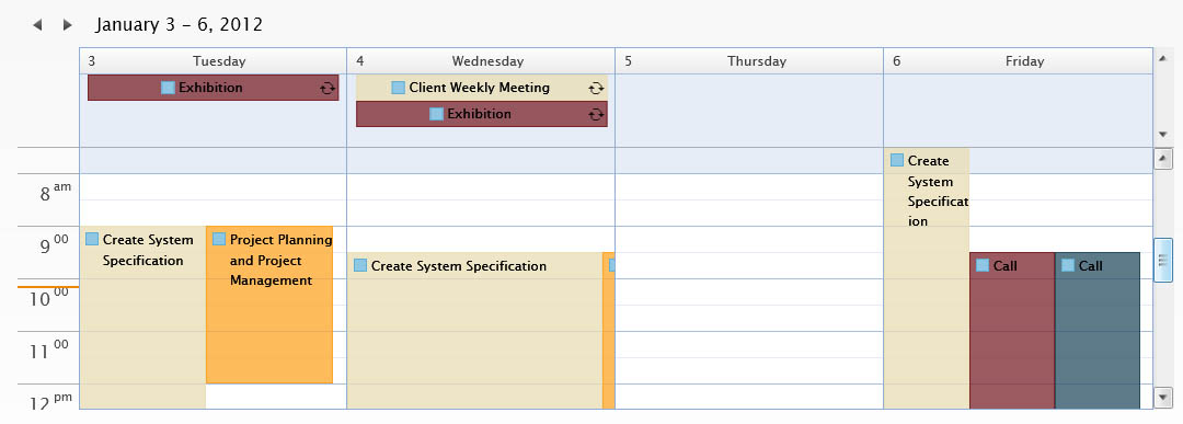
One of the impressive UX features in UXScheduleDayView is the current hour indicator element which indicates the current time in your local computer. The indicator is updated on minute interval, which is enabled by default. To disable this feature, you set the TodayHourLineVisibility to Collapsed, or IsTodayHighlighted to false.
The header of each day cell in UXScheduleDayView implements smart adjustment depending on the available width. It will check whether all header elements have enough space to display the full day of week text. If one or more headers do not have enough space, it will automatically use the short day of week text instead. If there are still one or more header elements that do not have enough space, it will collapse the day of week text and only display the date.
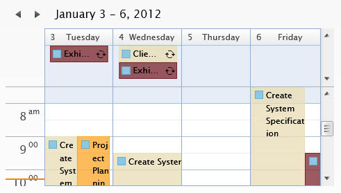
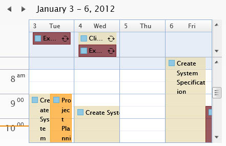
UXScheduleDayView also implements sophisticated keyboard gesture that you can use to navigate cell and views, perform inline editing, navigating through events. etc. The following table provide a list of keyboard gestures that you can perform based on certain conditions.
| Key | Action |
|---|---|
| Left Arrow Key | Move one cell to the left. If the current cell is the at the most left position of the current view, go to previous date of range and select the most right cell when the view is changed. |
| Right Arrow Key | Move one cell to the right. If the current cell is the at the most right position of the current view, go to next date of range depending and select the most left cell when the view is changed. |
| Up Arrow Key | Move one cell upward. If the current cell is at the top most position of the current view port, scroll the view to the previous cell and select that cell. If no more scrolling can be done select the all day event area. |
| Down Arrow Key | Move one cell downward. If the current cell is at the bottom most position of the current view port, scroll the view to the next cell and select that cell. |
| Page Down | Scroll the view to the next view port and select the cell. |
| Page Up | Scroll the view to the previous view port and select the cell. |
| Any keys or enter key | Depending on the InsertKeyMode and whether the insertion is enabled, pressing any keys or enter key will create a new event in the current selected cells. If you press escape afterward it will select the previous cells. |
| Tab | Move to the next nearest event. |
| Shift + Tab | Move to the previous nearest event. |
 |
If the Shift modifier key is hold when navigating the cells using Left Arrow, Right Arrow, Up Arrow, Down Arrow, Page Up and Page Down; multiple cells will be selected starting from the current position to the target position. |
| Key | Action |
|---|---|
| Left Arrow Key | Select the cell positioned at the left of the event's start date. |
| Right Arrow Key | Select the cell positioned at the left of the event's end date. |
| Up Arrow Key | Select the cell positioned at the top of the event's start date. |
| Down Arrow Key | Select the cell positioned at the bottom of the event's end date. |
| Page Down | Scroll the view to the next view port. |
| Page Up | Scroll the view to the previous view. |
| F2 | Enter inline editing mode when editing event is enabled. |
| Tab | Move to the next nearest event. |
| Shift + Tab | Move to the previous nearest event. |
Whenever your select a cell with keyboard or mouse, or moving from one event to another event to an element that is outside the view, UXScheduleDayView will scroll directly to that particular element using the auto scroll feature.
UXScheduleDayView implements a unique scrolling behavior. When you scroll the time-cell area or all-day event area, it will move one cell at a time or one event at a time which gives smooth scrolling experiences. In addition, the view is designed with state-of-the-art layout rendering which allows all rows to be displayed with pixel-perfect height thus eliminates the possibility of partial cell display.
You can customize the UXScheduleDayView appearance through the following properties.
If you would like to completely customize the control appearance or if you want to change the styles of each visual state available in UXScheduleDayView, you can edit the template of the control and do the modification accordingly.
To learn more how to change the template and the visual states, see Styles and Template Overview.