
| Intersoft ClientUI 8 > ClientUI Controls > Control Library > Advanced Input Controls Overview > UXDateTimePicker |
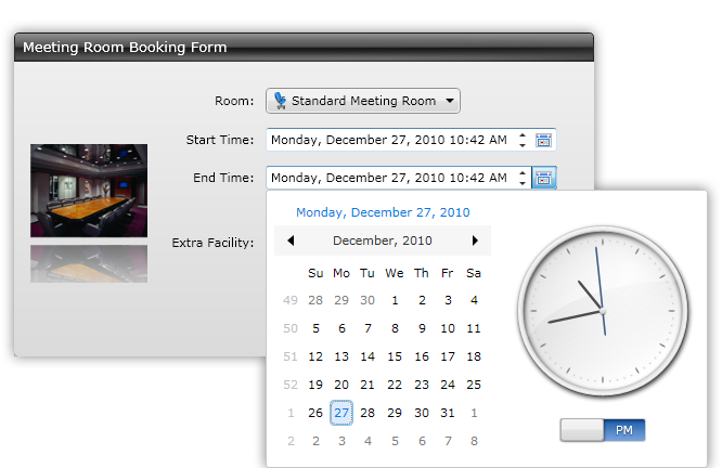
UXDateTimePicker is a powerful data entry control comprises of UXDateTimeUpDown, UXCalendar, and UXClock for precise date and time input. It sports a sleek, Aero-style theme with built-in sliding animation for the date time editor. UXDateTimePicker includes a host of configuration allowing you to flexibly customize the mode of the date time picker, for instance, showing both calendar and clock, calendar only, or clock only.

UXDateTimePicker is a control which combines several existing controls such as UXDateTimeUpDown, UXCalendar and UXClock. Consequently, these controls have similar characteristics as the control is used. To learn how to use the UXDateTimeUpDown, UXCalendar and UXClock control, see UXDateTimeUpDown, UXCalendar and UXClock respectively.
The following code shows how to create a simple UXDateTimePicker control.
| XAML |
Copy Code
|
|---|---|
<Grid> <Intersoft:UXDateTimePicker Height="22" /> </Grid> |
|
You can activate the popup using Enter key, or by clicking the dropdown button of the control. Using the date time picker is easy and straightforward, simply click on a date in the Calendar to select the desired date, and then dragging the hands in the Clock to change the time parts of the DateTime value. There are a number of ways to interact with the Clock control, such as using keyboard arrow keys, mouse wheel, or combination of keyboard and mouse gestures. For more information on the Clock user experiences, see UXClock Overview.
You can also set the IsDropDownOpen property to True in order to show the popup automatically. To close the popup, you can just click on the dropdown button, or press either the Escape or Enter key.
By default, the dropdown menu will be closed when you select a date in the calendar. When Both mode is used, you can make the user experience more intuitive by enabling the StaysOpen property. When this property is enabled, the dropdown menu will not be closed when a date is selected in calendar. This allows you to select both the date and time without reopening the dropdown menu. The dropdown menu can be closed when you click elsewhere in the page, or by pressing the Enter or Esc key.
UXDateTimePicker control has three editor mode: Both, Calendar and Clock. The default value is Both. When Both mode is used, it will display both calendar and clock control in the editor. To show only Calendar or Clock, you simply customize the EditorMode property to the desired mode.
UXDateTimePicker complies to ISO 9241 usability standards in regards of keyboard navigation and focus support. When the editor is displayed, triggered from either the keyboard or mouse, the logical focus will be automatically set to the first editable object, which is the Calendar control in Both mode. This allows you to use navigational arrow keys to select the date.
The following list describes the keyboard gestures supported in UXDateTimePicker.
UXDateTimePicker shares several common properties with UXPopup that controls the dropdown menu position. The following list describes the properties that controls the dropdown menu position.
UXDateTimePicker also has properties similar to UXPopup which controls the dropdown menu animation. The following list describes the properties that control the dropdown menu animation.
Although these properties allow you to control each visual effects individually, it is advised that you avoid mixing the animation for DisplayAnimation or HideAnimation. If you want to disable certain animation, you can set the DisplayAnimation or HideAnimation property to None.
If you would like to completely customize the control appearance or if you want to change the styles of each visual state, you can edit the template of the control and do the modification accordingly. To learn how to customize the template and visual states, see Styles and Template Overview.