
| Intersoft ClientUI 8 > ClientUI Controls > Control Library > UI Controls Overview > UXBusyIndicator |
UXBusyIndicator is a lightweight content control with built-in busy indicator display. It comes with a predefined, modern spinner-style loading indicator suitable for use in typical business applications.
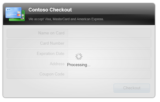
UXBusyIndicator includes a number of time-saving features that supports common busy indicator scenarios, such as using the control to block the existing content when busy, show an overlay, or hide the existing content.

UXBusyIndicator is inherited from ISContentControl, which means that it can contain a single object of any types, such as a string, an image, or a panel. For more information about content model, see Content Model Overview.
You use UXBusyIndicator control to provide an easy way to show a busy visual hint on top of the content when the application is in progress executing a long running task, such as retrieving data, logging in, or saving a record.
The UXBusyIndicator is designed as a content control, this means that you generally put the content inside the control, such as shown in the following example.
| XAML |
Copy Code
|
|---|---|
<Intersoft:UXBusyIndicator> <Intersoft:DockPanel Width="300" Height="200"> <TextBlock Text="Welcome to My Application" HorizontalAlignment="Center"/> </Intersoft:DockPanel> </Intersoft:UXBusyIndicator> |
|
UXBusyIndicator displays a busy visual hint when the control is busy, which is done by setting the IsBusy property to true. You can also easily add a custom content to the busy indicator, such as showing a "Loading..." text, or other content that suitable to your application's context.
The following example shows how to add a text to the busy content and set the busy mode in Button .Click event.
| XAML |
Copy Code
|
|---|---|
<Intersoft:UXBusyIndicator x:Name="BusyIndicator1" BusyContent="Signing in..."> <Intersoft:DockPanel Width="300" Height="200"> <TextBlock Text="Welcome to My Application" HorizontalAlignment="Center"/> <Intersoft:UXItemsControl Intersoft:DockPanel.IsFillElement="True" Width="300"> <Intersoft:FieldLabel> <Intersoft:UXTextBox Width="150"/> </Intersoft:FieldLabel> <Intersoft:FieldLabel Header="Password:"> <Intersoft:UXPasswordBox Width="150"> </Intersoft:FieldLabel> <Intersoft:FieldLabel Header=""> <Intersoft:UXButton Content="Login" Width="80" IsDefault="True" Click="UXButton_Click"/> </Intersoft:FieldLabel> </Intersoft:UXItemsControl> </Intersoft:DockPanel> </Intersoft:UXBusyIndicator> |
|
| C# |
Copy Code
|
|---|---|
private void UXButton_Click(object sender, RoutedEventArgs e) { this.BusyIndicator1.IsBusy = true; } |
|
The IsBusy property is a dependency property, which means that you can bind it to a property in the ViewModel using MVVM design pattern. This allows you to set the busy mode from the user interaction logic in the ViewModel, track the notification and give feedback as a response.
For more information on building Silverlight and WPF application with MVVM design pattern, see MVVM Pattern Overview.
In addition to customizing the busy content, there are several layout-related properties that you can configure such as the busy content placement position and the busy content margin. These properties provides an easy way for you to customize common settings without requiring control re-templating. By default, the busy content appears below the busy indicator, which is controlled through the BusyContentPlacement property, while the item spacing between the indicator and the content is controlled through the BusyContentMargin property.
One of the useful features in UXBusyIndicator is the ability to block the content from user interaction when the control is in busy state. This feature is enabled by default, which can be disabled by setting the BlockUIOnBusy property to false.
When enabled, UXBusyIndicator automatically disable the content and show an overlay on the top of the content which gives impression to users that the content cannot be accessed.
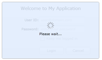
The overlay is set to a semi-transparent radial gradient background which is ideal for typical business applications. You can easily customize the background brush by setting the OverlayBackground property. In addition, you can provide more comprehensive styling to the overlay element by specifying a style to the OverlayStyle property.
The following illustration shows the UXBusyIndicator with a customized overlay background.

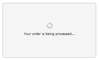
In addition to blocking the content, UXBusyIndicator also provides a feature to show only the busy indicator and hide the existing content. This mode is particularly useful in data sensitive scenarios such as in order submission or payment processing. You can enable this mode by setting the HideContentOnBusy property to true.
Although it is possible to enable both BlockUIOnBusy and HideContentOnBusy at the same time, you will need to set only one of the mode in most application scenarios.
The following illustration shows the UXBusyIndicator with the HideContentOnBusy property set to true.

In this mode, the content will show back when the value of the IsBusy property is set to false.
In many cases, data processing or application tasks may complete faster than expected. The performance varies on a number of factors such as hardware configuration, network speed, and more. In a good sense of user experience, you may want to display the busy indicator only after a certain timespan has ellapsed, for instance, after two seconds. This technique also reduces screen flickering which may occur when the busy indicator is displayed and then hidden in short timespan.
UXBusyIndicator introduces busy latency, a feature that allows you to set the timespan to wait before the busy indicator is displayed, when the IsBusy property changes to true. The default value for the busy latency is one second, which you can customize through the BusyLatency property.
The following example shows how to customize the timespan of the busy latency to two seconds.
| XAML |
Copy Code
|
|---|---|
<Intersoft:UXBusyIndicator BusyLatency="2"> <Intersoft:DockPanel Width="300" Height="200"> <TextBlock Text="Welcome to My Application" HorizontalAlignment="Center"/> </Intersoft:DockPanel> </Intersoft:UXBusyIndicator> |
|
UXBusyIndicator provides IsBusyChanged event which occurs when the IsBusy property changes. The IsBusyChanged is a routed event with bubbling strategy, which means that you can flexibly handling the event anywhere in the tree node. For more information on handling a routed event, see How to: Handle a Routed Event. For more information about routed event concept, see Routed Events Overview.
UXBusyIndicator includes a predefined busy indicator that shows a modern indeterminate spinner design. While this design suits to just any application types, you may often run into a scenario where you need to use other type of busy indicators, such as a progress bar.
You can easily completely replace the default busy indicator with your own custom indicator design by providing a custom data template to the BusyIndicatorTemplate property.
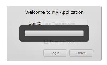
The following example shows how to customize the indicator template of the UXBusyIndicator control which uses a UXProgressBar to show an indeterminate progress.
| XAML |
Copy Code
|
|---|---|
<Grid x:Name="LayoutRoot"> <Grid.Resources> <DataTemplate x:Key="BusyIndicatorTemplate"> <Border Background="#B3000000" CornerRadius="8"> <Intersoft:UXProgressBar IsIndeterminate="True" Width="200" Height="20" Margin="18"/> </Border> </DataTemplate> </Grid.Resources> <Intersoft:UXBusyIndicator BusyIndicatorTemplate="{StaticResource BusyIndicatorTemplate}"> <Intersoft:DockPanel Width="300" Height="200"> <TextBlock Text="Welcome to My Application" HorizontalAlignment="Center"/> </Intersoft:DockPanel> </Intersoft:UXBusyIndicator> </Grid> |
|
The result looks like the illustration in the following.

You can easily customize the UXBusyIndicator appearance through the following properties.
If you would like to completely customize the control appearance or if you want to change the styles of each visual state, you can edit the template of the control and do the modification accordingly.
To learn more how to customize the template and visual states, see Styles and Template Overview.
For the list of ClientUI walkthroughs, see Walkthroughs and How-to Topics.
For the list of ClientUI samples available in local installation, see Locating the Samples in Local Installation.