


This topic contains the following sections:
- Introduction
- Define your own editing control
- Custom Editor Interfaces
- Attach your custom editor
- Deployment
- Tutorial
- Using NumericUpDown CustomEditor
- Using Calculator CustomEditor
- Using HTMLEditor CustomEditor
- Using SliderBar CustomEditor
Introduction
WebGrid introduced several built-in EditType to be used in conjunction with built-in cell editing feature. In WebGrid Enterprise, you would be surprised that we do not add much EditType but one - Custom. The new version is promised to let you use your favorite editing control and "hook" it up into WebGrid easily. This great and powerful feature will allow you to use virtually any types of controls as WebGrid's EditType, whether it is an ASP.NET Server Control or a DHTML Client Control.
The core architecture that made all of these possible - CustomEditor open architecture - is a set of client-side interfaces that need to be implemented by each custom editor in order for the interfacing with WebGrid.NET core editing architecture. These interfaces have been defined to be very flexible, extensible and modular. To give you an idea of how the interfaces work and correspond with built-in editing architecture, please see following chart:
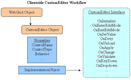
Developers can easily wrap their favorite editor into these interfaces and WebGrid will be able to properly interface with the editor functionality and call appropriate methods and events based on user's action. Moreover, in conjunction with OnTheFly architecture, the custom editor interface is written once and can be reusable in any numbers of columns, tables and even in different grids instance in same page. Developers don't have to worry about the dealing with custom editor object itself, such as dynamic object creation, object instantiated for each assigned column, and more. We have made it so that there are no additional interfaces or codes needed in server side, all of them are automatic such as hiding them on first page load and so on. The final release of WebGrid 4.0 is planned to include "Editors Pack 1" which contains 3 editors that are ready to use. Two of them will be a DHTMLClientControl and one will be ServerControl. These editors will give developers a quick start to learn and develop rich editors that can be "hooked" up into WebGrid that built on the top of OnTheFly architecture. The installed Custom Editors will not be visible in CustomEditors designer since it is packed and shouldn't be modified. These editors will be automatically visible in CustomEditorName dropdown designer in WebGridColumn property.
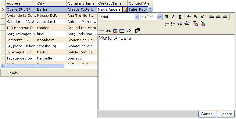
As seen in following screenshot, a sample of server-side customeditor implementation by using WebGrid's editor (RichTextBox) server control. Something that is never possible before is now possible with the new version of WebGrid, enabling even more advanced data and content management application - with even richer and more sophisticated user's experience - to be done in much less time and efforts than ever before.
With the power and great extensibility provided with the Customeditor open architecture specifically and WebGrid built-in editing in general, it is hopefully to open new market and opportunity to 3rd party vendors to develop their editing products to support WebGrid CustomEditor architecture or develop new products specifically targetting WebGrid.NET Enterprise in near future.
Define your own editing control
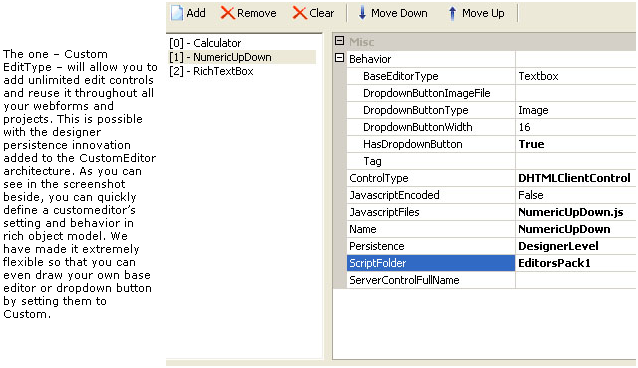
You can easily define your editing control and its behavior in the rich object model provided by WebGrid in designer. In Custom Editors node inside WebGrid.NET Designer, click Add to create new custom editor. A custom editor is made of following properties:
| Properties | Description |
| ControlType | The type of your custom editor. A Server Control or DHTML Client Control. Server Control means that the custom editor would require an instance of object in server side. DHTML Client Control doesn't require the custom editor to be instantiated in server side. |
| JavaScriptEncoded | Specifies whether the javascript files for this control is encoded. When set to True, the script will automatically rendered as "JScript.Encode". |
| JavaScriptFiles | The javascript files required by this control. Define multiple javascript files by using semi colon. Example: Object_Core.js; Object_UI.js. |
| Name | The name of the custom editor. The name must be unique through all collection regardless of whether it is installed custom editors or designer-persisted. |
| Persistence | Specifies how this custom editor should be persisted. Valid values are GridLevel and DesignerLevel. When GridLevel (default) is specified, the custom editor will be saved to the grid's instance and therefore will be applicable by that grid only and can't be seen in other grids. When DesignerLevel is specified, the custom editor definition will not be saved in the current webpage. Instead, it will be saved as a separate WCE file in a special CustomEditor folder. DesignerLevel's custom editors can be highly reusable and is visible throughout the entire project as well as in different projects. |
| ScriptFolder | Specifies the folder containing the scripts which should be accessible through IIS. By default, ScriptFolder is made on the top of grid's ScriptFolder. For example: Grid's ScriptFolder by default is /CommonLibrary/WebGrid/V3_5_5000/. In this case, the ScriptFolder for custom editor when set to Empty will point the scripts to /CommonLibrary/WebGrid/V3_5_5000/CustomEditors. If the ScriptFolder doesn't contain "/" character, the ScriptFolder will be made "relative" to the grid's [ScriptFolder]/CustomEditors. For example: ScriptFolder is set to "EditorsPack1", the result path would be "/CommonLibrary/WebGrid/V3_5_5000/CustomEditors/EditorsPack1". |
| ServerControlFullName | Specifies the server's control full name. This is required when the ControlType is ServerControl. The fully qualified assembly name should be : [AssemblyNamespace].[ClassName]. For example: ISNet.WebUI.WebCombo.WebCombo |
| Behavior: | |
| BaseEditorType | Defines the base editor type of the custom editor. Default is Textbox. Most of scenarios will use Textbox as the base editor control, such as NumericUpDown or Calculator. In this case, many of the base editing functionality is automatically handled by internal custom editor API. For more advanced scenarios, you can "draw" your own base editor type by setting this property to Custom. In that case, you would need to completely implement the GetBaseEditorElement interface and handle the base editor creation manually. |
| DropdownButtonImageFile | Specifies the dropdown button's image file. The image file should be located in the same folder as specified in ScriptFolder. |
| DropdownButtonType | Defines the dropdown button's type. The default button type is Image. You can set to Custom to build your own dropdown button and implement the GetDropdownButtonElement interface. |
| DropdownButtonWidth | Defines the width of dropdown button, if any. |
| HasDropdownButton | Determines whether the custom editor has dropdown behavior. |
| Tag | Specifies additional information about the custom editor. |
Custom Editor Interfaces
Custom Editor interfaces is a set of client side methods which definition have been made very modular for flexibility. These methods are all the required implementation for a custom editor. There are no server-side interfaces that need to be implemented even for "ServerControl" control type as they have all been taken care automatically in WebGrid's internal code. The custom editor interfaces implementation are vary depending on the complexity of a custom editor. For example, several advanced interfaces can be left unimplemented when the custom editor doesn't need the scenario. However, most of the interfaces are required implementation and should be fully implemented in order for the core Editing to communicate with them properly.
You usually write a custom editor interface in a JS format (JavaScript). For quick start, you can grab NumericUpdown.js that come with "Editors Pack 1". All three included custom editors have the source code fully documented, so you can quickly pick one of them as your base template and start your own custom editor development. Once you finished the custom editor interfaces, you can reuse it throughout all your projects by setting the Persistence to DesignerLevel!
Interfaces List
| Interface Name | Description |
| OnInitialize | Fired on WebGrid's initialization. Put codes to initialize custom editor's properties and create necessary objects here |
| OnUnload | Fired on WebGrid's unload. Put codes to clean up objects or resources here. |
| OnEnterEditMode | Fired when the control is entering edit mode. |
| OnSetValue | Fired when the control is about to be displayed during enter edit mode. The value of the editor need to be set to reflect current cell's text. |
| OnDirty | Fired when the editor's content is changed. |
| OnExitEditMode | Fired when the editor is about to exit edit mode. |
| OnApply | Fired when the changes in editor is applied/accepted. |
| OnCancel | Fired when user cancel the changes in editor, by pressing Escape in editor or entire row changes cancel. |
| OnValidate | Fired when the cell is about to exit edit mode. When the validation result is true, it will process to exit edit mode. |
| OnKeyDown | Fired when user type on keyboard (only for customeditor that has baseeditor). |
| OnDropdown | Fired when dropdown button is clicked. Automatically fired used when dropdown button type is Image, or F4 key is pressed |
| GetBaseEditorElement | Required method to get base editor element. |
| GetDropdownButtonElement | Required method to get dropdown button element. |
| GetDropdownObject | Required method to get dropdown list object. |
| IsDirty | Required method to get the IsDirty status of the editor. |
| GetText | Required method to get the content of the editor. |
| GetValue | Required method to get the value of the editor. Only useful when editor value is differ then content/text such as in Dropdownlist. |
| SetProperties | Required method to apply editor properties defined in Column's CustomEditorProperties. |
| ShouldProcessExitEditModeDefaultBehavior | Indicates whether default behavior of exit edit mode should be processed. This method is optional. |
| GetContentMode | Specifies the cell's content mode. This method is optional. |
Attach your custom editor
Once your custom editor is ready, you can test it directly in the WebGrid. Firstly, you go to WebGrid Designer, and select a column of RootTable. Next, you simply dropdown the CustomEditorName property and a list of available custom editors will appear. Your custom editor should appear as well. If your custom editor is a ServerControl type, you would also need to create an instance of the server control first into the design surface. Then select the server control's ID from the CustomEditorServerID dropdown.
Deployment
The script files and all supporting client files such as xml or image files should be available in the folder specified in ScriptFolder (see above). These files must be copied along with your application. By default, the CustomEditor scriptfolder is based on grid's ScriptFolder which default to centralized deployment concept "CommonLibrary". It is highly recommended that you use the "CommonLibrary" deployment concept so that you only need to remember one thing - "CommonLibrary" - then simply copying it to your production's server and map it to IIS.
To deploy the project using SmartWebResources, see Deploying project that uses SmartWebResources.
Tutorial
A tutorial to guide you applying custom editor is available in WG50Tutorial Solution. Check out the "CustomEditor.aspx" web form inside the Tutorial solution.
Using NumericUpDown CustomEditor
NumericUpDown custom editor is built-in installed with WebGrid and should be available in CustomEditorName dropdown. NumericUpDown is a DHTMLClientControl and it is very easy to apply it to a Column.
- Set the CustomEditorName in WebGrid Designer.
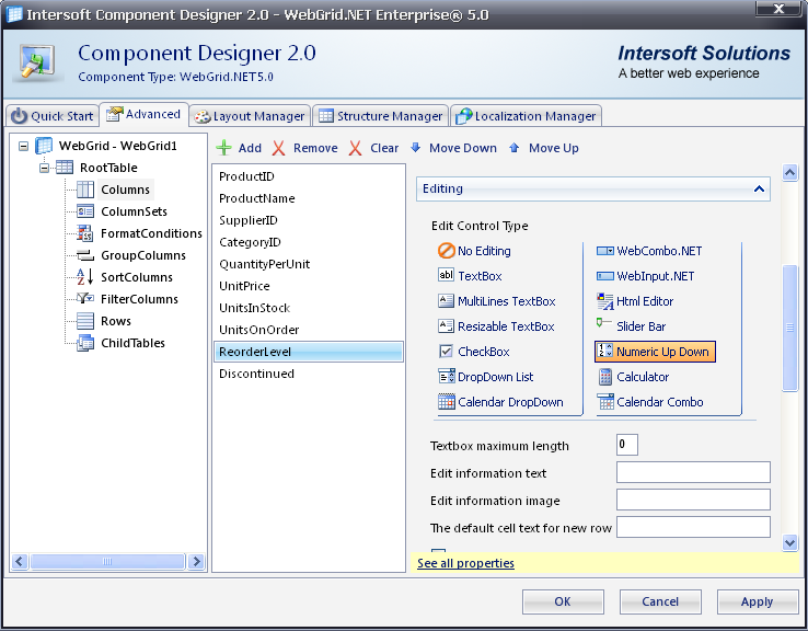
- Set the CustomEditorProperties. There are two properties available in NumericUpDown :
-
- MinValue: The minimal value allowed for the control. Data Type: Int. Default Value: 0.
- MaxValue: The maximal value allowed for the control. Data Type: Int. Default Value: 2147483647.
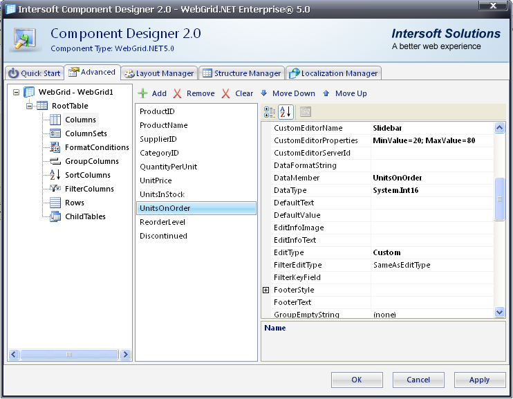
To enable validation for a NumericUpDown, simply set the properties in CustomEditorProperties. Separate each property with ; character. For example: MinValue=10;MaxValue=50. You could find CustomEditorProperties in WebGrid.NET Designer - Advanced tab - RootTable - Click See all properties.
Deployment
The EditorsPack1 folder inside ScriptFolder/CustomEditors (default is /CommonLibrary/WebGrid/V5_0_7200/CustomEditors) must be copied along with your application files to production server. The EditorsPack1 folder must be placed inside ScriptFolder/CustomEditors. The centralized deployment concept "CommonLibrary" allows you to easily deploy Intersoft's components along with your web applications by simply copying the "CommonLibrary" folder and map it to IIS.
To deploy the project using SmartWebResources™, see Deploying project that uses SmartWebResources.
Using Calculator CustomEditor
Calculator custom editor is built-in installed with WebGrid and should be available in CustomEditorName dropdown. Calculator is a DHTMLClientControl and it is very easy to apply it to a Column.
- Set the CustomEditorName in WebGrid Designer.
- Set the CustomEditorProperties.
Following is a list of properties available in Calculator.
- Mode (Combo / DropDown). Data Type: String. Default Value: Combo. Valid Values: Combo or Dropdown
- Font-Name. Data Type: String. Default Value: Verdana. Valid Values: HTML Style Font-Name value
- Font-Size. Data Type: String. Default Value: 8pt. Valid Values: HTML Style Font-Size value
- Font-Weight. Data Type: String. Default Value: normal. Valid Values: HTML Style Font-Weight value
- ForeColor. Data Type: String. Default Value: Empty String. Valid Values: HTML Style ForeColor value
- Width. Data Type: String. Default Value: 120. Valid Values: HTML object Width value
- Height. Data Type: String. Default Value: 120. Valid Values: HTML object Height value
- BackgroundColor. Data Type: String. Default Value: "#f5f5f5". Valid Values: HTML Style Color value
- BorderColor. Data Type: String. Default Value: darkgray. Valid Values: HTML Style Color value
- NumericHighLightColor. Data Type: String. Default Value: ""#dcdcdc". Valid Values: HTML Style Color value
- OperatorHighLightColor. Data Type: String. Default Value: "#a9a9a9". Valid Values: HTML Style Color value
You can change the mode and other appearance settings of Calculator, simply set the properties in CustomEditorProperties. Separate each property with ; character.
For example: Mode=Combo;Font-Name=Tahoma;Font-Size=10pt
Deployment
The EditorsPack1 folder inside ScriptFolder/CustomEditors (default is /CommonLibrary/WebGrid/V6_0_7200/CustomEditors) must be copied along with your application files to production server. The EditorsPack1 folder must be placed inside ScriptFolder/CustomEditors. The centralized deployment concept "CommonLibrary" allows you to easily deploy Intersoft's components along with your web applications by simply copying the "CommonLibrary" folder and map it to IIS.
To deploy the project using SmartWebResources, see Deploying project that uses SmartWebResources.
Using HTMLEditor CustomEditor
Using HtmlEditor
HtmlEditor custom editor is built into WebGrid and should be available in the CustomEditorName property's dropdown. HtmlEditor is a DHTMLClientControl and designed so it is easy to use.
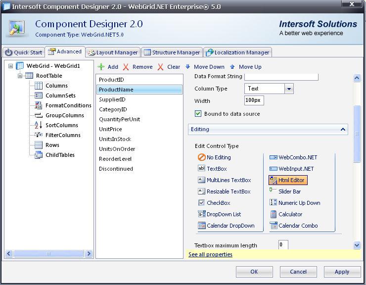
Setting a column to use HtmlEditor as its edit type
You can easily set a column of your table to use HtmlEditor as its edit type from the WebGrid Designer. Open the Designer and select the column you wish to apply. In the properties pane, select HtmlEditor from the dropdown of the CustomEditorName property. After the selection is accepted, the EditType value will automatically change to Custom. Click OK and the column will now be configured to use HtmlEditor as its edit type.
Editing text using HtmlEditor
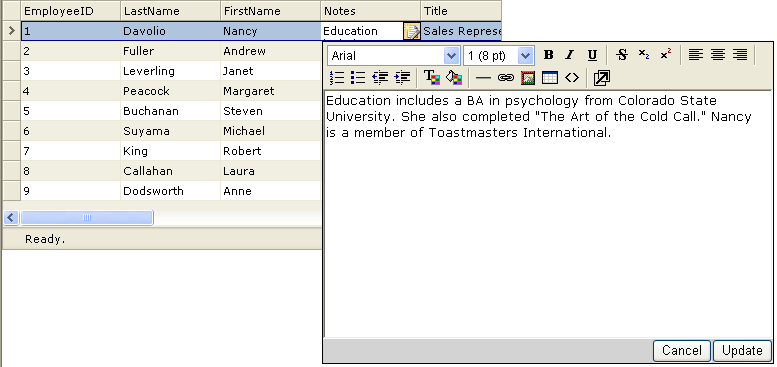
Using the editor to edit text is intuitive and requires no specific knowledge. For example, to apply bold style to a word, simply highlight the word and click the bold icon.
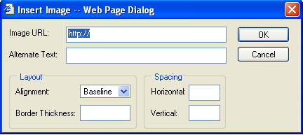
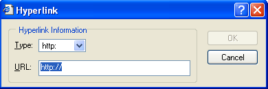
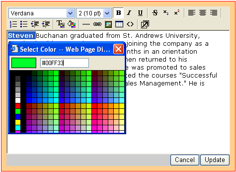
Inserting objects into the HTML text is done by filling the input fields of the respective popup windows:
- Insert image
- Insert hyperlink
- Color picker
The color picker will be shown when applying a color or highlight to the text.
Customizing HtmlEditor
HtmlEditor has its own folder -inside ScriptFolder/CustomEditors/EditorsPack2 (default folder is '/CommonLibrary/WebGrid/V6_0_7200/CustomEditors')- which is used to configure the layout of the control such as button icons and a number popup windows of the control.
You can customize many aspects of the HtmlEditor such as width, height, font names and sizes listed in the dropdowns, toolbar color, icons, etc.
To customize the HtmlEditor, first you need to create a .js file that will be used to store the configuration. The file should be put inside the '/CommonLibrary/WebGrid/V6_0_7200/CustomEditors' directory and named as editor_config.js. In the text file, create a new object that will be used to hold the configuration settings of the control. Then, you can set various properties to customize the control. Below is an example on how to customize the HtmlEditor control:
editor_config.js
| JavaScript |  Copy Code Copy Code |
|---|---|
/* save as: editor_config.js */ // create new config object to store the configuration. var config = new Object(); // set the desired width, height and body style config.width = "90%"; config.height = "200px"; config.bodyStyle = 'background-color: white; font-family: "Verdana"; font-size: x-small;'; config.debug = 0; // NOTE: You can remove any of these blocks (config.toolbar, config.fontnames, etc) // and then the default configuration will be used. config.toolbar = [ ['fontname'], ['fontsize'], ['fontstyle'], ['linebreak'], ['bold','italic','underline','separator'], // ['strikethrough','subscript','superscript','separator'], ['justifyleft','justifycenter','justifyright','separator'], ['OrderedList','UnOrderedList','Outdent','Indent','separator'], ['forecolor','backcolor','separator'], ['HorizontalRule','Createlink','InsertImage','htmlmode','separator'], ['about','help','popupeditor'], ]; config.fontnames = { "Arial": "arial, helvetica, sans-serif", "Courier New": "courier new, courier, mono", "Georgia": "Georgia, Times New Roman, Times, Serif", "Tahoma": "Tahoma, Arial, Helvetica, sans-serif", "Times New Roman": "times new roman, times, serif", "Verdana": "Verdana, Arial, Helvetica, sans-serif", "impact": "impact", "WingDings": "WingDings" }; config.fontsizes = { "1 (8 pt)": "1", "2 (10 pt)": "2", "3 (12 pt)": "3", "4 (14 pt)": "4", "5 (18 pt)": "5", "6 (24 pt)": "6", "7 (36 pt)": "7" }; // link a stylesheet to the config object. // config.stylesheet = "http://www.domain.com/sample.css"; config.fontstyles = [ { name: "headline", className: "headline", classStyle: "font-family: arial black, arial; font-size: 28px; letter-spacing: -2px;" }, { name: "arial red", className: "headline2", classStyle: "font-family: arial black, arial; font-size: 12px; letter-spacing: -2px; color:red" }, { name: "verdana blue", className: "headline4", classStyle: "font-family: verdana; font-size: 18px; letter-spacing: -2px; color:blue" } // you need to define a class somewhere (in a page or a stylesheet file) // and set its style if you leave the classStyle blank. { name: "verdana blue", className: "headline4", classStyle: "" } ]; |
|
Deployment
The EditorsPack1 folder inside ScriptFolder/CustomEditors (default is /CommonLibrary/WebGrid/V6_0_7200/CustomEditors) must be copied along with your application files to production server. The EditorsPack2 folder must be placed inside ScriptFolder/CustomEditors. The centralized deployment concept "CommonLibrary" allows you to easily deploy Intersoft's components along with your web applications by simply copying the "CommonLibrary" folder and map it to IIS as an application.
To deploy the project using SmartWebResources, see Deploying project that uses SmartWebResources.
Using SliderBar CustomEditor
Using SliderBar
SliderBar is a new custom editor control which is built into WebGrid Enterprise and should be available in CustomEditorName property's dropdown. SliderBar is a DHTMLClientControl and it is designed to allow users to conveniently input numeric values with rules such as maximum/minimum value, interval value, etc.
Navigating the SliderBar
SlideBar can be handled using mouse drags as well as keyboard navigation arrows (Up/Down arrow key for vertical SlideBar and Right/Left arrow key for horizontal SliderBar). Following is the list of keys that can also be used to navigate the slider:
- Home - move to MinValue
- End - move to MaxValue
- PgUp - move lower per IntervalLarge value. (not applied for smooth movement / Interval=0)
- PgDn - move higher per IntervalLarge value. (not applied for smooth movement / Interval=0)
Setting a column to use SliderBar as its edit type
You can easily set a column of your table to use SliderBar as its edit type from the WebGrid.NET Designer. Open the Designer and go to advanced tab - RootTable - click see all properties then select the column you wish to apply. In the properties pane, select SliderBar from the dropdown of the CustomEditorName property. After the selection is accepted, the EditType value will automatically change to Custom. Click OK and the column will now be configured to use SliderBar as its edit type.
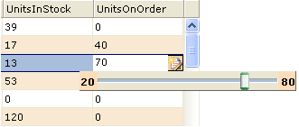
In CustomEditorProperties you can set the MinValue and MaxValue as shown in the picture below.
Customizing SliderBar
You can change the mode and other appearance settings of SliderBar by simply setting the properties in CustomEditorProperties. Specify the property you want to customize and provide the value, then separate each property with a semicolon ';'. For example: "Type=x;Interval=5;MaxValue=80;MinValue=20;Width=150;"
Note that you should input the line above (without quotes) as a string into the CustomEditorProperties property.
Following is the list of properties you can customize in SliderBar:
| Type |
Description Valid Value |
| Width |
Description |
| Height | Description Specifies the height (in pixel) of the SliderBar. ValueType integer Default Value - 20 ( for horizontal SliderBar ) - 200 ( for vertical SliderBar ) |
| SliderSize | Description Specifies the size (in pixel) of the slider. ValueType integer Default Value 10 |
| SliderImage | Description The path of the slider handle image. ValueType string Default Value - |
| MaxValue |
Description ValueType |
| MinValue |
Description ValueType |
| Interval |
Description ValueType Valid Value Any integer number that is less than (MaxValue - MinValue). Negative value is invalid. If set to 0, the slider movement would be per pixel (smooth movement, without snapping). |
| IntervalLarge |
Description ValueType Valid Value Any integer number that is less than (MaxValue-MinValue) and bigger than Interval value. (Negative value is invalid). |
| Value |
Description ValueType |
| TrackSize |
Description ValueType Valid Value Any integer number that is less than the value of the Height property (for horizontal SliderBar), or Width property (for vertical SliderBar). |
 See Also
Getting Started
Getting Started
Overview
WebGrid Features Overview
Other Resources
Walkthrough Topics
How-to Topics