WebGrid provides flexibility for developers to customize many aspects of the user interface elements. For instances, you can customize the context menu, displaying the row checker, showing verbose information during editing, show or hide filter status bar indicator, localizing text, freezing columns, and much more.
This topic contains the following sections:
- Context Menu
- Verbose Editing Info Text
- Row Checker
- Localization Manager
- Rich User Interface Elements
- Column Freezing
- Customizing Default Style
- Multiple Row Selection
- ButtonImage Column Type
- Predefined Visual Themes
- Column Action
- Section 508 Standards and Accessibility Support
- Text Settings
- XHTML and HTML5 Support
Context Menu
WebGrid introduces convenient context menus for column header, allowing user to perform column-related actions based on the column's context. In Enterprise edition, the context menu is applicable to all WebGrid's UI objects such as grouped column header in GroupByBox area, cell, row, grouped row and so on. The context menus selectively displays a list of actions which is valid in the current context of the object. For instance, the "Show child rows" menu will appear for hierarchical row or the "Expand" menu will appear when the grouped row is right-clicked. This allows end-users to perform actions in the way that they prefer by either using keyboard or mouse.
Following is screenshot of objects that has context menu applicable.
GroupColumn
Standard Cell/Row
Grouped Row
Row with Edit and Delete feature.
Edited New Row
Context Menu Customization
WebGrid is continually enhanced to meet your most demanding Web 2.0 applications. It now supports customization on all context menu elements such as header context menu and exporting context menu - giving developers the utmost flexibility to create rich user experiences required in today's business applications.
 |
The context menu can be customized through the new OnColumnContextMenu client-side event. For more information on the event arguments supplied in this event, please see New Client Events. |
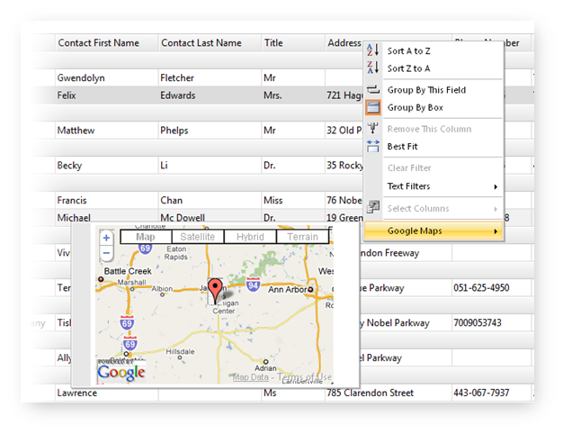
The following Javascript code shows how to add custom menu to the header context menu. It adds Google Map functionality when users right click on the Address column header.
| JavaScript |  Copy Code Copy Code |
|---|---|
function OnColumnContextMenu(controlId, column, menu, isGroup, location) { var grid = ISGetObject(controlId); var selectedObject = grid.GetSelectedObject(); var selectedRow = (selectedObject ? selectedObject.ToRowObject() : null); if (column.Name == "Address" && selectedRow != null && selectedRow.Type == "Record") { var mapsMenu = new WebMenuItem("maps", "Google Maps"); var templateMenu = new WebMenuItem("maps_canvas", ""); var address = selectedRow.GetCell(column.Name).Text; templateMenu.Type = "Template"; templateMenu.Enabled = false; if (googleMapInitialized && address != "") { mapsMenu.SubMenu.Items.Add(templateMenu); // add our new menu items to the header context menu menu.Items.Add(new WebMenuSeparatorItem()); menu.Items.Add(mapsMenu); ShowMapByAddress(address); } else { mapsMenu.Enabled = false; } } } |
|
Turn Off Animation in Context Menu
One of the best features in WebGrid is its rich user interaction. WebGrid includes rich context menu natively, so that users can choose from various commands that related to a specific object or context. By default, the context menu will be shown with fading animation for best user experience.
The following image shows the context menu on row object with AutoFilterSuggestion feature enabled.
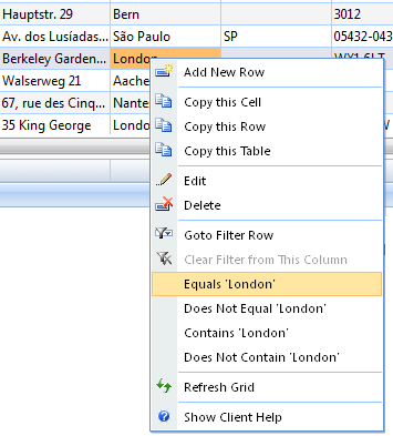
New to this version is the option to turn off animation in context menu. WebGrid now provides a property called ContextMenuAnimation inside the LayoutSettings property. You can set it to false value to turn off the animation in all WebGrid's context menu.
The following image illustrates the result of the sample which integrates Google Map into WebGrid's header context menu.
Verbose Editing Info Text
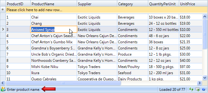
WebGrid comes with many enhancements related to editing feature. One of the most significant enhancements is the new verbose information text in editing mode. This new feature is useful to deliver intuitive editing experience for users as they can notice on important information related to a specific column in status bar area.
This new feature allows you to assign information text and image for each WebGridColumn. You can try to click on different cells in this sample and notice the verbose infotext in the status bar. When this feature is enabled, there are several automated behaviors:
- Column with EditType = NoEdit (read only) will have the status text and icon configured automatically.
- When EditInfoImage is provided, the image will appear in status bar.
- When a cell is being edited, the Edit Image will appear in status bar.
- When a cell is being edited or has been modified - and EditInfoText is not provided, the status text and image will be configured automatically.
- When the edit cursor is focused on cell which has been modified, the Edit Image indicator will appear in the status bar. This allows users to easily discover whether a cell has been modified or not.
- New user-friendly text and icon will be displayed after the successful add/edit/delete operation. For instance, the text Record is updated successfully will be displayed instead of Ready after successful update.
Row Checker
A significant improvement in WebGrid is column's IsRowChecker property, allowing you to create efficient multiple rows selection grid interface quickly. There are numerous automated behavior attached when working in this mode, such as select/deselect all checkbox in column header, application of CheckedRowStyle, batch multiple rows selection by pressing Shift key, and much more.
Behavior
When a column has its IsRowChecker property set to True, a few other properties will be automatically configured such as Width to 25px, ColumnType to Checkbox, SelectColumns To No and so on. The "select/deselect all" checkbox in Caption is automatically generated for IsRowChecker column. The code for the select/deselect all functionality has also been written internally and so you do not have to do anything else, just focus on your business logic. When you check a row and select another row, the checked row will have appeared in another style named "CheckedRowStyle". The CheckedRowStyle can be customized in designer and its purpose is to let users easily notice and read which rows have been checked. When not in Edit mode, you can press Spacebar to toggle the checkbox state of a row. Use Ctrl Spacebar when the table is editable.
Another useful behavior is its ability to perform "batch" selection or deselection by clicking on a checkbox for starting point, pressing Shift key afterwards and finally clicking on another check box far below or up from the starting point. All checkboxes between the starting point and the secondly clicked checkbox will be check marked. This made "multiple rows selection" is not only possible in today's high innovative web applications, but also improves the efficiency which results in more productivity.
Client APITo get checked rows in root table, you can use following syntax:
| JavaScript |  Copy Code Copy Code |
|---|---|
var grid = ISGetObject("WebGrid1"); var table = grid.RootTable; var checkedRows = table.GetCheckedRows(); alert(checkedRows.length); // return 4 for (var i=0; i<checkedrows.length; i++) alert(checkedRows[i].keyValue); |
|
Server API
You can easily retrieve checked rows in root table at server side by using:
| C# |  Copy Code Copy Code |
|---|---|
ArrayList checkedRows = WebGrid1.RootTable.GetCheckedRows(); |
|
Localization Manager
Localization Manager is a feature to help you configuring the language settings in WebGrid. In this new version, Localization Manager has been much improved with the adoption of clean and uncluttered user interface which results in better development experience and easier to use.
The improved Localization Manager also incorporates the new SmartWebResources™ feature in its user interface so that you can effortlessly configure resources and related language settings in one streamlined user interface. For more information, please read Localization Manager Overview.
Rich User Interface Elements
WebGrid is the most significant release since its initial debut. Version 5.0 includes many enhancements to Grid-specific functions, data binding and new features in User Interface.
WebGrid comes with new user interface such as new icon-sets, new context menu engine and styles, as well as new "Elegant" style. These new features help end users to interact with information better with a Grid which is not only powerful in functions, but appealing to eyes and experience as well.
The following screenshot captures the "First Experience" sample of WebGrid 5.0. The new visual appearance and interface redefines user experience while interacting with the control.
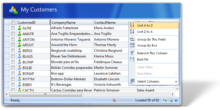
Some of the new features related to user interface are:
- Status bar group. The status text is now easier to be read with clear separation between each different function group.
- New theme and improved styles with smooth blue "Glass" appearance in Elegant style.
- New set of icons, such as new status bar icons and better loading indicator. All context menu items are also having new icons as well.
- User-friendly command messages based on data type. For instance, sorting text is now customized according to the data type. These new textual elements are included as localizable text (controlled by Localization feature).
- New RowHighlightType for more convenient editing experience.
- New high-performance context menu interface with smooth fading animation and shadow effect.
- Improved User Interface for Error Dialog Box.
- Visual indicator for action status and editing information in Status Bar.
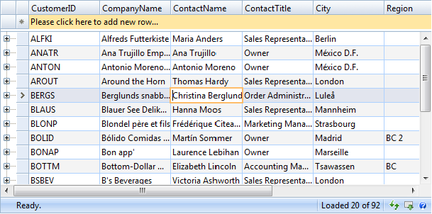
The following screenshot demonstrates the new "Elegant" style while operating in editing mode. Notice that cell border of selected row remains visible (new RowHighlightType) and larger edit cell for more convenience editing experience.
The following screenshot demonstrates the new "Elegant" style while operating in editing mode. Notice that cell border of selected row remains visible (new RowHighlightType) and larger edit cell for more convenience editing experience.
Column Freezing
WebGrid is the industry's first WebGrid that successfully implements Microsoft Excel style column freezing feature. In this new version, WebGrid introduces LiveFreeze™technology which enables users to "lively" perform column freezing and unfreezing in real-time without the need of postback or callback.
For more information, see Column Freezing overview.
Customizing Default Style
The DefaultStyle feature in WebGrid will significantly reduce page output size, especially if you have large number of WebGrid in a webform. We recommend you to enable the default style feature since it offers the following benefits:
- Clean control definition during development. This significantly improves loading time in the VS 2005 designer because unnecessary style objects do not need to be created.
- Best performance in server throughput. Using default style will significantly reduce server side processing because there is no need for serializing styles, validating and parsing the styles and finally generate the styles into css-based classes in the page output.
- When default style is enabled, in-line styles are no longer generated in the webpage. Instead, all WebGrid instances in the same webpage will share the same external stylesheet which significantly reducing output size.
- Reduced page output size up to 70 percent. Based on a research, more than 60 percent of web developers do not modify the styles of Intersoft’s controls in their web application.
For more information, read Customize Default Style overview.
Multiple Row Selection
WebGrid provides a feature that allows users to select multiple rows using checkbox. With this initial approach, checkbox will appear in every row in the Grid to allow users to check on the checkbox in order to select the row.
 |
In several scenarios, developers often want the ability to select multiple rows without using checkbox due to application design. WebGrid Enterprise in 2008 R2 release now allows you to perform multiple row selection by using the user-friendly Ctrl and Shift key combination. This feature allows you to simulate Windows-like interactivity and elegant design to select multiple rows without the need to use checkbox. |
IMPORTANT: Multiple Row Selection can't be used alongside with RowChecker feature, as both features will cause conflict and undesired effect to the selection result. You should enable only RowChecker feature (which used checkbox) or the new Multiple Row Selection feature at a time.
Keyboard combination supported in this new feature:
- Use Ctrl + Click to select any individual rows.
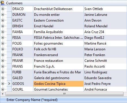
To select individual rows, hold down Ctrl key, and then click on the row to select it.
- Use Shift + Click to select a range of continuous rows.
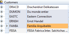
You can easily select a range of continuous rows by clicking on the start row, then hold down Shift key, and click on the destination ending row.
- Use Ctrl + Shift + Click to select a range of continuous rows without clearing previous selection.
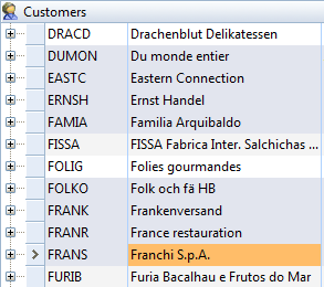
Use the combination of Ctrl and Shift key to select a range of continuous rows while preserving the previous selection.
 |
Thanks to the innovative architecture in WebGrid - you can enable this feature by simply setting the AllowMultipleSelection property to Yes value. This means you no longer require any workarounds or custom codes to enable this interactivity feature. |
Other enhancements related to Multiple Row Selection feature
The new Multiple Row Selection feature can be used in conjunction with many existing features. The bare-metal architecture of WebGrid allows a new feature to work flawlessly with other features, providing a great flexibility and options for developers to customize WebGrid's behaviors.
 |
When Multiple Row Selection is enabled, the row context menu will show a new command item to allow users to copy the selected rows to the clipboard. |
The following screenshot shows the Multiple Selection feature in a Grid with ColumnSet configuration.
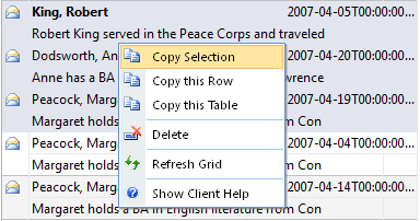
The new "Copy Selection" menu item will appear when you right click on the selection (any selected rows area).
The Copy Selection function is a handy way to copy selected information to other sources. For instance, you can copy the selection to clipboard, and paste them to Excel worksheet or Word document.
 |
By default, when AllowMultipleSelection property is set to Yes, all tables (WebGridTable) in the hierarchical configuration will apply the setting as well, thus allowing multiple selection on all tables. You can also disable the feature on individual table by setting the AllowMultipleSelection property of the desired table to No value. |
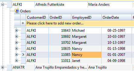
The Multiple Row Selection feature can be enabled only in Child Table, while disabled in Root Table.
ButtonImage Column Type
Due to popular demand, WebGrid now includes a new ButtonImage column type for handy button display with image. Although developers can use Template column type to specify any kind of contents such as <asp:Image>, it doesn't take advantage of WebGrid's postback mechanism and developers have to handle the events manually, which is time consuming.
The following screenshot shows a WebGrid using ButtonImage column type in the first column.
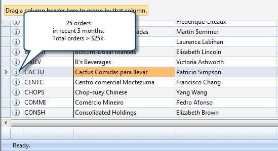
The ButtonImage column type takes advantage of existing architecture such as ButtonAutoPostback property and ButtonPostbackMode property. The ButtonClick client side event is invoked as well for ButtonImage column type.
The sample ButtonImage definition in WebGridColumn is as following:
| C# |  Copy Code Copy Code |
|---|---|
<ISWebGrid:WebGridColumn Width="25px" ColumnType="ButtonImage" ButtonImage="images/info.gif" ButtonAutoPostback="true"> </ISWebGrid:WebGridColumn> |
|
Predefined Visual Themes
Designed from the ground up by Intersoft artists, WebGrid 7 now is preloaded with three new dazzling visual themes: Windows 7, Glassy Black and Metallic Silver.
 |
Thanks to WebGrid's DefaultStyle - architecture, applying the new theme can be done as easy as one property set. The new themes are available as new options in DefaultStyleMode property in the WebGrid control. |
Each visual theme is designed with high quality graphics and balanced color scheme. In addition to the main WebGrid interface, the theme also covers all aspects of WebGrid user interface elements, including context menu, pivot charting interface, ribbon, buttons, status bar and more.
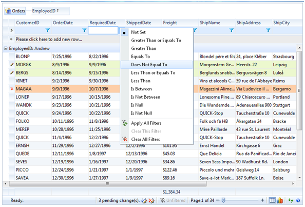
The following screenshots illustrate the design for each visual theme:
Windows 7
Grid View
Pivot Chart View
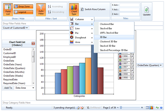
Black Theme
Grid View
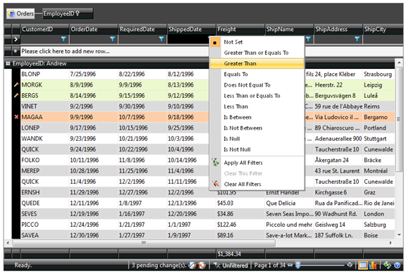
Pivot Chart View
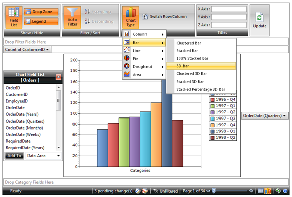
Silver Theme
Grid View
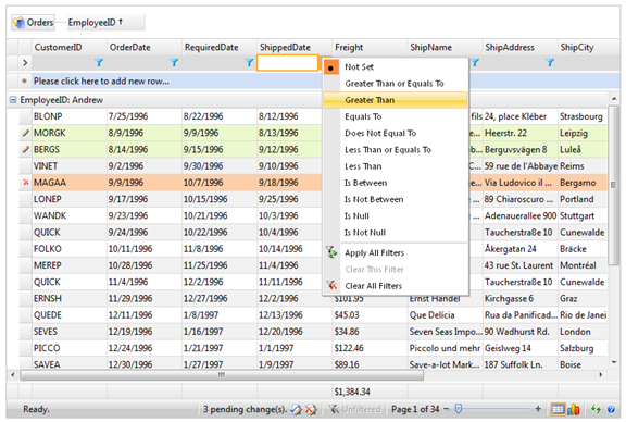
Pivot Chart View
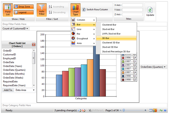
To set the theme in Webform, simply set the DefaultStyleMode property to the desired theme name in the WebGrid control. Alternatively, you can also set the theme in the design-time by using the enhanced WebGrid Designer.
Column Action
New in WebGrid 7 is Column Action, a new user interface feature to display contextual column actions through a visual hint that automatically appear when users hover on a column - making it even easier and faster for users to access column-related commands.
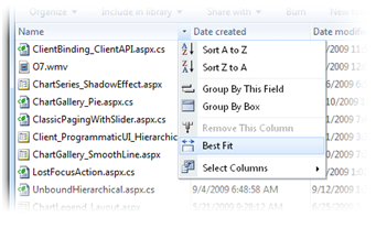
By default, the column action will show the column context menu which includes built-in commands such as sorting, grouping, column freezing, select columns or other column-related features that are currently enabled.
 |
In addition to the default behavior, WebGrid also supports column action customization to enable broader and more advanced scenarios, for instances, adding new commands or displaying predefined filter menu similar to Windows Explorer. The customization can be elegantly done by handling OnColumnAction client-side event. |
The following example shows how to show a custom context menu during column action.
ASPX
| C# |  Copy Code Copy Code |
|---|---|
<ISWebGrid:WebGrid ID="WebGrid1" runat="server"> <LayoutSettings> <ClientSideEvents OnColumnAction="OnColumnAction" /> </LayoutSettings> </ISWebGrid:WebGrid> |
|
Javascript
| JavaScript |  Copy Code Copy Code |
|---|---|
function OnColumnAction(controlId, column) { if (column.Name == "Modified") { var menu = ISGetObject("dateFilterMenu"); var grid = ISGetObject(controlId); var eventLocation = menu.GetEventLocation(); eventLocation.X -= 8; eventLocation.Y += 5; menu.Show(eventLocation); grid.ActionBoxShown = true; return false; // cancel default behavior } } |
|
The following screenshot illustrates a WebGrid sample that used Explorer-style predefined date filter as the column action.
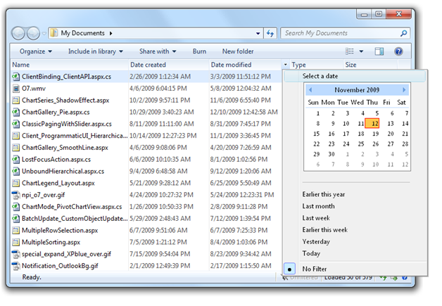
The column action is customized to display Windows Explorer style date filter menu
Section 508 Standards and Accessibility Support
WebGrid now fully implements the support for Section 508 Standards in the following provision:
- Provision 1194.22 - About Data Table Headers & Associations
- Row and column headers should be identified for data tables.
- Column headers should be in the same table structure as the table's contents (rows).
- Markup shall be used to associate data cells and header cells for data tables that have two or more logical levels of row or column headers.
- Objectives:
- Allows Web developers with their assistive technology to build solution using WebGrid.NET Enterprise for supporting people with visual disabilities.
- Allows users of screen readers to interpret table data efficiently.
Development notes and changes in WebGrid when this new feature is enabled:
- WebGrid renders column headers inside the content's table structure. The header and content structure is no longer separated.
- The fixed column header is no longer applicable. This means that when you scroll downward to the bottom, the column headers will follow as well.
- Column headers appearance and styles will still be rendered in the same fashion as in normal mode.
- Other type or headers such as filter row and new row is now rendered inside the content's table structure as well.
- Basic column operations are still supported in this accessibility mode, such as column moving, resizing, sorting, grouping and filtering.
- Working perfectly in conjunction with the following advanced features:
- User Interactions using keyboard, context menu, mouse selection, and drag drop.
- Virtual Load.
- Column Freezing.
- AutoFit Columns.
- All FlyPostBack actions such as refresh, grouping, load more data, etc.
- Hierarchical and Self Referencing modes are supported.
- Client side API is internally restructured, no public API changes is necessary. This means, your existing codes should run properly without any changes required.
- ColumnSet layout mode is not supported in this version.
Enabling Section 508 Standards in WebGrid
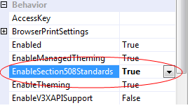
WebGrid makes it very easy for developers to enable Section 508 Standards mode in WebGrid instances. A new property at the WebGrid level has been added to take advantage of this mode.
 |
To enable Section 508 Standards mode in your WebGrid, simply locate the EnableSection508Standards property in Visual Studio property window, and set it to True. |
 |
While having significant changes in WebGrid's internal structures and APIs to support this new Accessibility mode, WebGrid is still fully compatible with all existing features such as column moving, grouping, resizing, filtering, sorting, context menu and the rest of advanced features. |
Using new properties for assistive technology requirement
WebGrid also exposes several new properties at the Column level to provide flexibility and customization for developers to build their own assistive technology, which connected into the WebGrid instance.
The new properties for WebGridColumn are listed in the following:
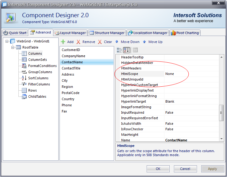
- HtmlScope
When specified, WebGrid will render the scope attribute to the column header. Valid values are None, Row, Col, RowGroup and ColGroup. - HtmlUniqueId
When specified, WebGrid will render the id attribute to the column header according to the value of this property. - HtmlHeaders
When specified, WebGrid will render the headers attribute to the column header according to the value of this property.
To access the new properties of WebGridColumn in design time, please do the following:
- Right click on the WebGrid instance.
- Choose WebGrid.NET Designer.
- Click on Advanced tab.
- Expand WebGrid, RootTable, and choose Columns.
- Select a column.
- Click "See all properties" in the right panel containing properties. Please refer to the following screenshot for more details.
Text Settings
To match the flexibility of WebGrid's XML Localization Manager, we have completely removed the property-based TextSettings such as Refresh, RefreshAll etc. As replacement, grid-level TextSettings can be customized in WebGrid Designer under Text Settings node as you can see in the screenshot below. You can add variety of TextItem to be customized by simply clicking on Add button and select a TextItem by selecting it from dropdown designer.
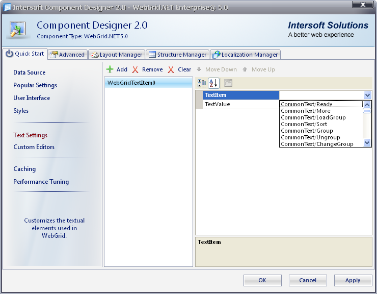
The grid-level TextSettings customization is the lowest level which will override the definition in default xml language file as well as custom defined language file. This provides flexibility to developers who wanted to customize specific TextItem that applicable to a grid instance only. Note that all properties in TextSettings should be removed in order for the new grid to work properly.
XHTML and HTML5 Support
WebGrid continues to deliver constant improvement to support Web standards such as HTML5. The latest release now supports pixel-perfect rendering when operating in HTML5 document type.
For more information about HTML5 support, see What's New in WebGrid 8.
The supported browsers for HTML5 document type are:
- Internet Explorer 9 Standards mode
- Firefox 7+
- Safari 5+
- Opera 11+
- Other Gecko or Webkit variants
Getting Started
Getting Started
Overview
WebGrid Features Overview
Other Resources
Walkthrough Topics
How-to Topics


