
| Intersoft ClientUI 8 > ClientUI Controls > Control Library > Advanced Input Controls Overview > UXRating |
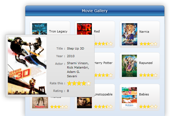
UXRating is a lightweight input control that allows you to easily input a rating value using the provided user interaction. You can determine how many items to be displayed, the precision mode and also the minimum and maximum value for the rating input.

UXRating is an ItemsControl providing an ItemCount property to conveniently add instances of UXRatingItem to the Items collection. You can also specify your own item without using ItemCount by specifying the custom values in the Items property. In the case that Items property is specified, the ItemCount property will be ignored. You can customize the minimum and maximum value through the Minimum and Maximum property respectively.
The following code shows how to create a simple UXRating.
| XAML |
Copy Code
|
|---|---|
<Grid> <Intersoft:UXRating ItemCount="5" Width="200" Height="50" /> </Grid> |
|
The UXRating control has two SelectionMode: Continuous and Single. In Continuous mode (the default), the control behaves the way most star-based rating controls does, which fill the first two stars and the selected rating item.
The following code shows how to set the selection mode to Continuous.
| XAML |
Copy Code
|
|---|---|
<Grid> <Intersoft:UXRating Width="200" Height="50" SelectionMode="Continuous" /> </Grid> |
|

In Single mode, only one star will be filled, which represents the selected rating item.
The following code shows how to set the selection mode to single.
| XAML |
Copy Code
|
|---|---|
<Grid> <Intersoft:UXRating Width="200" Height="50" SelectionMode="Single" /> </Grid> |
|

By default, precision mode for this control is set to Full. This control has three PrecisionMode: Full, Half and Precision. This mode can be activated only when selection is set to Continuous mode. In Full mode (the default), the control behaves the way most star-based rating controls does, which fill the first two stars and the selected rating item.

In Half mode, the star can be filled by half.

In Precision mode, you can set the PrecisionInterval property to do increment for rating value using keyboard navigation key, or you can just move your mouse to select the precision value.

You can also specify the orientation of UXRating to Horizontal or Vertical using Orientation property. In a horizontal rating, the increasing value starts from left to right. In a vertical rating, the increasing value starts from top to bottom.
The following code shows how to set the rating orientation.
| XAML |
Copy Code
|
|---|---|
<Grid> <Intersoft:UXRating Width="200" Height="50" Orientation="Horizontal" /> </Grid> |
|

You can also set IsDirectionReversed property to reverse the direction of the increasing value. If IsDirectionReversed property is set to True, the increasing value will start from right to left in a horizontal rating, or from bottom to top in a vertical rating.
This following illustration shows the rating display when the IsDirectionReversed property is set to True in horizontal orientation.

By default, UXRating tooltip is always visible. To hide the tooltip, you set the ToolTipVisibility property to Collapsed. You can also create your own tooltip in UXRatingItem by specifying the tooltip service through XAML markup declaration.
UXRating is built around the commanding semantics which allows the value changing interaction to be executed through declarative definition in the XAML markup. The commanding semantics is also an ideal approach for MVVM pattern development.
UXRating already includes several predefined commands to change the selected value that you can use in your application.
Gets a command that increases the value of the UXRating.
Increase command will be invoked when you perform the following action:
Gets a command that decreases the value of the UXRating.
Decrease command will be invoked when you perform the following action:
Gets a command that sets the value of UXRating to the value of Minimum property.
Minimize command will be invoked when you press the Home keyboard key.
Gets a command that sets the value of UXRating to the value of Maximum property.
Maximize command will be invoked when you press the End keyboard key.
Although these commands are already registered in the elements of UXRating, you can still register these commands to other UIElement outside UXRating scope. For example, you can have a UXButton that performs Increase command. For more information on how to register UXRating commands to other type of UIElement, see How-to: Register UXRating Command to UXButton.
You can easily customize the UXRating appearance through the following properties.