
| Intersoft ClientUI 8 > ClientUI Controls > Control Library > Editor Controls Overview > UXPropertyGrid |
UXPropertyGrid is an advanced editor control which provides an easy way to dynamically handle a vary types of objects instead of writing a custom view for each type. Designed to display a large number of properties, UXPropertyGrid implements VirtualizingStackPanel to solve the performance issue which may occur when dealing with large objects. UXPropertyGrid also comes with customizable editors which makes it possible to fit in various user specific scenarios. To improve its performance, UXPropertyGrid also will reuse the existing editors for different properties that use the same editor type to avoid object creation overhead.
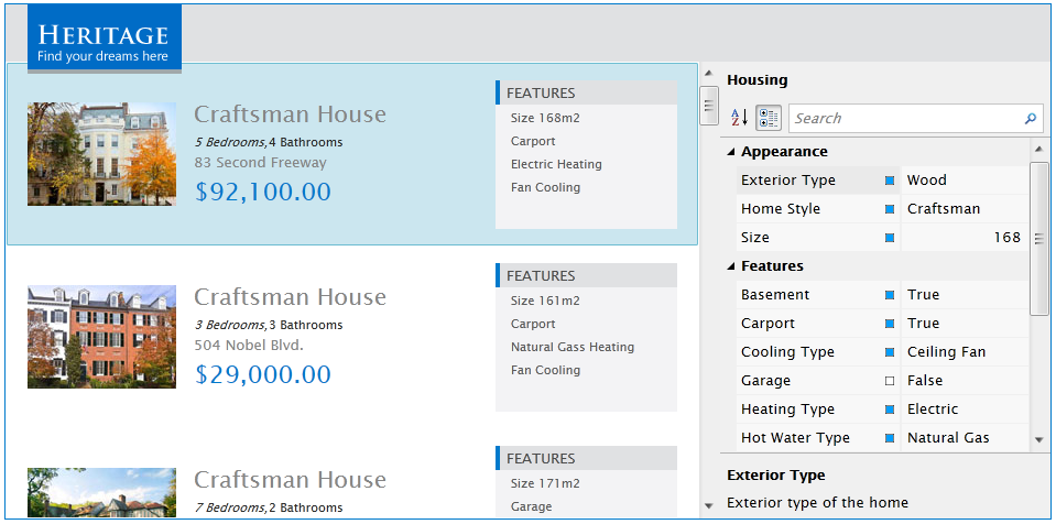
It's easy to use UXPropertyGrid control, you just need to provide the object's information and UXPropertyGrid will automatically generate and display the object properties in UXPropertyGrid. At runtime, the properties can be switched to be displayed in alphabetical or in a categorized mode. UXPropertyGrid also provide the capability to filter properties by performing query through the built-in search box.
The following shows how properties is displayed in alphabetical and categorized mode.
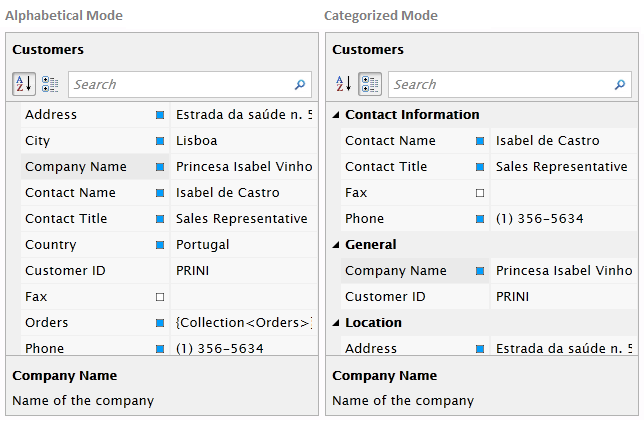
To ensure UXPropertyGrid works properly, you need to specify the target object to be displayed in the control. UXPropertyGrid has provided some approaches to define the target object.
To display a single object in UXPropertyGrid, you use the SelectedObject property. Simply you only need to bind the object to UXPropertyGrid and it will do the rest.
| XAML |
Copy Code
|
|---|---|
<Intersoft:UXPropertyGrid SelectedObject="{Binding SelectedObject}"/> |
|
UXPropertyGrid allows you to bind a collection of objects into SelectedObjects property. The objects can be in the same type or in a different type. Of course, UXPropertyGrid only will display the intersecting properties from each objects.
| XAML |
Copy Code
|
|---|---|
<Intersoft:UXPropertyGrid SelectedObjects="{Binding SelectedObjects}"/> |
|
UXPropertyGrid also allows you to directly provide the property definition of properties you would like to show, so UXPropertyGrid doesn't need to generate the given object's properties. The following example shows how to use PropertiesSource in UXPropertyGrid.
| XAML |
Copy Code
|
|---|---|
<Intersoft:UXPropertyGrid PropertiesSource="{Binding PropertiesSource}"/> |
|
| C# |
Copy Code
|
|---|---|
public class PropertiesSourceViewModel : ViewModelBase { private IEnumerable _propertiesSource; public IEnumerable PropertiesSource { get { return _propertiesSource; } set { if (_propertiesSource != value) { _propertiesSource = value; OnPropertyChanged("PropertiesSource"); } } } public PropertiesSourceViewModel() { this.InitializePropertiesSource(); } private void InitializePropertiesSource() { ObservableCollection<PropertyGridDefinition> propertiesSource = new ObservableCollection<PropertyGridDefinition>(); propertiesSource.Add(new PropertyGridDefinition() { Category = "Book Information", Name = "Title", Type = typeof(string), Display = "Title", SortOrder = 5, Value = "Silverlight/WPF Pro", Description = "Book's title" }); propertiesSource.Add(new PropertyGridDefinition() { Category = "Book Information", Name = "Edition", Type = typeof(byte), Display = "Edition", SortOrder = 4, Value = 5, Description = "Book's edition", DefaultValue = 5 }); propertiesSource.Add(new PropertyGridDefinition() { Category = "Book Information", Name = "Genre", Type = typeof(string), Display = "Genre", SortOrder = 3, Value = "Software Development", Description = "Book's genre" }); propertiesSource.Add(new PropertyGridDefinition() { Category = "Book Information", Name = "Language", Type = typeof(string), Display = "Language", SortOrder = 2, Value = "English", Description = "Book's language" }); propertiesSource.Add(new PropertyGridDefinition() { Category = "Book Information", Name = "Author", Type = typeof(string), Display = "Author", SortOrder = 1, Value = "John Doe", Description = "Book's author" }); propertiesSource.Add(new PropertyGridDefinition() { Category = "Details", Name = "PublishDate", Type = typeof(DateTime), Display = "Publish Date", SortOrder = 5, Value = DateTime.Now, Description = "Book's publish date" }); propertiesSource.Add(new PropertyGridDefinition() { Category = "Details", Name = "Publisher", Type = typeof(string), Display = "Publisher", SortOrder = 4, Value = "ABC Publishing", Description = "Book's publisher" }); propertiesSource.Add(new PropertyGridDefinition() { Category = "Details", Name = "ISBN", Type = typeof(string), Display = "ISBN", SortOrder = 3, Value = "2343-1667-8763", Description = "Book's ISBN" }); propertiesSource.Add(new PropertyGridDefinition() { Category = "Details", Name = "Pages", Type = typeof(short), Display = "Pages", SortOrder = 2, Value = 265, Description = "Total pages of the book" }); propertiesSource.Add(new PropertyGridDefinition() { Category = "Details", Name = "Price", Type = typeof(double), Display = "Price", SortOrder = 1, Value = 108.34, StringFormat = "C2", Description = "Book's price" }); propertiesSource.Add(new PropertyGridDefinition() { Category = "Dimensions", Name = "Width", Type = typeof(short), Display = "Width", SortOrder = 3, Value = 520, Description = "Book's width" }); propertiesSource.Add(new PropertyGridDefinition() { Category = "Dimensions", Name = "Height", Type = typeof(short), Display = "Height", SortOrder = 2, Value = 860, Description = "Book's height" }); propertiesSource.Add(new PropertyGridDefinition() { Category = "Dimensions", Name = "Depth", Type = typeof(short), Display = "Depth", SortOrder = 1, Value = 52, Description = "Book's depth" }); this.PropertiesSource = propertiesSource; } } |
|
In general, there are three ways to define how UXPropertyGrid generate the object's properties. You can have UXPropertyGrid generating all properties or restrict only specific properties to be displayed, which can be set through PropertyListMode property. There are three mode that you can choose.
PropertyMember attribute have several member that can be used to customize the displayed properties, such as:
The following example shows how to decorate property with PropertyMember attribute.
| C# |
Copy Code
|
|---|---|
[PropertyMember(DisplayName = "Product Name", Category = "General", Description = "Name of the product", DefaultValue = "Product 1")] public string ProductName { get; set; } |
|
To exclude a property from being displayed in UXPropertyGrid, you can utilize IgnorePropertyMember attribute.
| C# |
Copy Code
|
|---|---|
[IgnorePropertyMember] public string PhotoPath { get; set; } |
|
 |
In some cases, if you cannot directly decorate the property with the above attributes, you can add associated metadata class, PropertyMemberMetadata, in your derived or partial class. In the metadata class, you need to create a property whose name corresponds to the property that you want to decorate and apply the attribute to it. |
By default, UXPropertyGrid will regenerate the properties when the given objects is changed. This will cause performance issue if the number of properties which need to be generated is relatively large. When the caching feature is enabled, UXPropertyGrid only will generate properties for each object type once to achieve a better performance and more responsive results. To enable this feature, simply set EnableCaching property to True.
UXPropertyGrid provides several ways to customize the displayed property value.
UXPropertyGrid allows you to format the displayed property value using StringFormat, which is exposed by PropertyMember attribute. If not specified, the property value will be displayed using the default format (ToString). The following code shows how to specify StringFormat in PropertyMember attribute.
| C# |
Copy Code
|
|---|---|
[PropertyMember(StringFormat = "C2")] public decimal UnitPrice { get; set; } |
|
UXPropertyGrid provides a capability to customize the displayed property value via DataListProvider. Each data list provider must be inherited from EditorDataProvider class. EditorDataProvider exposes some unimplemented methods, which allow you to implement your own logic to provide the displayed data. To use this feature, you need to decorate your property with DataListProvider attribute. You also need to pass the data list provider into this attribute, either using strongly-typed or weakly-typed overload.
The following code shows how to specify DataListProvider using strongly-typed.
| C# |
Copy Code
|
|---|---|
[DataListProvider(typeof(Intersoft.ClientUI.Samples.Editors.DataListProvider.CategoryDataListProvider))] public int CategoryID { get; set; } |
|
The following code shows how to specify DataListProvider using weakly-typed. Make sure that the type name is fully qualified when using the weakly-typed overload.
| C# |
Copy Code
|
|---|---|
[DataListProvider("Intersoft.ClientUI.Samples.Editors.DataListProvider.CategoryDataListProvider")] public int CategoryID { get; set; } |
|
By default, the provide data operation will be executed in synchronous way. But in some cases, suppose you need to perform a long running process, you will need to run it asynchronously to give a better experience for the user. To run it asynchronously, set the IsAsync property to True.
Synchronous
To perform a synchronous operation, you must implement GetSingle method to provide the new data that will be displayed. A property definition will be passed to this method as a parameter.
| C# |
Copy Code
|
|---|---|
private ObservableCollection<Category> Categories { get; set; } public override object GetSingle(object item) { PropertyGridDefinition propertyDefinition = item as PropertyGridDefinition; int categoryID = 0; if (propertyDefinition != null && propertyDefinition.Value != null) categoryID = (int)propertyDefinition.Value; return this.Categories.Where(p => p.CategoryID == categoryID).FirstOrDefault(); } |
|
To learn more about synchronous DataListProvider, you can refer to How To Implement Synchronous DataListProvider in UXPropertyGrid.
Asynchronous
To perform an asynchronous operation, you must implement BeginSingleAsync method. After the asynchronous operation is completed, you need to notify it by calling EndGetSingleAsync method and passing the new data that will be displayed.
| C# |
Copy Code
|
|---|---|
private NorthwindEntities DataManager { get; set; } public override void BeginSingleAsync(Guid token, object item) { if (this.DataManager != null) { PropertyGridDefinition propertyDefinition = item as PropertyGridDefinition; int categoryID = 0; if (propertyDefinition != null && propertyDefinition.Value != null) categoryID = (int)propertyDefinition.Value; var query = this.DataManager.Employees.Where(p => p.CategoryID == categoryID); this.DataManager.ExecuteQueryAsync(query, op => { if (op.CompletedSuccessfully) this.EndGetSingleAsync(token, op.Results.FirstOrDefault()); }); } } |
|
To learn more about asynchronous DataListProvider, you can refer to How To Implement Asynchronous DataListProvider in UXPropertyGrid.
To support a variety of user scenarios, UXPropertyGrid comes with eight built-in editors as follows.
Default editor is defined to use UXTextBox control to host the property value. All properties with string type and the others which is not applicable with the other editor types, will be defined to use this editor type. To customize the default editor's appearance, you can use DefaultEditorStyle and DefaultEditorTemplate property.
Numeric editor is defined to use UXCurrencyEditor control to host the property value. All numeric properties will use this editor type. To customize the numeric editor's appearance, you can use NumericEditorStyle and NumericEditorTemplate property.
DateTime editor is defined to use UXDateTimePicker control to host the property value. All datetime properties will use this editor type. To customize the datetime editor's appearance, you can use DateTimeEditorStyle and DateTimeEditorTemplate property.
All boolean properties will be use boolean editor. By default, this editor type is defined to use UXComboBox control, enables it to perform selection between True and False. To customize the boolean editor's appearance, you can use BooleanEditorStyle and BooleanEditorTemplate property.
Enum editor will be used by all enum properties. Same as boolean editor, enum editor also use UXComboBox control to host the enum values. To customize the enum editor's appearance, you can use EnumEditorStyle and EnumEditorTemplate property.
Items editor will be used if the property is specified to use DataListProvider. Of course, items editor will use UXComboBox control to serve the data. To provide the data, you need to use DataListProvider, which is not only used to customize the displayed property value. Same with the one which has been explained in previous section, you need to decide whether will use synchronous or asynchronous operation.
Synchronous
To perform a synchronous operation, you need to implement GetData method to provide the data.
| C# |
Copy Code
|
|---|---|
private ObservableCollection<Category> Categories { get; set; } public override IEnumerable GetData() { return this.Categories; } |
|
Asynchronous
To perform an asynchronous operation, you need to implement BeginGetDataAsync method. After the asynchronous operation is completed, you need to notify it by calling EndGetDataAsync method and passing the retrieved data to it.
| C# |
Copy Code
|
|---|---|
private NorthwindEntities DataManager { get; set; } public override void BeginGetDataAsync(Guid token) { if (this.DataManager != null) { var query = this.DataManager.Categories; this.DataManager.ExecuteQueryAsync(query, op => { if (op.CompletedSuccessfully) this.EndGetDataAsync(token, op.Results); }); } } |
|
Besides that, you also need to specify DisplayMemberPath and SelectedValuePath for the items editor. To customize the items editor's appearance, you can use ItemsEditorStyle and ItemsEditorTemplate property. To learn more about DataListProvider, you can refer to How To Implement Synchronous DataListProvider in UXPropertyGrid or How To Implement Asynchronous DataListProvider in UXPropertyGrid.
Collection editor will be used if a property is referred as a collection. By default, collection editor will use UXPropertyGridCollectionEditor control, which has the capability to add, delete, and move items. Furthermore, UXPropertyGrid also provides several command-related properties that you can bind to your ViewModel to execute a method depending on the actions. These command-related properties are listed as follows.
When invoked, all of these commands will pass CollectionItemsCommandArgs as an argument which contains information about the corresponding items. In addition, if you want to cancel these action, simply set the argument's Cancel property to True.
To customize the collection editor's appearance, you can use CollectionEditorStyle and CollectionEditorTemplate property.
Custom editor is designed to be used by a complex object. By default, custom editor will use UXPropertyGridCustomEditor control to host the object. To customize the custom editor's appearance, you can use CustomEditorStyle and CustomEditorTemplate property.
Another approach to customize editor is via EditorType. This approach is only suitable to be used when you need to apply a custom user control as an editor on a specific property. EditorType can be set through PropertyMember attribute.
| C# |
Copy Code
|
|---|---|
[PropertyMember(EditorType = typeof(Intersoft.ClientUI.Samples.Editors.Views.UXPropertyGrid.CustomEditor))] public string ProductName { get; set; } |
|
Besides that, you also can specify it using weakly-typed as follows.
| C# |
Copy Code
|
|---|---|
[PropertyMember(EditorTypeName = "Intersoft.ClientUI.Samples.Editors.Views.UXPropertyGrid.CustomEditor")] public string ProductName { get; set; } |
|
In some case, you would need to apply different style for the specific property type or based on property name. To fulfill this need, you can use EditorDefinitions.
| XAML |
Copy Code
|
|---|---|
<Intersoft:UXPropertyGrid.EditorDefinitions> <Intersoft:EditorDefinition> <Intersoft:EditorDefinition.PropertyDefinitions> <Intersoft:PropertyDefinition Name="ShipCountry" Type="System.String"/> </Intersoft:EditorDefinition.PropertyDefinitions> <Intersoft:EditorDefinition.EditorStyle> <Style TargetType="Intersoft:UXTextBox"> <Setter Property="CornerRadius" Value="0"/> <Setter Property="WatermarkText" Value="Specify Value"/> <Setter Property="WatermarkTextVisibility" Value="Visible"/> <Setter Property="MaxLength" Value="250"/> </Style> </Intersoft:EditorDefinition.EditorStyle> </Intersoft:EditorDefinition> </Intersoft:UXPropertyGrid.EditorDefinitions> |
|
Besides that, UXPropertyGrid also allow you to customize editor template via EditorDefinitions. The following code shows how to customize it using EditorDefinitions.
| XAML |
Copy Code
|
|---|---|
<Intersoft:EditorDefinition TargetType="System.Nullable'1[System.DateTime]"> <Intersoft:EditorDefinition.EditorTemplate> <DataTemplate> <Intersoft:UXDateTimeUpDown Value="{Binding PropertyValue, Mode=TwoWay}" UseEditMaskAsDisplayMask="True" EditMask="{Binding DateTimeFormat, RelativeSource={RelativeSource FindAncestor, AncestorType=Intersoft:UXPropertyGrid}}" HorizontalAlignment="Stretch" CornerRadius="0"/> </DataTemplate> </Intersoft:EditorDefinition.EditorTemplate> </Intersoft:EditorDefinition> |
|
A rather unique scenario is where you would like to apply different style that depends on the property definitions. This can be achieved elegantly in UXPropertyGrid by using EditorSelector, which will be explained in the following code.
| XAML |
Copy Code
|
|---|---|
<Grid x:Name="LayoutRoot"> <Grid.Resources> <Selector:EditorSelector x:Key="EditorSelector"/> </Grid.Resources> <Intersoft:UXPropertyGrid SelectedObjects="{Binding SelectedItems}" EditorSelector="{StaticResource EditorSelector}"/> </Grid> |
|
| C# |
Copy Code
|
|---|---|
public class EditorSelector : IEditorSelector { public void ResolveSelector(EditorSelectorArgs args) { switch (args.PropertyName) { case "UnitPrice": UXCurrencyEditor unitPriceEditor = args.EditorObject as UXCurrencyEditor; unitPriceEditor.EditMask = "C2"; break; case "UnitsInStock": UXCurrencyEditor unitsInStockEditor = args.EditorObject as UXCurrencyEditor; unitsInStockEditor.EditMask = "N0"; break; } } } |
|
Not only to customize editor style, EditorSelector also enables you to customize editor template, which works similarly to any other template selectors.
| XAML |
Copy Code
|
|---|---|
<Grid x:Name="LayoutRoot"> <Grid.Resources> <DataTemplate x:Key="UnitPriceEditor"> <Intersoft:UXNumericUpDown Value="{Binding PropertyValue, Mode=TwoWay}" Maximum="1000" Intersoft:DataBinding.UpdateSourceOnPropertyChanged="True" UseEditMaskAsDisplayMask="True" EditMask="{Binding NumericFormat, RelativeSource={RelativeSource FindAncestor, AncestorType=Intersoft:UXPropertyGrid}}" HorizontalAlignment="Stretch" VerticalAlignment="Stretch" CornerRadius="0"/> </DataTemplate> <DataTemplate x:Key="UnitsInStockEditor"> <Intersoft:UXSliderBar Value="{Binding PropertyValue, Mode=TwoWay}" Maximum="300" Minimum="0" LargeChange="10" SmallChange="1"/> </DataTemplate> <Selector:EditorSelectorTemplate x:Key="EditorSelector" UnitPriceEditor="{StaticResource UnitPriceEditor}" UnitsInStockEditor="{StaticResource UnitsInStockEditor}"/> </Grid.Resources> <Intersoft:UXPropertyGrid SelectedObjects="{Binding SelectedItems}" EditorSelector="{StaticResource EditorSelector}"/> </Grid> |
|
| C# |
Copy Code
|
|---|---|
public class EditorSelector : IEditorSelector { public DataTemplate UnitPriceEditor { get; set; } public DataTemplate UnitsInStockEditor { get; set; } public void ResolveSelector(EditorSelectorArgs args) { if (args.PropertyName == "UnitPrice") { if (!(args.EditorObject is UXNumericUpDown)) args.EditorTemplate = this.UnitPriceEditor; } if (args.PropertyName == "UnitsInStock") { if (!(args.EditorObject is UXSliderBar)) args.EditorTemplate = this.UnitsInStockEditor; } } } |
|
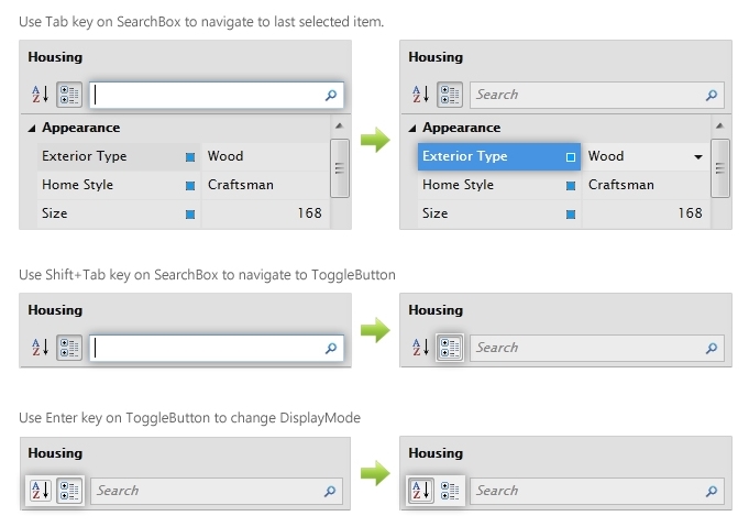
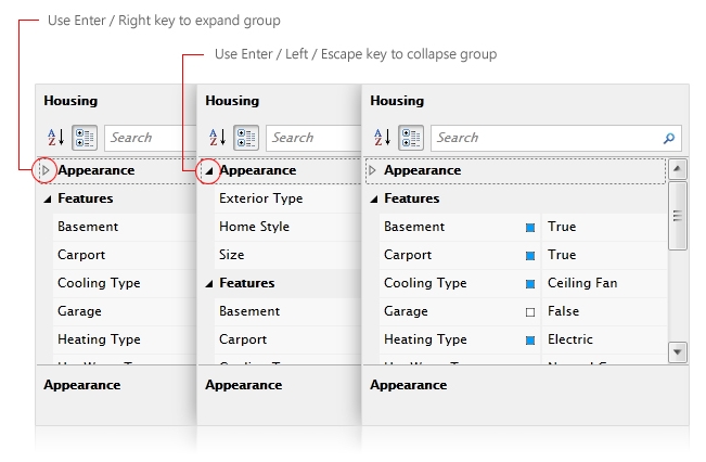
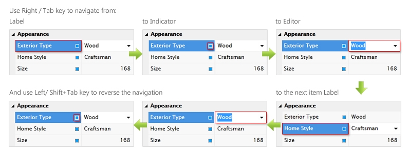
At a glance, the following illustration will shows how to use keyboard to navigate through UXPropertyGrid.
