
| Intersoft ClientUI 8 > ClientUI Controls > Control Library > Advanced Content Controls Overview > UXFluidContainer |
UXFluidContainer is an advanced content control with unique resizing capability. Unlike standard content control, UXFluidContainer smartly detects the size changes of its content and smoothly animates the control to the new size dimension.

UXFluidContainer uses the content control model and derives from ISContentControl, which means it has a Content property that can contain a single object of any type (such as a string, an image, or a panel). For more information about this content model see Content Model Overview.
You use UXFluidContainer control to display a single content which automatically adapt its size according to the content's dimension. When the content changes which affects its size, UXFluidContainer will perform a fluid animation from the current size to the new size. This visual effect gives the impression of smooth and sophisticated user experiences.
The following example shows how to define a simple UXFluidContainer in XAML.
| XAML |
Copy Code
|
|---|---|
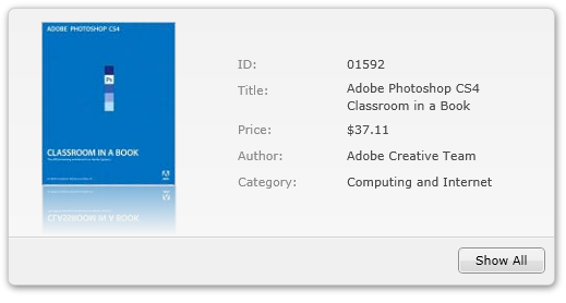
<Intersoft:UXFluidContainer> <local:BookDetails/> </Intersoft:UXFluidContainer> |
|
UXFluidContainer works best with ContentTransition control for its content. When ContentTransition is used as the content of UXFluidContainer, the content changes produces even smoother transition – thanks to the built-in visual transition effects available in the ContentTransition control. With both controls, the visual effects of content transition and the fluid animation will run in the same thread thus delivers stunning user experiences.
The following example shows the usage of both UXFluidContainer and ContentTransition control.
| XAML |
Copy Code
|
|---|---|
<Intersoft:UXFluidContainer> <Intersoft:ContentTransition TransitionStrategy="WaitContentReady" TransitionDuration="0.6"> <local:BookDetails/> <Intersoft:ContentTransition/> </Intersoft:UXFluidContainer> |
|
By default, UXFluidContainer runs with default configuration which has been predefined to achieve the balance of performance and user experiences. However, you may customize certain animation behaviors to suit your applications.
The customizable behaviors are listed below.
You can easily customize the UXFluidContainer appearance through the following properties.
If you would like to completely customize the control appearance or if you want to change the styles of each visual state, you can edit the template of the control and do the modification accordingly.
To learn more how to customize the template and visual states, see Styles and Template Overview.
For the list of ClientUI walkthroughs, see Walkthroughs and How-to Topics.
For the list of ClientUI samples available in local installation, see Locating the Samples in Local Installation.