
| Intersoft ClientUI 8 > ClientUI Controls > Control Library > Document Controls Overview > UXDocumentViewer |
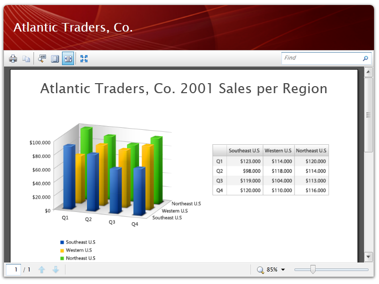
UXDocumentViewer is a feature-rich user interface control for displaying documents in high-fidelity resolution with WYSIWYG layout. UXDocumentViewer facilitates users with sophisticated viewing experiences, allowing them to easily view, zoom, search and navigate throughout the pages in the document.
In addition, users can also print the document in the same way and manner as the document is rendered. Text selection is supported as well, allowing users to select a range of text and copy them to clipboard for latter use. One of the key features of the UXDocumentViewer is its capability to handle large document without performance bottleneck, thanks to the state-of-the-art architecture and solid virtualization implementation.

You use UXDocumentViewer to view a document, which you can set through the provided Source property, or specify the document as the content of UXDocumentViewer. The UXDocumentViewer control renders the document in WYSIWYG (What-you-see-is-what-you-get) manner. To achieve pixel-perfect layout rendering, UXDocumentViewer requires the document to be of FixedDocument type.
A FixedDocument contains one or more pages which is defined in the Pages property. Each page is represented by a FixedPage type. Both FixedDocument and FixedPage are part of the ClientUI document framework, which allow developers to create rich document content that can be viewed consistently in both Silverlight and WPF application. For more information about ClientUI document framework, see Document Framework Overview
The following example shows how to define a FixedDocument with two pages and display the document in UXDocumentViewer.
| View |
Copy Code
|
|---|---|
<Intersoft:UXDocumentViewer Width="800" Height="600"> <Intersoft:FixedDocument PageSize="1280,720"> <Intersoft:PageContent> <Intersoft:FixedPage Width="1280" Height="720"> <Canvas> <TextBlock Text="Page 1 content" FontSize="64" Canvas.Left="25" Canvas.Top="25"/> </Canvas> </Intersoft:FixedPage> </Intersoft:PageContent> <Intersoft:PageContent> <Intersoft:FixedPage Width="1280" Height="720"> <Canvas> <TextBlock Text="Page 2 content" FontSize="64" Canvas.Left="25" Canvas.Top="25"/> </Canvas> </Intersoft:FixedPage> </Intersoft:PageContent> </Intersoft:FixedDocument> </Intersoft:UXDocumentViewer> |
|
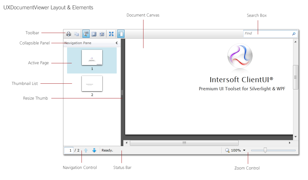
UXDocumentViewer facilitates users with the capability to view, search, and navigate a document. To achieve these capabilities, UXDocumentViewer comes with rich user interface elements that consisted of UXVirtualizingListBox, UXSearchBox, UXToolBar and UXStatusBar.
The following figure illustrates the main layout and user interface elements of the UXDocumentViewer control.

Although the UXDocumentViewer already provides predefined UI elements to allow rich user interaction, you are free to customize any of the elements to suit your application's preferences – thanks to the loosely-coupled architeture design that made the customization possible. You can customize the styles and appearance of the elements entirely by editing the control template using designer tools such as Expression Blend. To learn more about the commands used in the predefined UI elements, see the UXDocumentViewer Commands section later in this topic.
By default, UXDocumentViewer displays the navigation pane allowing users to quickly browse through the pages' thumbnails. You can set the navigation pane to collapse initially by setting the IsNavigationPaneExpanded property to false. Users can still expand the navigation pane at runtime by toggling the Expand/Collapse command in the toolbar.
If the navigation pane is not applicable, you can collapse it entirely by setting the NavigationPaneVisibility to Collapsed. With this settiing, both the navigation pane and the command button will be hidden.
The navigation pane contains an items container that is filled with a list of thumbnails that represent the document's pages. Clicking on the thumbnail allows you to quickly navigate to the selected page.
To improve the overall performance and minimize resources consumption, the navigation pane renders only the thumbnails visible in the viewport. A ScrollLatency property is provided to determine the timespan to wait for the next rendering after each scrolling. By default, the ScrollLatency property value is set to 0.33 seconds.
UXDocumentViewer comes with default viewing configuration that works best for users. One of the remarkable features is the automatic calculation to determine the scrolling step for both the horizontal and vertical scroll bar. By default, the scrolling step is determined at runtime by dividing the document's actual size by 8. However, if the automatic scrolling step is not desired, you can customize the behavior by setting the HorizontalScrollStep and VerticalScrollStep properties.
The following example shows how to customize the scrolling steps for both the horizontal and vertical scroll bar.
| View |
Copy Code
|
|---|---|
<Intersoft:UXDocumentViewer HorizontalScrollStep="12" VerticalScrollStep="24" /> |
|
UXDocumentViewer supports text highlighting for Glyphs and TextBlock element. The highlighting is applied on both text selection and search results found on the document. You can customize the selection brushes through the provided properties.
The properties and the default values are listed in the table below.
| Property | Value |
|---|---|
| HighlightSelectionBrush | #64006CC0 |
| HighlightSearchBrush | #4CFAFF00 |
| HighlightSelectedSearchBrush | #4C0074FF |
The following example shows how to customize the selection brushes in UXDocumentViewer.
| View |
Copy Code
|
|---|---|
<Intersoft:UXDocumentViewer HighlightSelectionBrush="#64006CC0" HighlightSearchBrush="#4CFAFF00" HighlightSelectedSearchBrush="#4C0074FF"/> |
|
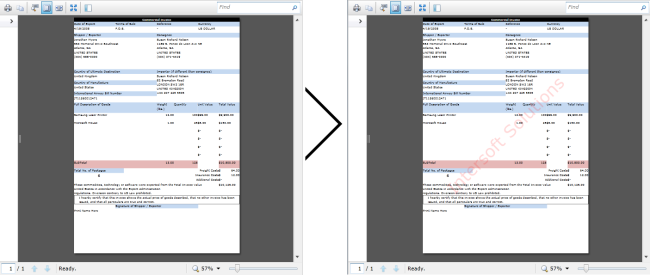
UXDocumentViewer also supports adding a layer of custom content positioned on the top of each page in the document. In order to customize the custom content, you will need to provide a DataTemplate object as a value in the CustomContentTemplate property.
The following example shows how to set the custom content template, overlaying Intersoft Solution text on the top of page content, in a UXDocumentViewer.
| View |
Copy Code
|
|---|---|
<Intersoft:UXDocumentViewer> <Intersoft:UXDocumentViewer.CustomContentTemplate> <DataTemplate> <Grid Width="816" Height="1056" Opacity="0.15"> <Grid VerticalAlignment="Stretch" HorizontalAlignment="Stretch" > <Grid.RenderTransform> <RotateTransform Angle="-45" CenterX="408" CenterY="528" /> </Grid.RenderTransform> <TextBlock Text="Intersoft Solutions" VerticalAlignment="Center" HorizontalAlignment="Center" FontSize="84" Foreground="Red"/> </Grid> </Grid> </DataTemplate> </Intersoft:UXDocumentViewer.CustomContentTemplate> ... </Intersoft:UXDocumentViewer> |
|
The results of the custom content template is shown below.

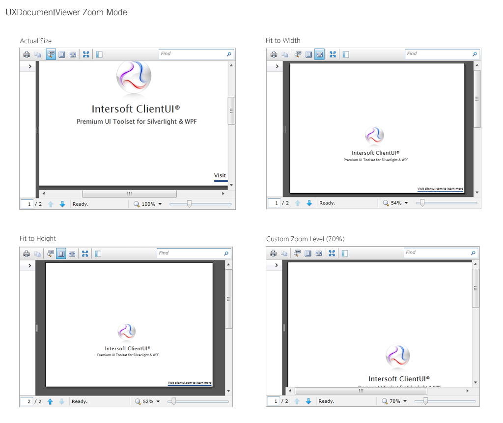
UXDocumentViewer features rich viewing capabilities that are comparable to the industry's popular viewers such as Adobe Reader, including various zoom presets and custom zoom ratio. UXDocumentViewer provides 4 zoom mode which can be customized through the ZoomMode property.
The following list describes the supported zoom mode.
You can also configure the UXDocumentViewer to display in full screen initially by setting the IsFullScreen property to true. Users can toggle the full screen mode at runtime through the full screen command button in the tool bar.
The following illustration compares the various zoom mode supported in UXDocumentViewer.

UXDocumentViewer provides full localization support for the textual content used in the user interface elements. The following table lists the localizable string resources.
| Toolbar | |
|---|---|
| PrintText | |
| CopyText | Copy [Also used in context menu.] |
| ActualSizeText | Show Actual Size |
| FitHeightText | Fit Page to Height |
| FitWidthText | Fit Page to Width |
| FullScreenText | Toggle Full Screen |
| ShowNavigationPaneText | Show/Hide Navigation Pane |
| SearchWatermarkText | Find |
| PreviousSearchText | Previous Match |
| NextSearchText | Next Match |
| Navigation Pane | |
| NavigationHeaderText | Navigation Pane |
| Status Bar | |
| PreviousPageText | Previous Page |
| NextPageText | Next Page |
| ChangeZoomLevelText | Change Zoom Level |
| ZoomInText | Zoom In [Also used in context menu.] |
| ZoomOutText | Zoom Out [Also used in context menu.] |
| ContextMenu | |
| ContextMenu_PrintText | Print... |
| DocumentViewers Status | |
| SearchingText | Searching page {0} |
| PrintingDocumentText | Printing document... |
UXDocumentViewer provides comprehensive commands for rich viewing experiences. Many of the essential commands are presented as command buttons in the toolbar and status bar section of the control. The complete elements can be seen in the section above.
The following table lists the commands presented in the toolbar section of the UXDocumentViewer control.
| Page Navigation | |
|---|---|
 |
Displays the current page shown in the content section and the total page count of the document. You can enter a page number to directly jump to the specific page. |
 |
Scroll to the previous page in the document. |
 |
Scroll to the next page in the document. |
 |
Show or hide the thumbnails section. |
| Page Zooming | |
 |
Sets the zoom mode to show the actual size of the document. |
 |
Sets the zoom mode to fit the width of the document. |
 |
Sets the zoom mode to fit the height of the document. |
  |
Magnify the document size by a preset ratio. |
| Search | |
 |
The TextBox element to enter search criteria. |
| Others | |
 |
Toggle the UXDocumentViewer control to fill the screen. |
 |
Print the document using print file dialog. |
 |
Copy the highlighted text. |
UXDocumentViewer is built around the commanding semantics which allows the document interaction to be executed through declarative definition in the XAML markup. The commanding semantics is also an ideal approach for MVVM pattern development.
UXDocumentViewer includes predefined commands to interact with the document which are described in the following table.
| Commands | Description |
|---|---|
| GoToPageCommand | Represents the command to scroll to the page referenced by the page number in the command parameter. |
| FirstPageCommand | Represents the command to scroll to the first page in the document. |
| NextPageCommand | Represents the command to scroll to the next page in the document. |
| PreviousPageCommand | Represents the command to scroll to the previous page in the document. |
| LastPageCommand | Represents the command to scroll to the last page in the document. |
| PrintCommand | Represents the command to print the page(s) in the document. |
| ActualSizeCommand | Represents the command to set the view to the actual size of the document. |
| FixedToHeightCommand | Represents the command to set the view to fit the UXDocumentViewer height. |
| FixedToWidthCommand | Represents the command to set the view to fit the UXDocumentViewer width. |
| ZoomInCommand | Represents the command to magnify the view by 10%. |
| ZoomOutCommand | Represents the command to magnify the view by 0.1%. |
| ZoomToCommand | Represents the command to magnify the view by a value defined in the command parameter. The accepted value is double. For instance, 1.25 will magnify the view by 125%. |
| CopyCommand | Represents the command to copy the highlighted text to clipboard. |
| FindNextCommand | Represents the command to scroll to the next search result in the document. |
| FindPreviousCommand | Represents the command to scroll to the previous search result in the document. |
| FullScreenCommand | Represents the command to toggle whether the UXDocumentViewer is shown in the full screen mode. |