
| Intersoft ClientUI 8 > ClientUI Controls > Control Library > Advanced Content Controls Overview > UXCallOut |
UXCallOut is an interactive popup control in a form of CallOut which can be used to represent the content inside the callout as well as the content of the control itself.

UXCallOut derives from ISHeaderedContentControl, which means that it is using headered content presentation model. To learn more about headered content model, see Content Model Overview.
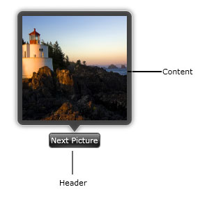
The Content in UXCallOut represents the object inside the callout itself., while the Header represents the element attached to the callout.
The following example shows the difference between the Content and Header in UXCallOut.
| UXCallOut |
Copy Code
|
|---|---|
<Intersoft:UXCallOut> <Intersoft:UXCallOut.Header> <Intersoft:GlassButton Content="Next Picture"></Intersoft:GlassButton> </Intersoft:UXCallOut.Header> <Grid Height="150" Width="150"> <Image Source="/Lighthouse.jpg" Stretch="Fill"/> </Grid> </Intersoft:UXCallOut> |
|

UXCallOut uses UXPopup control to display content which stays on the top of other elements along with comprehensive hide and display animation. Consequently, they share a number of settings that control the animation behaviors such as listed below.
To learn more about configuring the animation behaviors, see Popup Overview.
You can position the UXCallOut to one of the supported mode through the PreferredPosition property. It is best practice to use either Top, Left, Right or Bottom position to take advantage of the callout pointer feature. Otherwise, the callout pointer will not be enabled.
Beside animation and positioning, you also can control when the callout should be displayed or collapsed based on mouse interaction, which is listed below.
By default, the MouseEnterAction property is set to ShowPopup, while the other properties are set to None. This setting shows the UXCallOut when your mouse cursor is over the element.
The following list describes the some configurations used in common UI scenarios: