

| Intersoft ClientUI 8 > ClientUI Controls > Control Library > Navigation Controls Overview > UXBreadCrumb |
UXBreadCrumb is a versatile navigation control that combines the hybrid functionality of address bar and menu which allows users to perform navigation in a simple point-and-click manner. Designed with the familiar look of Windows Explorer, UXBreadCrumb simplifies the navigation of large business applications that are typically consisted of multi-level page hierarchy. With just a provided sitemap, it's incredibly easy to implement thanks to the integration with ClientUI Navigation framework.
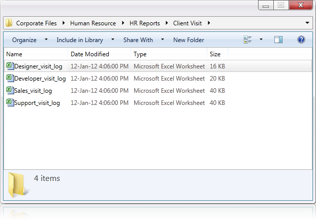
UXBreadCrumb works by utilizing Sitemap at its core, therefore it is crucial to understand how sitemap works in UXBreadCrumb. The Sitemap enables UXBreadCrumb to properly generate UXBreadCrumbItem according to the parsed URI. The following is an example of an XML sitemap.
| Sitemap.xml |
Copy Code
|
|---|---|
<Sitemap> <SitemapData> <DisplayName>Home</DisplayName> <Path>/HelpViewer/Home</Path> <Icon>/ClientUI.2012R2.Preview;Component/Assets/Icons/home.png</Icon> <Children> <SitemapData> <DisplayName>ClientUI</DisplayName> <Path>/HelpViewer/ClientUI</Path> <Icon>/ClientUI.2012R2.Preview;Component/Assets/Icons/clientui.png</Icon> <Children> <SitemapData> <DisplayName>Scheduling Controls</DisplayName> <Path>/HelpViewer/ClientUI/Scheduling Controls</Path> <Icon>/ClientUI.2012R2.Preview;Component/Assets/Icons/SchedulingControls.png</Icon> <Children> <SitemapData> <DisplayName>Schedule View</DisplayName> <Path>/HelpViewer/ClientUI/Scheduling Controls/Schedule View</Path> <Icon>/ClientUI.2012R2.Preview;Component/Assets/Icons/ScheduleView.png</Icon> </SitemapData> </Children> </SitemapData> <SitemapData> <DisplayName>Ribbon Controls</DisplayName> <Path>/HelpViewer/ClientUI/Ribbon Controls</Path> <Icon>/ClientUI.2012R2.Preview;Component/Assets/Icons/RibbonControls.png</Icon> <Children> <SitemapData> <DisplayName>Ribbon</DisplayName> <Path>/HelpViewer/ClientUI/Ribbon Controls/Ribbon</Path> <Icon>/ClientUI.2012R2.Preview;Component/Assets/Icons/Ribbon.png</Icon> </SitemapData> </Children> </SitemapData> </Children> </SitemapData> </Children> </SitemapData> </Sitemap> |
|
By default, if a sitemap is provided, the first item in the sitemap will be taken as root item. For more information about root item, see Root Item section below.
The PathSeparator property of UXBreadCrumb defines how URI should be parsed into UXBreadCrumbItem. By default, the PathSeparator is set to '/'. If you make changes to the separator, make sure you update the Sitemap accordingly.
You can easily generate an IEnumerable<SitemapData> using the utility method that UXBreadCrumb has provided as shown in the following code.
| GenerateSitemap |
Copy Code
|
|---|---|
Intersoft.Client.UI.Navigation.UXBreadCrumb.GenerateSitemap(XDocument xDocument, string displayNamePath, string navigateUriPath, string childrenPath, string iconPath); |
|
By default, the sitemap is generated and stored at the first load. For more information on how to configure UXBreadCrumb to work with load on demand scenario, see How-to: Enable Load on Demand for UXBreadCrumb.
In most cases, UXBreadCrumb is designed to work together with the ClientUI Navigation framework. It automatically synchronizes the current address information as users navigate between pages. Similarly, when users click on the menu item, the UXFrame automatically navigates to the designated location. For more information on navigation framework, see ClientUI Navigation overview.
For an example on how to configure UXBreadCrumb for page navigation, see How-to: Use UXBreadCrumb for Page Navigation.
UXBreadCrumb also supports advanced scenarios in which TargetFrame may not be available, but breadcrumb navigation is required. In this case, UXBreadCrumb will only function as ItemsControl, see How-to: Use UXBreadCrumb for Advanced Scenarios for more information.
UXBreadCrumb delivers innovative features such as fluid resizing, checked state for next item, editing mode, auto open drop down, load on demand, refresh button, customization of root item and child navigation.
UXBreadCrumb features a smart and fluid resizing of items, similar to the behaviors found in Windows Explorer navigation bar. This feature enables UXBreadCrumb to easily fit to various container sizes. The minimum item width can be easily adjusted the provided MinItemWidth property. The default value for MinItemWidth is 50.

The items that were hidden due to the resizing will be automatically added into the root dropdown button. This allows users to consistently look for the previous siblings and perform navigation as necessary. This feature is built into the control so you don't have to write additional code to activate this capability.
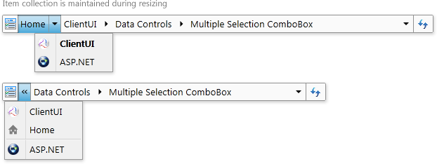
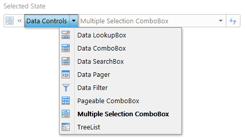
When an item drop down is opened, it will automatically check the state for the active item of the next path, highlighting them in bold. This feature will easily allow users to keep track in which node they are currently in.
Editing mode enables users to navigate directly to a certain URI. This feature is enabled when IsEditable proprety is set to true. You can enter editing mode using three ways: clicking on the root icon, pressing F2 key on keyboard when UXBreadCrumb is focused, or by clicking the empty area on the UXBreadCrumb. When sitemap data is provided, as users type in the search query, a drop down will open with URI suggestions. This will allow users to quickly navigate to a page without going through each individual node.
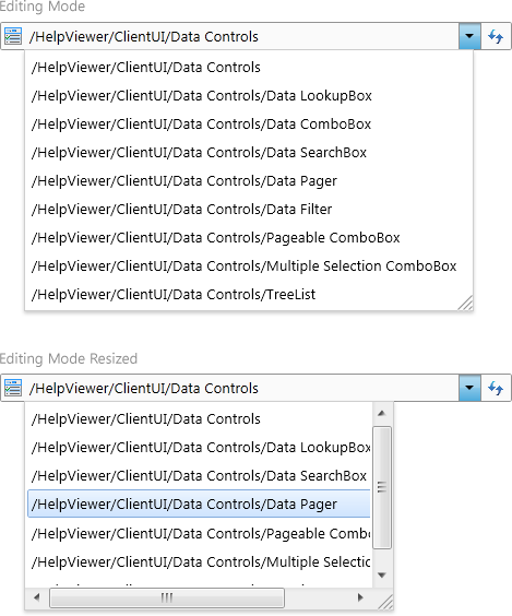
The auto open drop down feature allows UXBreadCrumb to persist the drop down state for the best user experiences. When user opened the drop down button once and hover to next item, it will close the previous item drop down and opens the drop down of the hovered item. This feature is also available during keyboard navigation by pressing the Left or Right key when item drop down is opened.
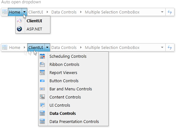
In addition to the basic features, UXBreadCrumb also offers advanced features such as loading child nodes on demand, while still maintaining MVVM development pattern. This feature is particularly useful to improve the overall performance when the assigned data source is relatively large. To enable load-on-demand, you set the IsLoadOnDemand property of the control to true and bind the ExpandedItem and ProcessedItem to the view model, with Two-Way as the BindingMode.
When IsLoadOnDemand is enabled, you will have to provide custom implementations in the view model. If an item drop down is opened, the ExpandedItem property will be set, and that is where the custom implementations should take place. Once the ExpandedItem is set, you must provide the result in the ProcessedItem which is used to notify the UXBreadCrumb control.
One thing to note that when an item drop down is opened, user may hover to other items in a rapid manner. You will have to cancel the previous requests and only process the last request. See How-to: Enable Load on Demand for UXBreadCrumb to learn more.
You can easily customize several common UXBreadCrumb elements through property sets. The following illustration shows the overview of the UXBreadCrumb elements.
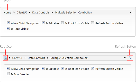
The refresh button will call NavigationCommands.Refresh upon click, which will refresh the UXFrame it is attached to (if any). The refresh button can be easily collapsed by setting IsRefreshButtonVisible to false. You can also customize the refresh button image using the RefreshImage property.
The root item represents the first UXBreadCrumbItem in the control. This section will elaborate the behavior of the root item and how it can be customized. The root item consists of three parts: RootName, RootUri, and RootIcon.
By default, if sitemap data is provided, then the first item in the sitemap will be taken as root item.
The RootName property represents the display name of the root item and can be customized easily.
When RootIcon is set, then target item icon will not reflect on the root item icon. By default, the root item icon will automatically adjust to the last item icon. You can also set its visibility to collapsed by setting IsRootIconVisible property to false.
RootUri represents the URI the root item will navigate when clicked.
By default, the root item will always show when the navigation path is equal to root item URI. Then if user navigates to second (or deeper) level of the sitemap, the root automatically collapse. When set to true, the root item will always stay visible despite what level of sitemap the navigation path is currently on.
UXBreadCrumb enables child navigation by default. By setting AllowChildNavigation property to false, users will not be able to open any item drop down, and allowing only backwards navigation path. This is especially useful if child navigation is not desirable.

This section will highlight keyboard navigation experience in UXBreadCrumb.
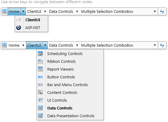
By default, UXBreadCrumb will always give virtual focus to root item. However, if IsRootVisible is set to false and AllowChildNavigation is set to false, UXBreadCrumb will automatically set the virtual focus to the first item.
Once the item has virtual focus, pressing the Down key will open the drop down, given AllowChlidNavigation property is set to true. Pressing Left or Right on the keyboard will cycle the items, with drop down state persisted.
When TargetFrame is specified, pressing the Enter key on selected item will navigate to the corresponding SitemapData's URI, and pressing F2 will set UXBreadCrumb into editing mode. When you type into the textbox, the combo box will open, giving the available suggestions based on the typed keywords. If you wish to select the suggestions, you can use the Up or Down key to select the suggestions. You can exit edit mode by pressing Escape on the keyboard.