Intersoft ClientUI Documentation
How-to: Customize the CallOut’s Effect in UXCallout

| Intersoft ClientUI 8 > ClientUI Controls > Control Library > Advanced Content Controls Overview > UXCallOut > How-to: Customize the CallOut’s Effect in UXCallout |
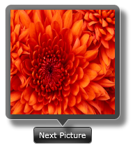
The following example shows how to customize callout effect of UXCallOut.
When you browse through UXCallOut properties, you would notice two similar Effect properties. The first is CallOutEffect and the other is Effect.
The difference between the two properties is the element of which the Bitmap Effect is applied. The CallOutEffect only applies the effect to UXCallOut shape, while Effect applies the effect to entire control’s element.
The following customize the effect of callout shape using CallOutEffect.
| XAML |
Copy Code
|
|---|---|
<Intersoft:UXCallOut HorizontalAlignment="Center" VerticalAlignment="Center"> <Intersoft:UXCallOut.CallOutEffect> <DropShadowEffect BlurRadius="9" ShadowDepth="12"/> </Intersoft:UXCallOut.CallOutEffect> <Intersoft:UXCallOut.Header> <Intersoft:GlassLabel Content="Next Picture"></Intersoft:GlassLabel> </Intersoft:UXCallOut.Header> <Grid Height="150" Width="150"> <Image Source="/Chrysanthemum.jpg" Stretch="Fill"/> </Grid> </Intersoft:UXCallOut> |
|
