
| Intersoft ClientUI 8 > ClientUI Controls > Control Library > Content Controls Overview > ContentReflector |
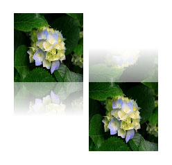
ContentReflector is a lightweight content control for applying a nice reflection effect of the original object.

ContentReflector is inherited from ISContentControl, which means that it can contain a single object of any types, such as a string, an image, or a panel. For more information about this content model, see Content Model Overview.
ContentReflector has a unique fundamental layouting concept. The structure is basically divided into two areas which are ContentElement and ReflectionElement. By default, each area has equal size determined by the ContentHeight and ContentWidth property. The default values for these properties are Double.NaN.
Using these default settings, you need to set the content reflector's height twice as large as its content when the ReflectionPosition is set to Top or Bottom, and content reflector’s width twice as large as its content when the ReflectionPosition is set to Left or Right.
The following examples show how to use ContentReflector with various ReflectionPosition.
| XAML |
Copy Code
|
|---|---|
<StackPanel Orientation="Horizontal" HorizontalAlignment="Center" VerticalAlignment="Center"> <Intersoft:ContentReflector Height="200" Width="100" Margin="4"> <Grid> <Image Source="/Hydrangeas.jpg" Stretch="Fill"/> </Grid> </Intersoft:ContentReflector> <Intersoft:ContentReflector Height="200" Width="100" Margin="4" ReflectionPosition="Top"> <Grid> <Image Source="/Hydrangeas.jpg" Stretch="Fill"/> </Grid> </Intersoft:ContentReflector> </StackPanel> |
|

| XAML |
Copy Code
|
|---|---|
<StackPanel Orientation="Horizontal" HorizontalAlignment="Center" VerticalAlignment="Center"> <Intersoft:ContentReflector Height="100" Width="200" Margin="4" ReflectionPosition="Left"> <Grid> <Image Source="/Hydrangeas.jpg" Stretch="Fill"/> </Grid> </Intersoft:ContentReflector> <Intersoft:ContentReflector Height="100" Width="200" Margin="4" ReflectionPosition="Right"> <Grid> <Image Source="/Hydrangeas.jpg" Stretch="Fill"/> </Grid> </Intersoft:ContentReflector> </StackPanel> |
|

There are a number of appearance settings that you can customize in content perspective such as described below.
By default, ContentReflector generates the reflection image based on the specified content. You can use any data types as the content to be reflected by the ContentReflector. However, if you’re using an Image as its content, it is recommended to use ReflectionSource to improve the performance. By providing ReflectionSource, the control will use the provided image instead of generating the reflection image.
If you are using non-image content type and having performance issue, you may want to set the AutoRefresh property to false. When set to true, this property enables ContentReflector to re-generate the reflection image whenever the content layout is updated, for instance, due to changes in the content such as text input, resizing, and visual states change.
The following example shows how to use ReflectionSource to improve the performance by skipping the reflection process.
| XAML |
Copy Code
|
|---|---|
<Intersoft:ContentReflector Height="200" Width="100" Margin="4" ReflectionSource="/Hydrangeas.jpg"> <Grid> <Image Source="/Hydrangeas.jpg" Stretch="Fill"/> </Grid> </Intersoft:ContentReflector> |
|