UXCalendar is a sophisticated calendar control with comprehensive view modes featuring multiple views and multiple date selection feature.
Using UXCalendar
UXCalendar is a rich, full-featured calendar control that allows users to select a date or a range of dates using a visual calendar display. A calendar displays either the days of a month, the months of a year, the years of a decade, or the decades of century, depending on the value of the DisplayDate and InitialDisplayMode properties. If the DisplayDate property is not specified, the UXCalendar will automatically use the current date as its DisplayDate.
The following example shows how to define simple UXCalendar in XAML
| XAML |  Copy Code Copy Code |
|---|---|
<Intersoft:UXCalendar x:Name="UXCalendar1" DisplayDate="12/1/2010" /> |
|
For more information about supported selection mode and how to obtain input in UXCalendar, see Understanding UXCalendar Selection.
Customizing Culture
UXCalendar supports localization through the Culture property. You can set the culture to one of the values supported in .NET Framework. The following example shows how to customize the UXCalendar to use Germany culture.
| XAML | Copy Code |
|---|---|
<Intersoft:UXCalendar x:Name="UXCalendar1" Culture="de" /> |
|
Customizing Transitions
UXCalendar comes with elegant transitions which perform animation when the calendar is navigating, for instances, navigating to the previous or next month, navigating up to the parent or child view, and more. The transition uses an innovative double-buffering algorithm to create stunning and responsive animation even in multiple calendar view.
The transition is enabled by default. You can disable the transition by setting the IsTransitionEnabled property to false.
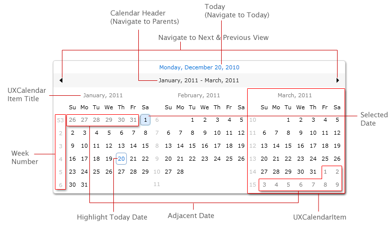
Understanding UXCalendar Layout
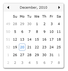
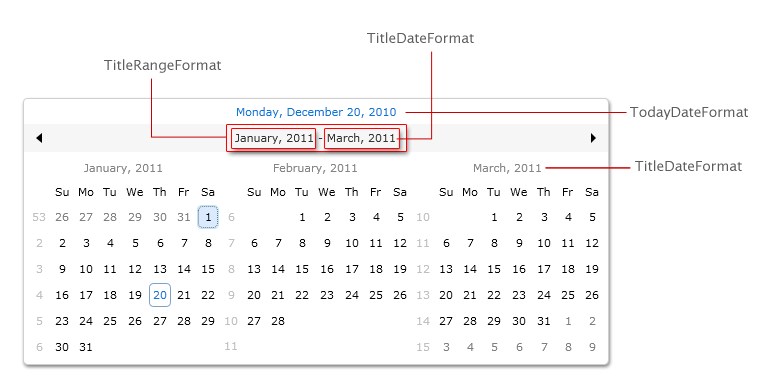
UXCalendar can display a single or multiple calendar views based on CalendarViewCount property. There are several layout differences between the single and multiple calendar views as described in the following figures.
Single Calendar View
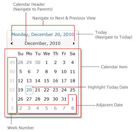
Multiple Calendar Views
The layout of UXCalendar is thoughtfully designed to support fluid layout which dynamically shrink or grow its size based on the content dimension, such as when you change the FontSize to a bigger value.
The following code shows how to create UXCalendar with larger FontSize.
| XAML | Copy Code |
|---|---|
<Intersoft:UXCalendar x:Name="UXCalendar1" FontSize="15"/> |
|
Customizing UXCalendar
There are a host of behaviors that you can customize in the UXCalendar. The following list are the properties that you can configure in UXCalendar.
- InitialDisplayMode
- CalendarViewCount
- WeekNumberRule
- FirstDayOfWeek
- WeekNumberVisibility
- IsTodayHighlighted
- CalendarTodayVisibility
- TodayDateFormat
- TitleDateFormat
- TitleRangeFormat
- DisplayDateStart
- DisplayDateEnd
- GenerateAdjacentMonthDays
Customizing Display Mode
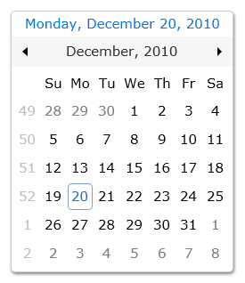
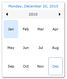
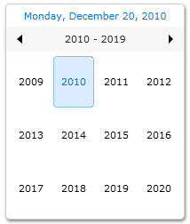
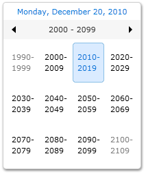
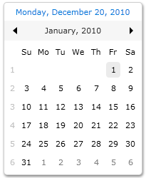
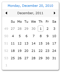
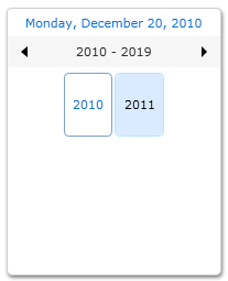
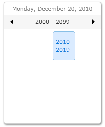
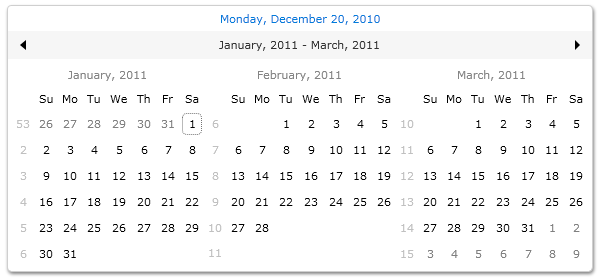
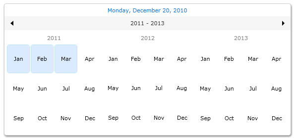
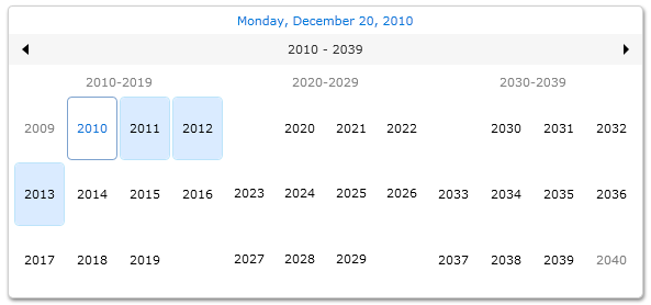
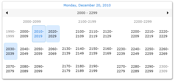
A calendar displays either the days of a month, the months of a year, the years of a decade, or the decades of century depending on the value of the DisplayDate and InitialDisplayMode properties. The following are display modes that available in UXCalendar:
- Month
Displays a month at a time. - Year
Displays a year at a time. - Decade
Displays a decade at a time. - Century
Displays a century at a time.
| XAML | Copy Code |
|---|---|
<StackPanel> <Intersoft:UXCalendar x:Name="UXCalendar1" InitialDisplayMode="Month"/> <Intersoft:UXCalendar x:Name="UXCalendar2" InitialDisplayMode="Year"/> <Intersoft:UXCalendar x:Name="UXCalendar3" InitialDisplayMode="Decade"/> <Intersoft:UXCalendar x:Name="UXCalendar4" InitialDisplayMode="Centry"/> </StackPanel> |
|
Customizing Display Range
The range of dates displayed is governed by the DisplayDateStart and DisplayDateEnd properties. If DisplayMode is Year or Decade, only months or years that contain displayable dates will be displayed.
The following example shows UXCalendar with display range starts from January 2010 to December 2011.
| XAML | Copy Code |
|---|---|
<Intersoft:UXCalendar x:Name="UXCalendar1" DisplayDate="1/1/2010" DisplayDateStart="1/1/2010" DisplayDateEnd="12/31/2011"/> |
|
Customizing Calendar View Count
You can set the UXCalendar to show multiple calendar view by setting the CalendarViewCount property such as shown in the following example.
| XAML | Copy Code |
|---|---|
<Intersoft:UXCalendar x:Name="UXCalendar1" DisplayDate="12/1/2010" CalendarViewCount="3"/> |
|
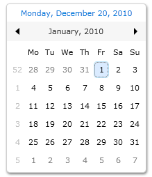
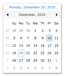
Customizing Week Number
By default, the week number is displayed in UXCalendar. You can set the week number visibility by changing the WeekNumberVisibility property to Collapsed.
| XAML | Copy Code |
|---|---|
<Intersoft:UXCalendar x:Name="UXCalendar1" WeekNumberVisibility="Collapsed"/> |
|
The calculation of week number is determined with FirstDayOfWeek and WeekNumberRule property. The combination of these two properties will affect the week number value of each week in UXCalendar.
The following example shows how to customize the week number behavior.
| XAML | Copy Code |
|---|---|
<Intersoft:UXCalendar x:Name="UXCalendar1" DisplayDate="12/1/2010" WeekNumberRule="FirstFullWeek" FirstDayOfWeek="Monday"/> |
|
Customizing Today Highlight
By default, the current day (today) will be highlighted in UXCalendar. You can disable it by changing the IsTodayHighlighted property to False.
The following example shows UXCalendar with IsTodayHighlighted property is set to True.
| XAML | Copy Code |
|---|---|
<Intersoft:UXCalendar x:Name="UXCalendar1" DisplayDate="12/1/2010" IsTodayHighlighted=True/> |
|
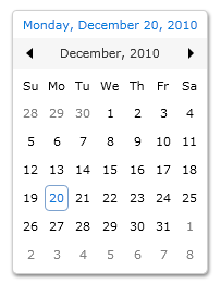
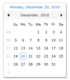
Customizing Calendar Today Visibility
Calendar Today is an element that shows today information which is located in the header of the UXCalendar as illustrated in the layout section. This element is visible by default. You can hide this element by setting the CalendarTodayVisibility property to Collapsed.
| XAML | Copy Code |
|---|---|
<Intersoft:UXCalendar DisplayDate="12/20/2010" CalendarTodayVisibility="Collapsed" /> |
|
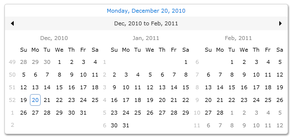
Customizing Date Title Format
The format of Date Title in UXCalendar can easily be customized. There are three properties that you can use to configure dates format in UXCalendar as follows:
- TodayDateFormat
The date time format that will be used as the calendar's Today date string format. The default value is {0:dddd, MMMM d, yyyy}. - TitleDateFormat
The date time format that will be used as Date Title format for single date like in Month mode. The default value is {0:MMMMM, yyyy}. - TitleRangeFormat
The date time format that will be used as Date Title format for range date like in Decade, Century or multiple calendars mode. The default value is {0} - {1}.
The following code shows how to modify Date Title formats in UXCalendar.
| XAML | Copy Code |
|---|---|
<Intersoft:UXCalendar x:Name="UXCalendar1" CalendarViewCount="3" HorizontalAlignment="Center" VerticalAlignment="Center" TitleDateFormat="{}{0:MMM, yyyy}" TitleRangeFormat="{}{0} to {1}"> </Intersoft:UXCalendar> |
|
Customizing Adjacent Days Visibility
Adjacent Days are dates from the previous or next months that due to the nature of display have slots in the current display view. You can determine whether these adjacent days should be visible through the GenerateAdjacentMonthDays property.
If these adjacent days are visible, you can navigate to the previous or next month by selecting the adjacent days using keyboard or mouse. To learn more about this feature, see Understanding UXCalendar Navigation section.
The following code shows how to hide the Adjacent Days in UXCalendar.
| XAML | Copy Code |
|---|---|
<Intersoft:UXCalendar x:Name="UXCalendar1" DisplayDate="12/1/2010" CalendarViewCount="2" GenerateAdjacentMonthDays="False"/> |
|
 |
In multiple calendars, adjacent date will only appear in the first and last calendar. |
Understanding UXCalendar Navigation
There are several ways to navigate between date in UXCalendar. The following table lists all actions to perform navigation between date in UXCalendar.
| Key Combination | SelectionMode | Action |
|---|---|---|
| CTRL + UP ARROW | Single Date, Single Range | Navigate to the Parent view. DisplayMode Decade : no action. |
| CTRL + DOWN ARROW | Single Date, Single Range | Navigate to the Child view. DisplayMode Month: no action. |
| CTRL + LEFT OR RIGHT ARROW | Single Date, Single Range | Navigation to the previous or next view. |
| Navigate to Adjacent Date | Any | Navigate to the selected adjacent date view. |
| ENTER | Any | Go to the Child viewZoom In if the DisplayMode != InitialDisplayMode |
| Page Up | Any | Navigate to the previous view |
| Page Down | Any | Navigate to the next view |
| T | Any | Go to today |
Mouse Navigation
| Mouse Action | SelectionMode | Action |
|---|---|---|
| Click on the Today element | Any | Navigate to Today date. |
| Click on the next icon | Any | Navigate to the next view. |
| Click on the previous icon | Any | Navigate to the previous view. |
| Click on the calendar header | Any | Navigate to the parent view. |
| Click on the calendar's date | Any | Navigate to the child view, if the DisplayMode != InitialDisplayMode |
| Click on the adjacent date | Any | Navigate to the adjacent date view |
Understanding UXCalendar Selection
You can determine the selection mode of the UXCalendar from SelectionMode property. There are four selection mode in UXCalendar that you can select as follows.
- None
Selection is disabled. - SingleDate
Users can select only a single date. - SingleRange
Users can select a range of continuous date. - MultipleRange
Users can select a different multiple range of date.
The following illustrations describe the selection mode supported in UXCalendar.
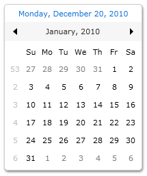
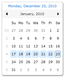
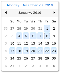
In SingleDate selection mode, you use the SelectedDate property to obtain the selected date. In SingleRange and MultipleRange selection mode, you use the SelectedDates property to obtain the collection of selected date.
Understanding UXCalendar Keyboard and Mouse Gestures
UXCalendar comes with both great user interface and user experience features. It implements comprehensive keyboard and mouse gestures support conforming to ISO 9241 usability standards.
The following section describes the user interactions to perform date selection in UXCalendar.
Keyboard Navigation
| Key Combination | SelectionMode | Action |
|---|---|---|
| ARROW or SPACEBAR | Any | Change focused date, unselect all selected date, and select new focused and selected date. |
| SHIFT + ARROW | Single Range, Multiple Range | Begin selecting a range of dates. |
| CTRL + ARROW | Multiple Range | Change focused date and select new focused date without unselect all selected date. |
| SHIFT + CTRL + LEFT OR RIGHT ARROW | Single Range | Unselect all selected date and begin selecting a range of date. |
| SHIFT + CTRL + LEFT OR RIGHT ARROW | Multiple Range | Begin selecting a range of dates without unselect all selected date. |
| SHIFT + SPACEBAR | Multiple Range | Begin selecting a range of date from the selected date to the focused date. |
| CTRL + SPACEBAR | Multiple Range | Unselect the date if selected or select the date if it is unselect. |
| CTRL | Any | Change selected date |
| Home | Any | Changed focused date to the first date from the calendar item |
| End | Any | Changed focused date to the last date from the calendar item |
Mouse Navigation
| Mouse Action | SelectionMode | Action |
|---|---|---|
| Click | Any | Change focused date, unselect all selected date, and select new focused and selected date. |
| Mouse Left Button Down + Mouse Move | Single Date | Changed focused date, unselect selected date and select new focused and selected date. |
| Mouse Left Button Down + Mouse Move | Single Range, Multiple Range | Begin selecting a range of dates |
Keyboard and Mouse Combination
| Keyboard and Mouse Combination | SelectionMode | Action |
|---|---|---|
| SHIFT + Click | Single Range, Multiple Range | Unselect all selected date and begin selecting a range of date from the selected date to the focused date. |
| CTRL + Click | Multiple Range | Unselect the date if selected or select the date if it is unselect. |
| CTRL + Mouse Left Button Down + Mouse Move | Multiple Range | Select new date without removes the others selected date. |
| SHIFT + CTRL + Mouse Left Button Down + Mouse Move | Multiple Range | Begin selecting a range of date without removes the selected date. |
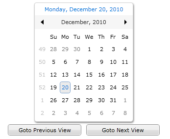
Understanding UXCalendar Commands
UXCalendar is included with predefined commands for navigation which integrated in CalendarCommands and DateTimeCommands that you can use in your application. To learn about using commands in your application, see Commanding Overview.
The following table describes the built-in calendar commands that you can use to perform navigation in UXCalendar.
| Commands | Description |
|---|---|
| GotoNextView | Command action to navigate to the next view. |
| GotoPreviousView | Command action to navigate to the previous view. |
| GotoChildView | Command action to zoom in from the current view to more detail view. |
| GotoParentView | Command action to zoom out from the current view to more general view. |
The following code shows how to use GotoNextView and GotoPreviousView command as UXCalendar navigation using UXButton.
| XAML | Copy Code |
|---|---|
<UserControl xmlns:Intersoft="http://intersoft.clientui.com/schemas" x:Class="SilverlightApplication4.UXCalendarCommandSample" xmlns="http://schemas.microsoft.com/winfx/2006/xaml/presentation" xmlns:x="http://schemas.microsoft.com/winfx/2006/xaml" xmlns:d="http://schemas.microsoft.com/expression/blend/2008" xmlns:mc="http://schemas.openxmlformats.org/markup-compatibility/2006" xmlns:intersoft="clr-namespace:Intersoft.Client.UI.Aqua.UXInput;assembly=Intersoft.Client.UI.Aqua.UXInput" mc:Ignorable="d" d:DesignHeight="300" d:DesignWidth="400"> <Grid x:Name="LayoutRoot" Background="White"> <StackPanel Orientation="Vertical" HorizontalAlignment="Center"> <Intersoft:UXCalendar x:Name="UXCalendar1" HorizontalAlignment="Center"> </Intersoft:UXCalendar> <StackPanel Orientation="Horizontal"> <Intersoft:UXButton Command="intersoft:CalendarCommands.GotoPreviousView" CommandTarget="{Binding ElementName=UXCalendar1}" Content="Goto Previous View" Height="23" Width="150" Margin="5,5"/> <Intersoft:UXButton Command="intersoft:CalendarCommands.GotoNextView" CommandTarget="{Binding ElementName=UXCalendar1}" Content="Goto Next View" Height="23" Width="150" Margin="5,5"/> </StackPanel> </StackPanel> </Grid> </UserControl> |
|
The following table lists the built-in commands related to date and time operation. You can use these commands to navigate to specific date based on each command characteristic.
| Commands | Description |
|---|---|
| GotoDate | Command action to navigate to a certain date. |
| GotoToday | Command action to navigate to today date. |
| GotoNextDay | Command action to navigate to next day. |
| GotoNextMonth | Command action to navigate to next month. |
| GotoNextYear | Command action to navigate to next year. |
| GotoNextDecade | Command action to navigate to next decade. |
| GotoNextCentury | Command action to navigate to next century. |
| GotoPreviousDay | Command action to navigate to previous day. |
| GotoPreviousMonth | Command action to navigate to previous month. |
| GotoPreviousYear | Command action to navigate to previous year. |
| GotoPreviousDecade | Command action to navigate to previous decade. |
| GotoPreviousCentury | Command action to navigate to previous century. |
The following code shows how to use GotoDate and GotoToday command as UXCalendar navigation using UXButton.
| XAML | Copy Code |
|---|---|
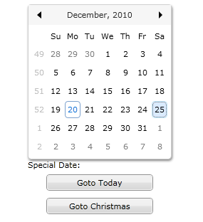
<UserControl xmlns:Intersoft="http://intersoft.clientui.com/schemas" x:Class="SilverlightApplication4.UXCalendarDateTimeCommand" xmlns="http://schemas.microsoft.com/winfx/2006/xaml/presentation" xmlns:x="http://schemas.microsoft.com/winfx/2006/xaml" xmlns:d="http://schemas.microsoft.com/expression/blend/2008" xmlns:mc="http://schemas.openxmlformats.org/markup-compatibility/2006" xmlns:intersoft="clr-namespace:Intersoft.Client.UI.Aqua.UXInput;assembly=Intersoft.Client.UI.Aqua.UXInput" mc:Ignorable="d" d:DesignHeight="300" d:DesignWidth="400"> <Grid x:Name="LayoutRoot" Background="White"> <StackPanel Orientation="Vertical" HorizontalAlignment="Center"> <Intersoft:UXCalendar DisplayDate="1/1/2010" x:Name="UXCalendar1" HorizontalAlignment="Center" CalendarTodayVisibility="Collapsed"> </Intersoft:UXCalendar> <StackPanel Orientation="Vertical"> <TextBlock Text="Special Date:" /> <Intersoft:UXButton Command="intersoft:DateTimeCommands.GotoToday" CommandTarget="{Binding ElementName=UXCalendar1}" Content="Goto Today" Height="23" Width="150" Margin="5,5"/> <Intersoft:UXButton Command="intersoft:DateTimeCommands.GotoDate" CommandParameter="12/25/2010" CommandTarget="{Binding ElementName=UXCalendar1}" Content="Goto Christmas" Height="23" Width="150" Margin="5,5"/> </StackPanel> </StackPanel> </Grid> </UserControl> |
|
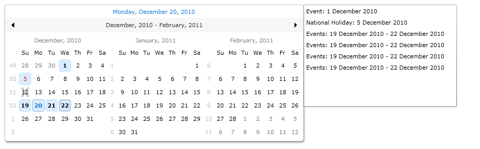
Creating Events in UXCalendar
You can add events to UXCalendar by populating the Events property or EventsSource property. Events property accept object of type UXCalendarEventItem. You can create as many UXCalendarEventItem in the Events property by specifying the following properties.
- StartDate
The start date of the event. - EndDate
The end date of the event. This property is optional. If you do not specify EndDate property, the value of EndDate will automatically set to be the same with the StartDate property. - EventType
There are three event type that you can choose for the event: Event, Holiday or Blackout. - Subject
The subject of the event. - Description
The description of the event.
Alternatively, you can simply bind the EventSource property with collection of data and use the member path properties as below to map your object model to UXCalendarEventItem properties.
- StartDateMemberPath
Used to bind the StartDate property. - EndDateMemberPath
Used to bind the EndDate property. - EventTypeMemberPath
Used to bind the EventType property. - SubjectMemberPath
Used to bind the Subject property. - DescriptionMemberPath
Used to bind the Description property.
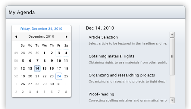
When UXCalendar has events from either the Events or EventSource property, it provides events from the current selected date or range of date through the SelectedEvents property. With these properties, you can create scheduling and calendaring application using MVVM design pattern, enabling you to bind the data and display the current selected events based on the selected dates. To learn more about data binding, see Data Binding Overview.
The following example shows how to perform data binding to UXCalendar using the member path properties and display selected events in a ListBox.
| Model | Copy Code |
|---|---|
namespace UXCalendarSample.Model { public class Event : ModelBase { public string StartDate { get; set; } public string EndDate { get; set; } public string EventType { get; set; } public string Description { get; set; } public Event(XElement x) { this.StartDate = x.Element("StartDate").Value.Trim(); this.EndDate = x.Element("EndDate").Value.Trim(); this.EventType = x.Element("EventType").Value.Trim(); this.Subject = x.Element("Subject").Value.Trim(); this.Description = x.Element("Description").Value.Trim(); } public Event() { } } } |
|
| View Model | Copy Code |
|---|---|
namespace UXCalendarSample.ViewModel { public class EventViewModel : ViewModelBase { public EventViewModel() { this.Events = new ObservableCollection<Event>(); this.SelectedEvents = new ObservableCollection<object>(); this.LoadEvents(); } public ObservableCollection<Event> Events { get; set; } public ObservableCollection<object> SelectedEvents { get; set; } private void LoadEvents() { // loads contact data from xml file StreamResourceInfo resource = System.Windows.Application.GetResourceStream( new Uri("SilverlightApplication4;component/Data/EventDataSource.xml", UriKind.Relative)); XDocument doc = XDocument.Load(resource.Stream); var events = from x in doc.Descendants("Event") select new Event(x); foreach (Event evt in events) { this.Events.Add(evt); } resource.Stream.Close(); } } } |
|
| View | Copy Code |
|---|---|
<Intersoft:UXPage xmlns="http://schemas.microsoft.com/winfx/2006/xaml/presentation" xmlns:x="http://schemas.microsoft.com/winfx/2006/xaml" xmlns:d="http://schemas.microsoft.com/expression/blend/2008" xmlns:mc="http://schemas.openxmlformats.org/markup-compatibility/2006" xmlns:ViewModels="clr-namespace:UXCalendarSample.ViewModel" mc:Ignorable="d" xmlns:Intersoft="http://intersoft.clientui.com/schemas" x:Class="SilverlightApplication4.Views.UXPage1" Title="UXPage1 Page" d:DesignWidth="640" d:DesignHeight="480"> <Intersoft:UXPage.DataContext> <ViewModels:EventViewModel /> </Intersoft:UXPage.DataContext> <Grid x:Name="LayoutRoot"> <StackPanel Orientation="Horizontal" VerticalAlignment="Center" HorizontalAlignment="Center"> <Intersoft:UXCalendar DisplayDate="12/12/2010" SelectionMode="MultipleRange" CalendarViewCount="3" x:Name="UXCalendar1" EventsSource="{Binding Events}" SelectedEvents="{Binding SelectedEvents}" StartDateMemberPath="StartDate" EndDateMemberPath="EndDate" EventTypeMemberPath="EventType" SubjectMemberPath="Subject" DescriptionMemberPath="Description"> </Intersoft:UXCalendar> <ListBox Height="200" HorizontalAlignment="Left" Name="listBox1" VerticalAlignment="Top" Width="300" ItemsSource="{Binding SelectedEvents}" DisplayMemberPath="Description" /> </StackPanel> </Grid> </Intersoft:UXPage> |
|