


Intersoft ClientUI introduces UXFlow, a cinematic 3D media browsing that brings in many new and exciting features and improved performance for better user experience
Redesigned from the ground up, UXFlow is geared toward line-of-business application development with the built-in MVVM support, easier data binding, and item templating. The fluid drag and drop feature lets you achieve previously impossible scenarios, such as item rearranging, drop to other visual containers, and much more. Adding to the powerful features, UXFlow offers visually compelling user interface with highly customizable appearance.
To learn more about the breaking changes from the earlier version, see Migration from Previous Version.

Selection Control
UXFlow is inherited from ISSelectionControl, which mean it can be used to perform a single selection. For more information about selection control, see ItemsControl Overview and Content Model Overview.
Understanding FlowIndex
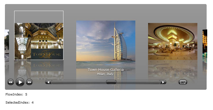
FlowIndex is used to indicate and control the current flow position. FlowIndex will always be the same as SelectedIndex as long the TotalFocusItem property is set to 1.
The following example shows how to use the FlowIndex in the UXFlow control.
| XAML |  Copy Code Copy Code |
|---|---|
<StackPanel HorizontalAlignment="Center" VerticalAlignment="Center"> <Intersoft:UXFlow x:Name="UXFlow1" Width="700" Height="300" TotalFocusItem="3"> <Intersoft:UXFlowItem ImageSource="le-meurice.jpg" Title="Hôtel Le Meurice" SubTitle="Paris, opposite Tuileries Garden."/> <Intersoft:UXFlowItem ImageSource="altira-macau.jpg" Title="Altira Macau" SubTitle="Taipa Island, Macau."/> <Intersoft:UXFlowItem ImageSource="st-regis.jpg" Title="St. Regis Shanghai" SubTitle="Shanghai, China."/> <Intersoft:UXFlowItem ImageSource="palazzo-versace.jpg" Title="Palazzo Versace Australia" SubTitle="Gold Coast, Queensland, Australia."/> <Intersoft:UXFlowItem ImageSource="town-house-galleria.jpg" Title="Town House Galleria" SubTitle="Milan, Italy."/> <Intersoft:UXFlowItem ImageSource="burj-al-arab.jpg" Title="Burj Al Arab" SubTitle="Dubai, United Arab Emirates."/> <Intersoft:UXFlowItem ImageSource="emirates-palace.jpg" Title="Emirates Palace" SubTitle="Abu Dhabi, United Arab Emirates."/> <Intersoft:UXFlowItem ImageSource="mardan-place.jpg" Title="Mardan Palace" SubTitle="Antalya, Turkey"/> <Intersoft:UXFlowItem ImageSource="amanjiwo-resort.jpg" Title="Amanjiwo Resort Borobudur" SubTitle="Central Java, Indonesia"/> <Intersoft:UXFlowItem ImageSource="grand-hotel-europe.jpg" Title="Grand Hotel Europe" SubTitle="St. Petersburg, Russia"/> </Intersoft:UXFlow> <Intersoft:FieldLabel Header="FlowIndex: "> <TextBlock Text="{Binding FlowIndex, ElementName=UXFlow1}" VerticalAlignment="Center"/> </Intersoft:FieldLabel> <Intersoft:FieldLabel Header="SelectedIndex: "> <TextBlock Text="{Binding SelectedIndex, ElementName=UXFlow1}" VerticalAlignment="Center"/> </Intersoft:FieldLabel> </StackPanel> |
|
Data Binding
Like the other ISSelectionControl, you can bind collection of data to the UXFlow control. To learn more about data binding, see Data Binding Overview.
The following list describes the data members that are available for simple data binding:
- ImageMemberPath
Used to bind the ImageSource property. - TitleMemberPath
Used to bind the Title property. - SubtitleMemberPath
Used to bind the SubTitle property. - VideoMemberPath (if any)
Used to bind the VideoSource property.
 |
Note that DisplayMemberPath is not used in UXFlow’s data binding. |
ItemContainer type for UXFlow is UXFlowItem.
The following example shows how to bind UXFlow using the member path properties.
| Model | Copy Code |
|---|---|
using System; using System.ComponentModel; namespace ClientUI.Samples.Models { public class Hotel : INotifyPropertyChanged { public Hotel() { } private Uri _image; private string _location; private string _name; public Uri Image { get { return this._image; } set { if (this._image != value) { this._image = value; this.OnPropertyChanged("Image"); } } } public string Location { get { return this._location; } set { if (this._location != value) { this._location = value; this.OnPropertyChanged("Location"); } } } public string Name { get { return this._name; } set { if (this._name != value) { this._name = value; this.OnPropertyChanged("Name"); } } } protected void OnPropertyChanged(string propertyName) { if (this.PropertyChanged != null) { this.PropertyChanged(this, new PropertyChangedEventArgs(propertyName)); } } public event PropertyChangedEventHandler PropertyChanged; } } |
|
| View Model | Copy Code |
|---|---|
using System; using System.Collections.ObjectModel; using System.ComponentModel; using ClientUI.Samples.Models; namespace ClientUI.Samples.ViewModels { public class MainPageViewModel : INotifyPropertyChanged { public MainPageViewModel() { this.Data = new ObservableCollection<Hotel>(); this.Data.Add(new Hotel() { Image = new Uri("le-meurice.jpg", UriKind.RelativeOrAbsolute), Location = "Paris, opposite Tuileries Garden.", Name = "Hôtel Le Meurice" }); this.Data.Add(new Hotel() { Image = new Uri("altira-macau.jpg", UriKind.RelativeOrAbsolute), Location = "Taipa Island, Macau.", Name = "Altira Macau" }); this.Data.Add(new Hotel() { Image = new Uri("st-regis.jpg", UriKind.RelativeOrAbsolute), Location = "Shanghai, China.", Name = "St. Regis Shanghai" }); this.Data.Add(new Hotel() { Image = new Uri("palazzo-versace.jpg", UriKind.RelativeOrAbsolute), Location = "Gold Coast, Queensland, Australia.", Name = "Palazzo Versace Australia" }); this.Data.Add(new Hotel() { Image = new Uri("town-house-galleria.jpg", UriKind.RelativeOrAbsolute), Location = "Milan, Italy.", Name = "Town House Galleria" }); this.Data.Add(new Hotel() { Image = new Uri("burj-al-arab.jpg", UriKind.RelativeOrAbsolute), Location = "Dubai, United Arab Emirates.", Name = "Burj Al Arab" }); this.Data.Add(new Hotel() { Image = new Uri("emirates-palace.jpg", UriKind.RelativeOrAbsolute), Location = "Abu Dhabi, United Arab Emirates.", Name = "Emirates Palace" }); this.Data.Add(new Hotel() { Image = new Uri("mardan-place.jpg", UriKind.RelativeOrAbsolute), Location = "Antalya, Turkey", Name = "Mardan Palace" }); this.Data.Add(new Hotel() { Image = new Uri("amanjiwo-resort.jpg", UriKind.RelativeOrAbsolute), Location = "Central Java, Indonesia", Name = "Amanjiwo Resort Borobudur" }); this.Data.Add(new Hotel() { Image = new Uri("grand-hotel-europe.jpg", UriKind.RelativeOrAbsolute), Location = "St. Petersburg, Russia", Name = "Grand Hotel Europe" }); } private ObservableCollection<Hotel> _data; public ObservableCollection<Hotel> Data { get { return this._data; } set { if (this._data != value) { this._data = value; this.OnPropertyChanged("Data"); } } } protected void OnPropertyChanged(string propertyName) { PropertyChangedEventHandler handler = PropertyChanged; if (handler != null) { handler(this, new PropertyChangedEventArgs(propertyName)); } } public event PropertyChangedEventHandler PropertyChanged; } } |
|
| View | Copy Code |
|---|---|
<UserControl x:Class="ClientUI.Samples.MainPage" xmlns="http://schemas.microsoft.com/winfx/2006/xaml/presentation" xmlns:x="http://schemas.microsoft.com/winfx/2006/xaml" xmlns:d="http://schemas.microsoft.com/expression/blend/2008" xmlns:mc="http://schemas.openxmlformats.org/markup-compatibility/2006" xmlns:Intersoft="http://intersoft.clientui.com/schemas" xmlns:vm="clr-namespace:ClientUI.Samples.ViewModels" mc:Ignorable="d" d:DesignHeight="400" d:DesignWidth="800"> <Grid x:Name="LayoutRoot" Background="White"> <Grid.DataContext> <vm:MainPageViewModel></vm:MainPageViewModel> </Grid.DataContext> <Intersoft:UXFlow Width="700" Height="300" ItemsSource="{Binding Data}" TitleMemberPath="Name" SubTitleMemberPath="Location" ImageMemberPath="Image"> </Intersoft:UXFlow> </Grid> </UserControl> |
|

Exploring UXFlow Features
Maximum Preview
MaximumPreview is used to determine the number of item in the left and right hand side of the focused item. The default value is -1 which means there is no limitation of preview item. It is a good idea to set this value to certain acceptable number based on your application layout to improve performance.
| XAML | Copy Code |
|---|---|
<Intersoft:UXFlow x:Name="UXFlow1" Width="700" Height="300" MaximumPreview="3"> <Intersoft:UXFlowItem ImageSource="le-meurice.jpg" Title="Hôtel Le Meurice" SubTitle="Paris, opposite Tuileries Garden."/> <Intersoft:UXFlowItem ImageSource="altira-macau.jpg" Title="Altira Macau" SubTitle="Taipa Island, Macau."/> ... </Intersoft:UXFlow> |
|

Total Focus Item
TotalFocusItem allows users to see one or more items in the UXFlow control. This property should be set to an odd value, for example: 1, 3, 5, 7, etc.
| XAML | Copy Code |
|---|---|
<Intersoft:UXFlow x:Name="UXFlow1" Width="700" Height="300" TotalFocusItem="3"> <Intersoft:UXFlowItem ImageSource="le-meurice.jpg" Title="Hôtel Le Meurice" SubTitle="Paris, opposite Tuileries Garden."/> <Intersoft:UXFlowItem ImageSource="altira-macau.jpg" Title="Altira Macau" SubTitle="Taipa Island, Macau."/> ... </Intersoft:UXFlow> |
|

Page Size
PageSize determines the index positioned moved when scrollbar is clicked.
| XAML | Copy Code |
|---|---|
<Intersoft:UXFlow x:Name="UXFlow1" Width="700" Height="300" PageSize="3"> <Intersoft:UXFlowItem ImageSource="le-meurice.jpg" Title="Hôtel Le Meurice" SubTitle="Paris, opposite Tuileries Garden."/> <Intersoft:UXFlowItem ImageSource="altira-macau.jpg" Title="Altira Macau" SubTitle="Taipa Island, Macau."/> ... </Intersoft:UXFlow> |
|
Slide Show
UXFlow can also be used as a slide show control. By default, the slide show buttons are visible. You can hide the slide show buttons by setting the SlideShowButtonVisibility property to Collapse.
Other properties that control the slide show behaviors are:
- SlideShowLatency which indicates the timeout between slides in milliseconds.
- SlideShowRepeat which indicates whether the slide show should repeat back to the start point when it reaches the end of collection.
| XAML | Copy Code |
|---|---|
<Intersoft:UXFlow x:Name="UXFlow1" Width="700" Height="300" SlideShowLatency="5000" SlideShowRepeat="True"> <Intersoft:UXFlowItem ImageSource="le-meurice.jpg" Title="Hôtel Le Meurice" SubTitle="Paris, opposite Tuileries Garden."/> <Intersoft:UXFlowItem ImageSource="altira-macau.jpg" Title="Altira Macau" SubTitle="Taipa Island, Macau."/> ... </Intersoft:UXFlow> |
|
Start Up Position
StartUpPosition determines the initial position to be selected when the page is first loaded. There are four types of startup position:
- Center
- First
- Last
- Custom
In Center mode, the UXFlow flows to the item which is in the center against total items in the collection. The First mode flows the item to the first item, while the Last mode flows the item to the last item.
The following example shows how to use the startup position feature.
| XAML | Copy Code |
|---|---|
<Intersoft:UXFlow x:Name="UXFlow1" Width="700" Height="300" StartUpPosition="First"> <Intersoft:UXFlowItem ImageSource="le-meurice.jpg" Title="Hôtel Le Meurice" SubTitle="Paris, opposite Tuileries Garden."/> <Intersoft:UXFlowItem ImageSource="altira-macau.jpg" Title="Altira Macau" SubTitle="Taipa Island, Macau."/> ... </Intersoft:UXFlow> |
|

Use Image Loader
The UXFlowItem is using ImageLoader control to load the image and perform compelling built-in effects based on the configuration. To disable this behavior, you can set the UseImageLoader property of the UXFlow control to false.
| XAML | Copy Code |
|---|---|
<Intersoft:UXFlow x:Name="UXFlow1" Width="700" Height="300" UseImageLoader="False"> <Intersoft:UXFlowItem ImageSource="le-meurice.jpg" Title="Hôtel Le Meurice" SubTitle="Paris, opposite Tuileries Garden."/> <Intersoft:UXFlowItem ImageSource="altira-macau.jpg" Title="Altira Macau" SubTitle="Taipa Island, Macau."/> ... </Intersoft:UXFlow> |
|
Video Player
UXFlow can also be used as a video player. When you create an UXFlowItem with MediaType set to Video and a VideoSource is set to a valid URI, the UXFlow automatically displays the player control panel when you mouse over on the the focused UXFlowItem.
You can full screen the video by clicking the full screen button in the control panel. Furthermore, you can also full screen the UXFlow entirely for a better viewing by clicking the full screen button in the main UXFlow user interface.
Virtual Flow
UXFlow comes with an innovative technology called VirtualFlow™. With this mode, UXFlow does not create the elements for all items. Instead, it creates only a certain number of elements, which is determined by the available space or by the MaximumPreview property.
To enable VirtualFlow mode, you set the EnableLoadOnDemand property to true.
VirtualFlow™ is primarily useful in advanced scenarios or enterprise web applications that require high scalability. For instance, an enterprise web application that displays video-based knowledge base could get the total number of items growing significantly as the business grows.
| XAML | Copy Code |
|---|---|
<Intersoft:UXFlow x:Name="UXFlow1" Width="700" Height="300" EnableLoadOnDemand="True"> <Intersoft:UXFlowItem ImageSource="le-meurice.jpg" Title="Hôtel Le Meurice" SubTitle="Paris, opposite Tuileries Garden."/> <Intersoft:UXFlowItem ImageSource="altira-macau.jpg" Title="Altira Macau" SubTitle="Taipa Island, Macau."/> ... </Intersoft:UXFlow> |
|
Drag and Drop Support
UXFlow is also equipped with full drag and drop support, which is powered by ClientUI DragDrop Framework. However, UXFlow implements drag-drop differently compared to other controls such as UXListBox, UXAccordion and UXDock, in the way users interact with the control.
UXFlow does not provide AllowReorderItem, AllowMoveItem, AllowRemoveItem properties. Instead, it introduces AllowDragItem property, which means that UXFlow only provides capability to drag its item (copy mode) and you will need to manually handle additional action in the drag events. When you set AllowDragItem property to true, any UXFlowItem can be dragged when they are positioned in the center as focus item. You can not drag items that are in preview position.
When AllowDropItem is set to True, a visual hint will be shown when an object is being dragged over to each UXFlowItem. You can change this visual hint by customizing the UXFlowItem template.
Customizing UXFlow Appearance
There are a variety of UXFlow visual elements that can be easily customized. The visual elements can be generally divided into five sections such as discussed in the following sections:
- Background Appearance
- Control Panel Appearance
- Padding
- Text Layout
- Reflection Visual Effect
Background Appearance
The background element of UXFlow is built using Border element. Therefore you have access to properties like Background, BorderBrush, BorderThickness and CornerRadius at your disposal to control the background appearance, such as shown in the following example.
| XAML | Copy Code |
|---|---|
<Intersoft:UXFlow x:Name="UXFlow1" Width="700" Height="300" BorderBrush="Black"> <Intersoft:UXFlow.Background> <LinearGradientBrush EndPoint="0.5,1" StartPoint="0.5,0"> <GradientStop Color="#7FFFF500" Offset="0"/> <GradientStop Color="#7F3CE74E" Offset="1"/> </LinearGradientBrush> </Intersoft:UXFlow.Background> <Intersoft:UXFlowItem ImageSource="le-meurice.jpg" Title="Hôtel Le Meurice" SubTitle="Paris, opposite Tuileries Garden."/> <Intersoft:UXFlowItem ImageSource="altira-macau.jpg" Title="Altira Macau" SubTitle="Taipa Island, Macau."/> ... </Intersoft:UXFlow> |
|

In certain cases, you may want to customize the background entirely. You can create the template and assign the template to the BackgroundTemplate property. You can also create the template directly from the provided context menu in design-time.
The following example shows how to customize the background entirely by customizing the BackgroundTemplate.
| XAML | Copy Code |
|---|---|
<Intersoft:UXFlow x:Name="UXFlow1" Width="700" Height="300"> <Intersoft:UXFlow.BackgroundTemplate> <DataTemplate> <Grid> <Grid.Background> <LinearGradientBrush EndPoint="0.5,1" StartPoint="0.5,0"> <GradientStop Color="White" Offset="0"/> <GradientStop Color="Black" Offset="1"/> </LinearGradientBrush> </Grid.Background> <Intersoft:GlassLabel Content="Recommended Hotels" HorizontalAlignment="Left" VerticalAlignment="Top" Margin="8,8,0,0" CornerRadius="0"/> </Grid> </DataTemplate> </Intersoft:UXFlow.BackgroundTemplate> <Intersoft:UXFlowItem ImageSource="le-meurice.jpg" Title="Hôtel Le Meurice" SubTitle="Paris, opposite Tuileries Garden."/> <Intersoft:UXFlowItem ImageSource="altira-macau.jpg" Title="Altira Macau" SubTitle="Taipa Island, Macau."/> ... </Intersoft:UXFlow> |
|

Control Panel Appearance
The control panel element is located at the bottom of UXFlow which provides navigation and control panel for navigating the items.
Several properties that you can customize for this element are:
-
The distance / margin with bottom boundary using ControlPanelPosition property.
XAML Copy Code<Intersoft:UXFlow x:Name="UXFlow1" Width="700" Height="300" ControlPanelPosition="40"> <Intersoft:UXFlowItem ImageSource="le-meurice.jpg" Title="Hôtel Le Meurice" SubTitle="Paris, opposite Tuileries Garden."/> <Intersoft:UXFlowItem ImageSource="altira-macau.jpg" Title="Altira Macau" SubTitle="Taipa Island, Macau."/> ... </Intersoft:UXFlow>
-
The buttons visibility / control panel visibility through Control Panel related properties such as ControlPanelVisibility, FullScreenButtonVisibility, SlideShowButtonVisibilty, and ScrollBarVisibility.
XAML Copy Code<Intersoft:UXFlow x:Name="UXFlow1" Width="700" Height="300" SlideShowButtonVisibility="Collapsed" FullScreenButtonVisibility="Collapsed"> <Intersoft:UXFlowItem ImageSource="le-meurice.jpg" Title="Hôtel Le Meurice" SubTitle="Paris, opposite Tuileries Garden."/> <Intersoft:UXFlowItem ImageSource="altira-macau.jpg" Title="Altira Macau" SubTitle="Taipa Island, Macau."/> ... </Intersoft:UXFlow>
Padding
Padding affects the UXFlow items positioning in overall. You may want to use this property to position the items in order to create different visual effects or provide some space to display other content.
| XAML | Copy Code |
|---|---|
<Intersoft:UXFlow x:Name="UXFlow1" Width="700" Height="300" Padding="400,0,0,0"> <Intersoft:UXFlowItem ImageSource="le-meurice.jpg" Title="Hôtel Le Meurice" SubTitle="Paris, opposite Tuileries Garden."/> <Intersoft:UXFlowItem ImageSource="altira-macau.jpg" Title="Altira Macau" SubTitle="Taipa Island, Macau."/> ... </Intersoft:UXFlow> |
|

Text Layout
There are two text elements in UXFlow, a title and a sub title element. Title element is used to display the Title text of the selected item, while sub title element is used to display the SubTitle text of the selected item. The title element is positioned on the top of sub title element; you can control the height of each element through TitleSpace and SubTitleSpace properties accordingly.
These properties are also useful to provide margin between the title element, sub title element and the control panel element. Note that you should specify enough amount of height for the text to be displayed, if your text space is smaller than the actual text size, the text may look truncated.
These text elements can also be collapsed entirely if not desired, distributing more space for the flow element. To visibility of these text elements can be customized through the TitleVisibility and SubTitleVisibility property respectively.
| XAML | Copy Code |
|---|---|
<Intersoft:UXFlow x:Name="UXFlow1" Width="700" Height="300" TitleSpace="20" SubTitleSpace="30"> <Intersoft:UXFlowItem ImageSource="le-meurice.jpg" Title="Hôtel Le Meurice" SubTitle="Paris, opposite Tuileries Garden."/> <Intersoft:UXFlowItem ImageSource="altira-macau.jpg" Title="Altira Macau" SubTitle="Taipa Island, Macau."/> ... </Intersoft:UXFlow> |
|

Reflection Effects
Reflection effect is one of the built-in effects integrated in the UXFlow control, which can be controlled through the ReflectionBrush property.
Customizing UXFlow Visual Effects
UXFlow provides two types of visual effects. The first one is adapted from Apple iTunes’s cover flow, which uses a perspective point of view, and the other is an Intersoft's unique implementation which uses scale point of view.
Both of the effect shares several settings in common such as explained in the following list:
- ItemOffset
Determines the space between the focus item with the first item on the left and right using the following formula [distance = offset * actual CoverSize]. Meanwhile the distance between the rest of items is determined by ItemSpace.

ItemOffset = 0.3

ItemOffset = 0.6

ItemOffset = 0.8
- ItemSpace
Determines the space between items except the first item on the left and right of focus item.

ItemOffset = 0.4 and ItemSpace = 70

ItemOffset = 0.4 and ItemSpace = 30
Perspective Mode
In this new version, the perspective point effect has been significantly enhanced to provide visually compelling flow effect.
The perspective effect is controlled by the following properties:
-
PerspectiveRotation
Determines the angle of rotation that UXFlow should perform; by default the value is 45.

PerspectiveRotation = 60

PerspectiveRotation = 30
-
PerspectiveOffsetZ
Determines the Z position of the perspective. The default value is -200


PerspectiveOffsetZ = -400
-
PerspectiveOffsetY
Determines the Y position of the perspective. The default value is 0.

While the flow animation is controlled by:
You can control the flow-in speed and flow out speed in four different transformations (movement x, movement z, scale and rotation). To achieve the best animation as you desired, you may need to play around with these properties.
Scale Mode
The effect of this mode is controlled by the following properties:

While the flow animation is controlled by:
You can control the flow-in speed and flow out speed in four different transformations (movement x, and scale). To achieve the best animation as you desired, you may need to play around with these properties.