


This topic discusses the content model used by ClientUI controls. The content model specifies the types of objects that a control can contain.
Intersoft ClientUI provides four content model types which are equivalent with the four content model that WPF introduces, plus several enhanced content model such as ContentItems and ImageContent model.
The four basic content models are:
- ContentControl
The control contains a single item. - HeaderedContentControl
The control contains a header and a single item. - ItemsControl
The control contains collection of item. - HeaderedItemsControl
The control contains a header and collection of item.
The other two enhanced content models are:
- ContentItems
Comprehensive control that contains collection of item, such as UXDropDownButton, UXSplitButton, UXStackButton etc. - ImageContent
ContentControl that contains image element along with the content element.
ContentControl
The simplest content model of the four is the ContentControl, which has a Content property. The Content property is of type Object, so there are no restrictions on what you can put in a ContentControl. You can use either Extensible Application Markup Language (XAML) or code to set the Content.
The base class for content control model in ClientUI line up is ISContentControl. The following are some examples of controls that use the ISContentControl content model:
Button Controls
UI Controls
Window Controls
Assigning content to Content Control
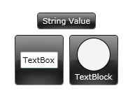
The following example demonstrates how to create three GlassLabel controls with Content set to one of the following:
- A string
- A UIElement
- A Panel that contains other UIElement objects.
| XAML |  Copy Code Copy Code |
|---|---|
<Intersoft:GlassLabel Content="String Value" Margin="4"/> <Intersoft:GlassLabel Margin="4"> <TextBox TextWrapping="Wrap" Text="TextBox"/> </Intersoft:GlassLabel> <Intersoft:GlassLabel Margin="4"> <StackPanel> <Ellipse Fill="WHITE" Height="48" Stroke="Black" Width="48" HorizontalAlignment="Center" VerticalAlignment="Center"/> <TextBlock TextWrapping="Wrap" Text="TextBlock" HorizontalAlignment="Center" VerticalAlignment="Center"/> </StackPanel> </Intersoft:GlassLabel> |
|
The following figure shows three GlassLabel controls created in the previous example.
HeaderedContentControl
The HeaderedContentControl inherits the Content property from ContentControl and defines the Header property that is of type Object. Header provides a heading for the control. Like the Content property of a ContentControl, the Header can be any type.
The base class for headered content control model in ClientUI controls is ISHeaderedContentControl. The following are some examples of controls that use the ISHeaderedContentControl content model:
Examples of HeaderedContentControl
The following examples show several heading concept in ClientUI controls.
| Group Box | Copy Code |
|---|---|
<Intersoft:GroupBox Header="Contact Info"> <StackPanel Background="#FFE2B22F"> <Intersoft:FieldLabel Header="First Name :" HeaderWidth="80" HorizontalHeaderAlignment="Right"> <Intersoft:UXTextBox Width="100"/> </Intersoft:FieldLabel> <Intersoft:FieldLabel Header="Last Name :" HeaderWidth="80" HorizontalHeaderAlignment="Right"> <Intersoft:UXTextBox Width="100"/> </Intersoft:FieldLabel> <Intersoft:FieldLabel Header="Email :" HeaderWidth="80" HorizontalHeaderAlignment="Right"> <Intersoft:UXTextBox Width="100"/> </Intersoft:FieldLabel> <Intersoft:FieldLabel Header="Phone :" HeaderWidth="80" HorizontalHeaderAlignment="Right"> <Intersoft:UXTextBox Width="100"/> </Intersoft:FieldLabel> </StackPanel> </Intersoft:GroupBox> |
|

| Field Label | Copy Code |
|---|---|
<Intersoft:FieldLabel Header="First Name :" HeaderWidth="80" HeaderForeground="Red"> <Intersoft:UXTextBox Width="100" Background="White"/> </Intersoft:FieldLabel> |
|

| UXCallOut | Copy Code |
|---|---|
<Intersoft:UXCallOut> <Intersoft:UXCallOut.Header> <Intersoft:GlassButton Content="Next Picture"></Intersoft:GlassButton> </Intersoft:UXCallOut.Header> <Grid Height="150" Width="150"> <Image Source="/Lighthouse.jpg" Stretch="Fill"/> </Grid> </Intersoft:UXCallOut> |
|

ItemsControl
Controls that inherit from ItemsControl contain a collection of objects. You can use either the ItemsSource property or the Items property to populate an ItemsControl.
The base class for items control model in ClientUI is ISItemsControl. The following are some examples of controls that use the ISItemsControl content model:
ItemsSource property
The ItemsSource property of the ItemsControl enables you to use any type that implements IEnumerable as the content of the ItemsControl. ItemsSource is typically used to display a data collection or to bind an ItemsControl to a collection object.
To learn more how to bind data to ItemsSource property, see Walkthrough: Display data in UXListBox using MVVM Pattern.
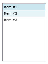
Items property
If you do not want to use an object that implements IEnumerable to populate the ItemsControl, you can add items by using the Items property.
| XAML | Copy Code |
|---|---|
<Intersoft:UXListBox HorizontalAlignment="Left" Height="200" VerticalAlignment="Top" Width="150"> <Intersoft:UXListBoxItem Content="Item #1"/> <Intersoft:UXListBoxItem Content="Item #2"/> <Intersoft:UXListBoxItem Content="Item #3"/> </Intersoft:UXListBox> |
|
Styling and Templating
Each ItemsControl has a specific item type that represent the items of the ItemsControl. You can change the style / template of these items using ItemContainerStyle, ItemContainerStyleSelector, ItemTemplate and ItemTemplateSelector.
To learn more about styling and templating, see Styles and Templates Overview.
HeaderedItemsControl
The HeaderedItemsControl inherits from the ItemsControl class. The HeaderedItemsControl defines the Header property, which follows the same rules as the Header property of a HeaderedContentControl.
The base class for headered items control model in ClientUI is ISHeaderedItemsControl. The following are some examples of controls that use the ISHeaderedItemsControl content model:
Examples of HeaderedItemsControl
The following examples shows several heading and items concept in ClientUI controls line up.
| UXContextMenu | Copy Code |
|---|---|
<Grid x:Name="Layout" Background="White" Intersoft:ContextMenuService.ContextMenuName="MyContextMenu"> <Intersoft:UXContextMenu x:Name="MyContextMenu" HorizontalAlignment="Left" VerticalAlignment="Top"> <Intersoft:UXMenuItem Header="View" Background="#FF767676"> <Intersoft:UXMenuItem Header="Large Icons"/> <Intersoft:UXMenuItem Header="Medium Icons"/> <Intersoft:UXMenuItem Header="Small icons"/> </Intersoft:UXMenuItem> <Intersoft:UXMenuItem Header="Sort By"> <Intersoft:UXMenuItem Header="Name"/> <Intersoft:UXMenuItem Header="Size"/> </Intersoft:UXMenuItem> <Intersoft:UXSeparator/> <Intersoft:UXMenuItem Header="Refresh"/> </Intersoft:UXContextMenu> </Grid> |
|

| UXAccordion | Copy Code |
|---|---|
<Intersoft:UXAccordion HorizontalAlignment="Center" Height="200" VerticalAlignment="Center" Width="150"> <Intersoft:UXAccordionItem Header="Co-workers"> <Intersoft:UXAccordionOption Content="Alex"/> <Intersoft:UXAccordionOption Content="Vyna"/> <Intersoft:UXAccordionOption Content="Greg"/> <Intersoft:UXAccordionOption Content="Silvia"/> </Intersoft:UXAccordionItem> <Intersoft:UXAccordionItem Header="Family"/> </Intersoft:UXAccordion> |
|

ContentItems
ContentItems is an enhanced content model concept for a comprehensive content controls that has collection of items. One of the examples that use ContentItems is UXDropDownButton, which is inherited from UXButtonItems class.
UXButtonItems is the base class of all ClientUI controls that have button characteristics and a collection of items. The following are some examples of controls that use the ContentItems model:
Examples of ContentItems
The following examples shows several content and items concept in ClientUI controls.
| UXStackButton | Copy Code |
|---|---|
<Intersoft:UXStackButton Content="Share This" DisplayMode="ContentAndImage" Foreground="White" Icon="ShareLarge.png" ImageHeight="32" ImageWidth="32" TextImageRelation="ImageAboveText" VerticalContentAlignment="Bottom" Padding="4,15,4,8" Width="80" HorizontalContentAlignment="Center" StackTotalDisplayItem="0" Text="Share to..." Height="80" StackMode="GridStyle" StackGridMode="DynamicGrid" DisplayAnimation="Zoom" Background="#C4000000" CornerRadius="8" IsOpen="True" HorizontalAlignment="Right"> <Intersoft:UXStackItem Text="Flickr" Icon="flickr.png"/> <Intersoft:UXStackItem Text="Facebook" Icon="facebook.png"/> <Intersoft:UXStackItem Text="Twitter" Icon="twitter.png"/> <Intersoft:UXStackItem Text="Delicious" Icon="delicious.png"/> <Intersoft:UXStackItem Text="Digg" Icon="digg.png"/> <Intersoft:UXStackItem Text="LinkedIn" Icon="linkedin.png"/> </Intersoft:UXStackButton> |
|

| UXDropDownButton | Copy Code |
|---|---|
<Intersoft:UXDropDownButton Content="DropDownButton" HorizontalAlignment="Left" VerticalAlignment="Top"> <Intersoft:UXMenuItem Header="Item #1"/> <Intersoft:UXMenuItem Header="Item #2"/> <Intersoft:UXMenuItem Header="Item #3"/> <Intersoft:UXMenuItem Header="Item #4"/> </Intersoft:UXDropDownButton> |
|

ImageContent
ImageContent is a conceptual content model for common controls that often use Image and Content representation at the same time such as Button, Label, etc.
Silverlight / WPF controls allows only a single arbitrary content in all its built-in presentation model, which introduces difficulty to create a content model that has both image and content at the same time.
Consider the following scenario where you want to create a button with an image and a text as its content.

To achieve this, you would normally need to specify the content of the Button with a complex structure similar to the following code.
| XAML | Copy Code |
|---|---|
<Button HorizontalAlignment="Center" VerticalAlignment="Center"> <StackPanel Orientation="Horizontal" HorizontalAlignment="Center" VerticalAlignment="Center"> <Image Source="Save.png" Stretch="None" Margin="2,0"/> <TextBlock Text="Save" HorizontalAlignment="Center" VerticalAlignment="Center" Margin="4,0"/> </StackPanel> </Button> |
|
Although not absolutely wrong, it might be less than ideal when it comes to design pattern and code efficiency.
Compared to the approach above, you can use the UXButton control that implements ImageContent content model to achieve the same results using straightforward and simplified code such as shown in the following example.
| XAML | Copy Code |
|---|---|
<Intersoft:UXButton Content="Button" DisplayMode="ContentAndImage" Icon="Save.png" HorizontalAlignment="Center" VerticalAlignment="Center" /> |
|
Understanding ImageContent Control Structure
There is no base class for controls that implements ImageContent presentation model. In fact, all controls that uses ImageContent model are derived from various base content model classes discussed above. This allows for flexible ImageContent design pattern to be applied to any controls without limited to a specific base class.
The following are some examples of controls that implement ImageContent presentation model:
Button Controls
UI Controls

Configuring ImageContent properties
All controls that support ImageContent presentation model expose several common properties such as DisplayMode, TextImageRelation, ImageWidth, ImageHeight and ImageStretch. You can easily customize the look and feel of your Image and Content presentation by using these properties.
For certain controls which are used as ItemContainer for ItemsControl such as UXListBoxItem, you can also configure the ImageContent properties from its parent which in this case is the UXListBox control.
To learn more how to configure these properties from parent level, see How-to: Configure UXListBoxItems ImageContent Properties from UXListBox.
 See Also
Concepts
Items Control Overview
Styles and Templates Overview
Other Resources
Walkthroughs and How-to Topics