
| Intersoft ClientUI 8 > ClientUI Controls > Control Library > UI Controls Overview > UXProgressBar |
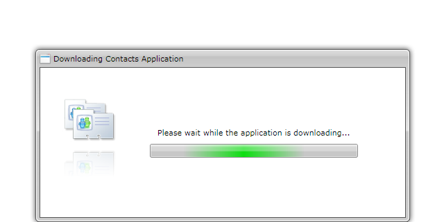
UXProgressBar is a rich, Aero-style progress bar control with support for determinate and indeterminate mode. UXProgressBar control can be used in indeterminate mode to represent a longer asynchronous operation such as checking updates or downloading progress.

UXProgressBar is used to indicate a progress based on the specified Value. Note that when you resize the control at runtime, for example due to window resize, the progress bar automatically adjusts the size relative to its dimension.
Changing the Value property also affects the progress text. You can format the progress text through the Text property. The {0} placeholder will be replaced with the actual progress value.
| XAML |
Copy Code
|
|---|---|
<Intersoft:UXProgressBar Height="20" Width="150" Text="{}{0} %" Value="50"/> |
|
Some progress is indeterminate, the best way to give indication is using indeterminate mode by setting the IsIndeterminate property to true.
| XAML |
Copy Code
|
|---|---|
<Intersoft:UXProgressBar Height="20" Width="150" IsIndeterminate="True"/> |
|
You can easily customize the appearance of the UXProgressBar control through the following properties:
Highlight animation is a user experience feature implemented in UXProgressBar. Its like a filter animation that move from left to right. This animation is enabled by default. To turn off the highlight animation, you set the EnableHighlightAnimation property fo false.
For more information about user experience features, see User Experiences Overview.