
| Intersoft ClientUI 8 > ClientUI Controls > Control Library > Advanced Input Controls Overview > UXNumericUpDown |
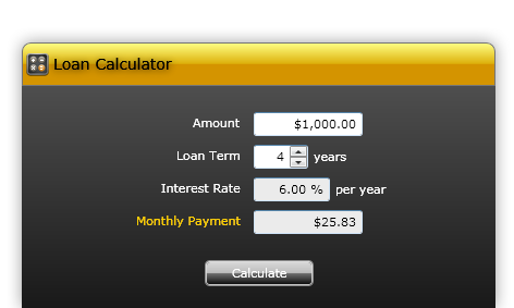
Based on the flexible UXSpinner control, UXNumericUpDown provides an easy numeric input with up down spin buttons. The comprehensive properties set provides full configuration on the control, such as the minimum value, maximum value, and the value increment.

UXNumericUpDown is a control that combines the UXCurrencyEditor control with UXButtonSpinner control to display numeric values. Since this control is a combination of several controls, these controls have similar characteristics as the control is used. To learn how to used UXCurrencyEditor, see UXCurrencyEditor Overview.
By default, the increment for this control is set to 1, you can change this value by setting the Increment property. You can also set the Maximum and Minimum property if you want a specific value that user can input or spin through the control. To disable users to input text into the control, you set the IsEditable property to false.
The following code shows how to create a simple UXNumericUpDown control with Minimum, Maximum and Increment property been set.
| XAML |
Copy Code
|
|---|---|
<Grid> <Intersoft:UXNumericUpDown Width="100" Minimum="1" Maximum="100" Increment="5" /> </Grid> |
|
UXNumericUpDown is built around the commanding semantics which allows the value changing interaction to be executed through declarative definition in the XAML markup. The commanding semantics is also an ideal approach for MVVM pattern development.
UXNumericUpDown already includes several predefined commands to change the selected value that you can use in your application.
Gets a command that increases the value of the UXNumericUpDown by the same amount as the Increment property.
Increase command will be invoked when you perform the following action:
Gets a command that decreases the value of the UXNumericUpDown by the same amount as the Increment property.
Decrease command will be invoked when you perform the following action:
Although these commands are already registered in the elements of UXNumericUpDown, you can still register these commands to other UIElement outside UXNumericUpDown scope. For example, you can have a UXButton that execute the Decrease command. For more information on how to register UXNumericUpDown commands to other type of UIElement, see How-to: Register UXNumericUpDown Command to UXButton.
The default spin button is always set to the right for the control. If you want to change the alignment of the spinner button, you set the SpinnerAlignment property to the Left. In case you don't want to show the spinner button, you set the SpinnerVisibility property to Collapsed. Although the spinner button are not shown, you can still do the increment and decrement by using key up and key down from the keyboard.
The following code shows how to change the spinner alignment in UXNumericUpDown.
| XAML |
Copy Code
|
|---|---|
<Grid> <Intersoft:UXNumericUpDown Width="100" SpinnerAlignment="Left" /> </Grid> |
|

The following code shows how to change the spinner visibility in UXNumericUpDown.
| XAML |
Copy Code
|
|---|---|
<Grid> <Intersoft:UXNumericUpDown Width="100" SpinnerVisibility="Collapsed" /> </Grid> |
|

If you would like to completely customize the control appearance or if you want to change the styles of each visual state, you can edit the template of the control and do the modification accordingly. To learn how to customize the template and visual states, see Styles and Template Overview.