
| Intersoft ClientUI 8 > ClientUI Fundamentals > Theme Manager Overview |
This topic describes the concepts of the ClientUI theme manager, the available themes, and provides guidelines to consume the theme resources as well as creating new elements that leverage the theme resources.
This topic contains the following sections:
ClientUI includes a built-in theme manager that allows you to instantly change the application’s look and feel at runtime. The ClientUI theme manager is modeled after the latest Windows 8 Modern UI style which provides two kind of customizable themes, namely Application Theme and UI Theme. The theme concept are further explained in the following sections.
The ClientUI theme manager provides two predefined application themes:
As a general guideline, the application theme is mostly connected to the background of the page and the foreground of the content.
The following table describes the theme-aware resources that are connected to the application theme.
| RESOURCE KEY | LIGHT | DARK |
| AppThemeBrush | #FFFFFFFF | #FF000000 |
| HeaderBrush | #FFA7A7A7 | #FFDADADA |
| SubHeaderBrush | #FF8D8D8D | #FFDFDFDF |
| NavigationBrush | #FF252525 | #FFDFDFDF |
| ContentBrush | #FF161616 | #FFF7F7F7 |
| ContentAlternateBrush | #FFA7A7A7 | #FFECECEC |
| TertiaryBrush | #FF7B7B7B | #FFDCDCDC |
| BorderBrush | #FFA7A7A7 | #FFE2E2E2 |
| AppThemeBrush | #FFD7D7D7 | #FFD7D7D7 |
The following sample code shows how to use the Theme Manager API to change the application time at runtime.
| C# |
Copy Code
|
|---|---|
using Intersoft.Themes.Shared; private void ChangeAppThemeButton_Click(object sender, RoutedEventArgs e) { ThemeManager.Current.ApplicationTheme = ApplicationTheme.Dark; } |
|
When the ApplicationTheme is set, all elements in the application that use the connected resources (also called as theme-aware resources) will be updated instantly. The ClientUI theme manager uses the native approach to perform the runtime theme update which enables real-time color update without performance bottleneck, even in application with relatively large number of elements.
The UI theme uses accent color concept in which the color will be applied to elements that represent user interaction such as selection, mouse over highlight, press state, and so on. In this release, the ClientUI theme manager ships with 7 predefined UI themes.
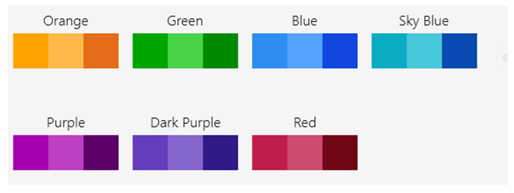
Each UI theme represents an accent color such as Orange or Purple, and each accent color has three variants, main accent color, light accent color, and strong accent color. As the results, a single UI theme is always associated with at least three accent colors that will be used consistently throughout the user interface in the application.
The following illustration shows the predefined UI theme and its associated accent colors.

Each color accent is represented through a unique resource key:
The following sample code shows how to use the Theme Manager API to change the application time at runtime.
| C# |
Copy Code
|
|---|---|
private void ChangeColorThemeButton_Click(object sender, RoutedEventArgs e) { ThemeManager.Current.ColorTheme = UIColorTheme.Purple; } |
|
Other resources that are connected to the UI theme color are as follow:
In this release, ClientUI ships modern themes for a host of common user interface controls that leverage the theme-aware resources such as described above. The ClientUI controls that support the UI themes are as follow:
In addition, there are several control style variants that have been styled to resemble Windows-style Modern user interface such as follows:
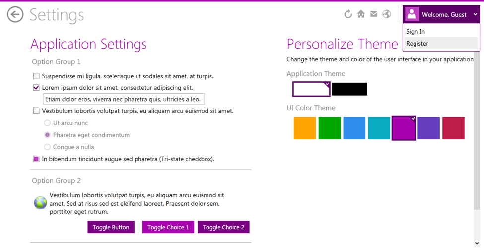
The following screenshot illustrates the theme-aware ClientUI controls mentioned above.

For more information on how to use the ClientUI theme manager in your application, see the Getting Started with Theme-aware Project section below.
Modern user interface today relies extensively on beautiful typography to create a balanced look and feel between the content and the design elements. ClientUI theme manager includes several predefined fonts that you can use in your application such as Segoe UI and Segoe UI Light. In addition, all design elements such as icons are best represented with font-based icons when possible. As such, ClientUI theme manager also includes a symbol font based on Segoe UI Symbol. These fonts can be used freely to build applications using Microsoft-based development platforms.
The font resources can be easily referenced through the following resource keys:
The following screenshot illustrates the font variants available in the ClientUI theme manager.

In addition to the theme-aware resources, the ClientUI theme manager also includes a number of useful predefined resources that you can directly use in your project. These resources used neutral colors and will look appropriate in either light or dark theme.
DropShadowEffect Resources:
SolidColorBrush Resources:
ClientUI theme manager comes with a set of assemblies that contain the shared resources and the control resources. At the heart of the ClientUI theme manager is the Intersoft.Themes.Shared assembly which hosts the core theme manager API and shared resources. This assembly must be referenced in your application to leverage the theming features.
In addition, the theme manager includes several assemblies that have been logically grouped by functionality. For example, all control resources related to common user interface – such as button, dropdown, and window – are contained in the Intersoft.Themes.Controls.Metro assembly, while the data intensive controls are contained in Intersoft.Themes.DataControls.Metro. This separation allows you to choose which control styles you would like to apply in your application.
The above mentioned assemblies can be found in the Assembly References dialog in Visual Studio 2010 or 2012.
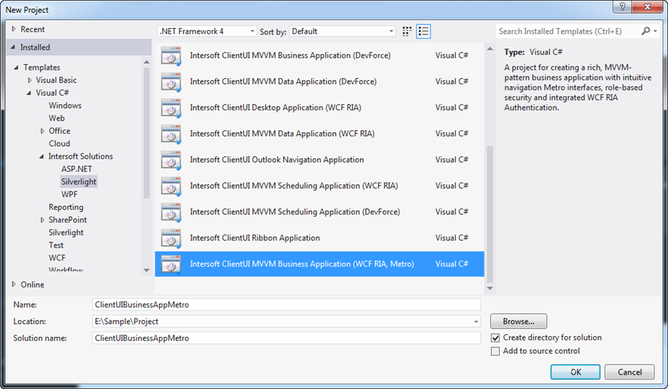
The easiest way to get started with the ClientUI theme manager is by creating your new project based on the ClientUI Metro Business Application project template which can be found in the Visual Studio’s New Project dialog. This project template includes several ready-to-use pages that harness the theme-aware UI controls. It also includes a Settings page that shows how to change the application and UI theme color using MVVM pattern.
The following screenshot shows the location of the ClientUI Metro Business Application project template in Visual Studio 2012.

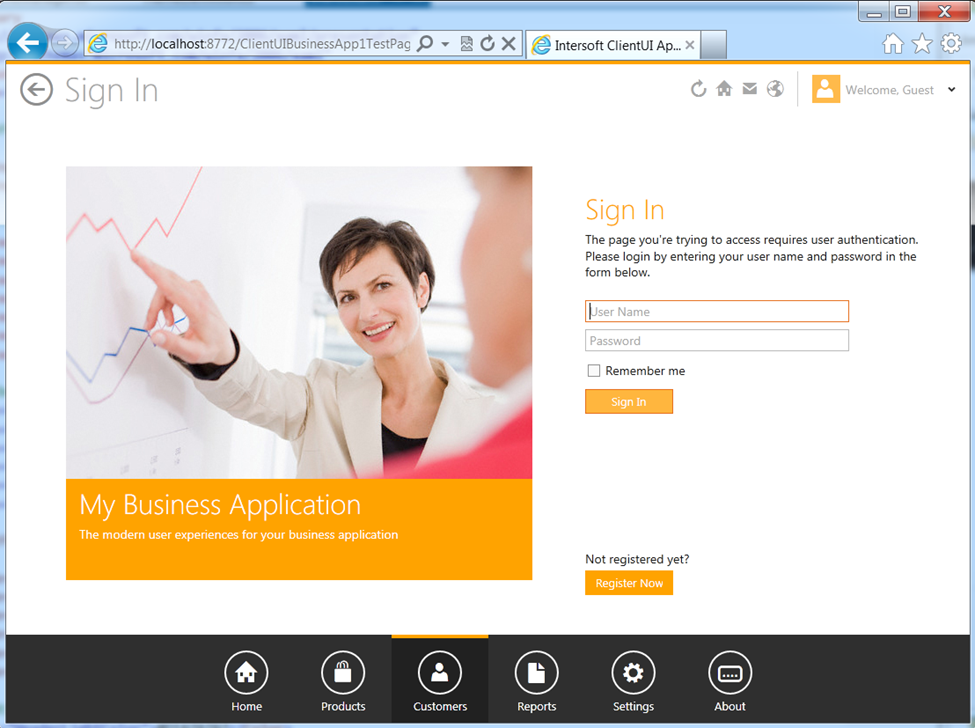
The following screenshot shows the newly created project running in browser.

This section explains how you can use the theme-aware resources described in the above sections, and apply them to your user interface elements.
Using the theme-aware resources in your application is straightforward, thanks to the robust theme manager architecture that leverages native XAML capability. To apply the resource, you can simply specify the resource key in the design element through the static resource definition.
The following code shows how to apply the main theme brush to the title element.
| XAML |
Copy Code
|
|---|---|
<TextBlock Text=”Application Settings” Foreground=”{StaticResource ThemeBrush}” /> |
|
With the above simple definition, the color of the title element will be synchronized automatically as the theme is changed at runtime through the ThemeManager API. This means that you don’t have to write additional code or specific attributes to keep the elements in sync with the current theme.
As a general guideline, it’s highly recommend to create a Style definition that represents a semantic design element. For example, instead of assigning the theme-aware resource to the design element individually, you may want to create a Style definition such as PageHeaderStyle, PageSubHeaderStyle and so on. This allows you to easily reuse the common styles in your application, such as shown in the code below.
| XAML |
Copy Code
|
|---|---|
<Style x:Key="PageHeaderStyle" TargetType="TextBlock"> <Setter Property="Foreground" Value="{StaticResource ThemeBrush}"/> <Setter Property="FontFamily" Value="{StaticResource TitleLightFont}"/> <Setter Property="FontSize" Value="32"></Setter> <Setter Property="Margin" Value="0,5"></Setter> </Style> <TextBlock Text="Application Settings" Style="{StaticResource PageHeaderStyle}"/> |
|