
| Intersoft.Client.UI.Aqua.UXRibbon Namespace > UXRibbonBar Class : QuickAccessToolBar Property |
Public Property QuickAccessToolBar As UXRibbonQuickAccessToolBar
Dim instance As UXRibbonBar
Dim value As UXRibbonQuickAccessToolBar

instance.QuickAccessToolBar = value

value = instance.QuickAccessToolBar
public UXRibbonQuickAccessToolBar QuickAccessToolBar {get; set;}
public:
property UXRibbonQuickAccessToolBar^ QuickAccessToolBar {
   UXRibbonQuickAccessToolBar^ get();
   void set (    UXRibbonQuickAccessToolBar^ value);
}
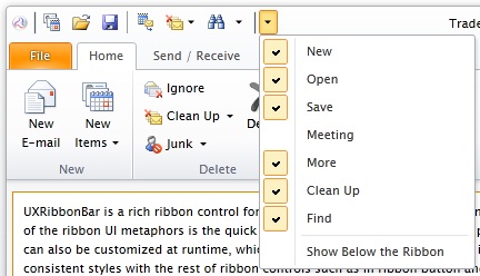
UXRibbonQuickAccessToolbar is a ribbon-friendly control that provides quick access to frequently accessed commands such as New, Open, Save and Print. You can hide the commands initially by setting the Visibility property to Collapsed. At runtime, users can show the hidden commands through the dropdown menu in the quick access toolbar.
By default, the position of UXRibbonQuickAccessToolbar is set to the top of UXRibbonBar. If you prefer, you can set the position to the bottom by setting the ToolBarPosition property to Bottom.
UXRibbonQuickAccessToolbar derives from UXToolbar which is an advanced, rich-featured toolbar control with elegant built-in styles and built-in support for various button types such as described below.
Represents a standard command button.
Represents a button that displays dropdown menu when clicked, which can contain a collection of menu items and nested menu items similar to UXContextMenu.
Represents a combination of command button and a dropdown menu. This type of button typically provides users with a default command that executed when the command part of the button is clicked, while at the same time allowing users to choose alternative commands through the dropdown arrow. Similar to the DropdownButton, you can also define a collection of menu items and nested menu items as in UXContextMenu.
Represents a custom button that can be used to contain any UIElement or controls. With this type, the default layout properties such as margin and padding as well as the UI behaviors would be disabled. Consequently, this type is ideal to host custom controls such as text box, combo box, date picker and others.
The following code shows how to add UXRibbonQuickAccessToolbar to the ribbon control with several buttons using different button type.
| XAML |
Copy Code
|
|---|---|
<Intersoft:UXRibbonBar.QuickAccessToolBar> <Intersoft:UXRibbonQuickAccessToolBar> <Intersoft:UXRibbonToolBarButton DisplayMode="Image" Content="New" Icon="/assets/icons/new.png" /> <Intersoft:UXRibbonToolBarButton DisplayMode="Image" Content="Open" Icon="/assets/icons/openfolder.png" /> <Intersoft:UXRibbonToolBarButton DisplayMode="Image" Content="Save" Icon="/assets/icons/save.png" /> <Intersoft:UXSeparator /> <Intersoft:UXRibbonToolBarButton Visibility="Collapsed" DisplayMode="Image" Content="Meeting" Icon="/assets/icons/meeting.png" IsToggleButton="True" /> <Intersoft:UXRibbonToolBarButton DisplayMode="Image" Content="More" Icon="/assets/icons/more.png" /> <Intersoft:UXRibbonToolBarButton ButtonType="DropdownButton" DisplayMode="Image" Content="Clean Up" Icon="/assets/icons/clean_up.png"> <Intersoft:UXRibbonMenuItem Header="Clean Up Conversation" /> <Intersoft:UXRibbonMenuItem Header="Clean Up Folder" /> <Intersoft:UXRibbonMenuItem Header="Clean Up Folder & Subfolders" /> </Intersoft:UXRibbonToolBarButton> <Intersoft:UXRibbonToolBarButton ButtonType="SplitButton" DisplayMode="Image" Content="Find" Icon="/assets/icons/find.png"> <Intersoft:UXRibbonMenuItem Header="Find" Icon="/assets/icons/find.png" /> <Intersoft:UXRibbonMenuItem Header="Advanced Find..." Icon="/assets/icons/find.png" /> <Intersoft:UXRibbonMenuItem Header="Go To..." /> </Intersoft:UXRibbonToolBarButton> </Intersoft:UXRibbonQuickAccessToolBar> </Intersoft:UXRibbonBar.QuickAccessToolBar> |
|
The result looks like the following figure.

The following example shows how to assign a command to a UXRibbonToolBarButton which will be executed when the item is pressed.
| XAML |
Copy Code
|
|---|---|
<Intersoft:UXRibbonToolBarButton Content="Add new task" Command="{Binding AddNewTaskCommand}" /> |
|
Target Platforms: Windows 7, Windows Vista SP1 or later, Windows XP SP3, Windows Server 2008 (Server Core not supported), Windows Server 2008 R2 (Server Core supported with SP1 or later), Windows Server 2003 SP2