

| Intersoft ClientUI 8 > ClientUI Controls > Control Library > UI Controls Overview > CallOut |
CallOut is a simple content control featuring highly customizable callout shape rendering.
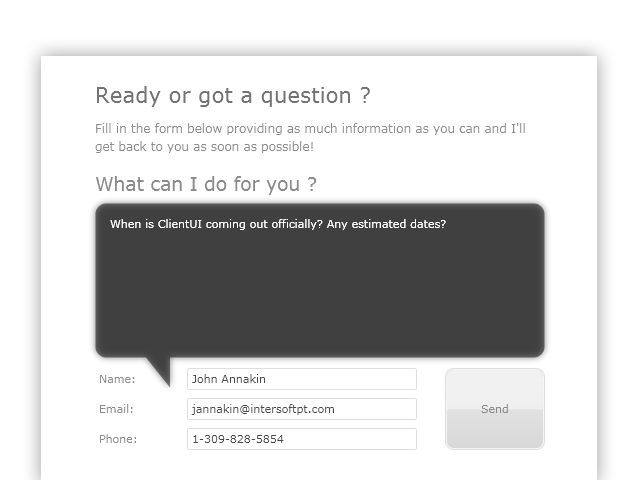
CallOut is inherited from ISContentControl, which means that it can contain a single object of any types, such as a string, an image, or a panel. For more information about this content model, see Content Model Overview.
Since CallOut supports CornerRadius, the control implements automatic margin which is applied to the content presenter placeholder. This was intended to avoid overlapping between the content and the callout shape. To customize this behavior, you can change the UseAutoMargin property to HorizontalOnly, or VerticalOnly, or None.
The following example shows the difference between each mode.
| XAML |
Copy Code
|
|---|---|
<StackPanel Orientation="Horizontal" d:LayoutOverrides="Height"> <Intersoft:CallOut Height="150" Width="150" Margin="8"> <RichTextBox> <Paragraph><Run Text="RichTextBox"/></Paragraph> </RichTextBox> </Intersoft:CallOut> <Intersoft: Height="150" Width="150" Margin="8" UseAutoMargin="VerticalOnly"> <RichTextBox> <Paragraph><Run Text="RichTextBox"/></Paragraph> </RichTextBox> </Intersoft:CallOut> <Intersoft:CallOut Height="150" Width="150" Margin="8" UseAutoMargin="HorizontalOnly"> <RichTextBox> <Paragraph><Run Text="RichTextBox"/></Paragraph> </RichTextBox> </Intersoft:CallOut> <Intersoft:CallOut Height="150" Width="150" Margin="8" UseAutoMargin="None"> <RichTextBox> <Paragraph><Run Text="RichTextBox"/></Paragraph> </RichTextBox> </Intersoft:CallOut> </StackPanel> |
|

CallOut control is commonly used to visualize modern balloon user interface. You can fully customize the appearance through the available properties such as listed below.
One of the most unique features in CallOut control is the ability to easily customize the pointer shape. The following sections explain the properties that controls the shape of the call out control.
ShowPointer determines whether the pointer is visible or not.
| XAML |
Copy Code
|
|---|---|
<StackPanel HorizontalAlignment="Center" VerticalAlignment="Center" Orientation="Horizontal"> <Intersoft:CallOut Margin="4" ShowPointer="False" Width="128" Height="128"/> <Intersoft:CallOut Margin="4" Width="128" Height="128"/> </StackPanel> |
|
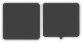
PointerPosition determines the position of your pointer. You can choose Top, Left, Right, or Bottom.
| XAML |
Copy Code
|
|---|---|
<StackPanel HorizontalAlignment="Center" VerticalAlignment="Center" Orientation="Horizontal"> <Intersoft:CallOut Margin="4" Width="128" Height="128"/> <Intersoft:CallOut Margin="4" Width="128" Height="128" PointerPosition="Left"/> <Intersoft:CallOut Margin="4" Width="128" Height="128" PointerPosition="Top"/> <Intersoft:CallOut Margin="4" Width="128" Height="128" PointerPosition="Right"/> </StackPanel> |
|

PointerOffset determines the offset position from its default positioning (at center of the CallOut).
| XAML |
Copy Code
|
|---|---|
<StackPanel HorizontalAlignment="Center" VerticalAlignment="Center" Orientation="Horizontal"> <Intersoft:CallOut Margin="4" Width="128" Height="128" PointerOffset="20"/> <Intersoft:CallOut Margin="4" Width="128" Height="128" PointerPosition="Left" PointerOffset="20"/> <Intersoft:CallOut Margin="4" Width="128" Height="128" PointerPosition="Top" PointerOffset="20"/> <Intersoft:CallOut Margin="4" Width="128" Height="128" PointerPosition="Right" PointerOffset="20"/> </StackPanel> |
|

PointerPoint1, PointerPoint2 and PointerPoint3, determine the triangular points that create the pointer shape.
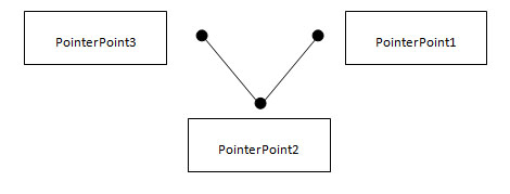
Note that all the points are relative to the center point of the CallOut. Which mean point (0, 0) is the center, point (-8, 0) is 8 pixel to left from the center point, and point (8, 0) is 8 pixel to right from the center point.
| XAML |
Copy Code
|
|---|---|
<StackPanel HorizontalAlignment="Center" VerticalAlignment="Center" Orientation="Horizontal"> <Intersoft:CallOut Margin="4" Width="128" Height="128" PointerOffset="20" PointerPoint1="2,0" PointerPoint3="20,0" PointerPoint2="0,24"/> <Intersoft:CallOut Margin="4" Width="128" Height="128" PointerPosition="Left" PointerOffset="20" PointerPoint1="2,0" PointerPoint3="20,0" PointerPoint2="0,24"/> <Intersoft:CallOut Margin="4" Width="128" Height="128" PointerPosition="Top" PointerOffset="20" PointerPoint1="2,0" PointerPoint3="20,0" PointerPoint2="0,24"/> <Intersoft:CallOut Margin="4" Width="128" Height="128" PointerPosition="Right" PointerOffset="20" PointerPoint1="2,0" PointerPoint3="20,0" PointerPoint2="0,24"/> </StackPanel> |
|

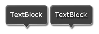
When you browse through CallOut properties, you would notice two similar Effect properties. The first is CallOutEffect and the other is Effect.
The difference between the two properties is the element of which the Bitmap Effect is applied. The CallOutEffect only applies the effect to CallOut shape, while Effect applies the effect to entire control’s element.
The following example shows the difference between using CallOutEffect and Effect.
| XAML |
Copy Code
|
|---|---|
<StackPanel Orientation="Horizontal"> <Intersoft:CallOut Foreground="White" Margin="4" HorizontalAlignment="Center" VerticalAlignment="Center"> <Intersoft:CallOut.CallOutEffect> <DropShadowEffect/> </Intersoft:CallOut.CallOutEffect> <TextBlock Text="TextBlock" FontSize="21.333" Margin="8"/> </Intersoft:CallOut> <Intersoft:CallOut Foreground="White" Margin="4" CallOutEffect="{x:Null}" HorizontalAlignment="Center" VerticalAlignment="Center"> <Intersoft:CallOut.Effect> <DropShadowEffect/> </Intersoft:CallOut.Effect> <TextBlock Text="TextBlock" FontSize="21.333" Margin="8"/> </Intersoft:CallOut> </StackPanel> |
|
Another key feature of CallOut control is the ability to specify TargetElement. By specifying the TargetElement property to a UIElement through element binding, the callout control automatically adjusts the pointer's position to the center point of the particular UIElement.
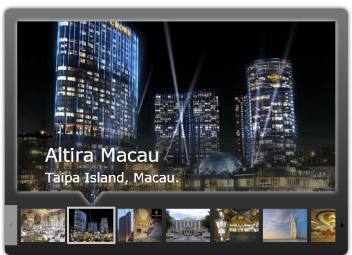
There are two scenarios that can be achieved with this feature:
 |
Your application may perform slower when your user interface contains a relatively large number of elements that use opacity and animation. To avoid the performance degradation, please carefully review your user interface design and balance the use of opacity and animation. |
The following example shows how to define TargetElement property using XAML.
| XAML |
Copy Code
|
|---|---|
<Intersoft:CallOut TargetElement="{Binding SelectedElement, ElementName=ListBox1}" PointerPoint1="-16,0" PointerPoint3="16,0" PointerPoint2="0,20"> </Intersoft:CallOut> <Intersoft:UXScroller> <Intersoft:UXListBox x:Name="ListBox1" ItemsSource="{Binding Hotels}"/> </Intersoft:UXScroller> |
|
The following example shows how to define TargetElement property using code behind.
| C# |
Copy Code
|
|---|---|
private void UXListBox_SelectionChanged(object sender, SelectionChangedEventArgs e) { UXListBox listBox = sender as UXListBox; this.SampleControl1.TargetElement = listBox.SelectedElement; } |
|