


WebTab includes most functions a "Tab control" should have, in addition to its unique features in the following:
- Rich Design Time experience
WebTab makes it possible for you to design and develop your rapid web application the same way and manner as in WinForm IDE. WebTab implements ClickAndEdit and ClickAndSelect technologies to deliver this time-saving and elegant architecture to life. See following screenshot for more details.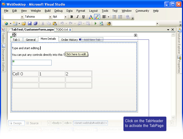
With this new level of design time experience, you can develop rich form application efficiently, effectively and quicker than ever before.
- TabHeader Position
You can configure the TabHeader Position to be at Top (Default) or Bottom. When you change the Position configuration, WebTab will automatically determine the best style as well as adjusting it for the consistency of the configured WebTab behaviors.
This feature will also work in conjunction of RoundCorner RenderMode.
- Size Mode
WebTab allows you to configure the tab header to use one of three sizing mode below:
1. Automatic
This is the default value for the SizeMode. The automatic sizing mode is the most recommended configuration which allowing you to enter any length of characters in the tab header's text. The TabHeader will shrink and expand automatically depend on the size of the text.
2. Fixed
This sizing mode is suitable when you want all tab headers to have same width. When using this mode, if the size of the text exceeds the width of the tab header, the text will be wrapped automatically. To prevent text wrapping, set AllowTextWrapping to False. In the case when AllowTextWrapping is False, the overflowed text will be truncated and shown as ellipsis.
3. Justified
The Justified sizing mode will automatically adjust tab header's width of all headers to fit the width of the tab control. This mode is suitable when you have fixed width of tab control with a lot of tab items and in the case where empty gaps are not preferred.
- Innovative Rendering Mode
WebTab introduced 3 Rendering Mode that you can use to easily create professional Tab control in your web application. The RenderMode values are:
1. Simple
This is the default RenderMode where WebTab will render basic and simple rectangle edge for the tab header. Use this mode for best performance and compact output.
2. RoundCorner
Thanks to TrueShape architecture which enables WebTab to render round corner without the need of using images. With this mode, the tab header's edge will be rendered in round corner fashion allowing you simulate XP-like Tab control. You can even configure the round corner colors and other advanced settings in RoundCornerSettings property enabling you to design a XP-like Tab control in any color schemes easily.
3. ComplexImages
The ComplexImages rendering mode lets you create a more sophisticated style and appearance of a Tab control. You can specify the images of every part of the element's edges in ImagesSettings. Each element's part requires two set of images which is the Inactive and Active state of the tab header, and another set for the junction/intersection part.
- Structure Management
WebTab extensively implements Structure Management API as well as in other members. With this feature, you can load previously saved structure file or stream from either design-time or runtime (via code behind).
To load layout programmatically, use LoadTabsStructureFromXml method available in WebTab object.
To save layout, use SaveTabsStructureToXml method available in WebTab object.
- Keyboard support and Accessibility
As WebUI.NET Framework family, WebTab offers complete keyboard support and accessibility that you would expect in desktop Tab control. You can easily enable keyboard navigation by setting EnableKeyboardNavigation to True.
When enabled, you can navigate the active tab in runtime by using following keys:
* Ctrl+Alt+Left Arrow. Navigate active tab to the left visible and enabled tab.
* Ctrl+Alt+Right Arrow. Navigate active tab to the right visible and enabled tab.
The accessibility supports can be enabled through two properties:
* ShowFocusBorder.
By enabling this property, users can press Tab key to navigate between TabHeader. When the designated TabHeader has the Focus Border, users can hit Space or Enter in order to activate the Page for that Tab.
* AccessKey.
WebTabItem has AccessKey property which you can configure for each tab items. The AccessKey term is similar to Mnemonic key used in WinForm development. For instance, you have the tab header's Text set to "General" and would like user to be able to access the General page by pressing Alt+G, you can then set the AccessKey to "g" (note that AccessKey is case-insensitive). In runtime mode, you will see an underline beneath G character automatically.
- AllowScrolling and Automatic Resizing
For scalability objective, you may use WebTab to contain a lot of tab items which might exceed the boundary of the Tab control itself. WebTab allows you to accomplish this scenario by turning on Scrolling feature.
The feature can be easily enabled with setting AllowScrolling to True. When set to True, a Left and Right arrow will appear at the right end of the Tab control.
The AllowScrolling feature worked in conjunction with Automatic Resizing, that is the arrows will appear as "disabled" when there are no items exceeding the Tab width boundary. However, when later user resized the browser window which cause the Tab control to be smaller than available items, the WebTab will automatically enable the Scroll arrows. Furthermore, any active tab which set from either codes or invoked by keyboard keys will be scrolled into view automatically.
The AllowScrolling feature will also work perfectly in conjunction with programmatic API call to the WebTab. For instance, adding or removing tab items dynamically at client side.

You can customize the Text and Image for the Scroll Arrows in TextSettings and ImagesSettings.
- AllowClose
For most common scenarios, you may want your users to close a Tab item by clicking on a Close button at right end of the Tab control. For example, in the scenario of "Text Editor application" or closable property pages. You can achieve this easily by configure AllowClose property to True.
When enabled, a Close control will appear at the right end of the Tab control, after the Scroll arrows if AllowScrolling is enabled. When clicked, it will close the currently Active Tab and activate the nearest tab at the right or left side depend on the which is available.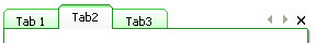

There should be at least one Active Tab so that the only Tab left in the WebTab control can't be closed.
- Client Side Events
WebTab exposed numerous client side events that you can consume in order to create rich interaction and extensible web applications. Following is the list of available client side events:
- OnAfterTabClosed
- OnAfterTabChanged
- OnBeforeClosed
- OnBeforeTabChanged
- OnCreated
- OnInitialize
- OnScroll
The OnBeforeClosed event is the best place where you can put your codes to validate some actions before the Tab is really closed. For instance, you may want to display a WebDialogBox asking "Do you want to save the changes?". You can cancel the Close action by returning false in your javascript function which used to handle the event.
The other most common scenario would be populating some information when a Tab is activated. For instance, you might want to call a FlyPostBack action through FlyPostBackManager to fill the fields on demand when the Tab is activated. In this case, you can handle OnAfterTabChanged client side event.
The parameters passed to the events will be automatically created for you when you chosen "Create new handler..." in Visual Studio Property Window's Dropdown designer.
- Comprehensive Client Side OOP and API
As member of WebUI.NET Framework family, WebTab is extensively taking advantage of the client side framework enabling the same structure of object model between server and client side.
Additionally, WebTab provides comprehensive API for you to easily interact and manipulate the objects at clientside (runtime). For example, you can easily disable or enable a TabItem by calling tabItem.Enable(). You can also programmatically closing a tab, creating a new tab and add it the TabPages collection, switching active tab, changing the caption or image of a Tab item, and more. For a list of complete WebTab API, please see "Client Side Reference >> WebTab".
- IFrame ContentMode
By default, the WebTab will operate in "UseInlineContent" mode when a new instance is dropped to designer surface. UseInlineContent is the most suitable when the contents inside each tab page are relatively small. You can also determine the "content load" by inspecting the performance during page load as well as the size of the output. UseInlineContent mode utilized .NET Framework's Templating archictecture and therefore all contents are loaded at once in first load (although the inactive pages are set to hidden).
In most cases where you want to develop a more reusable form, you should use UseIFrame for the content mode. When using IFrame mode, you would need to specify the ContentURL which page you want to load for the designated Tab item.
The ContentURL accepts three formats of URL:
1. .NET specific application relative URL. This format starts with "~" character, for instance, "~/FolderA/Page1.aspx".
2. Absolute URL. This format starts with "/" character, for instance, "/SharedModule/Page1.aspx".
3. Relative URL. This format usually starts with "." character or no special characters (which assume the page can be found in the current folder's context).
You can configure different ContentMode for each TabItem. To apply all TabItem to use a specific ContentMode, configure the ContentMode in WebTab control level and leave TabItem's ContentMode to Default. - Advanced IFrame-related Features
WebTab introduced several advanced features related to IFrame (that is when ContentMode is set to UseIFrame). These advanced features are:- IFrameAllowTransparency. The Default value is True.
When set to True, the IFrame will show the background color specified in ContainerStyle instead of the background color in the page specifid in ContentURL. This feature will produce better consistency of the user interface and appearance, without having to configure background color of each webform.
The webform specified in ContentURL must have its bgColor set to transparent. For instance, <body bgColor="transparent">
- IFrameAutoLoadContent. The Default value is False.
When set to True, WebTab will automatically load all the pages specified in each tab's ContentURL at first load. This is not recommended when you have numerous tab items as it will degrade the performance at first load. When set to False (default), the IFrame's URL will be populated on demand only when the TabHeader is clicked (activated).
- IFrameShowLoader. The Default value is True.
When set to True, the WebTab will display an animated image and text indicating that the Page is currently in loading progress. This feature is helpful when loading a relatively large page and still keep informing the user of the loading progress. See following screenshot for more details.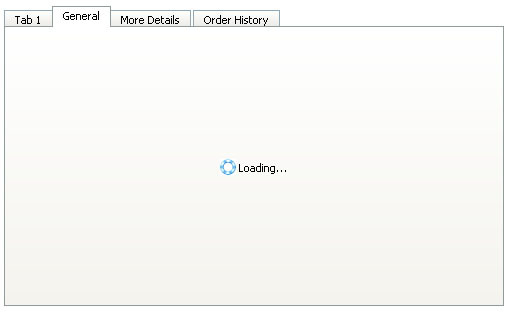
You can customize the in progress image and text in ImagesSettings and TextSettings respectively.
- IFrameAllowTransparency. The Default value is True.
- Advanced ComplexImages Features
In "Innovative Rendering Mode" point above, we have mentioned about ComplexImages rendering mode which makes it possible for designers to create the images of every part of elements to simulate the look&feel of modern styles such as irregular MSN style or Visual Studio style.
WebTab introduced three unique advanced features related to the ComplexImages:- AllowOverlappingEdges. Default value is False.
- RenderDividerForActiveTab. Default value is True.
- UseSpecialRightSeparator. Default value is False.
- Fully customizable styles and appearances
WebTab allows you to customize most of the elements' styles by using strongly typed WebStyle and DynamicStyle properties listed in following:- ContainerStyle
- DisabledStyle
- FrameStyle
- TabItemImageStyle (DynamicStyle including Normal, Over and Active styles)
- TabItemStyle (DynamicStyle)
- TabSeparatorStyle
- Component Designer
Instead of changing properties in Visual Studio Property Window, you can configure most properties shown in "logical group" from WebTab Component Designer. You can also easily manipulate the styles, properties as well as managing the TabPages.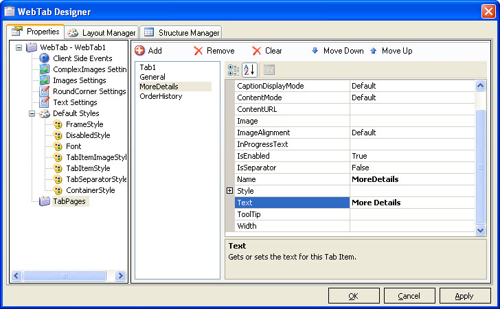
Most Intersoft's components that exposed rich functionalities, complex objects and collection would implement Component Designer similar to the screenshot above. The consistency of the user interface and functions throughout all Intersoft's components would significantly reduce learning time as well as increasing productivity.
 See Also
Related Topics
{Overview}
{Understanding Concepts}