


Introduction
Window is the core and most essential user interface element in WebDesktopManager. In Windows-based application, a Window typically represents an application or a module of application compiled on Win32 executable format. In WebDesktopManager, a Window represents content which can be in-line contents using HTML markups or webform page using IFrame.
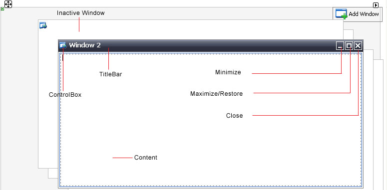
Window user interface element is typically represented by a rectangular shape containing an Image and Text describing the running application of the Window. In WebDesktopManager, a Window consists of:
- ControlBox element.
- TitleBar.
- Minimize button.
- Maximize button (swapable with Restore).
- Close button.
-

The window's behaviors can be easily customized at global WindowSettings or at individual Window configurations.
More Details
In addition to the highly customizable elements, WebDesktopManager also implements most of functions found in a Desktop. The following lists some of the implementation:
- Window moving.
- Window resizing.
- Window states.
- Window context menu.
For a complete list of WebDesktopManager's behaviors in this release, see High Clarity Desktop technology.
At component level, a Window is represented by WebDesktopWindow object which contained in Windows collection of a
WebDesktopManager instance. The windows are arranged in Cascading tiling style by default at design time which can be seen in following screenshot. You can
change the default arrangement in the WindowArrangement property under DesktopManager instance.
WebDesktopManager is developed to following today's popular Desktop specification and guidelines in high details. As seen in above screenshot, there are two states of Window in a DestkopManager instance: Active and Inactive windows. There can be up to one Active Window specified in the ActiveWindowIndex property. DesktopManager also supports no active window scenarios, that is when all windows are minimized or hidden.
Features
In this release, WebDesktopWindow supports wide range of features such as shown in following screenshot.
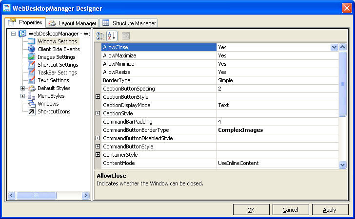
The following table describes the functions of available properties.
| Property Name | Function |
| AllowClose | Specifies whether Window can be closed. |
| AllowMaximize | Specifies whether Window can be maximized. |
| AllowMinimize | Specifies whether Window can be minimized. |
| AllowResize | Specifies whether Window can be resized. |
| BorderType | The type of the border used to render the Window's border. |
| CaptionButtonSpacing | The amount of spacing in pixel between the buttons in Caption. The buttons in context are Minimize, Maximize, Close. |
| CaptionDisplayMode | The display mode of the Caption. You can use your own custom content in the Caption by setting this property to UseTemplate. |
| CommandBarPadding | The amount of padding in pixel of the CommandButtons relative to content area. This property is applicable to WebDialogBox component when integrated to DesktopManager. |
| CommandButtonBorderType | The type of the border used to render the CommandButtons border. This property is applicable to WebDialogBox component when integrated to DesktopManager. |
| ContentMode | The content mode of the Window. |
| ControlBox | Specifies whether the ControlBox of the Window is visible. |
| IFrameAllowTransparency | Specifies whether the IFrame should allow transparency in its background. |
| IFrameShowLoader | Specifies whether the IFrame should show loading indicator when the content is being loaded. |
| MaximumSize | The maximum size in pixel allowed when resized. |
| MinimumSize | The minimum size in pixel allowed when resized. |
| Size | The preferred size of the Window in pixel. |
| TextAlignment | The horizontal alignment of caption's text. |
Complex Images Support
This release of WebDesktopManager supports ComplexImages border type in addition to the Simple type. The ComplexImages border type enables you to create great looking visual style of today popular's desktop in high details. You can use transparent image format such as GIF to create round-corner borders or use PNG format to create translucent title bars.
|
Built-in PNG image format is only supported in Internet Explorer 7.0 and Mozilla browsers with Gecko engine version 1.5+ |
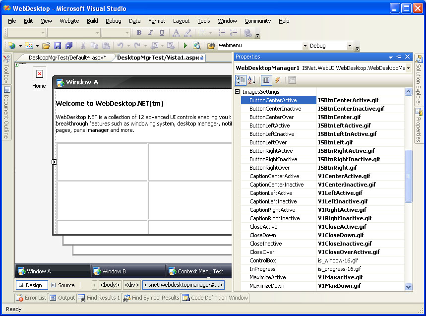
The complex images border type are made up of more than 32 images which allow you to skin most of the elements in the Window. The images configuration are centrally available in ImagesSettings property. The following lists the configurable images:
- 3 set of interactive ButtonLeft
- 3 set of interactive ButtonCenter
- 3 set of interactive ButtonRight
- 2 set of interactive CaptionLeft
- 2 set of interactive CaptionCenter
- 2 set of interactive CaptionRight
- 4 set of interactive Close
- 4 set of interactive Maximize
- 4 set of interactive Minimize
- 4 set of interactive Restore
|
The "interactive set" above means that an element requires three state of images. The states are Normal (Inactive), Over and Active. There are several elements which require 4 states. The last state is Down. |
The following screenshot illustrates a DesktopManager with ComplexImages border type configuration.
The above sample has the properties configured like in the following image.
Styles
WebDesktopManager comes along with fully customizable visual styles for the Window's elements. The styles are defined in strong object model which can be easily applied through Designer or code-behind without the need to use css syntax.
The following table lists the available styles applicable to Window elements.
| Style Name | Description |
| CaptionButtonStyle | The dynamic interactive styles applied to caption button element. |
| CaptionStyle | The dynamic interactive styles applied to the caption bar element. |
| CommandButtonDisabledStyle | The style applied to command button when disabled. |
| CommandButtonStyle | The dynamic interactive styles applied to command button element. |
| ContainerStyle | The style applied to the content area. |
| ScrollBarStyle | The scrollbar style of the Window. |
| WindowStyle | The dynamic interactive styles applied to the Window client area. |