This topic summarizes the key features available in the latest version of WebCombo. It provides information about the basic features of WebCombo such as query mode, multiple columns, editing validation and rich UI customizations. You will also learn how to use WebCombo such as using the control in data bound mode, customizing the search fields and items adding, allowing wild card search, and more.
This topic discusses the WebCombo features in depth, which contains the following topics.
- Data Binding
- Unbound Mode
- User Interface Elements
- Improved Layout
- Dynamically Add Item
- Additional Search Field
- Minimum Character Request
- Allow WildCard Search
- TextBox Mode
- Validation
- WebCombo Look and Feel
- Column Types
- Extensible Client-side API
- Text Settings
Data Binding
One of the most significant productivity gain that you can experience after migrating to the latest version of WebCombo version 4 is the new, codeless data binding development experience.
Codeless data binding means that you can configure the data source, its connection and related property without writing code. This means that means you can configure the datasource through a simple drag-drop and a few mouse clicks.
You can declaratively create a WebCombo instance and bind it to a table in your SQL database in two simple statements such as illustrated in the following example:
| ASPX |  Copy Code Copy Code |
|---|---|
<ISWebCombo:WebCombo ID="WebCombo1" runat="server" UseDefaultStyle="True" Width="200px" Height="20px" DataSourceID="SqlDataSource1" DataTextField="ActivityName DataValueField="ActivitiesId"> </ISWebCombo:WebCombo> | |
| ASPX |  Copy Code Copy Code |
|---|---|
<asp:SqlDataSource ID="SqlDataSource1" runat="server" ConnectionString="<$ ConnectionStrings:DbConnectionString >" SelectCommand="SELECT * FROM [Activities]"> | |
As you can see in the above examples, the WebCombo1 is bound to a DataSource control through DataSourceID property. The WebCombo connects to the specified DataSource control and display data from the DataSource available in SqlDataSource1.
 |
With this new data binding concept, building a data bound web application is very fairly easy and straightforward. Also notice that there is no code required in the page's code behind. In the previous version, you will need to configure the InitializeDataSource event and write code in the event which pass the DataSource to the e.DataSource property. While this technique is no longer required in WebCombo version 4.0, it is still supported for backward compatibility. |
The benefits of the new DataSource control binding support:
- Improved developer's productivity via codeless, simple and hassle-free data binding.
- Cleaner separation between User Interface and Data Access/Business Layer codes.
All data layer codes and logics are now handled at DataSource control level instead of component level. That means UI component such as WebCombo is now purely serving as data selector and combo box function, and no longer handling DataSource. - Better architecture.
For more than decades, developer was struggling to find the best pattern in developing data bound application. DataSource control binding concept is one of the most appealing and acceptable mechanism recognizing its cleaner separation between user interface and data access layer. - Highly reusable.
DataSource control offers better reusability since it has rock solid architecture. For instance, developer can write business layer codes in application level which is used throughout the application and use ObjectDataSource to connect to the business layer function. - Extensible.
DataSource controls such as ObjectDataSource and ISDataSource (Intersoft's proprietary multi-views DataSource control) have the ability to connect to custom business layer codes. You can also connect the controls to DataSet and TableAdapter that are generated using Visual Designer in Visual Studio 2005, as well as connect it to extended function that you write in an extended class through new "partial class" mechanism.
Several important notes that developer should aware with the new DataSource control concept:
- InitializeDataSource event is no longer fired when the WebCombo is bound to DataSourceID. This event will still be fired normally when the DataSourceID property is empty (old data binding mode).
- You cannot bind to DataSource control and DataSource object at the same time. For instance, if you set DataSourceID to SqlDataSource1 and at the same time set WebCombo1.DataSource = dsNorthWind.Customers in the code, these will throw an invalid operation exception.
- Flat-view DataSource controls that come with ASP.NET 2.0 are all supported. This includes SqlDataSource, AccessDataSource and ObjectDataSource.
- All internal operations and existing functions in WebCombo are still working properly with the new DataSource control binding. This ensures full compatibility in behaviors and functions with the previous versions.
- Data caching.
In pre-2007 platform, Intersoft's data bound control such as WebCombo and WebGrid Enterprise employ built-in automatic data caching mechanism. In 2007 product lines, the built-in data caching is no longer functioning when the control is bound to DataSource control. To configure caching, please refer to the capability of the DataSource control that you used to bind to the control. For instance, if you bind a WebCombo control to SqlDataSource, then you can enable the caching by setting EnableCaching of the SqlDataSource control to True.
To learn more about data binding, see Data Binding Wakthroughs.
FAQ
FAQ: I am not familiar with DataSource control concept and I have been pretty much familiar with DataSource object binding that you introduced in pre-2007 products. Why do you introduce this new data binding concept?
We did not introduce this new DataSource control binding concept. This new concept was introduced by Microsoft in ASP.NET 2.0. With this new data binding mechanism in ASP.NET 2.0, Microsoft encouraged developers to use DataSource control to take advantage of new features and productivity gains.
As leading third party component provider, we are committed to deliver latest products that integrate and work best with latest Microsoft's technologies. The DataSource control supported in Intersoft 2007 product lines enables professional developers to leverage the benefits of new data access features and functions available in ASP.NET 2.0 and Visual Studio 2005.
Recognizing many benefits that DataSource control offered, we highly recommend developers to use this new data binding mechanism.
FAQ: How can I learn more and where can I get more resources related to DataSource control?
There are a lot of resources that explain how to use DataSource control. Please refer to the following sections.
- To learn more about DataSource concept in general, read ASP.NET Data Access Overview.
- To learn more about ObjectDataSource control, read ObjectDataSource Overview.
- To learn how to display data using ObjectDataSource control in 3-tier application, visit http://www.asp.net/data-access/tutorials/displaying-data-with-the-objectdatasource-cs
FAQ: Does WebCombo version 4.0 still support older data binding mechanism (i.e. through InitiliazeDataSource)?
Older data binding mechanism through InitializeDataSource or DataSource property set in code behind is still supported. Existing web application that is still using older data binding mechanism will work flawlessly once migrated to Intersoft 2007 platform.
Unbound Mode
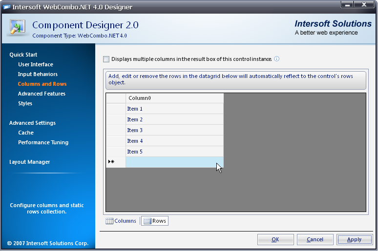
WebCombo has the ability to implement the control in true Unbound mode by using improved server-side object models. Unbound mode is a feature where the data is not bound to database even though the data could be taken from database. Developers can easily add multiple columns and row items in a single interface WebCombo Designer(Centralized). The columns and rows can also be added dynamically at runtime. It is also applicable to the Microsoft ASP.NET Server component guideline including standard ViewState implementation.
Here is the snapshot to create unbound mode in WebCombo Designer:
To learn more about unbound mode, see Unbound Mode How-to Topics.
User Interface Elements
-
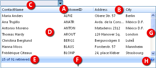
DropDown arrow [Refer to screenshot A]
-
Round corner edges [Refer to screenshot A]
-
Column name [Refer to screenshot B]
-
WebCombo's TextBox [Refer to screenshot C]
-
ResultBox [Refer to screenshot D]
-
Status [Refer to screenshot E]
-
Load more data arrow [Refer to screenshot F]
-
ScrollBar [Refer to screenshot G]
-
Help icon [Refer to screenshot H]
To learn more, please see User Interface Customization How-to Topics.
Improved Layout
WebCombo adds numerous appearance-related properties to improve the look and appearance of the WebCombo layout such as:
- Ability to truncate overflow text as ellipsis and display the complete text in a ToolTip.

- Configures the default ListBox's width and height.
- Supports percentage width.
- Improves automated ListBox positioning when used in complex container.
- Save and apply layout setting at runtime.
- Set WebCombo's alignment to be right displayed.
- And much more.
To learn more about combo's alignment, see How-to: Set combo's alignment to be right displayed.
Dynamically Add Item
One of the unique features available in WebCombo is the ability to add a new record at run time without requiring full page postback. When you set the AllowAddItem property of the WebCombo to true, you will be able to add items which are not existed in the data source.
Now, the row addition to WebCombo can be done through client-side. You can use the object-oriented JavaScript function which has been provided by the WebCombo API specifically to add new rows to the WebCombo. The best thing about this feature is that the new object will be available directly in the client-side which replicates the server object model. This makes client-side development as comfortable as in the server.
The following illustration shows the snapshots the feature:
- Initial data population

- Search for specific record

- Searched text is added
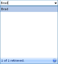
- Final data

As you can see from the snapshots above, the data insertion is fairly simple and straightforward. When you search for an item which is not existed in the list, the particlar item can be added instantly to the collection by simply pressing the "Enter" key. The result is shown in the third snapshot above.
FAQ
FAQ: How to implement adding item in WebCombo when we set AllowAutoPostBack and AllowAddItem to true?
Sometimes when you enable AllowAddItem and AllowAutoPostBack, you missed to create WebCombo_AddItem server side event. In this case, an error will occur because AddItem event is called but there is no event to handle this task. In this situation, you should handle the WebCombo_AddItem server side event.
For example:
| C# |  Copy Code Copy Code |
protected void WebCombo1_AddItem(object sender, ISNet.WebUI.WebCombo.RowEventArgs e
{
   // get cached data from data source control
   DataView view = this.EmployeeDataSource.Select(DataSourceSelectArguments.Empty) as DataView;

  // update the cached data
  DataTable table = view.Table;
  DataRow newRow = table.NewRow();
  newRow["FirstName"] = e.Row.Value;
  table.Rows.Add(newRow);
}
| |
Additional Search Field
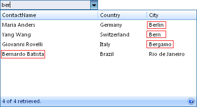
WebCombo allows multiple field to be searched against DataSource instead of just the specified DataTextField. The DataTextField remains to be the primary search field followed by comma separated list of string specified in the AdditionalSearchField property. This feature is extremely useful in a situation where you want to search the information in multiple columns.
The following image illustrates the AdditionalSearchField feature.
 |
In the screenshot above, AdditionalSearchField is set to ContactName and City columns. When user types "ber" in the combo's box, it will search any data that contains "ber" characters in the defined columns, such as Bernardo Batista (ContactName), Berlin (City) and etc. |
To learn more, see How-to: Use AdditionalSearchField to search a query text on other column besides DataTextField column.
Minimum Character Request
Another time-saving features available in WebCombo is the ability to define the minimum character before the control queries the data to the server. First, it checks for the input length that users type into the WebCombo, then compare against the length specified in the MinCharsToRequest property. With this feature, data retrieval will be performed only if it satisfies the value assigned to MinCharsToRequest property. This feature is specifically useful to narrow down relatively large result sets by limiting the data requests based on the number of typed characters.
Below is the snapshot of the feature:
Normal behavior


Behavior with MinCharsToRequest property set to 2


To learn more, see How-to: Set minimum character typed to request the data.
Allow Wildcard Search
By default, WebCombo will search the datasource based on the starting character of the user's input. For example, if user inputs an "a" character in the text box, WebCombo will search all data that begins with the "a" character.
Allow Wildcard Search is a feature that allows wildcard/fuzzy logic searching. For example, if user inputs "rio" in the search field, WebCombo will search all data that contains the word "rio".
To learn more, see How-to: Enable wildcard search.
TextBox Mode
TextBoxMode has two enumeration: Editable and ReadOnly.
When the TextBoxMode is set to Editable, WebCombo will use the default searching behavior. Users can filter the datasource by typing a keyword into the text box. When set to ReadOnly, WebCombo will behave like a standard ASP.NET Dropdown List. Users can select an item from the list, but filtering functionality is disabled.
To learn more, see How-to: Set the TextBox mode in WebCombo.
Validation
WebCombo supports .NET's control validation, which means that it is compatible with all Validators control such as RequiredFieldValidator. You can easily create a validation simply by dropping a validator control from toolbox into your web form and set its ControlToValidate property to the WebCombo object you want to validate.
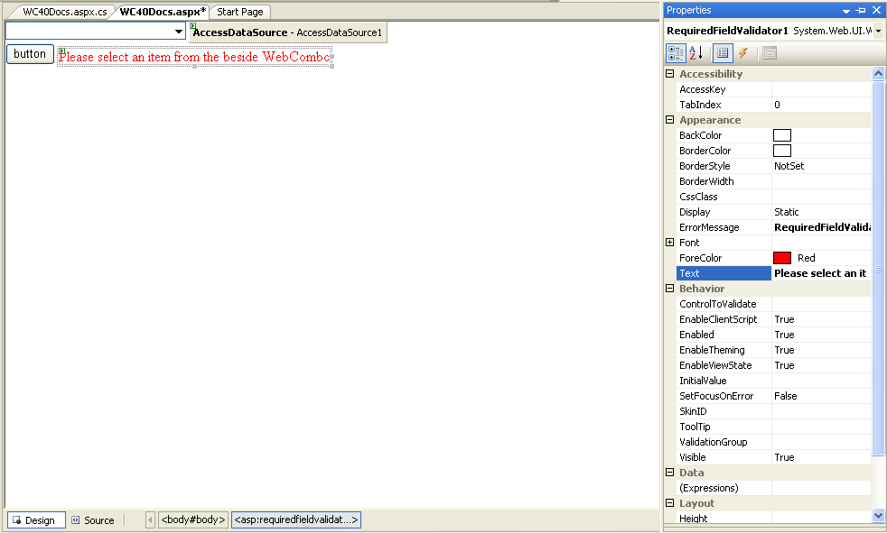
The results look like the following illustration.
To learn more, see Validation How-to Topics.
Column Types
WebCombo provides predefined column type such as Image, ImageAndText and so on, which are most commonly used. For greater level of customization, the content of the WebCombo's column can also be customized to display rich HTML-based content by setting the ColumnType property to Custom and write the custom content code in InitializeRow Server-side event.
Below is the screenshot of ImageAndText Column Type:
To learn more about Column Types, see Column Type How-to Topics.
Extensible Client-side Programming
WebCombo provides a set of comprehensive client side API to let developers extending the WebCombo to achieve more advanced business scenarios. You can access WebCombo's properties and methods using the similar server-side syntax.
The following example shows how to get the selected row in WebCombo in the client-side.
| JavaScript |  Copy Code Copy Code |
function SetText()
{
   var WebCombo1 = ISGetObject("WebCombo1");
   WebCombo1.SetText("Maria Anders");
   WebCombo1.LoadValue();
}
| |
To learn more, please see Extensible Client-side Programming How-to Topics.
Text Settings
You can easily customize the textual settings of the WebCombo control through the WebCombo Designer. Under the Advanced Settings node, expands LayoutSettings and Text Settings node, you will find the textual-related properties as you can see in the following illustration. You can modify each property in the designer by simply modified the predefined text settings.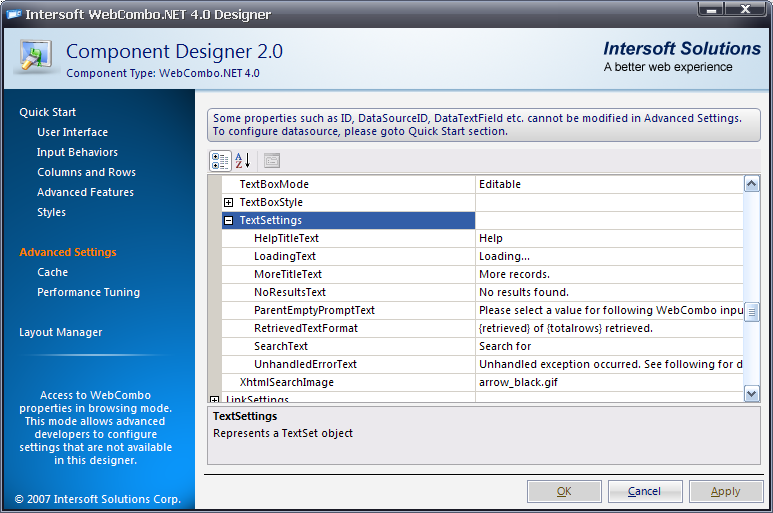
Tasks
Walkthrough Topics
FAQ and How-to Topics
Other Resources
Features Added In WebCombo 5
Learning More
Advanced


