


UXStackButton is a state-of-the-art dropdown control that displays menu items in stunning stack layout with elegant animation. With impressive visual features and fully customizable appearance such as the callout pointer, spring animation, item styles, dock position and more, UXStackButton is the perfect fit for modern RIA interfaces requiring rich user experiences.

ContentItems Model
UXStackButton is using ContentItems model where you had both Button characteristic and ItemsControl characteristic in one control. To learn more about this content model see Content Model Overview.
Using UXStackButton
UXStackButton is an advanced button control that represents one or more items in the form of stack layout. This stack layout is created using UXPopup as its fundamental architecture.
Consequently, the dropdown menu of UXStackButton has identical features with UXPopup, such as positioning, hide and display animation, and more.
Data Binding
UXStackButton supports data binding/hierarchical binding. To learn more about data binding, see Data Binding Overview.
To bind the data you can either use ItemTemplate or the member path properties such as:
- DisplayMemberPath
Used to bind the Content property. - ImageMemberPath
Used to bind the Icon property. - CollectionMemberPath
Used to bind the Items property. - NavigateUriMemberPath
Used to bind the NavigateUri property that allows navigation. To learn more about Navigation see Navigation Overview.
The following example shows how to perform data binding to UXStackButton.
| ButtonObject (Model) |  Copy Code Copy Code |
|---|---|
using System.ComponentModel; using System.Collections.ObjectModel; namespace ClientUI.Samples.Models { public class ButtonObject: INotifyPropertyChanged { private ObservableCollection<ItemObject> _subItems; private string _text; private string _image; public ObservableCollection<ItemObject> SubItems { get { return this._subItems; } set { if (this._subItems != value) { this._subItems = value; this.OnPropertyChanged("SubItems"); } } } public string Text { get { return this._text; } set { if (this._text != value) { this._text = value; this.OnPropertyChanged("Text"); } } } public string Image { get { return this._image; } set { if (this._image != value) { this._image = value; this.OnPropertyChanged("Image"); } } } protected void OnPropertyChanged(string propertyName) { if (this.PropertyChanged != null) { this.PropertyChanged(this, new PropertyChangedEventArgs(propertyName)); } } public event PropertyChangedEventHandler PropertyChanged; } } |
|
| ItemObject (Model) | Copy Code |
|---|---|
using System; using System.Net; using System.Windows; using System.Windows.Controls; using System.Windows.Documents; using System.Windows.Ink; using System.Windows.Input; using System.Windows.Media; using System.Windows.Media.Animation; using System.Windows.Shapes; using System.ComponentModel; namespace ClientUI.Samples.Models { public class ItemObject : INotifyPropertyChanged { private string _text; private string _image; public string Text { get { return this._text; } set { if (this._text != value) { this._text = value; this.OnPropertyChanged("Text"); } } } public string Image { get { return this._image; } set { if (this._image != value) { this._image = value; this.OnPropertyChanged("Image"); } } } protected void OnPropertyChanged(string propertyName) { if (this.PropertyChanged != null) { this.PropertyChanged(this, new PropertyChangedEventArgs(propertyName)); } } public event PropertyChangedEventHandler PropertyChanged; } } |
|
| View Model | Copy Code |
|---|---|
using System.Collections.ObjectModel; using System.ComponentModel; using ClientUI.Samples.Models; namespace ClientUI.Samples.ViewModels { public class MainPageViewModel : INotifyPropertyChanged { public MainPageViewModel() { this.Document = new ButtonObject() { Text = "Document", Image = "Document.png" }; this.Document.SubItems = new ObservableCollection<ItemObject>(); this.Document.SubItems.Add(new ItemObject() { Text = "Video", Image = "Video.png" }); this.Document.SubItems.Add(new ItemObject() { Text = "Picture", Image = "Picture.png" }); this.Document.SubItems.Add(new ItemObject() { Text = "Music", Image = "mp3.png" }); this.Document.SubItems.Add(new ItemObject() { Text = "Text", Image = "text.png" }); } private ButtonObject _document; public ButtonObject Document { get { return this._document; } set { if (this._document != value) { this._document = value; this.OnPropertyChanged("Document"); } } } protected void OnPropertyChanged(string propertyName) { PropertyChangedEventHandler handler = PropertyChanged; if (handler != null) { handler(this, new PropertyChangedEventArgs(propertyName)); } } public event PropertyChangedEventHandler PropertyChanged; } } |
|
| XAML | Copy Code |
|---|---|
<UserControl x:Class="ClientUI.Samples.MainPage" xmlns="http://schemas.microsoft.com/winfx/2006/xaml/presentation" xmlns:x="http://schemas.microsoft.com/winfx/2006/xaml" xmlns:d="http://schemas.microsoft.com/expression/blend/2008" xmlns:mc="http://schemas.openxmlformats.org/markup-compatibility/2006" xmlns:Intersoft="http://intersoft.clientui.com/schemas" xmlns:vm="clr-namespace:ClientUI.Samples.ViewModels" mc:Ignorable="d" d:DesignHeight="400" d:DesignWidth="800"> <Grid x:Name="LayoutRoot" Background="White"> <Grid.DataContext> <vm:MainPageViewModel/> </Grid.DataContext> <Intersoft:UXStackButton ItemsSource="{Binding Document.SubItems}" DisplayMemberPath="Text" ImageMemberPath="Image" Text="{Binding Document.Text}" Icon="{Binding Document.Image}" StackMode="GridStyle" StackGridMode="DynamicGrid" HorizontalAlignment="Center" VerticalAlignment="Center" Height="64" Width="64"> </Intersoft:UXStackButton> </Grid> </UserControl> |
|

This example is using MVVM pattern to perform the data binding. To learn more about MVVM pattern, see MVVM Pattern Overview.
Understanding UXStackItem
The item container type of UXStackButton is UXStackItem.
UXStackItem implements both ICommandSource and INavigationSource interface to support commanding and navigation, such as shown in the following example.
| XAML | Copy Code |
|---|---|
<Intersoft:UXStackButton Content="Button" HorizontalAlignment="Center" Height="64" VerticalAlignment="Bottom" Width="64" Icon="ShareLarge.png" StackMode="MenuStyle"> <Intersoft:UXStackItem Icon="twitter.png" Text="Twitter" NavigateUri="www.twitter.com" TargetName="_blank"/> <Intersoft:UXStackItem Icon="facebook.png" Text="Facebook" NavigateUri="www.facebook.com" TargetName="_blank"/> <Intersoft:UXSeparator></Intersoft:UXSeparator> <Intersoft:UXStackItem Icon="email.png" Text="Forward" Command="{Binding ForwardCommand}"/> </Intersoft:UXStackButton> |
|
You can do commanding through Command, CommandTarget and CommandParameter properties and navigation using NavigateUri and TargetName properties. To learn more about commanding, see Commanding Overview. To learn more about navigation, see Navigation Overview.
Opening a UXStackButton
To open or display stack items of UXStackButton, you simply set the IsOpen property to True. In the runtime, users click on the stack button visual element to display the stack items.
Similar to other button types, UXStackButton also has ClickMode property that determines the action that triggers the click event. When the ClickMode property is set to Hover, UXStackButton will display the stack items when it is being hovered.
| XAML | Copy Code |
|---|---|
<Intersoft:UXStackButton Content="Button" ClickMode="Hover" HorizontalAlignment="Center" VerticalAlignment="Bottom" Height="64" Width="64" Icon="ShareLarge.png" StackMode="GridStyle" StackGridMode="DynamicGrid"> <Intersoft:UXStackItem Icon="twitter.png" Text="Twitter"/> <Intersoft:UXStackItem Icon="facebook.png" Text="Facebook"/> <Intersoft:UXStackItem Icon="digg.png" Text="Digg"/> <Intersoft:UXStackItem Icon="delicious.png" Text="Delicious"/> <Intersoft:UXStackItem Icon="flickr.png" Text="Flickr"/> <Intersoft:UXStackItem Icon="linkedin.png" Text="Linked In"/> </Intersoft:UXStackButton> |
|
Customizing Stack Mode
You can change the stack mode of a UXStackButton using StackMode property. There are three different stack modes they are ArcStyle, GridStyle and MenuStyle. Each of the mode has different kind of settings that specific for each visual effects.
Arc Style
ArcStyle shows the items of UXStackButton in arc representation.
| XAML | Copy Code |
|---|---|
<Intersoft:UXStackButton Content="Button" HorizontalAlignment="Center" Height="64" VerticalAlignment="Bottom" Width="64" Icon="ShareLarge.png"> <Intersoft:UXStackItem Icon="twitter.png" Text="Twitter"/> <Intersoft:UXStackItem Icon="facebook.png" Text="Facebook"/> <Intersoft:UXStackItem Icon="digg.png" Text="Digg"/> <Intersoft:UXStackItem Icon="delicious.png" Text="Delicious"/> <Intersoft:UXStackItem Icon="flickr.png" Text="Flickr"/> <Intersoft:UXStackItem Icon="linkedin.png" Text="Linked In"/> </Intersoft:UXStackButton> |
|

The following are list of properties you can customize when using ArcStyle mode.
- StackArcDegree
Determines the arc degree. - StackArcDirection
Determines the direction of the arc. - StackArcItemHeight and StackArcItemWidth
Determines the item height and width. - StackArcTextOffset
Determines the space between text element and item element. - StackArcTextPosition
Determines the position of text element.
Grid Style
GridStyle shows the items of UXStackButton within a grid panel that hosted inside a CallOut.
| XAML | Copy Code |
|---|---|
<Intersoft:UXStackButton Content="Button" HorizontalAlignment="Center" Height="64" VerticalAlignment="Bottom" Width="64" Icon="ShareLarge.png" StackMode="GridStyle" StackGridMode="DynamicGrid"> <Intersoft:UXStackItem Icon="twitter.png" Text="Twitter"/> <Intersoft:UXStackItem Icon="facebook.png" Text="Facebook"/> <Intersoft:UXStackItem Icon="digg.png" Text="Digg"/> <Intersoft:UXStackItem Icon="delicious.png" Text="Delicious"/> <Intersoft:UXStackItem Icon="flickr.png" Text="Flickr"/> <Intersoft:UXStackItem Icon="linkedin.png" Text="Linked In"/> </Intersoft:UXStackButton> |
|

The following are list of properties you can customize when using GridStyle mode.
- EnableStackGridFadeAnimation
Determines whether stack grid items fading animation is enabled. - StackGridColumn
Determines number of column used in grid layout. - StackGridFooterText
Determines the footer text. - StackGridHeaderText
Determines the header text. - StackGridItemHeight and StackGridItemWidth
Determines the item height and width. - StackGridItemMargin
Determines margin between items. - StackGridMode
Determines the grid layouting mode. - StackGridPadding
Determines the distance between grid container and itempresenter. - StackGridRow
Determines the number of row used in grid layout. - StackGridTemplate
Determines the templated used to replace the content.
Understanding Grid Layout
The grid layout is controlled through the StackGridMode property along with StackGridColumn and StackGridRow. There are six types of grid layout that you can choose from, such as described in the following list.
-
AutoColumn
The items are arranged in a single row with infinite columns. StackGridColumn and StackGridRow is ignored in this mode. -
AutoRow
The items are arranged in a single column with infinite rows. StackGridColumn and StackGridRow is ignored in this mode. -
MaxColumn
The items are arranged in a row until it reach the number of maximum column defined in StackGridColumn. When it happens it will create new rows until all items is arranged. -
MaxRow
The items are arranged in a column until it reach the number of maximum row defined in StackGridRow . When it happens it will create new columns until all items is arranged. -
DynamicGrid
The items are arranged in a layout determined by StackGridColumn and StackGridRow . If the total number of item is less than the available space, it will shrink the empty spaces. On contrary if the total number of item is larger than the available space the layout will not grow like in MaxColumn or MaxRow modes, instead it will provide scroll bar to scroll the items. -
Grid
The items are arranged in a fix layout determined by StackGridColumn and StackGridRow. Unlike in DynamicGrid, if the total number of item is less than the available space, the layout will not shrink.
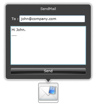
Using StackGridTemplate
The content of UXStackButton is not necessary a collection of UXStackItem. Using GridStyle as StackMode of UXStackButton, you can use StackGridTemplate instead specifying items for its stack content.
The following example shows how to use custom content for UXStackButton using StackGridTemplate.
| XAML | Copy Code |
|---|---|
<Intersoft:UXStackButton Icon="Mail.png" Text="SendMail" Height="64" Width="64" StackMode="GridStyle"> <Intersoft:UXStackButton.StackGridTemplate> <DataTemplate> <StackPanel Width="250"> <Intersoft:FieldLabel HeaderForeground="White" Header="To :" Margin="4" HorizontalContentAlignment="Stretch"> <Intersoft:UXTextBox></Intersoft:UXTextBox> </Intersoft:FieldLabel> <RichTextBox Height="125" Margin="4"/> <Intersoft:GlassButton Content="Send" Margin="4"/> </StackPanel> </DataTemplate> </Intersoft:UXStackButton.StackGridTemplate> </Intersoft:UXStackButton> |
|
Menu Style
MenuStyle shows the items of UXStackButton within a menu panel that hosted inside a CallOut.
| XAML | Copy Code |
|---|---|
<Intersoft:UXStackButton Content="Button" HorizontalAlignment="Center" Height="64" VerticalAlignment="Bottom" Width="64" Icon="ShareLarge.png" StackMode="MenuStyle"> <Intersoft:UXStackItem Icon="twitter.png" Text="Twitter"/> <Intersoft:UXStackItem Icon="facebook.png" Text="Facebook"/> <Intersoft:UXStackItem Icon="digg.png" Text="Digg"/> <Intersoft:UXStackItem Icon="delicious.png" Text="Delicious"/> <Intersoft:UXStackItem Icon="flickr.png" Text="Flickr"/> <Intersoft:UXStackItem Icon="linkedin.png" Text="Linked In"/> </Intersoft:UXStackButton> |
|

Customizing Stack Position
UXStackButton stack position is determined by the StackDockPosition property. When StackDockPosition is set to Bottom, the stack items will be shown upward and vice versa.
The following example shows the different StackDockPosition mode and their effects.
| XAML | Copy Code |
|---|---|
<Intersoft:UXStackButton Content="Button" StackDockPosition="Top" HorizontalAlignment="Center" VerticalAlignment="Top" Height="64" Width="64" Icon="ShareLarge.png" StackMode="GridStyle" StackGridMode="DynamicGrid"> <Intersoft:UXStackItem Icon="twitter.png" Text="Twitter"/> <Intersoft:UXStackItem Icon="facebook.png" Text="Facebook"/> <Intersoft:UXStackItem Icon="digg.png" Text="Digg"/> <Intersoft:UXStackItem Icon="delicious.png" Text="Delicious"/> <Intersoft:UXStackItem Icon="flickr.png" Text="Flickr"/> <Intersoft:UXStackItem Icon="linkedin.png" Text="Linked In"/> </Intersoft:UXStackButton> <Intersoft:UXStackButton Content="Button" StackDockPosition="Bottom" HorizontalAlignment="Center" VerticalAlignment="Bottom" Height="64" Width="64" Icon="ShareLarge.png" StackMode="GridStyle" StackGridMode="DynamicGrid"> <Intersoft:UXStackItem Icon="twitter.png" Text="Twitter"/> <Intersoft:UXStackItem Icon="facebook.png" Text="Facebook"/> <Intersoft:UXStackItem Icon="digg.png" Text="Digg"/> <Intersoft:UXStackItem Icon="delicious.png" Text="Delicious"/> <Intersoft:UXStackItem Icon="flickr.png" Text="Flickr"/> <Intersoft:UXStackItem Icon="linkedin.png" Text="Linked In"/> </Intersoft:UXStackButton> <Intersoft:UXStackButton Content="Button" StackDockPosition="Left" HorizontalAlignment="Left" VerticalAlignment="Center" Height="64" Width="64" Icon="ShareLarge.png" StackMode="GridStyle" StackGridMode="DynamicGrid"> <Intersoft:UXStackItem Icon="twitter.png" Text="Twitter"/> <Intersoft:UXStackItem Icon="facebook.png" Text="Facebook"/> <Intersoft:UXStackItem Icon="digg.png" Text="Digg"/> <Intersoft:UXStackItem Icon="delicious.png" Text="Delicious"/> <Intersoft:UXStackItem Icon="flickr.png" Text="Flickr"/> <Intersoft:UXStackItem Icon="linkedin.png" Text="Linked In"/> </Intersoft:UXStackButton> <Intersoft:UXStackButton Content="Button" StackDockPosition="Right" HorizontalAlignment="Right" VerticalAlignment="Center" Height="64" Width="64" Icon="ShareLarge.png" StackMode="GridStyle" StackGridMode="DynamicGrid"> <Intersoft:UXStackItem Icon="twitter.png" Text="Twitter"/> <Intersoft:UXStackItem Icon="facebook.png" Text="Facebook"/> <Intersoft:UXStackItem Icon="digg.png" Text="Digg"/> <Intersoft:UXStackItem Icon="delicious.png" Text="Delicious"/> <Intersoft:UXStackItem Icon="flickr.png" Text="Flickr"/> <Intersoft:UXStackItem Icon="linkedin.png" Text="Linked In"/> </Intersoft:UXStackButton> |
|

Customizing Stack Animation
UXStackButton also provides properties similar to UXPopup which controls the hide and display animation in the case that StackMode property is set to GridStyle or MenuStyle. The following list describes the properties that controls the dropdown menu animation.
Although these properties allow you to control each visual effects individually, it is advised that you avoid mixing the animation for DisplayAnimation or HideAnimation. If you want to disable certain animation, you can set the DisplayAnimation or HideAnimation property to None.
Customizing UXStackButton Appearance
UXStackButton has an Icon property that you can assign to an image source which indicates a visual element that the button represent. Alternatively, you can also display the thumbnail of stack items that belongs to UXStackButton through the StackTotalDisplayItem property.
The following example shows how to display the stack items to represent the UXStackButton.
| Example Title | Copy Code |
|---|---|
<Intersoft:UXStackButton Content="Button" HorizontalAlignment="Center" Height="64" VerticalAlignment="Bottom" Width="64" StackTotalDisplayItem="3"> <Intersoft:UXStackItem Icon="twitter.png" Text="Twitter"/> <Intersoft:UXStackItem Icon="facebook.png" Text="Facebook"/> <Intersoft:UXStackItem Icon="digg.png" Text="Digg"/> <Intersoft:UXStackItem Icon="delicious.png" Text="Delicious"/> <Intersoft:UXStackItem Icon="flickr.png" Text="Flickr"/> <Intersoft:UXStackItem Icon="linkedin.png" Text="Linked In"/> </Intersoft:UXStackButton> |
|

There are also other properties that you can customize to control UXStackButton appearance such as described below.
- Background
- BorderBrush
- BorderThickness
- CornerRadius
- GlassBackground
- EnableMouseOverState
Determines whether UXStackItem mouse over state is enabled or not when the StackMode property is set to GridStyle or ArcStyle. - UseImageLoader
Determines whether the image loader is used. - StackIndicatorSource
Specifies the stack indicator image when the UXStackButton is opened.
If you would like to completely customize the control appearance or if you want to change the styles of each visual states available in UXStackButton, you can edit the template of the control and do the modification accordingly.
To learn more how to change the template and the visual states, see Styles and Template Overview.
Drag Drop Capability
UXStackButton also supports drag and drop capability by using ClientUI DragDrop Framework. To learn how to enable drag and drop capability in UXStackButton, see ItemsControl Overview and Drag-drop Framework Overview.