This topic discusses the grouping capability in ItemsControl model available in all ClientUI controls lineup.
Items Control Grouping is a common feature in WPF platform, but unavailable in Silverlight. Intersoft ClientUI controls provide a framework for ItemsControl model so that similar grouping capability can be achieved for the following controls:
- UXItemsControl
- UXListBox
- UXComboBox
- UXSearchBox
- UXDataComboBox
- UXDataSearchBox
- UXDataLookupBox
- UXPageableComboBox
- UXPageableLookupBox
- UXMultipleSelectionComboBox
Enable Data Grouping
To enable grouping in ItemsControl, you need to use CollectionView with grouping capability and then we supply the collection of CollectionViewGroup to the ItemsControl.
The following code shows how to provide ItemsControl with a collection of CollectionViewGroup.
| C# |  Copy Code Copy Code |
|---|---|
PagedCollectionView collectionView = new PagedCollectionView(this.Contacts); collectionView.GroupDescriptions.Add(new PropertyGroupDescription() { PropertyName = "Name", Converter = new AlphabetGroupConverter() }); this.CollectionView = collectionView; this.Items = collectionView.Groups; |
|
Notice that you need to encapsulate your source collection to a CollectionView object (in this case its PagedCollectionView) and then set the initial GroupDescriptions. By doing this you can get the collection of CollectionViewGroup from collectionView.Groups property.
| XAML | Copy Code |
|---|---|
<Intersoft:UXComboBox ItemsSource="{Binding Items}" DisplayMemberPath="Name"/> |
|
Styling and Templating
When grouped, the ItemContainerStyle, ItemContainerStyleSelector, ItemTemplate and ItemTemplateSelector of ItemsControl are still working as if the items have never been grouped. You can still use these properties to control the look and feel of your items.
If you want to style the group item, you can use the GroupStyle property. This property contains a collection of GroupStyle object that determines the group style for each level. If the collection contains less item than the actual group level, it will use the last item in the collection for the rest of group level.
Customizing GroupStyle.ContainerStyle
Similar to any ItemsControl, GroupStyle also has ContainerStyle. This property is used to determine the style for each group item in the same level.
| Example Title | Copy Code |
|---|---|
<Intersoft:UXItemsControl ItemsSource="{Binding Items}" DisplayMemberPath="Name"> <Intersoft:UXItemsControl.GroupStyle> <Intersoft:GroupStyle> <Intersoft:GroupStyle.ContainerStyle> <Style TargetType="Intersoft:UXGroupItem"> <Setter Property="Template"> <Setter.Value> <ControlTemplate TargetType="Intersoft:UXGroupItem"> <Grid x:Name="RootElement"> <Intersoft:ExpandableGroupBox Header="{TemplateBinding Header}" Visibility="{TemplateBinding HeaderVisibility}"> <ItemsPresenter/> </Intersoft:ExpandableGroupBox> </Grid> </ControlTemplate> </Setter.Value> </Setter> </Style> </Intersoft:GroupStyle.ContainerStyle> </Intersoft:GroupStyle> </Intersoft:UXItemsControl.GroupStyle> </Intersoft:UXItemsControl> |
|
When customizing the ContainerStyle, you can also change the Template property as shown in the above code, and completely redefine the look and feel of the group items.
In the following sample, the look and feel is changed to an ExpandableGroupBox control.
Customizing GroupStyle.ContainerStyleSelector
If you need to perform additional checking to determine which style should be applied, you can use the ContainerStyleSelector similar to the one available in ItemsControl.
To use this approach, you need to create a class that inherits from StyleSelector class.
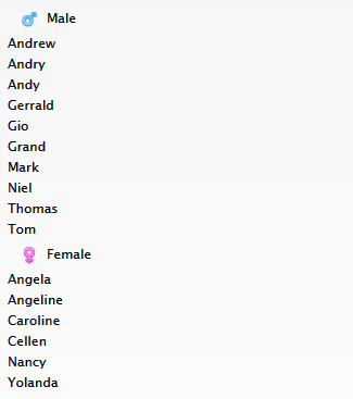
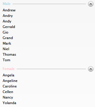
The following example shows how to use ContainerStyleSelector to distinguish male group and female group.
| C# | Copy Code |
|---|---|
using System.Windows; using System.Windows.Data; using ClientUI._2012R1.Preview.Models; using Intersoft.Client.Framework; using Intersoft.Client.UI.Controls; namespace ClientUI._2012R1.Preview.StyleSelectors { public class GenderStyleSelector: StyleSelector { public Style FemaleStyle { get; set; } public Style MaleStyle { get; set; } public override Style SelectStyle(object item, DependencyObject container) { CollectionViewGroup group = item as CollectionViewGroup; if (group != null) { if (group.Name.ToString() == "Female") return FemaleStyle; else return MaleStyle; } else { UXGroupItem groupItem = container as UXGroupItem; if (groupItem != null) { if (groupItem.Header.ToString() == "Female") return FemaleStyle; else return MaleStyle; } } return null; } } } |
|
| XAML | Copy Code |
|---|---|
<Intersoft:UXPage.Resources> <StyleSelectors:GenderStyleSelector x:Name="GenderStyleSelector"> <StyleSelectors:GenderStyleSelector.FemaleStyle> <Style TargetType="Intersoft:UXGroupItem"> <Setter Property="Template"> <Setter.Value> <ControlTemplate TargetType="Intersoft:UXGroupItem"> <Grid x:Name="RootElement"> <Intersoft:ExpandableGroupBox HeaderForeground="Pink" Header="{TemplateBinding Header}" Visibility="{TemplateBinding HeaderVisibility}"> <ItemsPresenter/> </Intersoft:ExpandableGroupBox> </Grid> </ControlTemplate> </Setter.Value> </Setter> </Style> </StyleSelectors:GenderStyleSelector.FemaleStyle> <StyleSelectors:GenderStyleSelector.MaleStyle> <Style TargetType="Intersoft:UXGroupItem"> <Setter Property="Template"> <Setter.Value> <ControlTemplate TargetType="Intersoft:UXGroupItem"> <Grid x:Name="RootElement"> <Intersoft:ExpandableGroupBox HeaderForeground="LightBlue" Header="{TemplateBinding Header}" Visibility="{TemplateBinding HeaderVisibility}"> <ItemsPresenter/> </Intersoft:ExpandableGroupBox> </Grid> </ControlTemplate> </Setter.Value> </Setter> </Style> </StyleSelectors:GenderStyleSelector.MaleStyle> </StyleSelectors:GenderStyleSelector> </Intersoft:UXPage.Resources> <Intersoft:UXItemsControl ItemsSource="{Binding Items}" DisplayMemberPath="Name"> <Intersoft:UXItemsControl.GroupStyle> <Intersoft:GroupStyle ContainerStyleSelector="{StaticResource GenderStyleSelector}"/> </Intersoft:UXItemsControl.GroupStyle> </Intersoft:UXItemsControl> |
|
Customizing GroupStyle.HeaderStringFormat
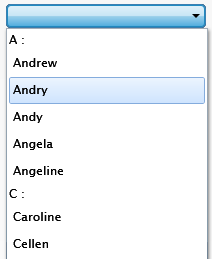
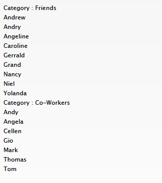
When the ItemsControl is bound to a collection of object, you can use HeaderStringFormat to format the string representation displayed in group item.
The following example shows how to use HeaderStringFormat.
| XAML | Copy Code |
|---|---|
<Intersoft:UXItemsControl ItemsSource="{Binding Items}" DisplayMemberPath="Name"> <Intersoft:UXItemsControl.GroupStyle> <Intersoft:GroupStyle HeaderStringFormat="{}Category : {0} "/> </Intersoft:UXItemsControl.GroupStyle> </Intersoft:UXItemsControl> |
|
Customizing GroupStyle.HeaderTemplate
Alternatively, you can use HeaderTemplate to control the look and feel of the group item. The following example shows how to perform templating using HeaderTemplate property.
| XAML | Copy Code |
|---|---|
<Intersoft:UXItemsControl ItemsSource="{Binding Items}" DisplayMemberPath="Name"> <Intersoft:UXItemsControl.GroupStyle> <Intersoft:GroupStyle> <Intersoft:GroupStyle.HeaderTemplate> <DataTemplate> <Intersoft:StylishLabel Background="{x:Null}" BorderBrush="{x:Null}" ContentType="ContentAndImage" Width="150" ImageWidth="32" ImageMargin="0" HorizontalContentAlignment="Left" ImageSource="/ClientUI.2012R1.Preview;component/Assets/Images/People.png" Content="{Binding}"/> </DataTemplate> </Intersoft:GroupStyle.HeaderTemplate> </Intersoft:GroupStyle> </Intersoft:UXItemsControl.GroupStyle> </Intersoft:UXItemsControl> |
|

Customizing GroupStyle.HeaderTemplateSelector
Similar to ContainerStyleSelector, you can also create an HeaderTemplateSelector by creating a class that inherits from DataTemplateSelector. This template selector allows you to apply different template on different group item based on the logic describes in the template selector.
The following example shows how to use DataTemplateSelector to distinguish male group and female group.
| Data Template Selector | Copy Code |
|---|---|
using System.Windows; using System.Windows.Data; using Intersoft.Client.Framework; namespace ClientUI._2012R1.Preview.TemplateSelectors { public class GenderTemplateSelector : DataTemplateSelector { public DataTemplate FemaleTemplate { get; set; } public DataTemplate MaleTemplate { get; set; } public override DataTemplate SelectTemplate(object item, DependencyObject container) { CollectionViewGroup group = item as CollectionViewGroup; if (group != null) { if (group.Name.ToString() == "Female") return FemaleTemplate; else return MaleTemplate; } return null; } } } |
|
| XAML | Copy Code |
|---|---|
<Intersoft:UXPage.Resources>
    <TemplateSelectors:GenderTemplateSelector x:Name="GenderTemplateSelector">
        <TemplateSelectors:GenderTemplateSelector.FemaleTemplate>
            <DataTemplate>
                <Intersoft:StylishLabel Background="{x:Null}" BorderBrush="{x:Null}" ContentType="ContentAndImage" Width="150" ImageWidth="32" ImageMargin="0" HorizontalContentAlignment="Left" ImageSource="/ClientUI.2012R1.Preview;component/Assets/Images/Female.png" Content="{Binding}"/>
            </DataTemplate>
        </TemplateSelectors:GenderTemplateSelector.FemaleTemplate>
        <TemplateSelectors:GenderTemplateSelector.MaleTemplate>
            <DataTemplate>
                <Intersoft:StylishLabel Background="{x:Null}" BorderBrush="{x:Null}" ContentType="ContentAndImage" Width="150" ImageWidth="32" ImageMargin="0" HorizontalContentAlignment="Left" ImageSource="/ClientUI.2012R1.Preview;component/Assets/Images/Male.png" Content="{Binding}"/>
            </DataTemplate>
        </TemplateSelectors:GenderTemplateSelector.MaleTemplate>
    </TemplateSelectors:GenderTemplateSelector>
</Intersoft:UXPage.Resources>

<Intersoft:UXItemsControl ItemsSource="{Binding Items}" DisplayMemberPath="Name">
    <Intersoft:UXItemsControl.GroupStyle>
        <Intersoft:GroupStyle HeaderTemplateSelector="{StaticResource GenderTemplateSelector}"/>
    </Intersoft:UXItemsControl.GroupStyle>
</Intersoft:UXItemsControl>
|
|