


Introduction
TrueShape architecture has made WebTab possible to render round corner without the need of using images. To be able to use this feature, you would need to set the value of RenderMode property to "RoundCorner". With "RoundCorner" RenderMode, the tab header's edge will be rendered in round corner fashion allowing you simulate XP-like Tab control. WebTab also facilitate you with configuration for the round corner colors and other settings related with RoundCorner in RoundCornerSettings property. With all of this accessibility to configure your WebTab's RoundCorner properties, to design a XP-like Tab control in any color schemes is no longer a troubled matter to be done.
RoundCornerSettings facilitates you to configure 2 colors for RoundCorner tab header, which represent FillerBorderColor and TopBorderColor of the active tab item.
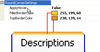
FillerBorderColor
The first color is the FillerBorderColor. The color specified in this property will become the filler color of the WebTab header's border.
TopBorderColor
The second color is the TopBorderColor which will turn out to be the color for the top part of the WebTab header's border.
ApplyHover
In RoundCornerSettings, you can customize your WebTab to apply active colors in mouse over event for your inactive WebTabItems. To use this feature, you will need to set the ApplyHover property to true ( by default, this property is set to false).
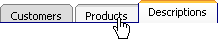
picture1: When ApplyHover property is set to false, the color that is applied on the inactive-hovered tab item is the inactive color.

picture2: When ApplyHover property is set to true, the color that is applied on the inactive-hovered tab item is the active color.