


Objectives
Configuring Interactive Style of WebButton
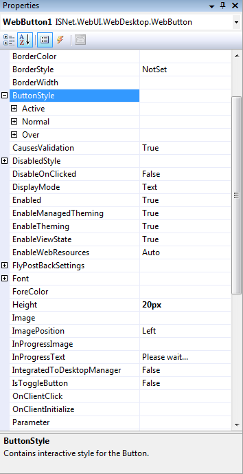
WebButton is designed to have the true Desktop's button behavior. It has three states (Active,
Over, Normal) in enable mode, where we can apply styles to each states to experience the same
behavior as in Desktop's Button (e.g minimize/max/restore/close button styles in every window).
Following are steps to configure the styles for each states : (in "Stand alone Mode")
- Drag WebButton control to the WebForm.
- Right-click on WebButton control and choose Properties.
- Expand ButtonStyle and you will see Active, Normal, and Over States.
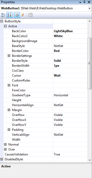
- Expand Active State, change BackColor and BackColor2.
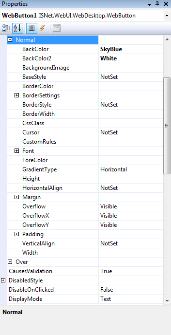
- Expand Normal State, change BackColor and BackColor2.
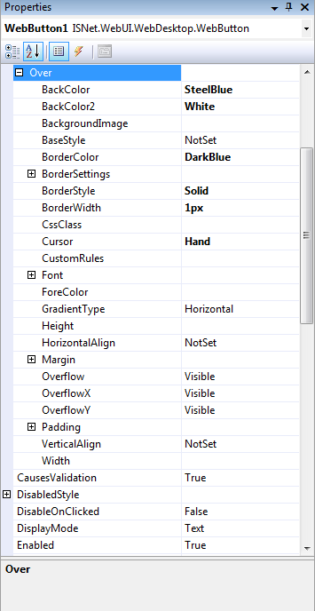
- Expand Over State, change BackColor and BackColor2.
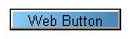
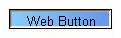
- Run The Project and you will see something like this.
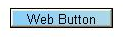
Normal
Over
Active
 |
|