Introduction
This documentation provides in-depth information on customizable styles in Hybrid Menu System. As part of Intersoft WebUI Studio.NET family, every component requires high-level style encapsulation which provides easy and convenient way to customize styles, look and feel as well as visual appearances of the component in WebForm.
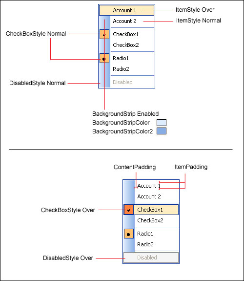
Unique to Intersoft Menu System, there are numerous styles and behaviors that can be easily applied through property change where previously require extensive image editing and tedious workarounds. For instance, you can easily draw a background strip similar to Office-style menu by setting HasBackgroundStrip property to True. You can even customize its colors by specifying the BackgroundStripColor and additionally BackgroundStripColor2 to achieve gradient effect.
Menu Styles
The following table lists customizable styles available in control which implements Menu System.
| Style/Behavior | Description |
| BackgroundStripColor | The background color of the strip. |
| BackgroundStripColor2 | The second background color of the strip. When specified, gradient fill will be applied to the strip. |
| BackgroundStripWidth | The width of the background strip. |
| CheckedItemStyle | The interactive style of Menu Item when checked. |
| ContentPadding | The padding width between Menu Item, applied to Content (Text) part. |
| DisabledItemStyle | The interactive style of Menu Item when disabled. |
| FrameStyle | The style of Menu's Frame. |
| HasBackgroundStrip | Indicates whether the background strip should be drawn. |
| ItemPadding | The padding width between Menu Item. |
| ItemStyle | The interactive style of Menu Item. |
| SeparatorStyle | The style of Separator Menu Item. |
The following image shows the Menu Styles in visual details.