


Background
The properties Manager is the first and basic feature of the Component Editor. This feature exists to give better layouting and organization of the properties available in the component you are editing. Other than that it also offers a better property editing experience.
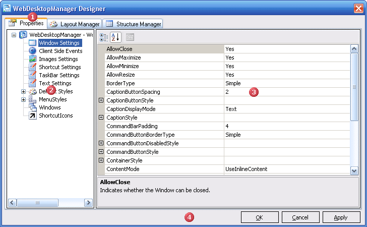
In this tab, there will be a TreeView on the Left of the TabPage and a Content Area on the Right side which will be used to display the selected TreeNode information.
UI Introduction
 |
The Properties Tab |
| The TabPage which holds the entire Properties Manager feature | |
 |
The TreeView |
| Used to divide the component properties into several categories. When the TreeView Node is clicked it will display the corresponding property on the Stage | |
 |
The Stage |
| Acts as a container which will display the properties of the currently selected Node in the TreeView | |
 |
Footer Section * |
| Consist of OK, Cancel, Apply Button. |
* Not part of Properties Manager but it is a part of Component Editor, so it will appear no matter which TabPage is selected.
TreeView NodeType
There are basically 3 Types of Node in the TreeView.
- The first one is for Text Nodes which are nodes which is only used as a PlaceHolder, it will have no content displayed on the stage when clicked.
- The second node is for Normal Nodes which are nodes which has an object associated with it. When clicked a PropertyGrid will appear on the Stage.
- The third node is for Collection Nodes, which are nodes which contain a Collection of Object. When clicked a composite control consisting ListView on the Left. a PropertyGrid on the Right, and a toolBar on the Top of the Stage.