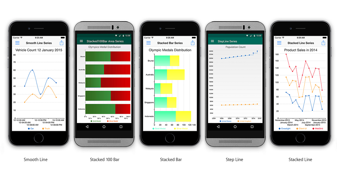
Smoothly Animated
![]()
Seeing is Believing.
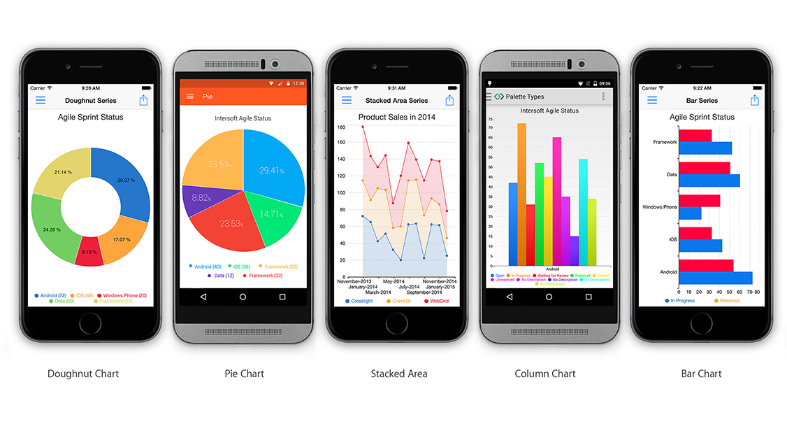
When the chart loads up, it animates smoothly with the most appropriate animation for the corresponding chart types. For example, pie and doughnut series will be circularly-animated, column and bar will animated from its axis, and so on. It's also beautifully animated when the data is changed, new series are added or deleted at runtime.
Fully Customizable
![]()
Move It Around. Repaint It. Give it A Facelift.
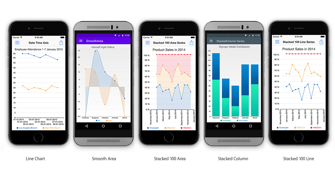
Every chart element is customizable – from the font, title, legend, position, color palette, fill style, data point style, axis style, and a lot more. In addition, you can also customize every little detail of the chart experience such as the animation duration. This allows you to obtain full control over its appearance and easily integrate Crosslight Charting to match your app branding.
Fully Automatic
![]()
Automatic Smart Display.
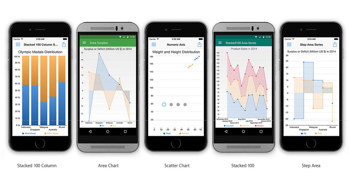
Crosslight Charting doesn't just look beautiful, it's also smartly designed so everything just works with very minimal configuration. It automatically determine the best axes, label positioning, interval range just by binding your data to it. Crosslight Charting has the best of both worlds: gorgeous looks and a powerful brain.
Built-in Enterprise Features
![]()
Make It More Meaningful.
Crosslight Charting comes with enterprise features without additional costs, such as data annotations and custom grid lines. You can easily mark a certain point inside the chart, allowing you to present more meaningful information on the chart. For example, you can mark a specific day where attendance is 0 because of a company trip.

